
Carousel components have become an effective technique for logically delivering content to consumers. Carousels give developers an adjustable way to organize and display content, whether it’s highlighting product features, showing portfolio items, or scrolling through picture galleries.

In this article, we’ll look at how to build carousel components for different frontend frameworks like React, Vue, Angular. We’ll even explore how to build carousel components in your vanilla JavaScript project effortlessly.
Before we get into building, let’s take a look at some advantages and drawbacks that come with using carousel components in your frontend project.
The Replay is a weekly newsletter for dev and engineering leaders.
Delivered once a week, it's your curated guide to the most important conversations around frontend dev, emerging AI tools, and the state of modern software.
Using carousel components in your projects has a number of benefits, along with a few drawbacks to keep in mind. Some of the pros of using carousel components include:
Some of the cons of using carousel components include:
Despite these few shortcomings, carousel components are still widely utilized in web development. There are numerous carousel libraries available, each with unique capabilities.
Next, let’s explore some popular carousel components tailored for modern frontend languages, dissecting their features, implementation methods, and comparative advantages.
bxSlider is a lightweight solution that leverages jQuery to allow you to integrate carousels effortlessly into your JavaScript applications. You can create responsive carousels with a large variety of transition effects, including fading modes, both vertical and horizontal shifts, and tons of other configuration options.
To get started with bxSlider in your JavaScript project, first navigate to the GitHub repository for the bxSlider package and download the code to your machine. Next, copy the css and js folders into your project folder.
Copy the code below into your index.html file:
//index.html
<!doctype html>
<html lang="en">
  <head>
    <meta charset="UTF-8" />
    <meta name="viewport" content="width=device-width, initial-scale=1.0" />
    <link rel="stylesheet" href="css/jquery.bxslider.css" />
    <title>BxSlider Tutorial</title>
  </head>
  <body>
    <div class="container">
      <ul class="bxslider">
        <li><img src="/images/img1.jpg" class="img-responsive" /></li>
        <li><img src="/images/img2.jpg" class="img-responsive" /></li>
        <li><img src="/images/img3.jpg" class="img-responsive" /></li>
      </ul>
    </div>
    <script src="https://ajax.googleapis.com/ajax/libs/jquery/3.1.1/jquery.min.js"></script>
    <script src="js/jquery.bxslider.js"></script>
    <script>
      $(document).ready(function () {
        $(".bxslider").bxSlider();
      });
    </script>
  </body>
</html>
In the code block above, we linked the CSS file, which we imported in the head tag. In the body of the HTML, we created a list of the images that we want to have in our carousel component.
Next, we created three script tags:
bxslider component to functionbxSlider() method on it. This method initializes the bxslider component, applying its default settings and behavior to the selected elementWith that done, start your local server and navigate to the browser. You should something similar to the below:

One of the various options provided by the bxSlider package is the ability to change the transition effect on the carousel. For example, you could change the transition effect from horizontal — which is the default — to vertical, as shown below:
<script>
        $(document).ready(function(){
            $('.bxslider').bxSlider({
             mode: 'vertical',
             slideMargin: 2
            });
        });
</script>
>
With this done, you should have a carousel that looks like this:

You can find the code for this carousel here.
Swiper.js is an open source JavaScript library designed for creating modern and responsive carousels. Swiper works seamlessly across various frameworks, making it easy to adapt to your existing project setup.
The Swiper library is built with a modular structure, allowing you to include only the features you need and keeping the library lightweight and fast. Swiper also offers a wide range of features out of the box, including full navigation control, parallax effects, and virtual slides for managing large datasets.
To set up Swiper.js in your JavaScript project, begin by copying the following code into your index.html file:
<!doctype html>
<html lang="en">
  <head>
    <meta charset="UTF-8" />
    <meta name="viewport" content="width=device-width, initial-scale=1.0" />
    <link rel="stylesheet" href="style.css" />
    <link
      rel="stylesheet"
      href="https://cdn.jsdelivr.net/npm/swiper@11/swiper-bundle.min.css"
    />
    <title>Swiper Js with Javascript</title>
  </head>
  <body>
    <div class="container">
      <!-- Slider main container -->
      <div class="swiper">
        <!-- Additional required wrapper -->
        <div class="swiper-wrapper">
          <!-- Slides -->
          <div class="swiper-slide">
            <img src="images/img1.jpg" alt="img1" class="slide-image" />
          </div>
          <div class="swiper-slide">
            <img src="images/img2.jpg" alt="img2" class="slide-image" />
          </div>
          <div class="swiper-slide">
            <img src="images/img3.jpg" alt="img3" class="slide-image" />
          </div>
        </div>
        <!-- If we need pagination -->
        <div class="swiper-pagination"></div>

        <!-- If we need navigation buttons -->
        <div class="swiper-button-prev"></div>
        <div class="swiper-button-next"></div>

        <!-- If we need scrollbar -->
        <div class="swiper-scrollbar"></div>
      </div>
    </div>
    <script src="https://cdn.jsdelivr.net/npm/swiper@11/swiper-bundle.min.js"></script>
    <script src="app.js"></script>
  </body>
</html>
In the code block above, we first import the CSS required for our carousel to function from the Swiper.js CDN. Then, in the body of the HTML file, we paste in the basic HTML layout, which we get from the Swiper.js docs. Below the body, we link the CDN for the JavaScript and also link to the app.js file where we will initialize Swiper.
The next step is to initialize Swiper by pasting the code below into your app.js file:
const swiper = new Swiper('.swiper', {
  // Optional parameters
  direction: 'vertical',
  loop: true,

  // If we need pagination
  pagination: {
    el: '.swiper-pagination',
  },

  // Navigation arrows
  navigation: {
    nextEl: '.swiper-button-next',
    prevEl: '.swiper-button-prev',
  },

  // And if we need scrollbar
  scrollbar: {
    el: '.swiper-scrollbar',
  },
});
The code above initializes Swiper.js by calling the required function on the swiper container element. We pass an optional object containing our desired features and settings to configure the carousel’s behavior.
Here’s how a simple carousel created with Swiper.js looks:

You can find the code for this carousel here.
React Snap Carousel is a DOM-first, headless carousel package for React. Instead of relying on heavy JavaScript code, it leverages the browser’s native DOM capabilities and built-in scrolling features, along with CSS features like scroll-snap-type, to make the carousel snap to specific positions as you scroll.
Install this package into your React app by running the command below:
npm install react-snap-carousel
Next, open the App.jsx file and copy the code below into it:
//App.jsx

import React from "react";
import { useSnapCarousel } from "react-snap-carousel";

export default function App() {
  const { scrollRef, pages, activePageIndex, next, prev, goTo } =
    useSnapCarousel();
  return (
    <div className="container">
      <ul
        ref={scrollRef}
        style={{
          display: "flex",
          overflow: "auto",
          scrollSnapType: "x mandatory",
        }}
      >
        {Array.from({ length: 20 }).map((_, i) => (
          <li key={i} style={{ listStyle: "none" }}>
            <img
              src={`https://picsum.photos/500?${i}`}
              width="250"
              height="250"
              alt={`Item ${i}`}
            />
          </li>
        ))}
      </ul>

      <div>
        {activePageIndex + 1} / {pages.length}
      </div>
      <button onClick={() => prev()}>Prev</button>
      <button onClick={() => next()}>Next</button>
      <div
        style={{
          display: "flex",
          justifyContent: "center",
          paddingTop: "20px",
        }}
      >
        {pages.map((_, i) => (
          <button
            key={i}
            style={i !== activePageIndex ? { opacity: 0.5 } : {}}
            onClick={() => goTo(i)}
          >
            {i + 1}
          </button>
        ))}
      </div>
    </div>
  );
};
In the code block above, we begin by importing the useSnapCarousel Hook from react-snap-carousel. From this Hook, we have access to various functions we can use to navigate our carousel:
scrollRef: Serves as a pointer to the scrollable container element of the carouselpages: An array containing information about the slides in the carouselactivePageIndex: The index of the currently visible slide in the carouselnext: A function to navigate to the next slideprev: A function to navigate to the previous slidegoTo: A function to navigate to a specific slide by its indexNext, we create a scrollable container using a ul element. Then, we create an array of images and loop through them. Each loop will display a different image in our carousel.
Below the carousel container, we have created three elements for pagination and page information:
div that displays the active page index and total number of slide pagesprev and next functions from the useSnapCarousel Hookdiv that displays and enables pagination in between all the slide pagesWith that done, you should see the results in your browser as shown below:
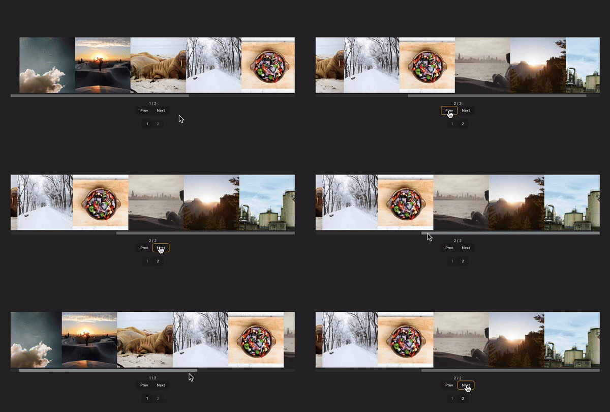
You can find the code for this carousel here.
React Responsive Carousel makes it easy to integrate user-friendly carousels that provide a seamless experience across PCs, tablets, and mobile devices. This library allows users to browse slides easily using touch gestures on mobile devices. It also supports additional controls, including keyboard and mouse navigation and even external controls.
To set up React Responsive Carousel in your React app, begin by installing it using the command below:
yarn add react-responsive-carousel
or
npm i react-responsive-carousel
Open your App.jsx file and paste the following code into it:
//App.jsx
import "react-responsive-carousel/lib/styles/carousel.min.css";
import { Carousel } from "react-responsive-carousel";
import "./style.css";
function App() {
  return (
    <div className="container">
      <Carousel className="slider" autoPlay infiniteLoop>
        <div>
          <img src="./images/img1.jpg" width={200} height={300} />
        </div>
        <div>
          <img src="./images/img2.jpg" width={200} height={300} />
        </div>
        <div>
          <img src="./images/img3.jpg" width={200} height={300} />
        </div>
      </Carousel>
    </div>
  );
}
export default App;
In the code block above, we import the Carousel component, which enables us to create and render the carousel within the app. Each direct child inside this carousel component represents a slide. In this example, we have three divs, and each div contains an image.
With this done, you should have a carousel that looks like this:
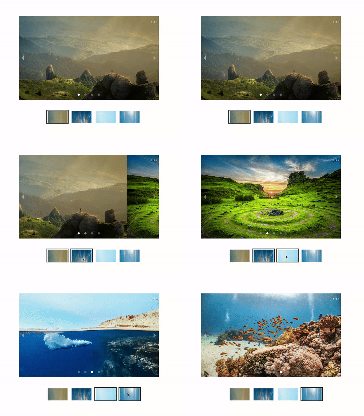
You can find the code for this carousel here.
Vue3-carousel lets you create beautiful and functional Vue carousels that seamlessly adapt to any screen size. This library provides many examples and templates to choose from and extensive customization options, allowing you to tailor your carousel’s appearance and behavior to perfectly match your design needs.
Follow the command below to install and set up Vue3-carousel in your project:
npm install vue3-carousel
# or
yarn add vue3-carousel
Next, paste the code below into the App.vue component:
<template>
  <div class="container">
    <Carousel>
      <Slide v-for="slide in 10" :key="slide">
        <img
          class="carousel__item"
          :src="`https://picsum.photos/500?${slide}`"
          width="250"
          height="250"
          :alt="`Item ${slide}`"
        />
      </Slide>
      <template #addons>
        <Navigation />
        <Pagination />
      </template>
    </Carousel>
  </div>
</template>
<script>
import { defineComponent } from "vue";
import { Carousel, Navigation, Pagination, Slide } from "vue3-carousel";
import "vue3-carousel/dist/carousel.css";
export default defineComponent({
  name: "Vue-3CarouselComponent",
  components: {
    Carousel,
    Slide,
    Pagination,
    Navigation,
  },
});
</script>
<style>
.container {
  width: 500px;
}
.carousel__item {
  min-height: 200px;
  width: 100%;
  border-radius: 8px;
  display: flex;
  justify-content: center;
  align-items: center;
}
.carousel__slide {
  padding: 10px;
}
.carousel__prev,
.carousel__next {
  box-sizing: content-box;
}
</style>
In the code block above, we import the necessary components from Vue3-carousel:
Carousel tag: The main component for creating the carouselSlide tag: Renders individual slidesPagination: Renders navigation arrowsNavigation: Renders pagination dots to indicate slide positionsThe optional template #addons provides a slot for additional elements. Here, it’s used to add navigation and pagination.
With that done, the results should look like the example below:
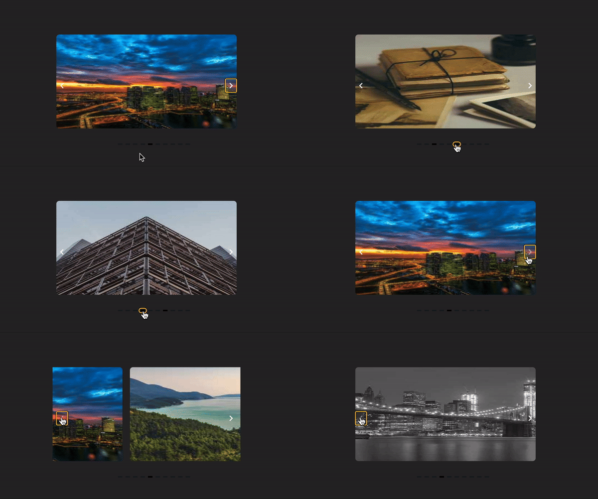
You can find the code for this carousel here.
ngx-owl-carousel-o makes it easier to create responsive and interactive carousels in Angular applications. Features like touch gestures, navigation buttons, and responsive design all come in the box with this package.
Run the command below to install ngx-owl-carousel-o in your Angular app:
npm install ngx-owl-carousel-o
or
yarn add ngx-owl-carousel-o
Next, import the styles for the library in src/styles.sass or src/styles.scss:
@import 'ngx-owl-carousel-o/lib/styles/scss/owl.carousel';
@import 'ngx-owl-carousel-o/lib/styles/scss/owl.theme.default';
Open your src/app/app.module.ts file and paste the following code into it:
import { NgModule } from '@angular/core';
import { BrowserModule } from '@angular/platform-browser';
import { AppRoutingModule } from './app-routing.module';
import { AppComponent } from './app.component';
import { CarouselModule } from 'ngx-owl-carousel-o';
import { BrowserAnimationsModule } from '@angular/platform-browser/animations';
@NgModule({
  declarations: [AppComponent],
  imports: [
    BrowserModule,
    AppRoutingModule,
    CarouselModule,
    BrowserAnimationsModule,
  ],
  providers: [],
  bootstrap: [AppComponent],
})
export class AppModule {}
Here, we imported BrowserAnimationsModule, and CarouselModule. This is essential to ensure the carousel works properly.
Then, copy the following code into the src/app/app.component.ts file:
>import { Component } from '@angular/core';
import { OwlOptions } from 'ngx-owl-carousel-o';
@Component({
  selector: 'app-root',
  templateUrl: './app.component.html',
  styleUrl: './app.component.css',
})
export class AppComponent {
  title = 'owl-carousel-tutorial';
  customOptions: OwlOptions = {
    loop: true,
    mouseDrag: true,
    pullDrag: true,
    dots: true,
    navSpeed: 700,
    navText: ['Previous', 'Next'],
    responsive: {
      0: {
        items: 1,
      },
      400: {
        items: 1,
      },
      740: {
        items: 1,
      },
      940: {
        items: 1,
      },
    },
    nav: true,
  };
}
In this file, we begin by importing OwlOptions, which exports a type for defining carousel options from the ngx-owl-carousel-o library. This ensures type safety when working with the various customization options.
Then, inside the AppComponent, we define a customOptions object that we use to customize the carousel’s behavior and appearance.
Now, paste the following code into the src/app/app.component.html file:
<main class="main">
  <p>Owl Carousel Angular Tutorial</p>
  <owl-carousel-o [options]="customOptions">
    <ng-template carouselSlide>
      <img src="../assets/images/img1.jpg" alt="img1">
    </ng-template>
    <ng-template carouselSlide>
      <img src="../assets/images/img2.jpg" alt="img3">
    </ng-template>
    <ng-template carouselSlide>
      <img src="../assets/images/img3.jpg" alt="img3">
    </ng-template>
    <ng-template  carouselSlide>
      <img src="../assets/images/img4.jpg" alt="img4">
    </ng-template>
  </owl-carousel-o>
</main>
<router-outlet />
This HTML code renders a carousel using the owl-carousel-o component. With that done, when you take a look at your app in the live server, you should see something like this:
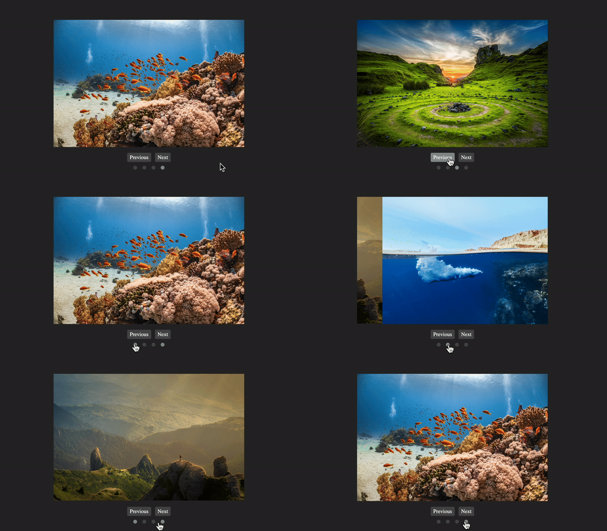
You can find the code for this carousel here.
Now that we’ve seen various carousel libraries and put together an example slider component using each one, let’s recap the carousel components available for your use:
| bxslider | React Snap Carousel | Swiper.js | vue3-carousel | ngx-owl-carousel-o | React Responsive Carousel | |
|---|---|---|---|---|---|---|
| Platform | JavaScript | React | JavaScript, React.js, Vue | Vue.js | Angular | React |
| Browser compatibility | Most modern browsers: Firefox, Chrome, Safari, iOS, Android, IE7+ | Modern browsers | All modern browsers | Modern browsers | Modern browsers | Modern browsers |
| Features | Touch support for mobile devices, responsive, lazy loading enabled | Touch support, responsive, headless design that gives you full control over the UI, lightweight | Touch enabled, responsive, multiple layouts and effects to choose from, lazy loading, easily accessible to screen readers | Touch, keyboard, mouse wheel, and navigation support, responsive library | Touch, responsive, lazy loading, multiple layouts | Mobile friendly, touch support provided, responsive, lightweight lazy loading, even supports external controls |
| Developer experience | Good, the library is easy to setup, examples are provided on the website which illustrate the various ways you can customize the carousel | OK, but might take a while to wrap your head around it. I believe the documentation can be made easier to understand — for example, it’s challenging to understand the various customization options | Excellent, good documentation provided for setup, and extensive examples of the various ways you can customize the carousel component in your app | Excellent, good documentation for installation, setup, and even extensive examples of various ways you can customize the carousel | Easy to integrate into no-standalone Angular apps, has a lot of properties you can customize, and very easy to style to optimize responsiveness | Excellent — very easy and quick to set up and customize in your application |
| User experience | Good | Good, especially when there are a lot of slides to be displayed | Excellent | Excellent | Very good | Excellent |
As you can see, no matter what language you’re developing in and no matter what features you need, there are some great carousel components to choose from.
Carousel libraries save you time and effort during development by making it easier to create responsive and user-friendly carousels. Features like touch support, increased accessibility, and a wide range of customization options are now standard for modern carousel components.
With the knowledge you’ve gained about carousel libraries and their diverse functionalities, you’re now equipped to integrate carousels into your frontend projects.
Install LogRocket via npm or script tag. LogRocket.init() must be called client-side, not
server-side
$ npm i --save logrocket

// Code:

import LogRocket from 'logrocket';
LogRocket.init('app/id');
// Add to your HTML:

<script src="https://cdn.lr-ingest.com/LogRocket.min.js"></script>
<script>window.LogRocket && window.LogRocket.init('app/id');</script>

Learn how Graph RAG uses connected knowledge structures to improve retrieval beyond simple text similarity.

Learn how sibling-index() enables clean, JavaScript-free stagger animations using native CSS.

useEffect breaks AI streaming responses in ReactSee why useEffect breaks AI streaming in React, and how moving stream state outside React fixes flicker and stale updates.

A real-world debugging session using Claude to solve a tricky Next.js UI bug, exploring how AI helps, where it struggles, and what actually fixed the issue.
Hey there, want to help make our blog better?
Join LogRocket’s Content Advisory Board. You’ll help inform the type of content we create and get access to exclusive meetups, social accreditation, and swag.
Sign up now