Popovers are essential and commonly used UI elements that reveal additional information when a user interacts with a designated element. Examples of professional use cases for popovers include dropdown navigation menus, date pickers, and guided tours during onboarding processes.

Within the React ecosystem, many libraries cater to this need, offering varying levels of customization, position strategies, and responsiveness. In this comprehensive guide, we’ll explore five standout popover and positioning libraries for React:
For each of these libraries, we will delve into their setup, positioning capabilities, responsiveness, and more, using the same basic demo project to see each library in action. You can check out the code and demos on CodeSandbox or jump to the end to see a comparison table for all five libraries.
Before we dive into the libraries, let’s first discuss why you should consider using popover libraries rather than building your popovers from scratch.
Creating a robust popover widget from scratch can be complex for many reasons. For example, it’s crucial to ensure that you’re handling numerous edge cases thoroughly. These complexities can pose significant challenges to your development process.
Let’s take a closer look at a simple, reusable popover component created from scratch.
Imagine a dashboard page where users can choose between Admin and User roles for themselves. When users click on the button to set their role, a popover will appear, presenting the available roles.
Achieving this in React involves creating a component state to toggle the popover content and applying a position: absolute on the popover to align it with the reference element. The following code should render a customized popover:
const TableRow = ({ ... }) => {
  const [isPopoverOpen, setIsPopoverOpen] = useState(false);

  return (
    // ...
    <Popover
      isOpen={isPopoverOpen}
      content={<div className="popover-content">{popup}</div>}
    >
      <div
        className="btn-container"
        onClick={() => setIsPopoverOpen(!isPopoverOpen)}
      >
        <Button label="Admin" />
        <RxCaretSort />
      </div>
    </Popover>
    // ...
  );
};
The actual Popover component will look like so:
const Popover = ({ isOpen, content, children }) => {
  return (
    <div className="no-library">
      {children}
      {isOpen && content}
    </div>
  );
};

export default Popover;
The GIF below demonstrates the outcome:

See the code on CodeSandbox.
While this demo works fine at the moment, there are two significant problems that can occur — placement and clipping — each with many potential edge cases to address. Let’s explore these now.
Currently, the reference element — represented by the button in the GIF above — is centrally positioned, so the popover works properly. However, when the element is near the right edge of the browser, it may lead to overflow and necessitate scrolling.
To prevent this overflow, you can make some manual adjustments. While manual adjustment is fine when implementing the popover in a single location, for a reusable component, we must incorporate dynamic positioning logic.
This placement problem becomes particularly important when we need to account for diverse screen sizes and layouts. Unfortunately, addressing all of those potential display scenarios can delay the development process significantly.
It’s unpredictable where a reusable popover component might end up. It could be situated within a container with styles that could disrupt the popup, like overflow: hidden or other styles.
In such a scenario, if the element is near the bottom edge of the boundary, the popover will be truncated:
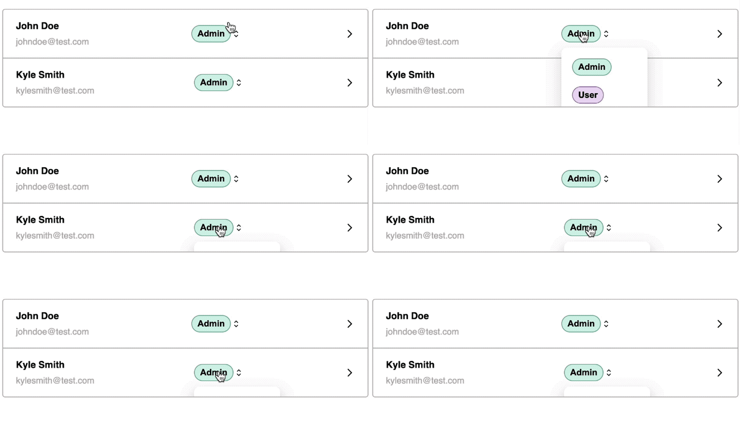
We can enable the popover to appear outside and disregard the overflow: hidden of the parent element by utilizing React Portals:
import { createPortal } from "react-dom";

const Popover = ({ isOpen, content, children }) => {
  return (
    <div>
      {children}
      {isOpen && createPortal(content, document.body)}
    </div>
  );
};

export default Popover;
The createPortal function allows us to render the content directly into a specified DOM node — in this case, within the <body>.
Using a portal ensures that the popover content escapes the constraints of table overflow styling. However, it comes with the drawback that the content loses its original positioning:
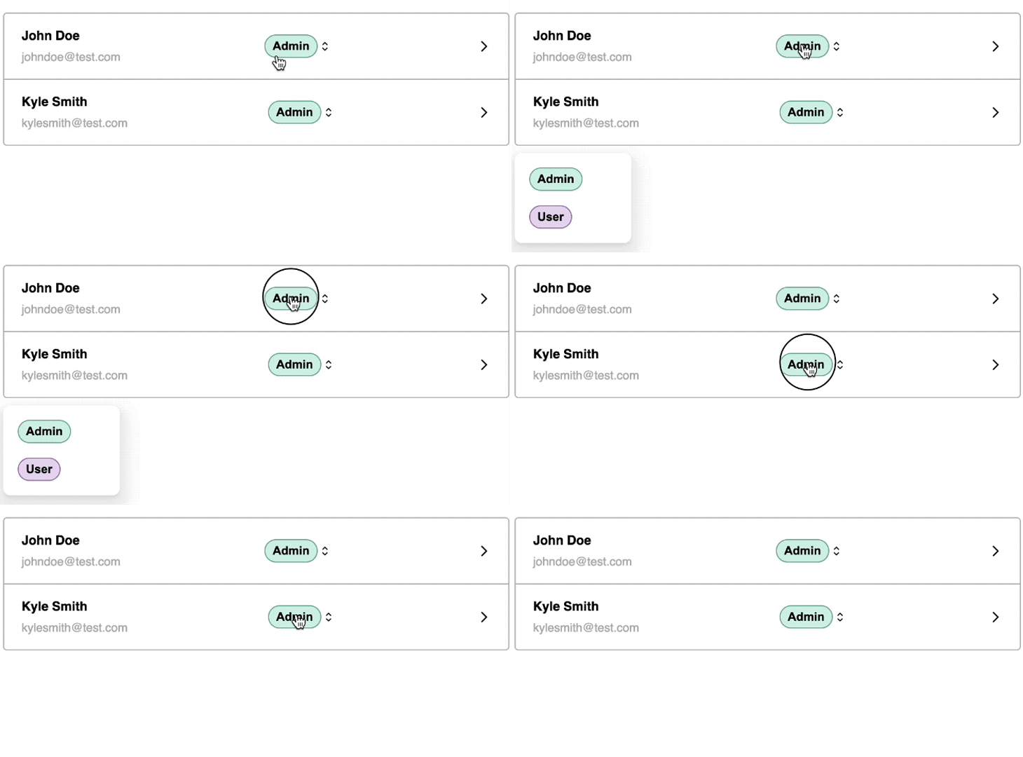
Instead of investing development hours in addressing edge cases, let’s explore standout libraries that help tackle these issues in an elegant and performant manner.
Popper.js is a positioning library designed for elements that “pop,” including popovers.
Technically, Popper.js is not a popover library in itself — we still have to create the popover as demonstrated earlier. However, it significantly simplifies the process of constructing a robust popover by handling complexities related to placement, overflow, and flipping.
Due to its capabilities, various UI libraries such as Material UI, Foundation, and Bootstrap incorporate Popper.js to ensure precise positioning of popup elements. Similarly, React developers frequently rely on it as a foundational tool for creating custom popovers.
While not exclusive to React, Popper.js provides a react-popper wrapper, making it easier to incorporate Popper’s powerful positioning capabilities into React applications.
Now, let’s explore how the Popper library can assist in directly attaching the popover to the reference button.
First, let’s install @popperjs/core and its React wrapper:
npm i react-popper @popperjs/core
In the earlier example, we observed how the createPortal function renders the popover content in a different part of the DOM. Now, let’s employ the Popper library to precisely address the positioning.
The react-popper wrapper provides a usePopper Hook that requires three arguments: a referenceElement, popperElement, and a configuration object. In this configuration, we can specify the initial placement of the popover:
import { useState } from "react";

import { usePopper } from "react-popper";
// ...
const TableRow = ({ name, email, popup }) => {
  // ...
  const [referenceElement, setReferenceElement] = useState(null);
  const [popperElement, setPopperElement] = useState(null);

  const { styles, attributes } = usePopper(referenceElement, popperElement, {
    placement: "bottom-start",
    modifiers: [{ name: "offset", options: { offset: [0, 5] } }]
  });

  return (
    // ...
    <Popover
      isOpen={isPopoverOpen}
      content={
        <div
          ref={setPopperElement}
          style={styles.popper}
          {...attributes.popper}
          className="popover-content"
        >
          {popup}
        </div>
      }
    >
      <div
        className="btn-container"
        ref={setReferenceElement}
        onClick={() => setIsPopoverOpen(!isPopoverOpen)}
      >
        <Button label="Admin" />
        <RxCaretSort />
      </div>
    </Popover>
    // ...
  );
};

export default TableRow;
The usePopper Hook returns an object containing styles and attributes necessary for positioning the popover along with the reference element. To enable proper positioning, we assigned the popper and reference setters to the ref attributes for both the popover content and the reference element.
With this implementation, the popover should now seamlessly attach to the button, escaping any overflow hidden in the parent container and achieving the correct positioning. The result should look like so:
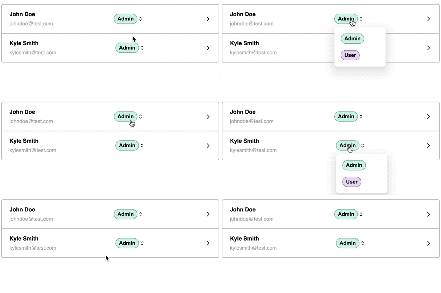
See the project demo and its source code on CodeSandbox.
react-popper without createPortalLet’s explore how the Popper library manages positioning without utilizing the createPortal function. After removing it from the code, we now have the following:
// import { createPortal } from "react-dom";

const Popover = ({ isOpen, content, children }) => {
  return (
    <div>
      {children}
      {isOpen && content}
      {/* {isOpen && createPortal(content, document.body)} */}
    </div>
  );
};

export default Popover;
The library is intelligent enough to flip the popover content to a different placement that fits better, thanks to its ability to handle offsetParent contexts. There’s no need to move the popover outside of its original DOM context:
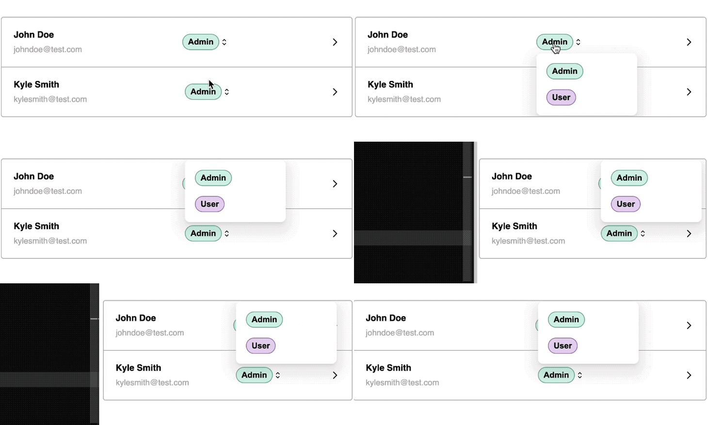
See the source code on CodeSandbox and check out the live demo to see for yourself.
Popper.js is an excellent choice if you want to create your own custom popover, as it‘s capable of managing complex, dynamic positioning logic effortlessly. However, if you’re seeking a ready-made popover component with comprehensive features, let’s explore the next library.
react-tiny-popover: A lightweight but brilliant libraryIf you’re in search of simplicity and a minimal footprint, react-tiny-popover stands out as an excellent choice for constructing popovers.
Despite its lightweight nature, this library is robust and provides great customization options. Moreover, it features a responsive design by default, ensuring compatibility across various screen sizes.
react-tiny-popoverYou can install react-tiny-popover as-is with no other dependencies:
npm install react-tiny-popover –save
Using this library is straightforward. Instead of creating a custom popover component, this library provides us with one that we can directly render:
// ...
import { Popover, ArrowContainer } from "react-tiny-popover";

const TableRow = ({ name, email, popup }) => {
  const [isPopoverOpen, setIsPopoverOpen] = useState(false);
  return (
    // ...
    <Popover
      isOpen={isPopoverOpen}
      positions={["top", "bottom", "left", "right"]}
      align="start"
      padding={8}
      onClickOutside={() => setIsPopoverOpen(false)}
      content={({ position, childRect, popoverRect }) => (
        <ArrowContainer
          position={position}
          childRect={childRect}
          popoverRect={popoverRect}
          arrowColor={"#2a2e2d"}
          arrowSize={8}
        >
          <div>
            <div className="popover-content">{popup}</div>
          </div>
        </ArrowContainer>
      )}
    >
      <div
        onClick={() => setIsPopoverOpen(!isPopoverOpen)}
        className="btn-container"
      >
        <Button label="Admin" />
        <RxCaretSort />
      </div>
    </Popover>
    // ...
  );
};
The Popover component from the library requires three props:
isOpen to track visibilitychildren, which represents the reference element in this casecontent, which takes the content that will appear as the popoverThe expected behavior of the Popover component is as follows:
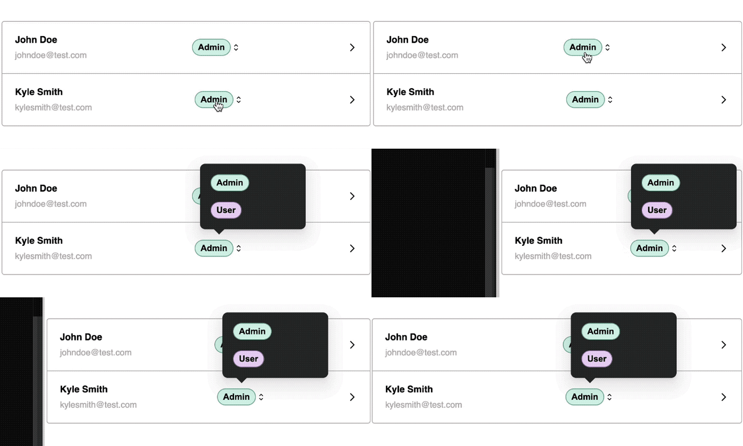
Similar to the positioning capability offered by Popper.js, react-tiny-popover can also guard against container boundaries and reposition itself to prevent hidden overflow. However, unlike Popper, this library by default moves the popover content outside of its DOM context, appending it to the document.body:

To position the popover adjacent to the button that activates it, include a parentElement prop, and then wrap the Popover with a reference element:
import { useState, useRef } from "react";
// ...
const TableRow = ({ name, email, popup }) => {
  // ...
  const boxContainerRef = useRef();
  return (
    // ...
      <div className="popover-container" ref={boxContainerRef}>
        <Popover
          // ...
          parentElement={boxContainerRef.current}
        >
          {...}
        </Popover>
    </div>
    //   ...
  );
};
The popover should now be attached to the container element instead of the body element:

If you prefer a popover without an arrow, you can modify the content prop to exclude the ArrowContainer like so:
content={<div className="popover-content">{popup}</div>}
See the source code and demo on CodeSandbox.
react-laag provides a Hook for positioning popovers. Similar to Popper.js, there’s still some effort involved in creating the visual aspects of the popover. The library takes care of intricate calculations to achieve precise positioning.
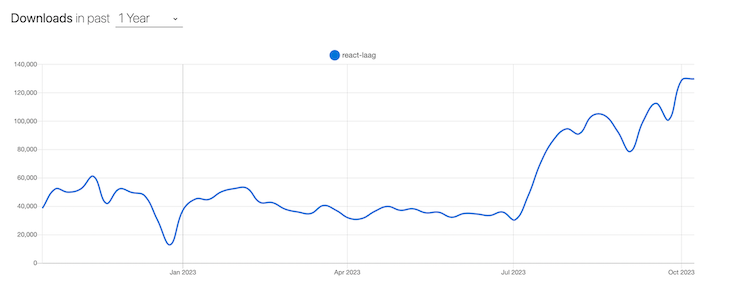
Its popularity has been growing recently, going from less than 50 thousand weekly npm downloads to over 138 thousand over the past year:
Like react-tiny-popover, you can install react-laag with zero dependencies:
npm install react-laag
Here is a quick example of integrating the library into our project:
// ...
import { useLayer, Arrow } from "react-laag";

const TableRow = ({ name, email, popup }) => {
  const [isOpen, setIsOpen] = useState(false);

  const { renderLayer, triggerProps, layerProps, arrowProps } = useLayer({
    isOpen,
    onOutsideClick: () => setIsOpen(false),
    onDisappear: () => setIsOpen(false),
    overflowContainer: false,
    auto: true,
    placement: "right-start",
    triggerOffset: 12,
    arrowOffset: 16
  });

  return (
    // ...
    <Popover
      isOpen={isOpen}
      content={renderLayer(
        <div className="popover-content" {...layerProps}>
          {popup}
          <Arrow {...arrowProps} backgroundColor="#2a2e2d" />
        </div>
      )}
    >
      <div
        {...triggerProps}
        onClick={() => setIsOpen(!isOpen)}
        className="btn-container"
      >
        <Button label="Admin" />
        <RxCaretSort />
      </div>
    </Popover>
    // ...
  );
};
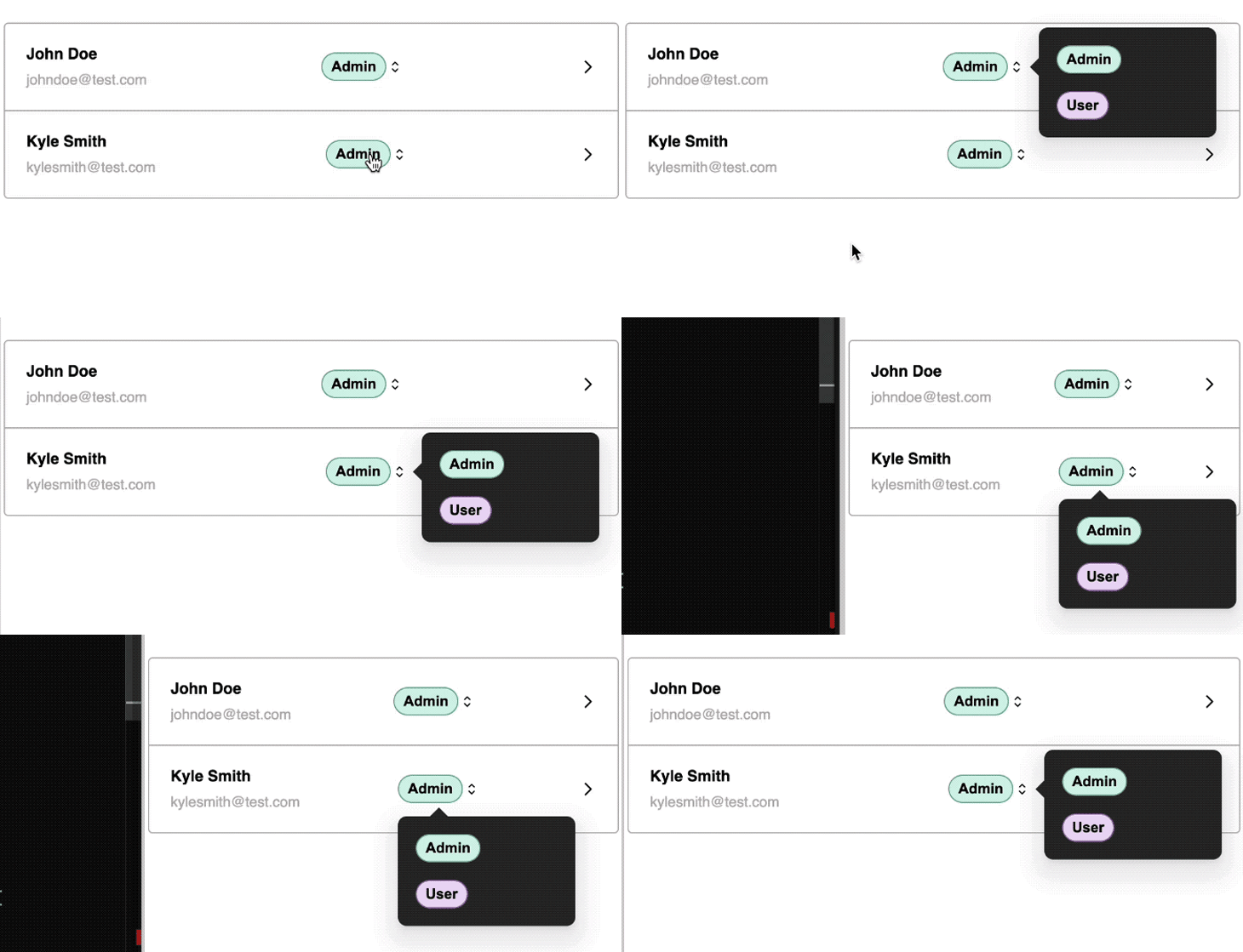
Despite its primary focus on positioning, this library provides essential popover features — such as the onOutsideClick function — to manage the outside click event that closes the popover. Refer to the expected behavior in the demo below:
See this react-laag demo’s source code on CodeSandbox.
reactjs-popupThe reactjs-popup popover library is an excellent choice for those seeking versatility in a simple package. It offers a fully accessible popup component, improving the user experience for individuals who rely on keyboard navigation.
reactjs-popupInstalling reactjs-popup is straightforward. Simply use this command:
npm i reactjs-popup
The code below demonstrates how you can create a popover using reactjs-popup:
import Popup from "reactjs-popup";

const TableRow = ({ name, email, popup }) => {
  return (
    // ...
    <Popup
      trigger={
        <div className="btn-container">
          <Button label="Admin" />
          <RxCaretSort />
        </div>
      }
      position={["top left", "top right", "bottom left", "bottom right"]}
      closeOnDocumentClick
      arrowStyle={{ color: "#2a2e2d" }}
    >
      <div className="popover-content">{popup}</div>
    </Popup>
    // ...
  );
};
This represents the simplest popover implementation for our hypothetical project that we’ve seen so far. reactjs-popup provides us with an easy-to-use Popup component and handles complex positioning very well. Feel free to explore the source code and demo on CodeSandbox.
React Joyride takes a unique approach to popovers, specializing in popovers designed for guided tours within React applications. It’s a standout choice for onboarding new users in a dynamic and engaging way.
Before we implement this library, let’s see a quick demo of what it entails:
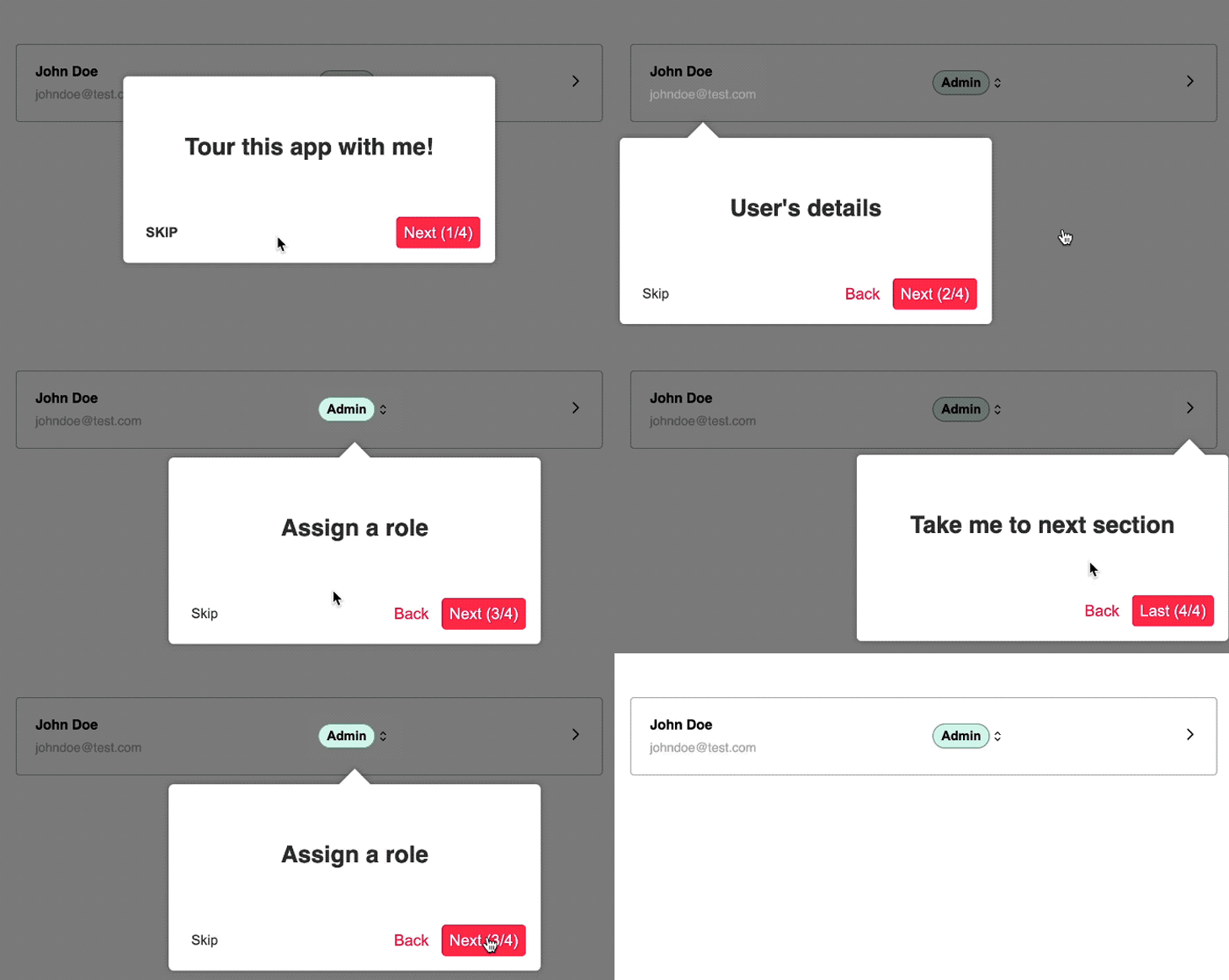
As we can see, React Joyride provides sufficient control over popover positioning to ensure a smooth user experience. It can adapt to different screen sizes, making it ideal for onboarding experiences.
Installing React Joyride is simple, requiring only the following command with no other dependencies:
npm i react-joyride
To use this library, you need to define the steps for the guided tour. Each step will include a target property that points to the appropriate element:
import { useState } from "react";
import Joyride from "react-joyride";
// ...

const TableRow = ({ name, email, popup }) => {

  const [{ run, steps }] = useState({
    run: true,
    steps: [
      {
        content: <h2>Tour this app with me!</h2>,
        locale: { skip: <strong>SKIP</strong> },
        placement: "center",
        target: "body"
      },
      {
        content: <h2>User's details</h2>,
        placement: "bottom",
        target: ".user"
      },
      {
        content: <h2>Assign a role</h2>,
        placement: "bottom",
        target: ".btn-container"
      },
      {
        content: <h2>Take me to next section</h2>,
        placement: "bottom",
        target: ".navigation"
      }
    ]
  });

  return (
    <>
      <Joyride
        steps={steps}
        continuous
        hideCloseButton
        run={run}
        scrollToFirstStep
        showProgress
        showSkipButton
      />
      {/* ... */}
    </>
  );
};
You can see the complete code on CodeSandbox.
This comparison table for all five popover libraries may be a helpful resource as you decide which option is best for your project:
| Library | Purpose | Popularity | Community | Best for |
|---|---|---|---|---|
| Popper.js | Positioning engine library for popup UI elements | 29.6K GitHub stars, 12 million weekly npm downloads |
Active and supportive | Applications requiring precise positioning of UI elements |
react-tiny-popover |
Lightweight React library for creating customizable popovers | 405 GitHub stars, 93.5K weekly npm downloads |
Active community | Projects requiring a simple and customizable popover solution |
| react-laag | React library for creating position-aware UI components | 884 GitHub stars, 138K weekly npm downloads |
Active community | Projects requiring precise control over the positioning of popovers |
reactjs-popup |
React library for creating customizable popups | 1.7k GitHub stars, 110K weekly npm downloads |
Active community | Projects requiring a versatile and customizable popup solution. |
| React Joyride | React library for creating guided tours and walkthroughs | 6k GitHub stars, 239K weekly npm downloads |
Active community | Projects requiring interactive onboarding experiences |
Popovers provide an interactive and user-friendly way to enhance your React applications, but they can be challenging to implement from scratch. Popover libraries can make it easier to deal with various edge cases so your popover components look and work great on any device or screen size.
In the vast landscape of React popover libraries, the choice boils down to your project’s specific needs. Whether you’re aiming for the lightweight simplicity of reactjs-popup and react-tiny-popover or the robust positioning capability of Popper.js, you can choose from a diverse range of options.
We explored five popover and positioning libraries in this article. Experiment with these libraries, considering factors such as ease of use, customization capabilities, responsiveness, and community support, to find the popover solution that best fits your project.
In the end, the journey through these libraries not only enhances your React skills but also empowers you to create compelling and user-friendly popover interfaces.
See all project demos here.
Install LogRocket via npm or script tag. LogRocket.init() must be called client-side, not
server-side
$ npm i --save logrocket

// Code:

import LogRocket from 'logrocket';
LogRocket.init('app/id');
// Add to your HTML:

<script src="https://cdn.lr-ingest.com/LogRocket.min.js"></script>
<script>window.LogRocket && window.LogRocket.init('app/id');</script>
Hey there, want to help make our blog better?
Join LogRocket’s Content Advisory Board. You’ll help inform the type of content we create and get access to exclusive meetups, social accreditation, and swag.
Sign up now
Not sure if low-code is right for your next project? This guide breaks down when to use it, when to avoid it, and how to make the right call.

Compare Firebase Studio, Lovable, and Replit for AI-powered app building. Find the best tool for your project needs.

Discover how to use Gemini CLI, Google’s new open-source AI agent that brings Gemini directly to your terminal.

This article explores several proven patterns for writing safer, cleaner, and more readable code in React and TypeScript.