A crucial aspect of modern web development is communicating your message to users quickly and clearly. If you offer a product or service, you need to guide new users efficiently so they can swiftly become comfortable using your interface.
No matter how good your products or services are, if users can’t grasp their purpose and how to use them, this poor UX could negatively impact your business.
A popular example of user guidance is providing some kind of product tour to highlight the main features and capabilities of a UI in a simple and straightforward way. Driver.js is a small and compact vanilla JavaScript library that provides an easy way to add such a tour to your site or app.
In this tutorial, we’ll explore Driver.js and demonstrate how to use the library in an example web app that incorporates its main features.
To see the working example of what we’re going to create, check out the Driver.js tour example on CodePen. Let’s get started.
Driver.js is a highly customizable and multipurpose library written in TypeScript. You can use this library for product and feature tours as well as any scenario where you need to guide the user’s focus. Some of its technical features include:
In short, Driver.js is a simple, powerful, and flexible library for driving the user’s focus in any way you want or need.
You can use this library in a variety of scenarios where driving and guiding the user focus is key. Here are some ideas for practical Driver.js use cases:
There are not many limitations when it comes to Driver.js. The library’s API provides complete control over its popover component execution.
There may be some use cases where specific Vue or React versions would help developers integrate Driver.js with their apps, but right now, this option is not in the library’s roadmap.
However, you can actually use Driver.js in any frontend framework. It’s just going to cost you a few more lines of code.
There are many ways you can leverage Driver.js in your app. Let’s go through a demo project now to see some of them in action.
In this section, we’ll incorporate Driver.js features in a dashboard project. We’ll use Driver.js to set up contextual help when the user clicks into the search bar and create a feature tour for the dashboard’s components.
To keep the focus on Driver.js, instead of setting up a new dashboard, we’re going to modify an existing dashboard project that looks like the image below:
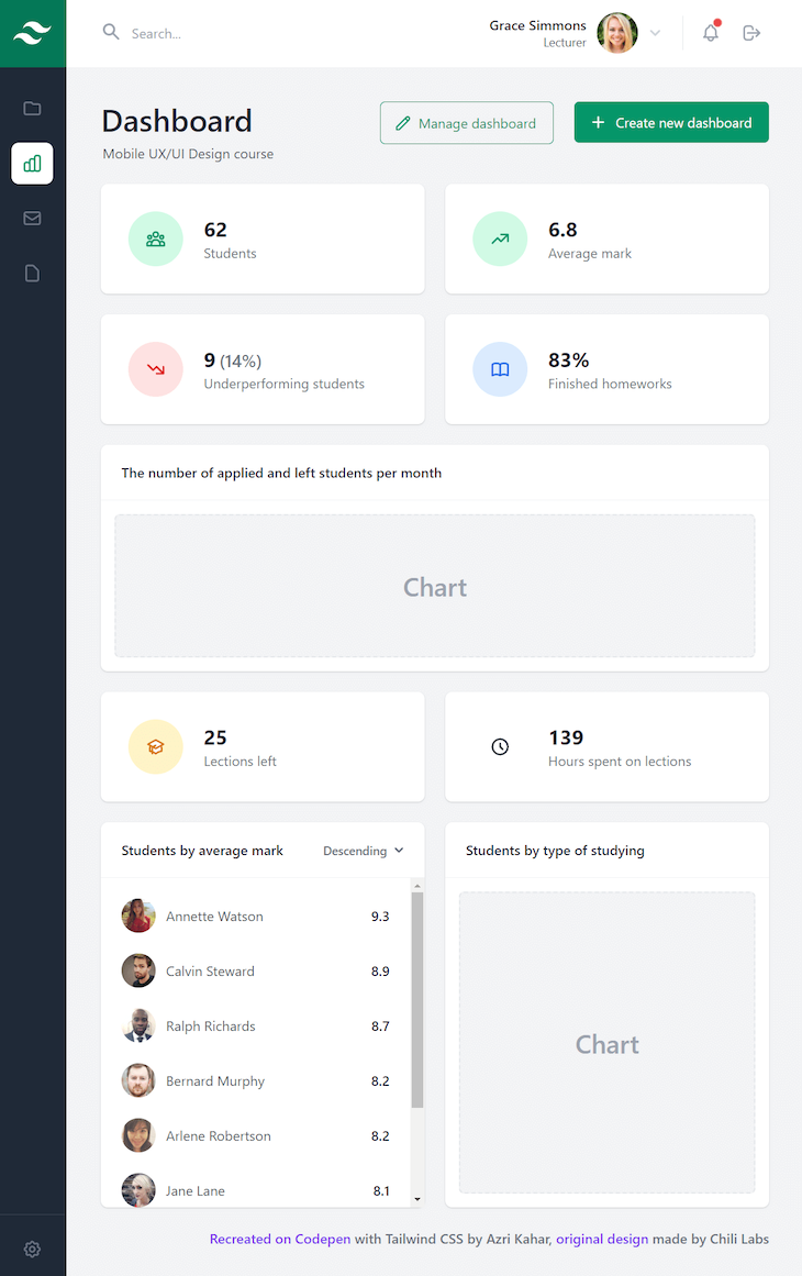
Let’s start by creating an HTML file in a directory of your choice. Name the file driver-tour-example.html or whatever else you’d like to name it. Then, put the following content inside the file:
<html lang="en">
<head>
  <meta charset="UTF-8">
  <meta name="viewport" content="width=device-width, initial-scale=1.0">
  <title>Driver Tour Example</title>
</head>
<body class="flex bg-gray-100 min-h-screen">
  <aside class="hidden sm:flex sm:flex-col">
    <a href="#" class="inline-flex items-center justify-center h-20 w-20 bg-green-700 hover:bg-green-500 focus:bg-green-500">
      <svg fill="none" viewBox="0 0 64 64" class="h-12 w-12">
        <title>Company logo</title>
        <path d="M32 14.2c-8 0-12.9 4-14.9 11.9 3-4 6.4-5.6 10.4-4.5 2.3.6 4 2.3 5.7 4 2.9 3 6.3 6.4 13.7 6.4 7.9 0 12.9-4 14.8-11.9-3 4-6.4 5.5-10.3 4.4-2.3-.5-4-2.2-5.7-4-3-3-6.3-6.3-13.7-6.3zM17.1 32C9.2 32 4.2 36 2.3 43.9c3-4 6.4-5.5 10.3-4.4 2.3.5 4 2.2 5.7 4 3 3 6.3 6.3 13.7 6.3 8 0 12.9-4 14.9-11.9-3 4-6.4 5.6-10.4 4.5-2.3-.6-4-2.3-5.7-4-2.9-3-6.3-6.4-13.7-6.4z" fill="#fff" />
      </svg>
    </a>
    <div class="flex-grow flex flex-col justify-between text-gray-500 bg-gray-800">
      <nav id="categories" class="flex flex-col mx-4 my-6 space-y-4">
        <a href="#" class="inline-flex items-center justify-center py-3 hover:text-gray-400 hover:bg-gray-700 focus:text-gray-400 focus:bg-gray-700 rounded-lg">
          <span class="sr-only">Folders</span>
          <svg aria-hidden="true" fill="none" viewBox="0 0 24 24" stroke="currentColor" class="h-6 w-6">
            <path stroke-linecap="round" stroke-linejoin="round" stroke-width="2" d="M3 7v10a2 2 0 002 2h14a2 2 0 002-2V9a2 2 0 00-2-2h-6l-2-2H5a2 2 0 00-2 2z" />
          </svg>
        </a>
        <a href="#" class="inline-flex items-center justify-center py-3 text-green-600 bg-white rounded-lg">
          <span class="sr-only">Dashboard</span>
          <svg aria-hidden="true" fill="none" viewBox="0 0 24 24" stroke="currentColor" class="h-6 w-6">
            <path stroke-linecap="round" stroke-linejoin="round" stroke-width="2" d="M9 19v-6a2 2 0 00-2-2H5a2 2 0 00-2 2v6a2 2 0 002 2h2a2 2 0 002-2zm0 0V9a2 2 0 012-2h2a2 2 0 012 2v10m-6 0a2 2 0 002 2h2a2 2 0 002-2m0 0V5a2 2 0 012-2h2a2 2 0 012 2v14a2 2 0 01-2 2h-2a2 2 0 01-2-2z" />
          </svg>
        </a>
        <a href="#" class="inline-flex items-center justify-center py-3 hover:text-gray-400 hover:bg-gray-700 focus:text-gray-400 focus:bg-gray-700 rounded-lg">
          <span class="sr-only">Messages</span>
          <svg aria-hidden="true" fill="none" viewBox="0 0 24 24" stroke="currentColor" class="h-6 w-6">
            <path stroke-linecap="round" stroke-linejoin="round" stroke-width="2" d="M3 8l7.89 5.26a2 2 0 002.22 0L21 8M5 19h14a2 2 0 002-2V7a2 2 0 00-2-2H5a2 2 0 00-2 2v10a2 2 0 002 2z" />
          </svg>
        </a>
        <a href="#" class="inline-flex items-center justify-center py-3 hover:text-gray-400 hover:bg-gray-700 focus:text-gray-400 focus:bg-gray-700 rounded-lg">
          <span class="sr-only">Documents</span>
          <svg aria-hidden="true" fill="none" viewBox="0 0 24 24" stroke="currentColor" class="h-6 w-6">
            <path stroke-linecap="round" stroke-linejoin="round" stroke-width="2" d="M7 21h10a2 2 0 002-2V9.414a1 1 0 00-.293-.707l-5.414-5.414A1 1 0 0012.586 3H7a2 2 0 00-2 2v14a2 2 0 002 2z" />
          </svg>
        </a>
      </nav>
      <div id="settings" class="inline-flex items-center justify-center h-20 w-20 border-t border-gray-700">
        <button class="p-3 hover:text-gray-400 hover:bg-gray-700 focus:text-gray-400 focus:bg-gray-700 rounded-lg">
          <span class="sr-only">Settings</span>
          <svg aria-hidden="true" fill="none" viewBox="0 0 24 24" stroke="currentColor" class="h-6 w-6">
            <path stroke-linecap="round" stroke-linejoin="round" stroke-width="2" d="M10.325 4.317c.426-1.756 2.924-1.756 3.35 0a1.724 1.724 0 002.573 1.066c1.543-.94 3.31.826 2.37 2.37a1.724 1.724 0 001.065 2.572c1.756.426 1.756 2.924 0 3.35a1.724 1.724 0 00-1.066 2.573c.94 1.543-.826 3.31-2.37 2.37a1.724 1.724 0 00-2.572 1.065c-.426 1.756-2.924 1.756-3.35 0a1.724 1.724 0 00-2.573-1.066c-1.543.94-3.31-.826-2.37-2.37a1.724 1.724 0 00-1.065-2.572c-1.756-.426-1.756-2.924 0-3.35a1.724 1.724 0 001.066-2.573c-.94-1.543.826-3.31 2.37-2.37.996.608 2.296.07 2.572-1.065z" />
            <path stroke-linecap="round" stroke-linejoin="round" stroke-width="2" d="M15 12a3 3 0 11-6 0 3 3 0 016 0z" />
          </svg>
        </button>
      </div>
    </div>
  </aside>
  <div class="flex-grow text-gray-800">
    <header class="flex items-center h-20 px-6 sm:px-10 bg-white">
      <button class="block sm:hidden relative flex-shrink-0 p-2 mr-2 text-gray-600 hover:bg-gray-100 hover:text-gray-800 focus:bg-gray-100 focus:text-gray-800 rounded-full">
        <span class="sr-only">Menu</span>
        <svg aria-hidden="true" fill="none" viewBox="0 0 24 24" stroke="currentColor" class="h-6 w-6">
          <path stroke-linecap="round" stroke-linejoin="round" stroke-width="2" d="M4 6h16M4 12h16M4 18h7" />
        </svg>
      </button>
            <div id="search" class="relative w-full max-w-md sm:-ml-2">
        <svg aria-hidden="true" viewBox="0 0 20 20" fill="currentColor" class="absolute h-6 w-6 mt-2.5 ml-2 text-gray-400">
          <path fill-rule="evenodd" d="M8 4a4 4 0 100 8 4 4 0 000-8zM2 8a6 6 0 1110.89 3.476l4.817 4.817a1 1 0 01-1.414 1.414l-4.816-4.816A6 6 0 012 8z" clip-rule="evenodd" />
        </svg>
        <input id="form" type="text" role="search" placeholder="Search..." class="py-2 pl-10 pr-4 w-full border-4 border-transparent placeholder-gray-400 focus:bg-gray-50 rounded-lg" />
      </div>
      <div class="flex flex-shrink-0 items-center ml-auto">
        <button id="profile" class="inline-flex items-center p-2 hover:bg-gray-100 focus:bg-gray-100 rounded-lg">
          <span class="sr-only">User Menu</span>
          <div class="hidden md:flex md:flex-col md:items-end md:leading-tight">
            <span class="font-semibold">Grace Simmons</span>
            <span class="text-sm text-gray-600">Lecturer</span>
          </div>
          <span class="h-12 w-12 ml-2 sm:ml-3 mr-2 bg-gray-100 rounded-full overflow-hidden">
            <img src="https://randomuser.me/api/portraits/women/68.jpg" alt="user profile photo" class="h-full w-full object-cover">
          </span>
          <svg aria-hidden="true" viewBox="0 0 20 20" fill="currentColor" class="hidden sm:block h-6 w-6 text-gray-300">
            <path fill-rule="evenodd" d="M5.293 7.293a1 1 0 011.414 0L10 10.586l3.293-3.293a1 1 0 111.414 1.414l-4 4a1 1 0 01-1.414 0l-4-4a1 1 0 010-1.414z" clip-rule="evenodd" />
          </svg>
        </button>
        <div class="border-l pl-3 ml-3 space-x-1">
          <button id="notifications" class="relative p-2 text-gray-400 hover:bg-gray-100 hover:text-gray-600 focus:bg-gray-100 focus:text-gray-600 rounded-full">
            <span class="sr-only">Notifications</span>
            <span class="absolute top-0 right-0 h-2 w-2 mt-1 mr-2 bg-red-500 rounded-full"></span>
            <span class="absolute top-0 right-0 h-2 w-2 mt-1 mr-2 bg-red-500 rounded-full animate-ping"></span>
            <svg aria-hidden="true" fill="none" viewBox="0 0 24 24" stroke="currentColor" class="h-6 w-6">
              <path stroke-linecap="round" stroke-linejoin="round" stroke-width="2" d="M15 17h5l-1.405-1.405A2.032 2.032 0 0118 14.158V11a6.002 6.002 0 00-4-5.659V5a2 2 0 10-4 0v.341C7.67 6.165 6 8.388 6 11v3.159c0 .538-.214 1.055-.595 1.436L4 17h5m6 0v1a3 3 0 11-6 0v-1m6 0H9" />
            </svg>
          </button>
          <button id="logout" class="relative p-2 text-gray-400 hover:bg-gray-100 hover:text-gray-600 focus:bg-gray-100 focus:text-gray-600 rounded-full">
            <span class="sr-only">Log out</span>
            <svg aria-hidden="true" fill="none" viewBox="0 0 24 24" stroke="currentColor" class="h-6 w-6">
              <path stroke-linecap="round" stroke-linejoin="round" stroke-width="2" d="M17 16l4-4m0 0l-4-4m4 4H7m6 4v1a3 3 0 01-3 3H6a3 3 0 01-3-3V7a3 3 0 013-3h4a3 3 0 013 3v1" />
            </svg>
          </button>
        </div>
      </div>
    </header>
    <main class="p-6 sm:p-10 space-y-6">
      <div class="flex flex-col space-y-6 md:space-y-0 md:flex-row justify-between">
        <div class="mr-6">
          <h1 class="text-4xl font-semibold mb-2">Dashboard</h1>
          <h2 class="text-gray-600 ml-0.5">Mobile UX/UI Design course</h2>
        </div>
        <div id="buttons" class="flex flex-wrap items-start justify-end -mb-3">
          <button class="inline-flex px-5 py-3 text-green-600 hover:text-green-700 focus:text-green-700 hover:bg-green-100 focus:bg-green-100 border border-green-600 rounded-md mb-3">
            <svg aria-hidden="true" fill="none" viewBox="0 0 24 24" stroke="currentColor" class="flex-shrink-0 h-5 w-5 -ml-1 mt-0.5 mr-2">
              <path stroke-linecap="round" stroke-linejoin="round" stroke-width="2" d="M15.232 5.232l3.536 3.536m-2.036-5.036a2.5 2.5 0 113.536 3.536L6.5 21.036H3v-3.572L16.732 3.732z" />
            </svg>
            Manage dashboard
          </button>
          <button class="inline-flex px-5 py-3 text-white bg-green-600 hover:bg-green-700 focus:bg-green-700 rounded-md ml-6 mb-3">
            <svg aria-hidden="true" fill="none" viewBox="0 0 24 24" stroke="currentColor" class="flex-shrink-0 h-6 w-6 text-white -ml-1 mr-2">
              <path stroke-linecap="round" stroke-linejoin="round" stroke-width="2" d="M12 6v6m0 0v6m0-6h6m-6 0H6" />
            </svg>
            Create new dashboard
          </button>
        </div>
      </div>
      <section id="statistics" class="grid md:grid-cols-2 xl:grid-cols-4 gap-6">
        <div class="flex items-center p-8 bg-white shadow rounded-lg">
          <div class="inline-flex flex-shrink-0 items-center justify-center h-16 w-16 text-green-600 bg-green-100 rounded-full mr-6">
            <svg aria-hidden="true" fill="none" viewBox="0 0 24 24" stroke="currentColor" class="h-6 w-6">
              <path stroke-linecap="round" stroke-linejoin="round" stroke-width="2" d="M17 20h5v-2a3 3 0 00-5.356-1.857M17 20H7m10 0v-2c0-.656-.126-1.283-.356-1.857M7 20H2v-2a3 3 0 015.356-1.857M7 20v-2c0-.656.126-1.283.356-1.857m0 0a5.002 5.002 0 019.288 0M15 7a3 3 0 11-6 0 3 3 0 016 0zm6 3a2 2 0 11-4 0 2 2 0 014 0zM7 10a2 2 0 11-4 0 2 2 0 014 0z" />
            </svg>
          </div>
          <div>
            <span class="block text-2xl font-bold">62</span>
            <span class="block text-gray-500">Students</span>
          </div>
        </div>
        <div class="flex items-center p-8 bg-white shadow rounded-lg">
          <div class="inline-flex flex-shrink-0 items-center justify-center h-16 w-16 text-green-600 bg-green-100 rounded-full mr-6">
            <svg aria-hidden="true" fill="none" viewBox="0 0 24 24" stroke="currentColor" class="h-6 w-6">
              <path stroke-linecap="round" stroke-linejoin="round" stroke-width="2" d="M13 7h8m0 0v8m0-8l-8 8-4-4-6 6" />
            </svg>
          </div>
          <div>
            <span class="block text-2xl font-bold">6.8</span>
            <span class="block text-gray-500">Average mark</span>
          </div>
        </div>
        <div class="flex items-center p-8 bg-white shadow rounded-lg">
          <div class="inline-flex flex-shrink-0 items-center justify-center h-16 w-16 text-red-600 bg-red-100 rounded-full mr-6">
            <svg aria-hidden="true" fill="none" viewBox="0 0 24 24" stroke="currentColor" class="h-6 w-6">
              <path stroke-linecap="round" stroke-linejoin="round" stroke-width="2" d="M13 17h8m0 0V9m0 8l-8-8-4 4-6-6" />
            </svg>
          </div>
          <div>
            <span class="inline-block text-2xl font-bold">9</span>
            <span class="inline-block text-xl text-gray-500 font-semibold">(14%)</span>
            <span class="block text-gray-500">Underperforming students</span>
          </div>
        </div>
        <div class="flex items-center p-8 bg-white shadow rounded-lg">
          <div class="inline-flex flex-shrink-0 items-center justify-center h-16 w-16 text-blue-600 bg-blue-100 rounded-full mr-6">
            <svg aria-hidden="true" fill="none" viewBox="0 0 24 24" stroke="currentColor" class="h-6 w-6">
              <path stroke-linecap="round" stroke-linejoin="round" stroke-width="2" d="M12 6.253v13m0-13C10.832 5.477 9.246 5 7.5 5S4.168 5.477 3 6.253v13C4.168 18.477 5.754 18 7.5 18s3.332.477 4.5 1.253m0-13C13.168 5.477 14.754 5 16.5 5c1.747 0 3.332.477 4.5 1.253v13C19.832 18.477 18.247 18 16.5 18c-1.746 0-3.332.477-4.5 1.253" />
            </svg>
          </div>
          <div>
            <span class="block text-2xl font-bold">83%</span>
            <span class="block text-gray-500">Finished homeworks</span>
          </div>
        </div>
      </section>
      <section class="grid md:grid-cols-2 xl:grid-cols-4 xl:grid-rows-3 xl:grid-flow-col gap-6">
        <div class="flex flex-col md:col-span-2 md:row-span-2 bg-white shadow rounded-lg">
          <div class="px-6 py-5 font-semibold border-b border-gray-100">The number of applied and left students per month</div>
          <div class="p-4 flex-grow">
            <div class="flex items-center justify-center h-full px-4 py-16 text-gray-400 text-3xl font-semibold bg-gray-100 border-2 border-gray-200 border-dashed rounded-md">Chart</div>
          </div>
        </div>
        <div class="flex items-center p-8 bg-white shadow rounded-lg">
          <div class="inline-flex flex-shrink-0 items-center justify-center h-16 w-16 text-yellow-600 bg-yellow-100 rounded-full mr-6">
            <svg aria-hidden="true" fill="none" viewBox="0 0 24 24" stroke="currentColor" class="h-6 w-6">
              <path fill="#fff" d="M12 14l9-5-9-5-9 5 9 5z" />
              <path fill="#fff" d="M12 14l6.16-3.422a12.083 12.083 0 01.665 6.479A11.952 11.952 0 0012 20.055a11.952 11.952 0 00-6.824-2.998 12.078 12.078 0 01.665-6.479L12 14z" />
              <path stroke-linecap="round" stroke-linejoin="round" stroke-width="2" d="M12 14l9-5-9-5-9 5 9 5zm0 0l6.16-3.422a12.083 12.083 0 01.665 6.479A11.952 11.952 0 0012 20.055a11.952 11.952 0 00-6.824-2.998 12.078 12.078 0 01.665-6.479L12 14zm-4 6v-7.5l4-2.222" />
            </svg>
          </div>
          <div>
            <span class="block text-2xl font-bold">25</span>
            <span class="block text-gray-500">Lections left</span>
          </div>
        </div>
        <div class="flex items-center p-8 bg-white shadow rounded-lg">
          <div class="inline-flex flex-shrink-0 items-center justify-center h-16 w-16 text-teal-600 bg-teal-100 rounded-full mr-6">
            <svg aria-hidden="true" fill="none" viewBox="0 0 24 24" stroke="currentColor" class="h-6 w-6">
              <path stroke-linecap="round" stroke-linejoin="round" stroke-width="2" d="M12 8v4l3 3m6-3a9 9 0 11-18 0 9 9 0 0118 0z" />
            </svg>
          </div>
          <div>
            <span class="block text-2xl font-bold">139</span>
            <span class="block text-gray-500">Hours spent on lections</span>
          </div>
        </div>
        <div class="row-span-3 bg-white shadow rounded-lg">
          <div class="flex items-center justify-between px-6 py-5 font-semibold border-b border-gray-100">
            <span>Students by average mark</span>
            <button type="button" class="inline-flex justify-center rounded-md px-1 -mr-1 bg-white text-sm leading-5 font-medium text-gray-500 hover:text-gray-600" id="options-menu" aria-haspopup="true" aria-expanded="true">
              Descending
              <svg class="-mr-1 ml-1 h-5 w-5" xmlns="http://www.w3.org/2000/svg" viewBox="0 0 20 20" fill="currentColor">
                <path fill-rule="evenodd" d="M5.293 7.293a1 1 0 011.414 0L10 10.586l3.293-3.293a1 1 0 111.414 1.414l-4 4a1 1 0 01-1.414 0l-4-4a1 1 0 010-1.414z" clip-rule="evenodd" />
              </svg>
            </button>
            <!-- Refer here for full dropdown menu code: https://tailwindui.com/components/application-ui/elements/dropdowns -->
          </div>
          <div class="overflow-y-auto" style="max-height: 24rem;">
            <ul class="p-6 space-y-6">
              <li class="flex items-center">
                <div class="h-10 w-10 mr-3 bg-gray-100 rounded-full overflow-hidden">
                  <img src="https://randomuser.me/api/portraits/women/82.jpg" alt="Annette Watson profile picture">
                </div>
                <span class="text-gray-600">Annette Watson</span>
                <span class="ml-auto font-semibold">9.3</span>
              </li>
              <li class="flex items-center">
                <div class="h-10 w-10 mr-3 bg-gray-100 rounded-full overflow-hidden">
                  <img src="https://randomuser.me/api/portraits/men/81.jpg" alt="Calvin Steward profile picture">
                </div>
                <span class="text-gray-600">Calvin Steward</span>
                <span class="ml-auto font-semibold">8.9</span>
              </li>
              <li class="flex items-center">
                <div class="h-10 w-10 mr-3 bg-gray-100 rounded-full overflow-hidden">
                  <img src="https://randomuser.me/api/portraits/men/80.jpg" alt="Ralph Richards profile picture">
                </div>
                <span class="text-gray-600">Ralph Richards</span>
                <span class="ml-auto font-semibold">8.7</span>
              </li>
              <li class="flex items-center">
                <div class="h-10 w-10 mr-3 bg-gray-100 rounded-full overflow-hidden">
                  <img src="https://randomuser.me/api/portraits/men/79.jpg" alt="Bernard Murphy profile picture">
                </div>
                <span class="text-gray-600">Bernard Murphy</span>
                <span class="ml-auto font-semibold">8.2</span>
              </li>
              <li class="flex items-center">
                <div class="h-10 w-10 mr-3 bg-gray-100 rounded-full overflow-hidden">
                  <img src="https://randomuser.me/api/portraits/women/78.jpg" alt="Arlene Robertson profile picture">
                </div>
                <span class="text-gray-600">Arlene Robertson</span>
                <span class="ml-auto font-semibold">8.2</span>
              </li>
              <li class="flex items-center">
                <div class="h-10 w-10 mr-3 bg-gray-100 rounded-full overflow-hidden">
                  <img src="https://randomuser.me/api/portraits/women/77.jpg" alt="Jane Lane profile picture">
                </div>
                <span class="text-gray-600">Jane Lane</span>
                <span class="ml-auto font-semibold">8.1</span>
              </li>
              <li class="flex items-center">
                <div class="h-10 w-10 mr-3 bg-gray-100 rounded-full overflow-hidden">
                  <img src="https://randomuser.me/api/portraits/men/76.jpg" alt="Pat Mckinney profile picture">
                </div>
                <span class="text-gray-600">Pat Mckinney</span>
                <span class="ml-auto font-semibold">7.9</span>
              </li>
              <li class="flex items-center">
                <div class="h-10 w-10 mr-3 bg-gray-100 rounded-full overflow-hidden">
                  <img src="https://randomuser.me/api/portraits/men/75.jpg" alt="Norman Walters profile picture">
                </div>
                <span class="text-gray-600">Norman Walters</span>
                <span class="ml-auto font-semibold">7.7</span>
              </li>
            </ul>
          </div>
        </div>
        <div class="flex flex-col row-span-3 bg-white shadow rounded-lg">
          <div class="px-6 py-5 font-semibold border-b border-gray-100">Students by type of studying</div>
          <div class="p-4 flex-grow">
            <div class="flex items-center justify-center h-full px-4 py-24 text-gray-400 text-3xl font-semibold bg-gray-100 border-2 border-gray-200 border-dashed rounded-md">Chart</div>
          </div>
        </div>
      </section>
      <section class="text-right font-semibold text-gray-500">
        <a href="#" class="text-purple-600 hover:underline">Recreated on Codepen</a> with <a href="https://tailwindcss.com/" class="text-teal-400 hover:underline">Tailwind CSS</a> by Azri Kahar, <a href="https://dribbble.com/shots/10711741-Free-UI-Kit-for-Figma-Online-Courses-Dashboard" class="text-purple-600 hover:underline">original design</a> made by Chili Labs
      </section>
    </main>
  </div>
</body>
</html>
This is the markup for the dashboard design from the image above. Now let’s add the following in the <head> section of your file:
<script src="https://cdn.jsdelivr.net/npm/[email protected]/dist/driver.js.iife.js"></script>
<link rel="stylesheet" href="https://cdn.jsdelivr.net/npm/[email protected]/dist/driver.css"/>
<link rel="stylesheet" href="https://cdnjs.cloudflare.com/ajax/libs/tailwindcss/2.0.0/tailwind.min.css"/>
This loads the necessary JavaScript and CSS files for Driver.js as well as the Tailwind CSS library used in the dashboard design. Now we’re ready to start working with Driver.js.
In this section, we’ll add a contextual highlight popover element that displays when the user focuses — or clicks — on the search bar. Add the following code before the closing <body> tag:
<script>
  const driver = window.driver.js.driver

  const step = driver({
    onDestroyed: () => document.activeElement.blur()
  })

  const formEl = document.getElementById('form')

  formEl.addEventListener('focus', () => {
    step.highlight({
      element: formEl,
      popover: {
        description: 'Enter your search term (for example, <em>student</em> or <em>homework</em>) and hit <strong>Enter</strong>.',
        side: 'bottom'
      }
    })
  })

  formEl.addEventListener('blur', () => step.destroy() )
</script>
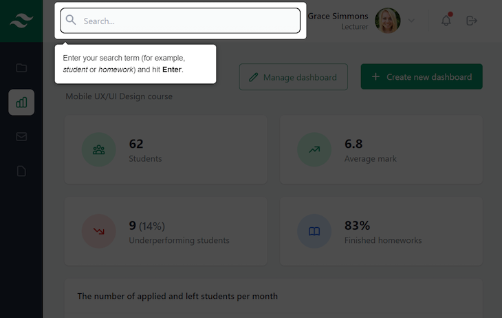
In the code above, we first declare the driver object. Next, we create an instance of the driver object. Then, we select the search input by its ID and attach a focus event listener to the search input. This will ensure that when the search input is in focus, the Driver.js code will execute.
Here, we use the highlight method, which is meant for when we need to highlight only one element. It represents a drive step with two properties:
element — The target element to highlight. It can be a CSS selector or an HTML elementpopover — The Driver.js UI element that highlights the target element and shows the content for the highlighted step, which in our case would be instructions for the search inputThe popover has many configuration options listed in the Driver.js docs. Here, we use the description property to add content for the step and side property to specify which side we want to display the popover on. In our case, bottom is the most appropriate side for our design.
Note that for the popover’s content, we can use HTML as well as plain text.
Next, we attach a blur event listener so that when the search input is not in focus anymore, we call the destroy() method to destroy the driver object instance.
In the driver object instance declaration we created before, we use the onDestroyed() hook to remove the focus from the search input when the driver is destroyed.
In the image below, you can see the result when we click on the search input:
In the last section, we saw how to use Driver.js to highlight a single element. Now, we’ll explore how to create a tour with multiple driver steps to highlight various different elements.
We want to provide users with explanation of each element’s purpose on our dashboard. To do so, add the following code in the <script> tag. This code should go after the code we added earlier to highlight the search bar when it’s in focus:
const tour = driver({
  steps: [
    { element: '#categories', popover: { title: 'Sidebar categories', description: 'Navigate to desired category.' } },
    { element: '#settings', popover: { title: 'Settings', description: 'Visit the <em>Settings</em> page.' } },
    { element: '#search', popover: { title: 'Search bar', description: 'Find the topic you need quickly and easily.' } },
    { element: '#profile', popover: { title: 'User profile', description: 'Access your settings.' } },
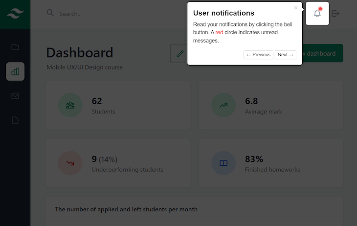
    { element: '#notifications', popover: { title: 'User notifications', description: 'Read your notifications by clicking the bell button. A <span style="color: red">red</span> circle indicates unread messages.' } },
    { element: '#logout', popover: { title: 'User logout', description: 'Logout from your account.' } },
    { element: '#buttons', popover: { title: 'Action buttons', description: 'Manage the current dashboard or create new one.' } },
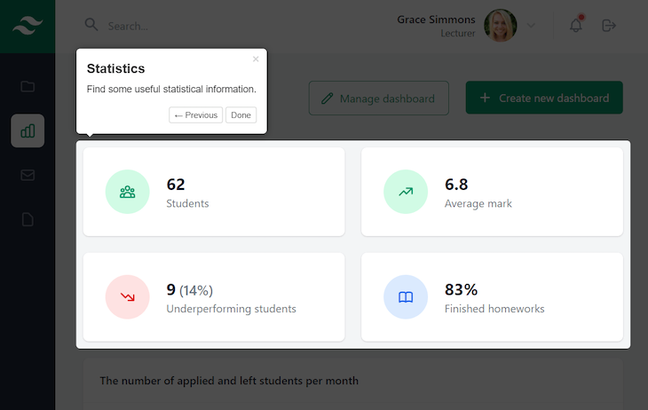
    { element: '#statistics', popover: { title: 'Statistics', description: 'Find some useful statistical information.' } },
  ]
})

tour.drive()
To create a multi-step tour, we create another instance of the driver object and use the steps property to define the tour’s steps. Each step takes the exact same configuration properties as the single step from the previous example.
We use ID selectors to select all the elements we want to highlight. Note that these IDs are already in the markup we copied earlier, so we don’t have to add them to the HTML file now. However, if you’re using Driver.js in your own project, you’ll need to add them on your own.
This time, in the popover configuration, we also add title and description options. However, we don’t use the side property because we don’t need it. Driver.js will set the most appropriate side automatically if the side option is omitted or if it’s present but not appropriate.
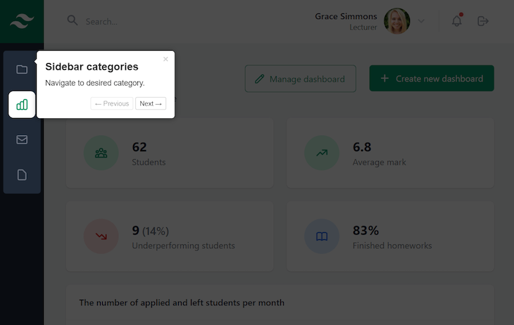
Finally, we use the drive() method to start the tour. Here are some screenshots of the tour steps.
Explaining how to navigate using the sidebar:
Demonstrating the notification feature:
Defining dashboard elements:
Now we have a fully functional tour for our dashboard app.
This is great, but what if we want to create a customized tour with our own design? Well, this is completely possible with Driver.js. Let’s see how we can do it in the next section.
Driver.js offers some configuration options you can use to change the appearance of the popover and the overlay. Let’s try some of them.
Copy the properties above steps in the code below and add them to the tour object in your file:
const tour = driver({
  prevBtnText: 'Previous',
  nextBtnText: 'Next',
  doneBtnText: 'Finish',
  overlayColor: 'maroon',
  showProgress: true,
  progressText: 'Step {{current}} of {{total}}',
  steps: [ /* Omitted for brevity */ ]
})
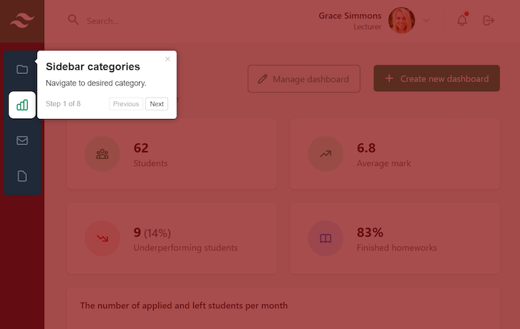
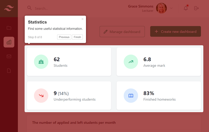
The first three properties change the display text for the Next, Previous, and Done buttons shown in the popover component.
The overlayColor property sets the color of the dimmed area when an element is highlighted.
The next two properties instruct the driver that the progress of steps should be shown and how its text should be formatted.
Now, if you reload the page, you should see how the tour looks with our modifications. Here’s the first step:
And here’s the last step:
Great! It already looks cool with our customizations, but let’s go further and completely change its appearance by adding some styles.
Driver.js allows you to theme the popover as you like. By using some of the library’s predefined popover classes, we can change every part of the popover.
Add a style tag in your file with the following content:
.driver-popover {
  border: 3px solid green;
}

.driver-popover-arrow {
  margin: 2px;
  border-width: 10px;
}

.driver-popover-arrow-side-left.driver-popover-arrow {
  border-left-color: green;
}

.driver-popover-arrow-side-right.driver-popover-arrow {
  border-right-color: green;
}

.driver-popover-arrow-side-top.driver-popover-arrow {
  border-top-color: green;
}

.driver-popover-arrow-side-bottom.driver-popover-arrow {
  border-bottom-color: green;
}
Here, we add a solid green border to the popover. We also change the color, width, and margin of the popover arrow to match the border color and size.
Here is the result:

Looks great! Let’s finish the popover transformation by adding custom fonts and some additional styling.
First, add the following links in your files to add the Cabin Sketch and Klee One Google Fonts:
<link rel="preconnect" href="https://fonts.googleapis.com">
<link rel="preconnect" href="https://fonts.gstatic.com" crossorigin>
<link href="https://fonts.googleapis.com/css2?family=Cabin+Sketch&display=swap" rel="stylesheet">
<link href="https://fonts.googleapis.com/css2?family=Klee+One:wght@600&display=swap" rel="stylesheet">
Now we can use them in our stylesheet. Add the following in the <style> tag:
.driver-popover-title {
  font-family: 'Cabin Sketch', cursive;
  font-size: 1.2rem;
}

.driver-popover-description {
  font-family: 'Klee One', cursive;
  font-size: 1rem;
}

.driver-popover-close-btn {
  color: red;
}

.driver-popover-footer {
  border-top: 1px solid lightgray;
  padding-top: 10px;
}

.driver-popover-progress-text {
  color: maroon;
}
In the code above, we made the title and description text a bit bigger and set the desired Google Font for each one.
Next, we made the color of the close button red. We also added a bit of padding to the top as well as a tiny, light gray top border to the popover footer to visually separate the popover text from the progress text.
Finally, we changed the color of the progress text to match the overlay color.
Here is the final appearance of the popover:
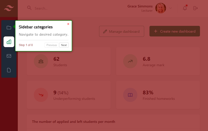
It looks way better than its default version, doesn’t it? You can easily change the style to suit your personal preference or brand scheme.
Here you can see the final result in action:
See the Pen Driver.js Tour Example by Ivaylo Gerchev (@codeknack)
on CodePen.
For a better experience, view the final project on CodePen to interact with it directly in fullscreen mode.
In this tutorial, we explored Driver.js and learned how to use some of its capabilities in a demo dashboard project. We built a feature tour for the dashboard and added a contextual popup to the search bar to help guide users.
Although this library is simple and easy to use, it can do way more than you’d expect at first glance. You can check out the Driver.js documentation to explore its advanced capabilities and see some more example projects for inspiration as you consider ways to add it to your own project.
Debugging code is always a tedious task. But the more you understand your errors, the easier it is to fix them.
LogRocket allows you to understand these errors in new and unique ways. Our frontend monitoring solution tracks user engagement with your JavaScript frontends to give you the ability to see exactly what the user did that led to an error.
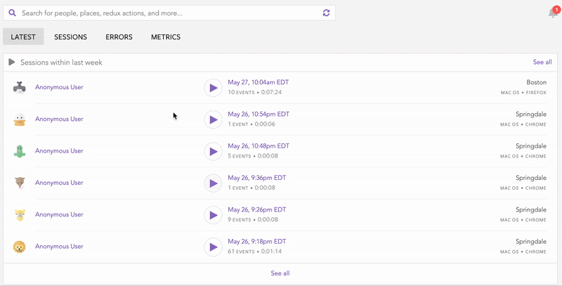
LogRocket records console logs, page load times, stack traces, slow network requests/responses with headers + bodies, browser metadata, and custom logs. Understanding the impact of your JavaScript code will never be easier!

Zero UI works well for screenless, voice-first experiences, but most digital products still require visual interaction. Here’s why multimodal UX offers a more scalable foundation for the future of design.
CPO and PhD Jen Wang covers “The Zone of Absorption” and why product teams are struggling to build when AI is shifting faster than anyone can keep up.

When should you move API logic out of Next.js? Learn when Route Handlers stop scaling and how ElysiaJS helps.

Explore how Dokploy streamlines app deployment with Docker, automated builds, and simpler infrastructure compared to traditional CI/CD workflows.