In this article we’ll take a look at glassmorphism, one of the most popular UI design trends. You’ll learn what glassmorphism is, how it came about, how to create the effect, and when you should use it (if ever!).
Editor’s note: This article was updated by Daniel Schwarz on 18 April 2025 to include fresh examples of glassmorphism’s use in modern design contexts, updated commentary on real-world adoption, and expanded practical guidance on how to create glassmorphic effects.
Glassmorphism is a UI design trend that leverages glass-textured backgrounds. It provides a clean interface that, if designed well, produces a modern (or even futuristic) aesthetic. It’s suitable for luxury brands, tech products, or anything of the sort.
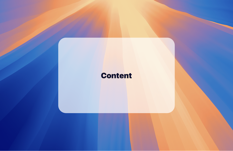
Glassmorphism incorporates translucency and often blurring (i.e., the ‘frosted glass’ effect), but can also incorporate borders, shadows, gradients, and other ambient lighting design properties as long as the details aren’t detrimental to the user’s experience:
While not every UI design trend is worth jumping on, there are plenty of upsides to glassmorphism. Some of its benefits include that it’s:
However, there are a couple of cons you should consider as well:
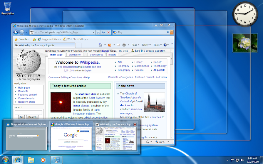
Windows Aero leaned into the effect pretty hard, and as a result it impacted accessibility. On low-end computers, it also impacted performance. Iconic, but not very subtle at all.
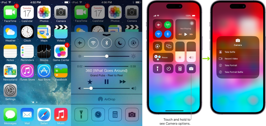
Apple’s iOS 7, launched 6 years later in 2013, introduced an “upgraded” glassmorphic aesthetic. Thanks to background blurring, this one featured a frosted glass effect that reduced the intensity of the aesthetic. The way Apple refined glassmorphism (notably, the reduced details and translucency) is often credited with making the UI design trend trendy — and over time, Apple’s iterations have only improved, especially in terms of accessibility:
Since then, glassmorphism has gained a lot of popularity among the design community. However, the majority of glassmorphic designs are showcased on Dribbble — not real products:
This is partially due to overuse of the effect, to the point that it makes these designs inaccessible, impractical, or even downright ugly. While it doesn’t have to be this way, it’s fair to say that glassmorphism has a bad reputation. That might be why, despite being a very popular UI design trend, we don’t actually see it in the wild that much. (Another reason is that many frontend developers don’t know how to implement it, as the technology for doing so is fairly new.)
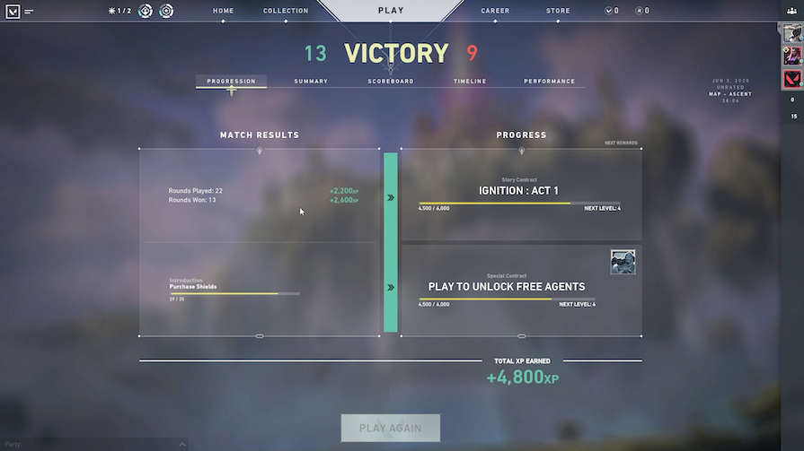
That being said, the UI design trend has found its way into gaming due to the consumer-centric and attention-demanding focus of these products in which glassmorphic aesthetics, even over-the-top ones, seem somewhat appropriate. In gaming, glassmorphism can look modern/futuristic and fun, although it often suffers from the usual drawbacks such as poor accessibility:
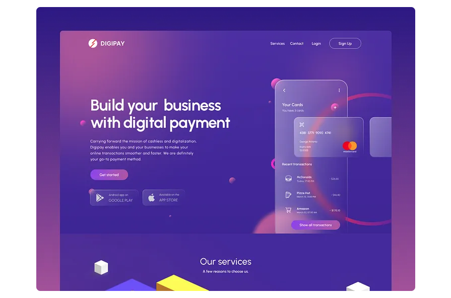
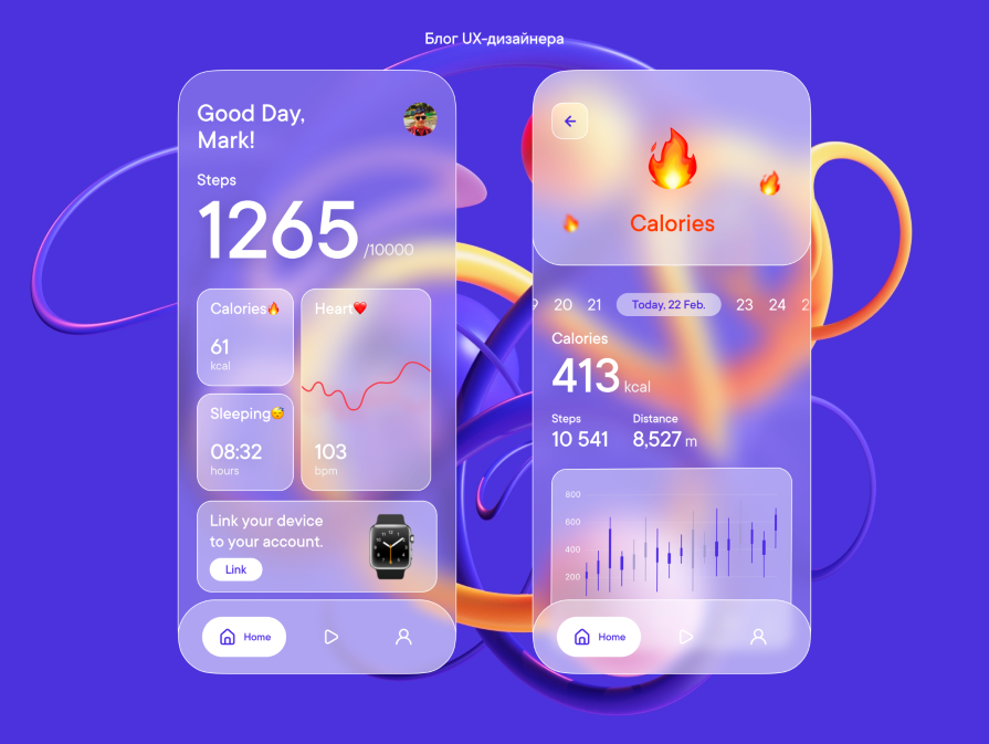
You’ll also see glassmorphism in tech products, pretty much all of which are trying to portray a modern/futuristic aesthetic. Since UI designers seem to be the only people interested in these UI design trends, it makes sense that glassmorphism makes its way into tech products used by designers and tech people in general. In these scenarios, glassmorphism tends to look much better, probably because it’s used more subtly/skillfully:
In addition, while I might be broadening the search for real-world applications of glassmorphism a bit too much, an interesting application of it is that of Apple’s visionOS:
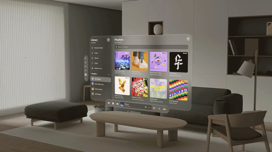
Here, Apple has used glassmorphism so as not to obstruct too much of the real world as seen through the virtual reality headset — makes sense!
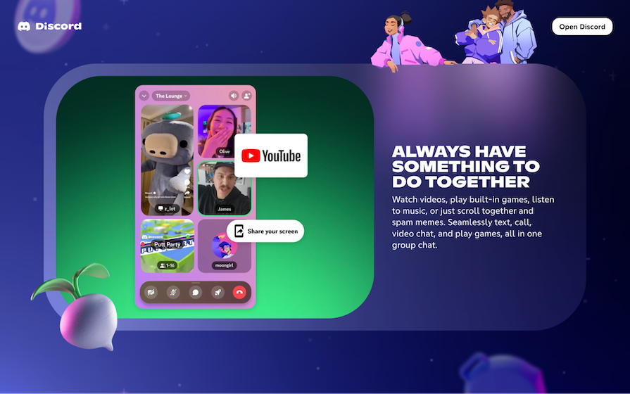
But while we could totally imagine a glassmorphic Airbnb for example (since glassmorphism and luxury purchases would go very well together), there’s little evidence to suggest that the typical consumer wants glassmorphism. The most significant modern use of glassmorphism that I could find (from a big brand besides Apple) is Discord, but of course Discord is hugely popular with, you guessed it…gamers again:
So despite being a very popular UI design trend that’s proven to be effective by the likes of Apple and probably others, and despite the longevity of the trend (unlike most trends), businesses seem reluctant to use glassmorphism on real products.
I don’t really understand why, especially since it’s easy to create glassmorphic apps and websites in a subtle way, but that is how UI design trends work sometimes — just as they can become trendy for seemingly no reason, they can refuse to take off for no reason too. The code for creating frosted glass effects on the web isn’t widely known, so it could just be a matter of time.
I’ve rambled on enough. Now I’m going to teach you how to create glassmorphic designs property-by-property and explain how each property impacts UX, either for better or worse.
Required: yes.
Glass ranges from translucent to completely transparent, so opacity is the key property to play around with. Low opacity will make it difficult for users to see the content (since more of the backdrop will seep through), so avoid this. Don’t worry, a subtle glassmorphic effect is still a very nice glassmorphic effect:
Required: no, but recommended.
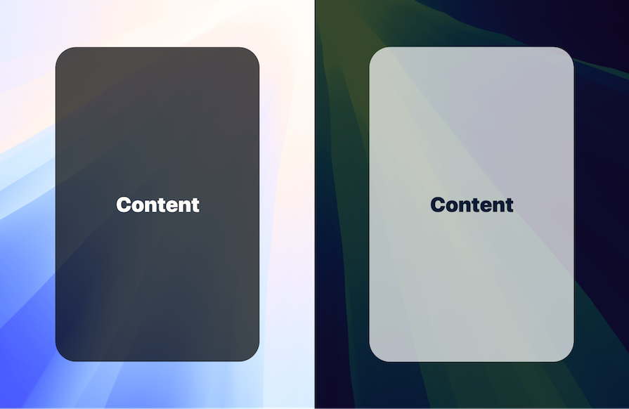
To put it simply, use a dark background if overlaying a light backdrop or a light background if overlaying a dark backdrop. This background provides a foundation for the content, increasing accessibility even more. The background color is also what makes glassmorphic effects work well in both light mode and dark mode.
Required: no, but recommended.
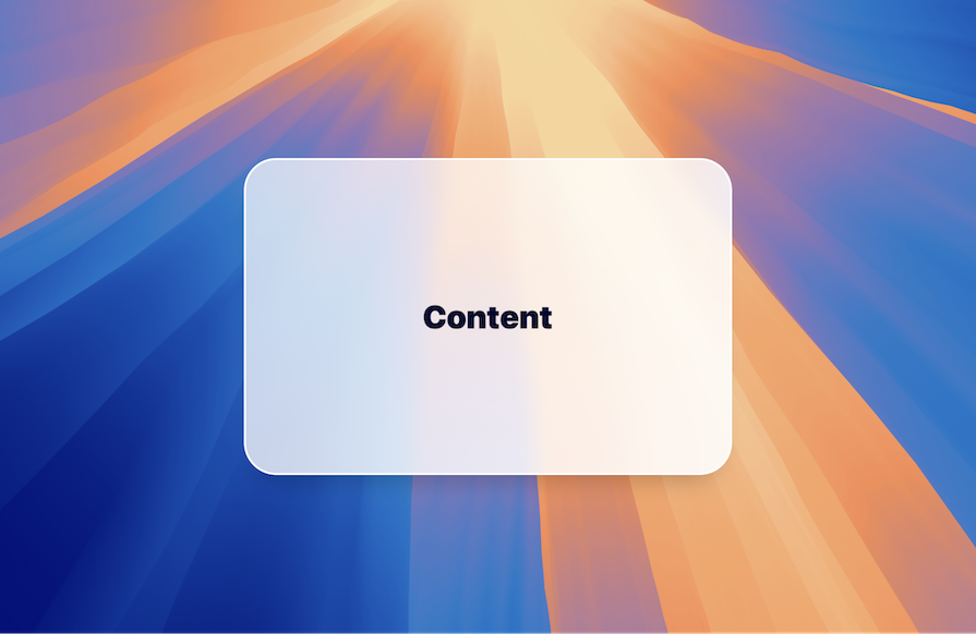
Background blur is used to create the frosted glass effect. It drowns out the backdrop, increasing accessibility and reducing clutter (same as opacity and background color), but also draws attention to the content. In Figma, you’ll find this property in the “Effects” section of the “Design” panel. As always, play with the different properties until you end up with something that feels right for your app/website’s design.

Required: no, but can be useful.
A border that’s opaque or less translucent than the background (but the same color of course) can strengthen the foundation, separating it from the backdrop a little more while also adding an abstract shine to the glass effect. This can even make your glassmorphic effect look a little more realistic, as the edge of a glass object typically reflects more light than its flat surface:

Required: no, but can be useful.
The purpose of a drop shadow is to make the glass effect more realistic but also to increase depth. Like borders they aren’t necessary and can result in too much detail, but it depends on the design’s complexity.

Required: no, use with caution.
Assuming that you’re using a gradient with two stops (there’s no need for anything more complex than that), the stops should have different opacities, one of which should closely resemble the border if there is one. This improves the ambient lighting of the foundation (‘surface’) but also the shine of the border, which should become less abstract. Gradients, whether linear, radial, angular, or diamond, are purely aesthetic, so avoid using them on cluttered designs.
| Property | Required? | Tips |
|---|---|---|
| Opacity | Yes | Avoid setting the opacity too low, as this will show more of the backdrop and make content harder to see |
| Background color | No, but recommended | For accessibility, use a dark background for a light backdrop and vice versa |
| Background blur | No, but recommended | Creates the “frosted” effect, increases accessibility, and reduces clutter |
| Border | No, but can be useful | Visually separates the glassmorphic element from the backdrop and adds a touch of realism |
| Drop shadow | No, but can be useful | Increases depth and makes the glass effect more realistic, but might result in too much detail |
| Gradient | No — Use with caution | Purely aesthetic and can further clutter designs |
Yes! It’s certainly practical to create glassmorphic iOS apps, since Apple had a huge hand in making the UI design trend popular. It’s possible with Android apps too, although uncommon as aesthetically it doesn’t work well with Android’s design system, Material Design.
On the web, modern advancements in CSS features make glassmorphism surprisingly easy to implement. Here’s a cool web-glassmorphism demo that you can play around with.
As with any design trend, there are benefits and drawbacks to using glassmorphism in your designs. It’s important to understand its strengths and weaknesses before deciding whether to use it for your website or app.
As with many design trends that value visual appeal over usability, a drawback to using glassmorphism is its potential to be inaccessible to users. This is a significant concern given that many users have vision impairments and may face challenges consuming content on the web.
To ensure that your glassmorphic designs are accessible to all users, test the color contrast between content on the glass surface and the background. This can be difficult if your background has a blur of many colors, so color contrast can vary depending on the placement of objects.
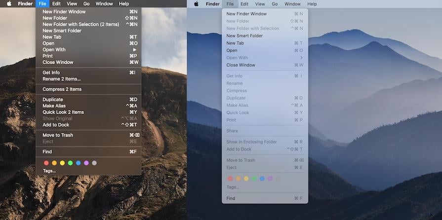
Using a less transparent background can help increase the visibility of content on top of the glass. Apple’s MacOS uses glassmorphism subtly on their dropdown menus, ensuring high contrast between text and the background color:
Avoid layering multiple glass objects on top of each other, using a glassmorphic element over a busy backdrop, or overusing the effect, as this can reduce the visibility of the content while increasing the amount of visual noise shown to the user:
Yes, when used in the right scenario (e.g., for a luxury brand or tech product). It’s attention-seeking, aesthetically pleasing, modern/futuristic, but should be used sparingly and thoughtfully. Its strength lies in its visual aesthetic and ability to capture users’ attention, but “less is more” definitely applies to this trend.
Both Microsoft and Apple have shown that glassmorphism has a lot going for it, but it’s rare to see the UI design trend in the wild despite how popular it is. However, thanks to modern advancements in technology and code, effects like this are becoming easier to implement into production apps and websites, so that could change.
The key is to not overdo the effect, as is commonly the case with gaming, and to always keep the user in mind. Specifically, be mindful of how detailed you make your glass effects and to which degree you use those design properties (opacity, background color, background blur, border, drop shadow, and gradient). The number one thing to keep an eye on is accessibility (specifically, color contrast).
If you can do that, glassmorphism is very easy to implement and very performant too. Don’t let the seemingly complicated implementation of glassmorphism deter you from using this UI design trend — if we can even call it that (after all, Microsoft did start it 18 years ago!).
Header image source: IconScout

LogRocket's Galileo AI watches sessions and understands user feedback for you, automating the most time-intensive parts of your job and giving you more time to focus on great design.
See how design choices, interactions, and issues affect your users — get a demo of LogRocket today.
AI has made polished, confident content easy to generate, but that does not make it trustworthy. This article explains how UX teams can design stronger quality signals using source transparency, validation, confidence communication, and reputation.
Inclusive design is evolving beyond accessibility alone. This guide explains how UX designers can create more inclusive products through usability, accessibility, neurodiverse UX, adaptive personalization, multimodal design, and culturally aware product experiences.

I was working with an intern on a UX research project, and before we even started, we both had private […]

AI has accelerated design execution, but speed can come at the expense of intentionality. Learn how UX teams can preserve product thinking and judgment.

 Learn more →
