Editor’s note: This post was last updated on 22 December 2023 to include information on text and shape gradients and a list of helpful gradient plugins.
Color gradients have numerous uses in design applications, from web to graphic and user interface design. Web designers in particular can take advantage of color gradients to add depth and movement on an otherwise flat screen; gradients in graphic design can add texture and dimension to an artwork; while user interface design uses gradients as a means of emphasizing certain parts.
Let’s learn how we can add gradients to our designs in one of the most popular design tools out there: Figma.
Color gradients play an integral part in design, providing many advantages that amplify its visual impact and heighten its aesthetic value.
Gradients add depth, dimension, and intrigue to even simple compositions, giving life to even seemingly static elements by drawing viewers’ eyes toward focal points that demand their attention. By carefully using gradients in their creations, designers can strike a delicate balance and ensure harmonious coexistence of hues within their pieces.
When we think of gradients, there are two main types: text and shape gradients.
A text gradient is just a color gradient that we apply to a collection of words rather than a shape or object. Text gradients are visually pleasing and are often used in title texts. It should not, however, be used in paragraphs or body sentences because it is difficult to read and goes against the rules of accessibility:

A shape gradient is when a color gradient is applied across the surface of a shape. When applied to a shape, the color gradient fills the interior of the shape, adding depth and dimension.
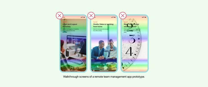
Shape gradients are commonly used in design elements such as logos, illustrations, and user interfaces to create dynamic and visually interesting designs. The use of shape color gradients contributes to the overall aesthetic quality of the design, making it more visually engaging for the audience:

Gradients come in three primary varieties: linear, radial, and angular gradients — each offering their own special set of characteristics and applications.
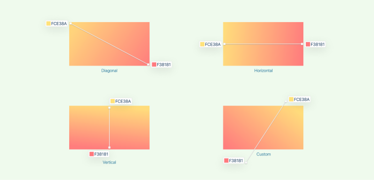
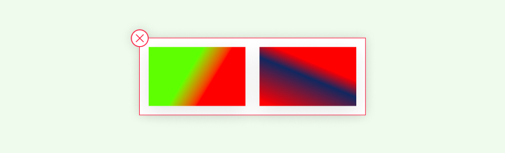
Linear gradients blend colors in a straight line, offering horizontal, vertical, diagonal, or custom angle transitions for transitions between colors. They find frequent use in backgrounds, buttons, and text elements for adding visual interest and engagement.
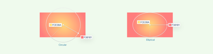
Radial gradients radiate out from a central point to create circular or elliptical effects, often used in backgrounds, logos, and icons to add depth and movement to designs.

Angular gradients follow a specific angle, gradually transitioning colors along their designated path. This effect is commonly used for backgrounds or illustrations to add energy and directionality to visual narratives.

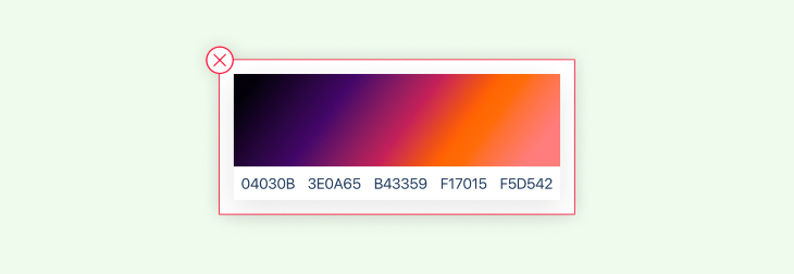
This particular sort of linear gradient is known as a diamond gradient, and it is used to depict the shape of a diamond. In this case, the colors begin in the middle and then mix outwards in four different directions smoothly.
Multiple tools exist for creating color gradients, catering to different design workflows and preferences. Renowned software such as Adobe Illustrator, Photoshop, and Sketch offer robust gradient creation capabilities. Moreover, the versatility of CSS and coding empowers developers to craft gradients with precision and control.
Notably, one of the leading design tools in the industry, Figma, provides designers with an intuitive platform to effortlessly create and utilize color gradients.
Figma makes creating and editing color gradients an effortless process that enables designers to add captivating visual effects to their designs. Follow these steps for creating and editing color gradients in Figma:
To launch Figma, either launch the application directly on your PC or access it via web browser by going directly to the Figma website and signing in as usual.
Begin or open up an existing project where you want to add or alter color gradients.
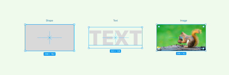
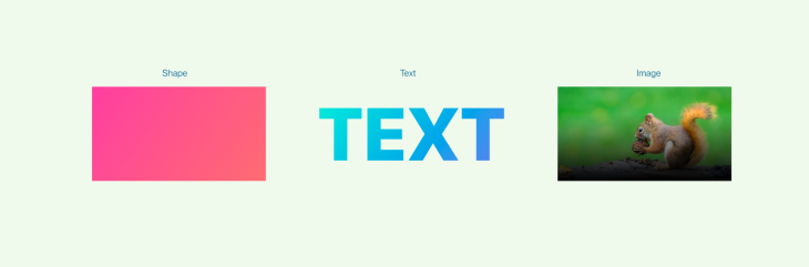
Locate the object or shape you’d like to apply a color gradient effect to and click to select it. Your object can be text, a shape, or an image.

On the right-hand panel, locate and expand Fill. This section controls the fill color of any selected object.
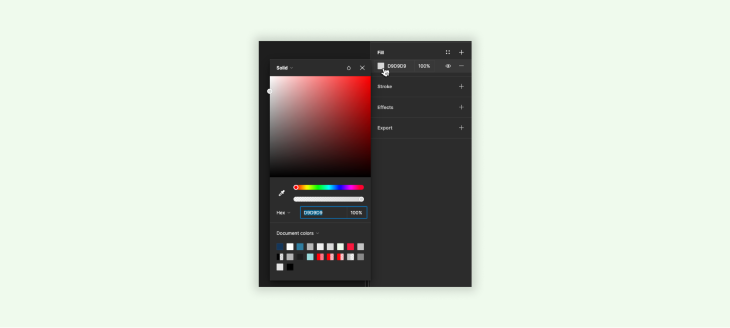
To access the fill settings, click on any color swatch or the current fill color and open up its settings. From the available options, choose Gradient fill as your type.
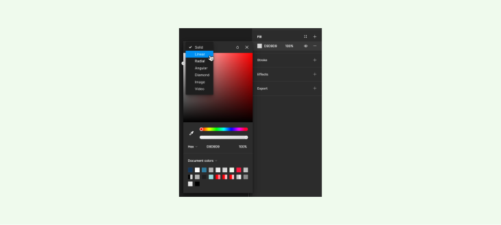
Figma offers three types of gradients: linear, angular, and radial. Select the option that best meets your design needs from our gradient menu to find your perfect gradient type.
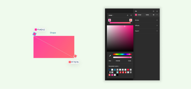
Color stops are used to specify which hues make up a gradient, and by default Figma provides two of them; one at either end. To add additional stops, simply click anywhere along the gradient line.
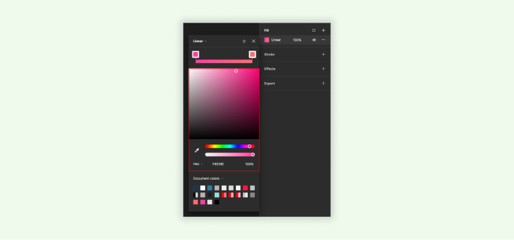
With Figma’s controls to modify each stop’s color, opacity, and position, simply click and customize! Clicking the color swatch enables you to access its associated color picker for an easy selection of new hues.

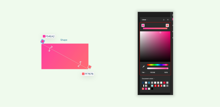
For linear gradients, you can modify their direction using an angle controller by dragging. This controls how gradient transition occurs. Alternatively, with radial gradients, you can modify their size using circular controllers.
Experiment with different color combinations, stop positions, and opacity settings until you achieve your desired result. As you make adjustments, watch how they unfold live before making further tweaks.
Once satisfied with your gradient design, click outside the fill settings to apply it to an object and display its chosen color gradient. The object will now exhibit your chosen hue gradient!

For further modifications of a gradient, select an object and access its fill settings again. Modify color stops, positions, or other properties until your gradient satisfies you perfectly.

Once you’ve finished creating and editing the color gradient, save and export it using Figma. Depending on your project or platform needs, these designs may also be exported into various file formats such as PNG or SVG for use across other projects or platforms.
By following these steps, Figma’s gradient creation and editing tools allow you to incorporate eye-catching color gradients into your designs for depth and visual interest. Experiment, fine-tune, and unleash your creativity until you’ve reached the desired aesthetic effect for your project.
Gradients can be an indispensable design element, adding depth, dimension, and visual interest to compositions. To maximize a gradient’s effectiveness in your designs, here are a few best practices and tips:
Select colors that pair harmoniously together for an eye-pleasing gradient effect, taking into account color theory principles like complementary or analogous hues to ensure that you create a harmonious composition that looks appealing. Use complementary or analogous hues if necessary to ensure an ideal, pleasing outcome.

To ensure legible text or that elements placed on gradient backgrounds are legible, adjust the opacity or color of the gradient accordingly for readability and accessibility.
When designing, it is important to take into account a design’s context. Gradients that work great on digital screens might not translate as smoothly to print — adapt and test each gradient for different scenarios to ensure optimal results.

Gradients can add subtle enhancements to various design elements such as buttons, icons, or backgrounds. Employ them strategically for maximum visual interest without overwhelming other design components.

Make sure the colors used in gradients match your brand’s visual identity and style guidelines to maintain a cohesive brand image. Consistency helps maintain an easily recognizable and identifiable brand.
Always bear accessibility in mind when designing with gradients. Be mindful of any color contrast issues and be sure that any gradient does not hinder readability or create barriers for people with visual impairments.
Do not hesitate to experiment with different color combinations, angles, and opacity settings until your gradient achieves the desired effect. Be sure to welcome feedback on your designs.
Follow these best practices and tips to use gradients effectively in your designs, adding depth, visual interest, and improving the aesthetic appeal of your creations. When using gradients in designs, experiment and iterate as necessary until the best result emerges for your use case.
While gradients can help designs stand out and captivate viewers, be wary of potential pitfalls that could compromise their effectiveness. Here are a few things you should avoid when creating gradients in design:
Avoid creating gradients that are overly intricate or use too many color stops; this could distract from the main design elements and cause clutter in your composition, so simplicity and clarity are often best.
Be wary when selecting colors for your gradients. Some colors clash. Make sure the hues you select complement each other to convey the intended mood or message — consult a color wheel!

To ensure legibility and readability, make your gradient provide enough contrast. Low contrast color combinations may compromise accessibility, making it more challenging for users to perceive text overlaid on it.
Gradients should enhance, rather than overwhelm, designs. When used strategically, they can add depth and dimension while at the same time helping bring focus away from essential elements in your composition.
Ensure a consistent gradient application throughout your design, refraining from switching up gradient types or using various color combinations without clear reasoning behind each decision. Consistency creates visual coherence and fosters the creation of a single design language.
Pay close attention to the smoothness of color transitions within your gradients to avoid sudden shifts or visible banding caused by inadequate color blending. Aim for seamless color blending for an impressive and professional appearance.
Now you know all the nuances of gradients and how to make your own. Want to make it easier on yourself? Here are a few plugins that can help you make gradients easily.
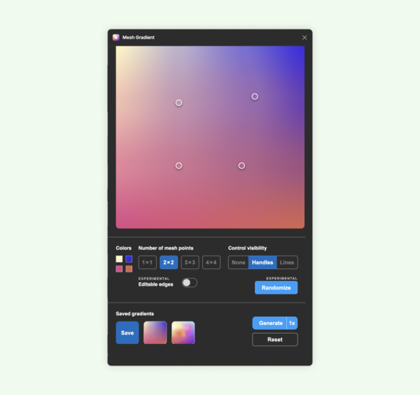
The user friendly interface of Mesh Gradient allows us to generate a gradient image that contains a two-dimensional mesh. In addition, the plugin gives you the ability to adjust the vertices and edges of the mesh to generate a smooth gradient. With the ability to save gradients for later use and to do live previews, the plugin is a powerful tool for quick gradients.
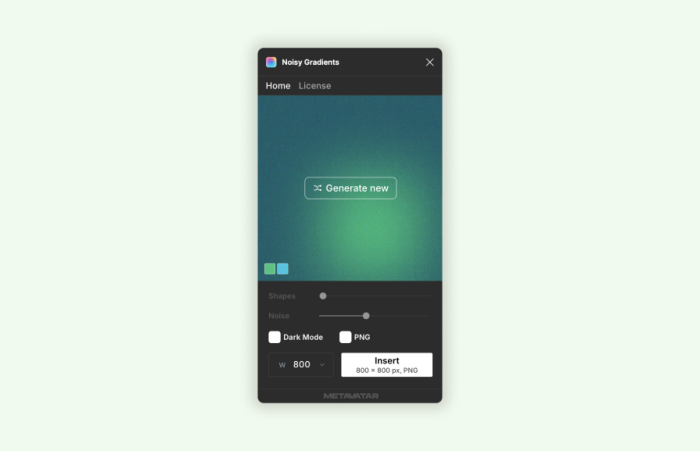
You can design a custom gradient with Noisy Gradients, which also includes the additional capability of adding noise to the gradient to make it more visually appealing. In accordance with their design and requirements, users can establish a custom resolution.
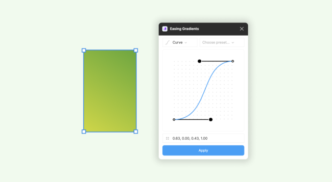
Easing Gradients allows users to fill frames with gradients using custom curves and steps. This function comes in handy for creating transparent gradients. Gradient easing works independently of traditional gradient types. It uses the first and last color stops as arguments to smooth the gradient according to the easing function.
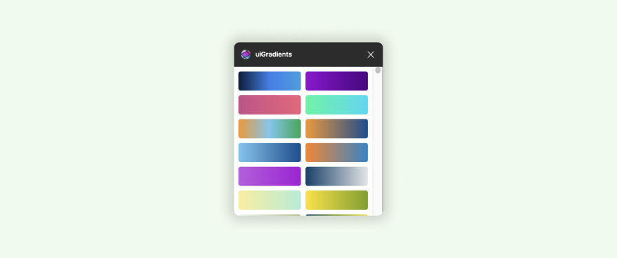
uiGradients is a simple Figma plugin that allows users to scroll through a large collection of gradients. Users only need to pick the element to which they want to apply the gradient and launch the plugin.
Figma provides designers with an innovative and intuitive tool for adding color gradients to their creations, providing depth, dimension, visual interest, and harmony through Figma’s user friendly interface and robust gradient creation features.
Gradients allow designers to add depth, dimension, and visual interest while drawing viewers’ eyes in toward them for greater viewer engagement and a sense of harmony in designs. From linear gradients to radial or angular gradients, Figma gives designers all of the control necessary for reaching their aesthetic effects! With such a versatile tool at their fingertips, designers can unleash creativity while elevating designs to new heights.

LogRocket's Galileo AI watches sessions and understands user feedback for you, automating the most time-intensive parts of your job and giving you more time to focus on great design.
See how design choices, interactions, and issues affect your users — get a demo of LogRocket today.
Skeuomorphism helped define early digital interfaces by mimicking real-world objects to make technology more intuitive. Learn how it compares with flat design and neumorphism, why it declined, and where it still has a place in modern UX.
Memos don’t have to be complicated. Just keep them clear, concise, and focused on actionable items. More on that in this blog.

AI has made polished, confident content easy to generate, but that does not make it trustworthy. This article explains how UX teams can design stronger quality signals using source transparency, validation, confidence communication, and reputation.
Inclusive design is evolving beyond accessibility alone. This guide explains how UX designers can create more inclusive products through usability, accessibility, neurodiverse UX, adaptive personalization, multimodal design, and culturally aware product experiences.

 Learn more →
