Wearable technology, or wearables, has become increasingly popular among consumers, especially over the past decade. In modern history, wearables first appeared around the 1950s with the transistor radio — a portable device small enough to wear on one’s wrist. From there, we saw the calculator watch in the 1970s, the Walkman in the 1980s, and more recently, Fitbit and other health-tracking devices. Now, wearable technology has become mainstream. The consumer market has deeply integrated web design and wearable technology into our veryday life for convenience and advanced insights.

This article explores the different types of wearables, unique challenges and opportunities in wearable design, and design best practices and future trends.
Wearables have existed for many decades, but their popularity exploded in the post-PC era, a term popularized by Apple’s former CEO, Steve Jobs, in 2007 with the launch of the first iPhone.
As computing devices evolved to be mobile and convenient, the adoption of wearable technology grew rapidly. In 2023, the global wearable technology market achieved over USD 110.3 billion in revenue, which is predicted to reach over USD 383.5 billion by 2032. That’s a 15 percent compound annual growth rate (CAGR) over the next decade — an impressive indicator that this market will continue expanding.
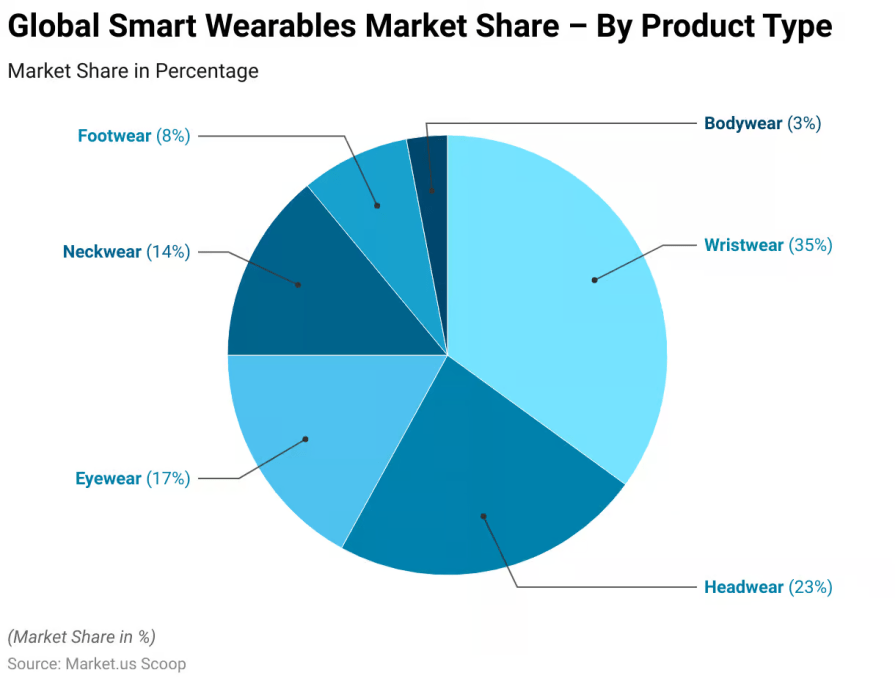
Wearables can be worn in different ways, depending on the type of device. Wristwear currently takes up 35 percent of the market share, followed by headwear at 23 percent and eyewear at 17 percent. This is directly correlated to the popularity of smartwatches and mixed-reality headsets:

The wearables market is segmented by categories, with the main ones being fitness trackers, smartwatches, and mixed-reality devices. Each category has gained traction due to its unique value propositions, disrupting how we live and interact. Let’s take a closer look.
Fitness trackers enable users to monitor their health and fitness by measuring stats like heart rate, steps, or sleep patterns. Before the fitness tracker, this level of health insight was not accessible to the public. Now, we can use this data to prompt users to change daily habits, improve wellness, and work toward their fitness goals.
Fitbit, the first widely recognized fitness tracker released in 2007 and later acquired by Google, simply clipped onto clothing and tracked steps, distance, calories burned, and sleep. This fitness tracker paved the way for other wearable technology, such as Whoop wristbands and Oura rings.
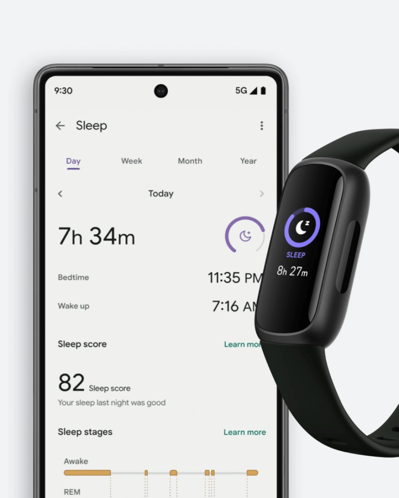
Google’s Fitbit has a simple, minimalist design that frees users from distractions and allows them to focus only on what’s important.
Whether you want to read your heart rate, control your music, or open your Google Wallet, Fitbit uses whitespace and simple typography to make the interface as clear as possible, so users aren’t overwhelmed by excess elements. It also incorporates visualizations to communicate metrics like sleep time in a simple way.
By connecting with a smartphone, users can view more detailed data on a larger screen, giving them further insights into their health. The app extends web design principles like simplicity, whitespace, and intuitive information architecture, creating dashboards that are easy to interpret.

Before the smartwatch, people relied on smartphones for notifications and basic communication tasks like sending messages and emails.
Mobile phones, however, can be distracting and inefficient for tasks such as setting reminders or making contactless payments. Smartwatches complement smartphones, boosting productivity by allowing quick access to notifications, calls, and messages without holding the phone. This convenience and accessibility are key aspects of designing for wearables.
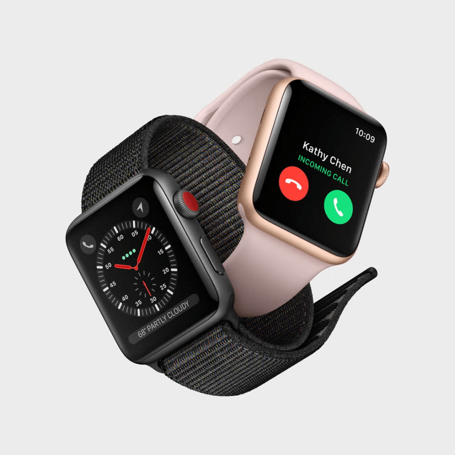
Apple currently holds the dominant position in the smartwatch industry, capturing 29 percent of the market with the Apple Watch. It not only provides the benefits of a fitness tracker but also connects with the iPhone to make communication more seamless and convenient. Users can receive notifications, calls, and messages on their smartwatch without pulling out their phones. This is extremely helpful when the phone is not as accessible, such as while running or holding things in both hands.

These are just a few examples of why consumers are ramping up their spending in the smartwatch market. Smartwatches offer plenty of benefits, like convenience, productivity, and insights, that have transformed how we live in the 21st century. The smartwatch market is expected to reach nearly USD 29 billion in 2024, with user penetration expected to reach over 9 percent by 2029.
As we consider designing for the future, tech companies are considering what will follow the mobile device and how the world will interact in a futuristic society. Mixed reality wearable technology is still in its infancy but has been steadily trending, with products such as Microsoft’s HoloLens and Apple’s Vision Pro.
These headsets blend digital content with the real world, providing immersive experiences through hand and eye tracking, voice commands, and spatial mapping. MR headsets allow users to engage in enhanced gaming, communication, and productivity. The MR interface, inspired by heads-up displays used by pilots, enables users to view crucial data in a transparent display while maintaining forward vision.

New devices bring challenges to creating sleek, user-friendly experiences. Wearables are often small, with limited screen space that influences web design choices compared to mobile devices. So, context is equally crucial in designing for wearables — users often move around or multitask, like exercising or working, rather than staying stationary. Designers must consider how users will realistically interact with their wearable without disruption.
For instance, mixed-reality headsets need to display information that aligns seamlessly with physical surroundings without overwhelming the user. The device’s form must also ensure comfort for prolonged wear.
However, these challenges also open opportunities to explore creative input methods such as voice commands, gesture controls, and touch inputs.
Traditional input methods, like a mouse and keyboard, may not work well for wearable design.
Accessibility is crucial, as minimal screen space and movement constraints can hinder precise tapping, so alternatives like physical buttons or haptic feedback are often necessary.
Now that we’ve identified some of the challenges and opportunities in wearable design, let’s discuss some best practices to keep in mind when designing for wearables:
Wearable design best practices overlap with mobile design due to the limited screen space on both device types.
Like with mobile design, focus on showcasing the most important information on a wearable screen and eliminating UI distractions or lower-priority information. The smaller screen size makes gestures difficult to execute, which can lead to a higher error rate when interacting with the device.
Keeping the design simple and minimalistic can help create clarity for the user.
Good user experience is relevant and timely. This means understanding the user’s current context and leveraging real-time data, such as location, motion, or health metrics, to deliver helpful insights. Always make sure to gain users’ consent before using their data, as some may find it invasive or unnecessary.
Being transparent about how our products use user data and asking for consent can help make technology more trusted in society.
Wearables are designed to be worn when users are on the go. This means that there’s a high chance that users are in suboptimal environments when using a device, such as in the dark, in a noisy room, or on public transportation. The user’s environment and current state should be considered when designing experiences for wearables to ensure that they are accessible at all times.
Conduct user research to understand where, when, and how users would use the device and design around those constraints.
For example, if a user wants to know their heart rate while cycling but cannot use their hands to interact with the device, consider using voice commands to give feedback.
Using haptic feedback can be a great way to alert users when they cannot see the wearable. Also, customizable font sizes can allow users to make text larger on screen in dimly lit environments. These considerations, among many others, can help make wearable experiences more accessible for users.
Fitness trackers and other wearable devices are usually linked to a smartphone using an app, which allows users to view data and insights collected by the device.
When designing for wearables, consider the user experience between the device and the smartphone for multi-device experiences. When would a user need to access their smartphone for additional information? How would the two devices interact with each other, and for what purposes?
Focus on using intuitive, gesture, or voice-based controls so that users can easily learn how to interact with their wearable devices. Users may be familiar with screen gestures such as tap, scroll, long hold, or swipe. Think about how these gestures can be used to interact with a wearable device.
If gestures do not make sense in the case of use, voice-based commands can be an accessible way to provide input to the device. With the incorporation of artificial intelligence (AI) assistants in many products, voice commands can be used with AI to execute quick actions efficiently and conveniently.
Loading is often overlooked in the design process and can make a huge difference in the user experience.
Wearable devices can be worn all day without charging, so optimizing your designs for quick loading times and efficient battery use is important. In terms of design, this means sticking to simple animations and interactions that don’t require significant processing power, dimming or turning off the screen display when not in use to save battery life, providing users the option to sync data in intervals rather than continuously, and designing a low-battery mode experience that uses less power.
These considerations can help avoid frustrations, such as the wearable running out of battery too quickly or actions performing slowly due to limited power.
The future of wearable technology holds endless potential. Advances could provide users with more sophisticated feedback, like insights based on biometrics such as stress or mood levels. Instead of tracking basic metrics, wearables may soon identify health trends and offer actionable suggestions.
Wearables may also become more embedded in clothing and accessories, offering broader design and customization options. For example, the Apple Vision Pro has received feedback on its weight, underscoring the importance of comfort and customization for user adoption.
Wearables are poised to play transformative roles in different industries — medical-grade devices in healthcare, mixed-reality devices in manufacturing, and entertainment wearables for consumers. We’re only scratching the surface of designing for wearables, and the future looks promising.
The global wearables market has steadily risen since the early 2000s and shows no signs of slowing down. These devices can augment and elevate our daily lives, be they fitness trackers, smartwatches, or mixed-reality headsets.
Designers have a unique opportunity to design for wearables that feel like natural extensions of the body. As screen sizes shrink and user contexts become more varied, maintaining accessibility and anticipating how users interact naturally will be crucial.
The future of wearable design promises innovation that can push the boundaries of traditional user experiences.
LogRocket's Galileo AI watches sessions and understands user feedback for you, automating the most time-intensive parts of your job and giving you more time to focus on great design.
See how design choices, interactions, and issues affect your users — get a demo of LogRocket today.

A three-week mobile banking project taught me that the “proper” UX process is not always realistic. Sometimes, the better approach is to work with what you know, identify what you still need to learn, and make the strongest decision possible under real constraints.

A/B testing compares two versions of a design to see which performs better with real users. Here’s how UX teams can use it to test hypotheses, measure outcomes, and make smarter product decisions.

This case study shows how one ad experience redesign increased total ad exposure while lowering perceived friction, proving that timing and context can matter more than raw interruption.

As products evolve into ecosystems, navigation becomes a system-level challenge. This article explores how to align structure, context, and user journeys to create seamless movement across tools without confusion.