Have you noticed that we’re increasingly relying on computer interactions to get things done? Technology makes almost anything we can imagine possible, from sending a quick text message to a friend to ordering a new pair of sneakers online and more.

Human-computer interaction (HCI) focuses on evaluating, designing, and implementing user-friendly UIs. HCI shapes how we engage with digital products and can tremendously impact UX, helping us as UX designers to create products that are more accessible, enjoyable, and efficient.
In this article, we’ll look at interaction in HCI. We’ll start with a brief overview of what HCI is, discuss its principles, then look at interaction design in HCI and its applications.
Human-computer interaction (HCI) is a field of study that focuses on the interaction between a human (the person using the system) and a computer system (the machine or network of machines that run the system).
Between the human and computer is a user interface that we design to facilitate smooth interactions. A primary focus of HCI is to help us create systems that make these interactions feel more like a natural conversation between people.
In the 1980s when HCI emerged, it focused on making desktop computers easier to use. But as technology evolved beyond desktops to include mobile phones, smartwatches, and other devices, its focus broadened to encompass a wider range of user experiences and interaction methods.
HCI aims to bridge the gap between humans and technology. Some of its goals and objectives include:
Ultimately, we want to make human-computer interactions enjoyable, not just functional. So, HCI looks at the user’s emotional experience as well as practical considerations to help us create more engaging, intuitive, and aesthetically pleasing interfaces.
Now let’s look at six ways humans can interact with a computer system:
These interface types offer different ways for our users to interact with our systems, but it’s also important to ensure these interactions are seamless and intuitive. Let’s explore nine principles to help us do so.
The following nine principles of HCI can help guide you in creating more enjoyable and user-friendly interfaces.
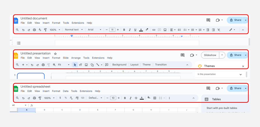
Ensure that similar actions and elements are represented the same way throughout the interface so that users won’t need to learn new interactions for every task. Also, reuse components and behaviors to make it easy for users to transfer knowledge from one task to another:

A great example of this principle is the consistent interface across the three Google Workspace tools shown above. Although the toolbars are contextual based on the product, most elements are in the same location across all interfaces.
Let users know the results of their actions. This helps users understand whether their actions were successful and helps them use the system correctly:

For example, this confirmation message from Medium lets a user know that their story has been successfully submitted and what next step to expect.
Users should be able to easily see and understand the state of the system and its components so they can take the right actions:

An example of this is an always-visible icon showing the number of items in a cart, as shown in the screenshot from the Jumia website above. This tells users the current status of their cart without navigating away from their task — more shopping.
Make it easy for users to undo their last action and recover from mistakes without significant consequences:

An example of this principle is the “Undo” option that appears for a few seconds after a user sends an email on Gmail. This allows the user to retract an email if it was sent by mistake.
Limit the range of possible actions in an interface to avoid unintended actions or invalid selections. For example, if you had a form with a phone number field, you could ensure the user can only input numbers, as shown in this example from Airbnb:

But be careful when implementing constraints — too many can make an interface feel restrictive.
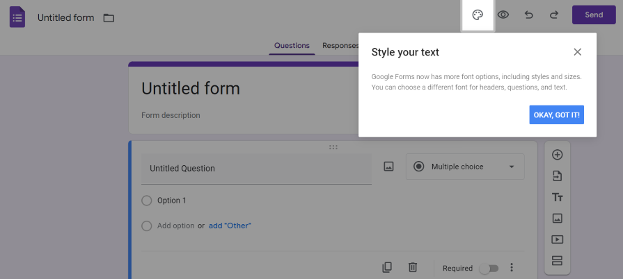
Provide users with brief tutorials and guided tours to show them how to navigate and use the product’s features quickly. A simple example of this principle is the tooltips in Google Forms that help new users understand how to use the different tools in the interface:

Onboarding tutorials can save users the extra time they might spend figuring things out on their own.
Use minimalistic design to ensure users can perform their primary tasks without distractions. As you can see in the example below, Google’s search engine homepage only has a search bar and a few buttons, leaving almost no room for confusion:

Minimizing the number of elements with high visual priority on a page allows you to guide users to the most important actions.
Design interfaces to align with users’ real-world experiences. This makes it easy for them to understand how things work based on their existing knowledge.
You can see this principle being applied in the use of icons that resemble objects or concepts from the real world. An example is using a trash can icon for deleting files or a magnifying glass icon for search functions.
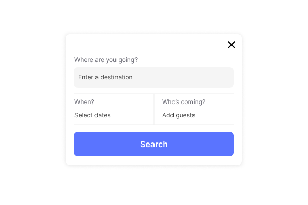
Use intuitive features to make clear to users how to interact with interface elements. Affordances are important as they let users know what actions are possible in an interface:

An example is using a button with the word “Search” to indicate that users can trigger a search by pressing it. If the example above looks familiar to you, you’re probably remembering my in-depth exploration of affordances in UX design — check it out if you’d like to learn more about this principle.
Use visual cues — such as the button’s shape, color, and style — that align with the user’s prior experiences, making it easy for them to understand the button’s purpose.
Interaction design (IxD), as the name suggests, focuses on designing the interaction between users and products. Considering the users’ needs and abilities will help you create intuitive actions (clicks, taps, voice commands) and clear system responses (visual cues and sounds) for a smooth UX.
IxD is a central component of HCI. It directly influences how users perceive and interact with a system and ensures that the user experience is smooth and efficient, from making navigation easier to guiding users and preventing errors.
Now, let’s look at some practical applications of HCI in some industries and their impact on user experience.
You can leverage HCI’s types and principles across various industries to improve user experiences and boost productivity. Here are some specific examples of how HCI is integrated into different sectors:
These examples illustrate how to take the principles of HCI beyond theory and make a profound impact on improving user experiences.
As we increasingly turn to technology to get things done, HCI is shaping our interaction with these devices. Understanding and applying HCI principles equips us to craft more functional, intuitive, and enjoyable interfaces.
We’ve explored key HCI principles and their practical applications across various industries. Now, I encourage you to consider the role of HCI in shaping your experience in the real world as you use various sites and apps. These seamless interactions hold valuable lessons that can help us design even better experiences for the future.
LogRocket's Galileo AI watches sessions and understands user feedback for you, automating the most time-intensive parts of your job and giving you more time to focus on great design.
See how design choices, interactions, and issues affect your users — get a demo of LogRocket today.

Let’s explore why and when to use drag and drop, discussing real-world examples, platform-specific considerations, and accessibility tips.

We’re told to reduce friction, but sometimes friction builds value. This blog explores how scarcity, when designed well, sharpens focus and strengthens user trust.

Discover how to craft UX-friendly hero sections with examples, design tips, and strategies that drive engagement and conversion.

While Apple’s Liquid Glass can’t yet be perfectly recreated with CSS or Figma, we can still think about how to adopt the effect thoughtfully in our designs.