User errors happen. Sometimes it’s a mistyped password. Other times it’s a poorly labeled button. But the good news? Many of these errors can be designed away.
Instead of blaming users for making mistakes, great UX designers focus on preventing those mistakes in the first place. That’s where error-prevention design comes in — an idea backed by Jakob Nielsen’s usability heuristics. Whether it’s simplifying an interface or adding just the right bit of guidance, the goal is always the same: help people succeed without tripping up.
In this article, I’ll walk you through 12 real-world UX design examples — from GitHub to Google Calendar — that show how thoughtful design can reduce user errors and improve overall UX. You’ll get practical takeaways you can apply to your own projects.
A user error can happen when the user unintentionally does an action or chooses the wrong action by misunderstanding the UI, and a user error can be a slip or mistake as follows:
A slip is an unintentional action. A user may initiate a slip due to a lack of awareness, distraction, or being in a hurry. Here are some general examples of user slips:
A mistake happens when a user misunderstands what they should do. It often comes down to a mismatch between the user’s mental model and how the interface behaves. For example:
Some designers argue that users are solely responsible for user errors, as they could act responsibly to avoid slips and understand the digital product to prevent mistakes. Meanwhile, some experienced designers may argue that UI/UX designers are solely responsible for user errors since a perfectly designed UI can prevent all user errors. Who is really responsible for user errors?
Considering practical design aspects, both users and designers are responsible for user errors. It’s not practical to make perfect designs by monitoring all user errors and designing a system to fit all unique user mental models. A design team should improve the UX of a digital product to prevent common user errors, and users should try to improve basic human-computer interaction (HCI) skills to interact properly with general digital products.
So, when a user error occurs, its responsibility gets fractioned and spreads in both the user and designer roles based on error prevention UX characteristics of the particular digital product. Improving UX with error prevention strategies drastically reduces designers’ responsibility for user errors.
Let’s explore some popular digital product designs and identify how they effectively implement error prevention to avoid user errors from happening:
A user undoubtedly makes fewer errors when a specific UI becomes minimal and offers fewer actions in its initial state. A simpler design hides advanced actions within hierarchical layers, also helping everyone discover the UI more quickly.
The GNOME Files app, aka Nautilus, implements a clear, simple, well-organized view by only displaying required actions with lesser element complexity:
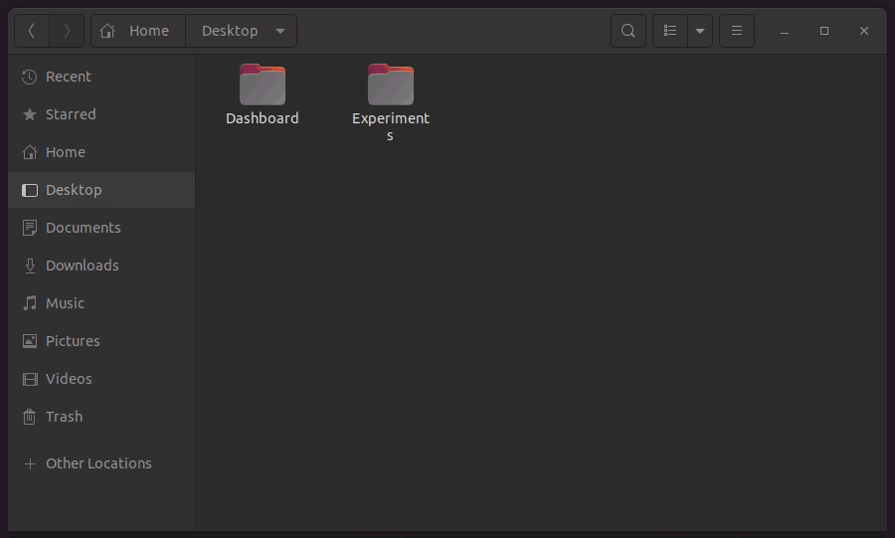
Here is how it uses simplicity and organized structure as an error prevention strategy:
Designers never place dangerous or irreversible actions in the first hierarchical layer of a UI since users might press them unintentionally. That’s why we see all apps place the logout option inside a menu, and even at the end of it.
GitHub effectively uses this positioning strategy to put several risky and irreversible settings away from the other, less severe, frequent general settings:
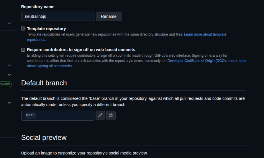
GitHub displays these dangerous actions with the following positioning techniques to avoid user slips:
Placing big red buttons with all-capital-letter text labels to warn users about severe actions is an old-fashioned, less user-friendly approach — now designers use minimal styles or friendly confirmation flows to warn users about action consequences in a friendly way.
The Medium publishing platform employs minimalism as a core design principle and consistently strives to minimize UI clutter. Its account settings page highlights both severe and irreversible actions with a shaded red text color to prevent user mistakes caused by mindless clicks:
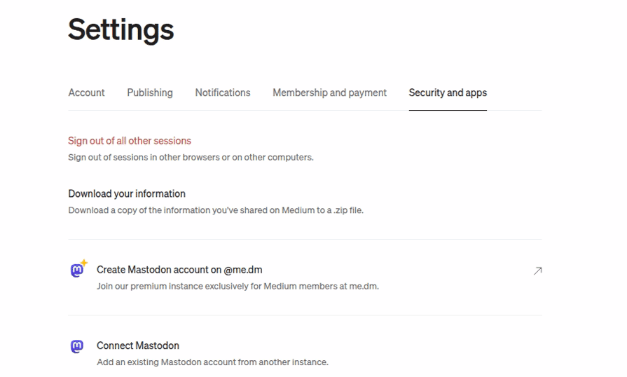
Here are some specific styling details behind this text coloring:
#c94a4a, a faded red color variant, as the link text color, which is not too intrusive but highlights the severity of the action. The color selection prevents user errors without affecting user-friendlinessUsing more traditional form inputs, such as text inputs and dropdowns, increases the error-proneness of the design. That’s why most designers stepped away from conventional, detailed form-based designs to futuristic forms that use a few, optimal input elements. For example, users won’t make any typing slips if you use social media sign-in buttons instead of limiting users to a traditional signup form.
The Walmart website’s advanced filtering section steps away from traditional text/number inputs and dropdowns and uses range selectors and checkboxes as follows:

Here is how Walmart’s advanced filtering section tries to eliminate user errors:
Using text inputs is inevitable in some form designs, as the text box is the standard, practical way to capture various text segments from the user. In some scenarios, text inputs are more productive and usable than date or time inputs. For example, almost all credit card expiry date inputs use a text input to capture the expiration month in the MM/YY format, rather than a month selector. Designers can drastically reduce user errors and boost user productivity in free-text inputs by implementing input formatters, which allow only specific keys and automatically format the text.
The checkout page of the Best Buy ecommerce website implements input formatters for first name, last name, postal code, and phone number inputs:
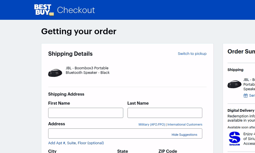
Here is how the checkout form implements input formatters, aka masked inputs, to reduce user errors:
-, . , etc, and block other entries like numbers and special characters that won’t be a part of a usual name to avoid slipsxxx xxx xxxx input mask to let the user avoid slips and scan the number fasterWe won’t be able to productively use search engines if they don’t display suggestions and require us to enter the complete search term. Every popular search engine displays suggestions, allowing users to easily search for something if they only know part of it or don’t know the exact spelling. Displaying relevant suggestions not only reduces user errors but also gives a feeling that expected results will be available on the results page.
The eBay website’s product search field implements a search-engine-like suggestion to prevent the user from entering invalid keywords:

The eBay search field reduces the required keystrokes to initiate a valid product search with the following design considerations:
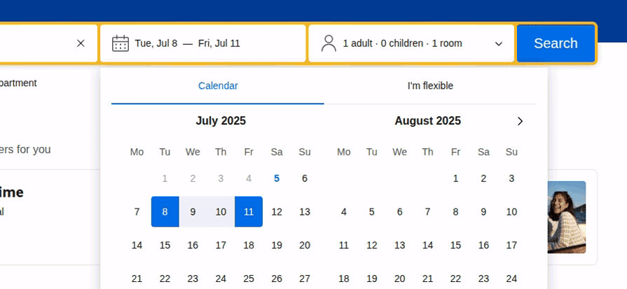
Using reasonable defaults can reduce slips because users can often continue with the default value, and it can also reduce mistakes because the default value indicates the type of data that should be entered or selected.
Google Calendar, a popular time management and scheduling app, implements reasonable defaults to let users schedule a one-hour event for the nearest half hour just by typing the event title. The Google Calendar will apply reasonable defaults for all event-related fields as follows:
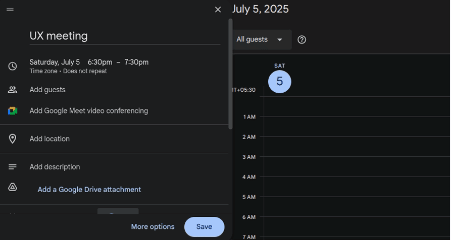
Google Calendar’s event creation form sets reasonable defaults as follows:
UX affordances are fundamental digital product properties, such as buttons and scrollable elements, that indicate how a digital product can be used. Signifiers highlight these affordances by utilizing various visual cues, such as icons, labels, colors, and images. Designers can effectively use visual cues to prevent user errors by highlighting the consequences or meaning of a specific action.
The well-known GNOME Terminal app uses visual cues to prevent user errors:
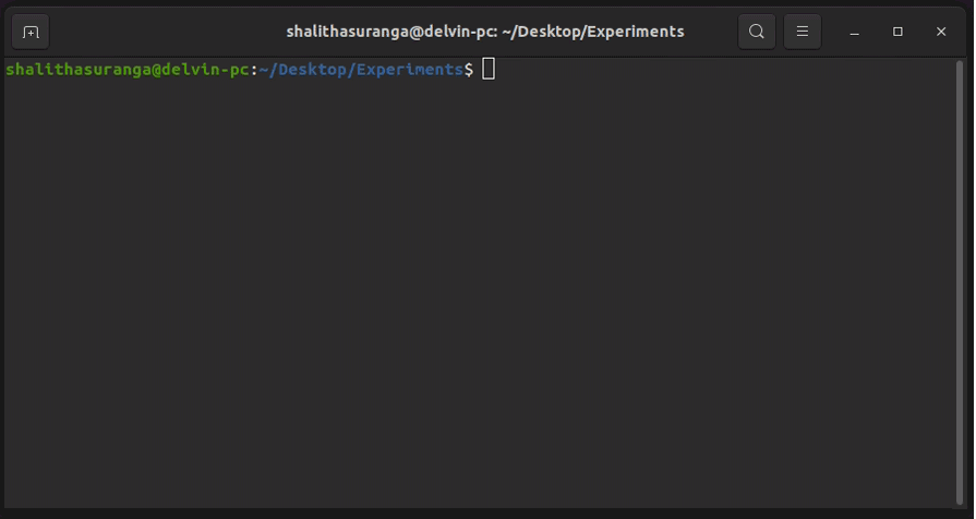
Here are some highlights from its effective visual cues:
Input validation has evolved with modern UI/UX design techniques. Earlier, most digital products validated user inputs after data submission and displayed alert messages to inform users. Later, the simple alert message turned into multiple individual form-field alerts. Now, most input forms do instant validations when they detect possible user errors before submission. GitHub implements a descriptive sign-up form by explaining input constraints and validates inputs instantly to avoid invalid data inputs:
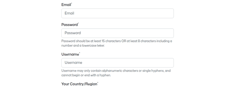
Here is how the GitHub sign-up form tries to prevent errors with instant and friendly validations:
You cannot pull a well-designed drawer until it drops to the floor because it’s designed in a way that prevents it from being pulled beyond the safe region. That’s how well-designed products block invalid usage flows with constraints. Similarly, designers block invalid user flows with various constraints to prevent user errors.
The most popular hotel reservation website, Booking.com, implements effective constraints in the search box to prevent users from initiating invalid flows:
This search box implements the following constraints:
Confirmation dialogs temporarily pause initiated user actions and request user confirmation to prevent user errors. A simple confirmation dialog can prevent user frustration that can even lead users to start disliking your digital product. So, designers include effective and friendly confirmations before executing irreversible actions.
Gmail displays a friendly and helpful confirmation dialog when the user includes the “attached file” phrase in the email draft but doesn’t attach a file, to remind users whether they actually forgot to attach a file:
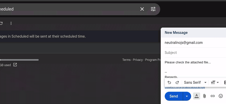
Here is how Gmail makes this confirmation dialog more effective:
Confirmation dialogs effectively prevent users from entering dangerous or irreversible actions, but they can sometimes overwhelm users, especially when they tend to complete tasks quickly. So, designers started implementing quick undo toast messages instead of confirmation messages for reversible actions, allowing users to act faster and offering a way to recover from user errors.
Google Drive displays a simple toast message with the undo action link after deleting a file:
Drive’s file deletion undo feature has the following notable characteristics:
Error prevention strategies sometimes affect usability, user-friendliness, and overall UX, so designers should tune the design to optimally prevent errors without affecting UX, using the following best practices:
Let’s discuss some common questions that most designers start thinking about when they start implementing error prevention strategies in their designs:
The effectiveness of error prevention strategies can be tested with specific UI test cases created based on user errors that designers need to test.
The minimalistic design approach naturally reduces user errors due to optimal user interaction points. However, designers can reduce the gulf of execution and evaluation in any design non-minimalistic philosophy (i.e., maximalism) to effectively prevent errors.
No, trying to implement undo support for many actions increases development complexity, so the recommended strategy is to implement undo for serious, frequent actions like deleting a file, broadcasting a message, etc.
No, real-time validation may feel helpful, but it’s actually annoying for users who are confident about their inputs. Validation on focus out or activating real-time validation only after the user completes entering an invalid input are better options.
In this article, we discussed user errors, their responsibility, and practical, effective error prevention strategies by evaluating 12 popular digital product designs. Error prevention is a recommended strategy to improve overall UX, as described in the 10 usability heuristics that most UI/UX designers know.
Optimal, user-friendly error prevention occurs when you carefully implement error prevention without compromising general usability factors, such as discoverability, learnability, and efficiency. Aim to create effective and user-friendly error prevention designs by using the above 12 examples as inspiration.

LogRocket's Galileo AI watches sessions and understands user feedback for you, automating the most time-intensive parts of your job and giving you more time to focus on great design.
See how design choices, interactions, and issues affect your users — get a demo of LogRocket today.

Learn how context-aware mode prioritization and seamless transitions improve multimodal UX and reduce mode confusion.

Research is becoming more democratized, product cycles are accelerating, and AI is transforming synthesis and ResearchOps. Here are the three trends shaping UX research in 2026.

Voice support is not the same as multimodal UX. Here’s how to design systems with true mode continuity and context-aware interactions.
AI tools can generate beautiful UI concepts in minutes, but most teams struggle to integrate those outputs into real design systems. This guide explores why AI drifts toward generic patterns and how to build governed workflows that keep speed without sacrificing brand consistency.

 Learn more →
