User experience design is critical when developing products. A successful digital product is one that solves a problem or adds value to your customer’s life. UX design helps you establish and explore the connection between your business and users.
Getting a deep understanding of user needs and pain points can help you to create functional, enjoyable, and easy-to-use products. Taking a human-centered approach is key to succeeding in any business, as it leads to customer loyalty and product success.
In this article, we will study principles, tools, and five stages of the UX design process to understand why it’s important to know your customer better.
The user experience, or what it feels like to use a digital product or service, encompasses the following aspects:
UX design, then, is the process of improving these three aspects to better satisfy user needs and increase enjoyment.
UX designers and researchers observe and interview users to understand how to improve their products. They analyze the challenges users face using the app or a website and improve them, creating intuitive and enjoyable products.
Prioritizing UX design ensures that users can easily complete desired actions such as purchasing, subscribing, filling out the form, and more. That often directly correlates with an increased conversion rate. Happy users are also more likely to share their experiences with friends and colleagues, helping to grow your audience (and by extension, your product).
There are different roles within UX design. For example, UX and interaction designers study user flow and usability, UX researchers are focused on user needs, and visual designers care about aesthetics.
Before we discuss UX design in depth, let’s quickly review how it differs from the other main area of product design, UI design:
| User experience design | User interface design | |
|---|---|---|
| Focus | Deals with people’s behavior and how they feel about the product | Deals with the visual parts of the product |
| Process | UX design includes planning, researching, and improving products to better guide user behavior and increase enjoyment of the product | UI design deals with creating visual elements like buttons, animations, screens, and other elements that make the user interface functional |
| Outcome | More functional products that are easier and more satisfying to use | Well-designed products that attract user attention and evokes positive emotions |
UI design and UX design are connected, as they’re based on the same principles — usability, consistency, and accessibility. Ultimately, they both contribute to product success.
The main goal of UX design is to create a positive experience for users, ensuring that every interaction is intuitive, enjoyable, and efficient. This encompasses other goals related to understanding user needs and pain points as well as making products accessible and engaging.
UX design goals are linked to KPIs that quantify the impact of design efforts and help teams make data-driven decisions. For example, you can measure things like user satisfaction, engagement, task success, conversion, and error rates.
Monitoring these metrics allows teams to understand pain points, test design changes, and measure the results. This leads to a better user experience and demonstrates the effectiveness of achieving business objectives through good UX design.
UX designers often use the “five Ws and one H” approach to understand user needs, answering the following six questions to better understand the user, tasks, tools, and environment in which the product will be used:
Answering all these questions can give you insights into user needs and behaviors, allowing you to craft solutions that meet their expectations in a way that makes the experience smooth and problem-free.
There are five fundamental principles that form the foundation of successful UX design practices: usability, accessibility, consistency, simplicity, and feedback. Let’s define them and understand the role they play in designing pleasing, intuitive user experiences.
You can also think of usability as user-centered design. Usability focuses on how user-friendly and efficient the product is. It involves creating clear and simple interactions, well-designed navigation, clear information, and consistency throughout the product, allowing users to achieve their goals effortlessly.
Usability is crucial in UX design. If a product is hard to use, people feel frustrated and leave without accomplishing the necessary task, which leads to potential income loss. The screenshot below shows a great example of a highly usable design:
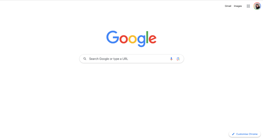
Google’s homepage is minimalist and functional, making it one of the best examples of usability. The page focuses on the search functionality, and nothing distracts users from it.
Accessible design focuses on making sure anyone is able to use the product. UX design teams should aim to ensure their product is usable for users in any situation, of all abilities, and no matter what context. Not only do accessible designs benefit users with disabilities, but they usually create a better experience for all users.
For example, you can check if the color contrast is good, which font size is accessible, and how to make a keyboard-friendly website. This makes your product more engaging, readable, and navigation-friendly for everyone, including users with low vision, assistive technology, and more.
If you want to evaluate the accessibility of your design, check the Web Content Accessibility Guidelines. This resource provides guidelines and standards to help designers and developers make their designs accessible for people with disabilities.
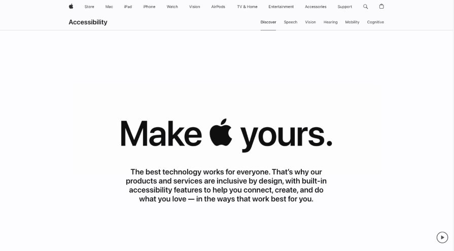
Apple’s website is one of the best examples of accessible websites as it has features like screen reader support, high contrast, and keyboard navigation to ensure accessibility for all users:
When it comes to consistency in UX design, Jakob Nielsen said it best:
“Consistency is one of the most powerful usability principles: when things always behave the same, users don’t have to worry about what will happen.”
Consistency means having the same design elements and patterns. This principle is crucial because it makes the design intuitive. When elements have the same look and functionality, users easily learn to use the product and quickly complete tasks.
Nowadays, people are overloaded with information and commonly choose products that are easy to understand and interact with. Consistency builds a reliable foundation for the feeling of harmony in both how the product looks and works. In addition, consistency helps create a strong brand image for a website or app.
An example of the consistency principle is seen in the buttons on the Mailchimp website. They have the same color and shape, signaling to users that they can take an action (clicking to learn more) and expect the same result (triggering navigation to a page with more information):

Simplicity in UX design means reducing all unnecessary elements and creating clean interfaces with intuitive and seamless functionality. This includes easy-to-use navigation, intuitive layouts, clear content, and consistency across elements.
Each element should be designed to serve a specific purpose. This approach helps reduce cognitive overload and enables users to achieve their goals.
Users enjoy products they can navigate effortlessly, so they continue to use them and share them with their friends, growing your audience. Customer satisfaction rates have a great impact on sales and overall product success.
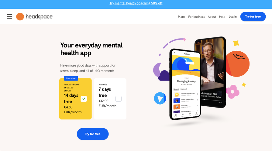
The Headspace website is a great example of how to implement simplicity: clear messaging, pricing, and a call-to-action. All the essentials that a user needs are presented right on the first screen:
In UX design, feedback describes any communication between users and the interfaces they interact with. Immediate responses to user actions create user-friendly and pleasurable designs — for example, by allowing people to understand whether their actions were successful or not.
Feedback may come in various forms, such as:
This is what Don Norman says in his book, The Design of Everyday Things, where he discusses the importance of feedback in design:
“Feedback is essential. The well-known and often repeated rule of thumb for feedback is simple: provide each user action with a response. Feedback must be immediate: long delays in providing feedback make users uncertain.”
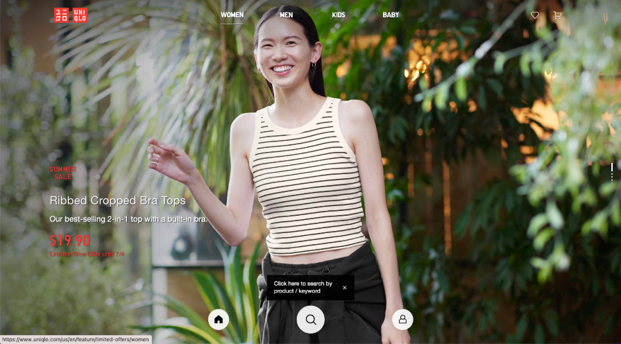
Uniqlo has a great example of how to communicate with users on their website. They provide a short instruction near the search icon prompting users to click the icon and search by product or keyword:
To create a user-friendly product, UX design teams typically go through a five-stage UX design process. It starts with empathizing with users to understand their needs and pain points. The key idea of this stage is to define the objectives and goals of the project.
The next step is ideation, which is the creative process of finding concepts that will be prototyped (stage three) and tested (stage four). The final stage is the product launch, which also includes iterations based on user feedback.
Each design process is unique depending on the team’s needs and the product, but these stages are typical for the design thinking process from an idea to a product launch.
An idea without research is just a guess. That’s why each UX design process starts with market and user research.
At this point, assume you know nothing about the market, audience, and product. The main goal of UX research is to understand who the potential users are, what their needs are, and what problems are already solved by your competitors.
Before diving into design, it’s crucial to understand the business and product. That includes business goals, target audience product vision, and KPIs. Design teams can also conduct a competitive study to analyze competitors.
It can be tempting to make your UX design unique to stand out from the competition, but according to Jakob’s Law:
“Users spend most of their time on other sites, so they prefer your site to work the same way as all the other sites they already know.”
In other words, users prefer the product to function like other familiar ones.
The next step is to study users’ needs and pain points more closely through user interviews and surveys.
During the research stage, UX designers create personas and user journey maps to understand who the customers are and what feelings they experience while using the product. A persona represents a user’s behavior, problems, and needs, which helps you focus your efforts and create a user-friendly product tailored to the target audience.
To understand user problems, researchers use qualitative and qualitative research. Qualitative research typically uses questionnaires and surveys to study user behavior. Qualitative research includes techniques such as moderated testing, unmoderated testing, behavioral studies, and attitudinal studies.
The methods you choose to conduct UX research should depend on your team’s goals, the product, and the company’s budget.
Ideation is an exciting creative process of generating ideas and brainstorming. The main goal is to find innovative solutions to user problems.
UX designers use various methods and approaches for ideation, including mind mapping, the “what if” technique, “crazy eights,” and much more. Let’s quickly go over two common methods that often go hand-in-hand: brainstorming and sketching.
One of the techniques that design teams use to generate new ideas is brainstorming. The key goal of brainstorming is to collect and categorize different ideas from different team members to find a better solution to user problems.
Brainstorming can include different tasks and questions. One of the techniques used during the brainstorming session is the “How might we?” question.
For example, if we wanted to create a mental health app, we could ask: “How might we design an app to help users manage their emotions?” or “How might we design a meditations section to help users easily save and find their favorite meditations?”
After the ideas are collected, grouped, and analyzed, the teams prepare for the next stage: sketching.
A wireframe is a low-fidelity sketch of a possible interface. UX designers plan the layouts to confirm or deny different design choices and collaborate on their decisions.
Wireframes provide an effective way to define the website or app structure and navigation flow. There are various tools that help designers create low-fidelity wireframes, but the most popular and quickest sketching method is still pen and paper.
Prototyping is the most visual stage of the UX design process. A prototype aims to present how a product will work in reality, including user interactions and flow.
There are two types of prototypes — low-fidelity (lo-fi) and high-fidelity (hi-fi). Lo-fi prototypes are usually used to test the product’s initial functionality, while hi-fi prototypes are realistic, visually polished, and close to the final product.
High-fidelity prototypes should be interactive so they can show developers, stakeholders, and other team members how users will interact with the final product. Interactive prototypes can easily be tested with real users to help designers identify mistakes and areas for improvement.
Various prototyping tools are available for UX designers. Among the most popular prototyping tools are Figma, Adobe XD, and Framer.
Usability testing is the last stage before implementing the final design. It answers important questions such as, what are the challenges when using the product? Can customers complete the desired action? What can be improved?
During this stage, your team should check previous hypotheses and get firsthand feedback on the product’s usability. Users participating in testing sessions usually get tasks to complete that guide them through using interactive prototypes, such as creating an account, filling out a form, or making a purchase.
After running tests, you can use their results to analyze product usability and understand what to improve to make the product even more user-friendly. You’ll likely need to update your prototype — especially if you’re starting with a lo-fi prototype — before the final launch stage.
After testing and further iterations, it’s time to launch the product. At this stage, your UX team will need to focus on collaborating with developers to implement everything efficiently. For example:
The launch stage emphasizes functionality and efficiency. The design process never really ends; after a product has been successfully launched, the UX team typically starts a new round of testing and iterations.
It’s difficult to identify one single “best design tool” for everyone. Each design team should choose a tool or suite of tools that meet their goals and work best for their purposes.
Among the various design tools available, Adobe XD, Figma, and Framer stand out for their benefits and collaborative features. Let’s compare the features and benefits of each tool and see how they can enhance the UX design flow.
Adobe XD is a vector-based design tool that is a great choice for designers who still use Photoshop or Illustrator for UI design. It integrates with Creative Cloud and offers collaborative features similar to Figma:
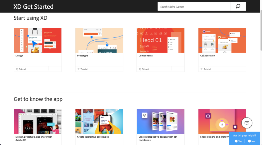
Adobe XD’s responsive resize feature is similar to Figma’s auto layout feature, but it requires manual adjustment of constraints, which can be time-consuming. Additionally, Adobe XD has a plugin library and a “share for development” mode.
Adobe XD’s standout features and functionalities include:
Other benefits of Adobe XD are:
Figma stands out for its collaborative features. You can share a design file with your team and leave feedback for other team members via comments. The Figma ecosystem also includes plugins and resources so you can optimize and customize your creative workflow:
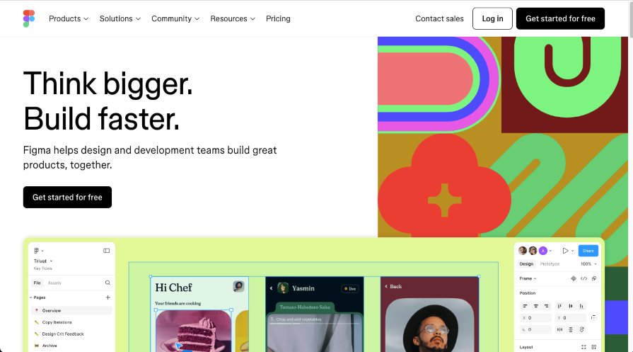
Figma started in 2016 and has since constantly added new features, making it one of the most popular design tools. One of Figma’s advantages is its accessibility across various platforms: web browsers, desktop apps, and mobile apps.
Figma’s standout features and functionalities include:
Other notable benefits of Figma include:
Framer is not only a prototyping tool but also a no-code website builder. It’s a great choice for designers who want to design and publish websites from the same platform:
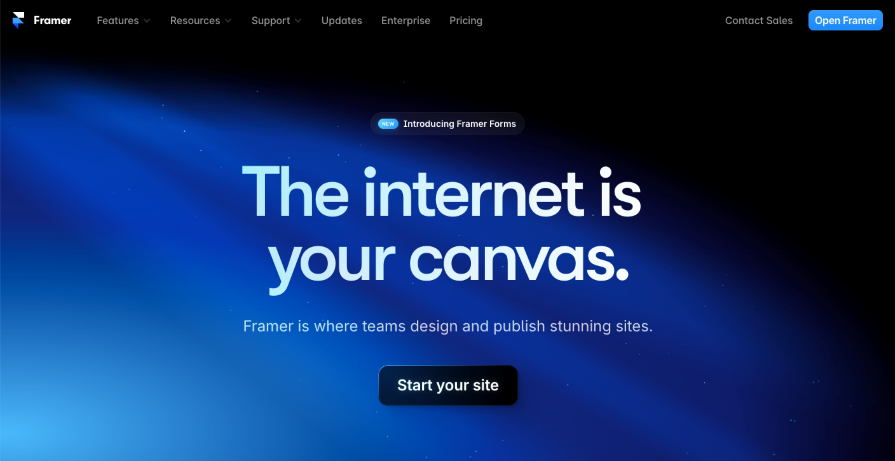
Framer offers similar features and interface to Figma, but focuses on simplifying the process and gives designers great opportunities with animations and interactions. You can easily integrate Framer with Figma and Sketch. It’s also great to use if you need to collaborate across teams.
Some of Framer’s standout features and functionalities include:
Other Framer benefits are:
If you want to dive deeper into collaborative design tools, take a look at our guide on Figma vs. Framer: A comprehensive comparison.
The goal of each design team is to create amazing products that users love. But what do you need to make people love, use, and share your product?
The answer is simple in theory — you need to understand your users; their feelings, pain points, and goals. The better you know your users, the better you can solve their problems. Achieving this level of understanding is harder in practice, but that’s where the UX design principles and process come in handy.
UX is a good investment from a long-term perspective, as user-friendly design helps to gain customer loyalty and leads to business growth. Companies that put user needs first and aspire to bring value to society with their products have more chances to succeed in today’s competitive world.
It’s also important to remember that the UX design process never really ends. Constantly testing your product even after you launch it can help you continue to improve the user experience, making it more seamless and enjoyable.
LogRocket's Galileo AI watches sessions and understands user feedback for you, automating the most time-intensive parts of your job and giving you more time to focus on great design.
See how design choices, interactions, and issues affect your users — get a demo of LogRocket today.

As products evolve into ecosystems, navigation becomes a system-level challenge. This article explores how to align structure, context, and user journeys to create seamless movement across tools without confusion.
Figma’s AI features have exploded in 2026 — from text generation and image editing to full UI drafts and code handoff. But speed isn’t the same as quality. This guide breaks down every major feature, what it’s good at, and where human judgment still does the heavy lifting.
Zero UI works well for screenless, voice-first experiences, but most digital products still require visual interaction. Here’s why multimodal UX offers a more scalable foundation for the future of design.

Multimodal UX goes beyond designing for screens. Learn how context-aware systems, progressive modality, failover modes, and accessibility-first design create better digital product experiences.