Have you heard of Penpot yet?

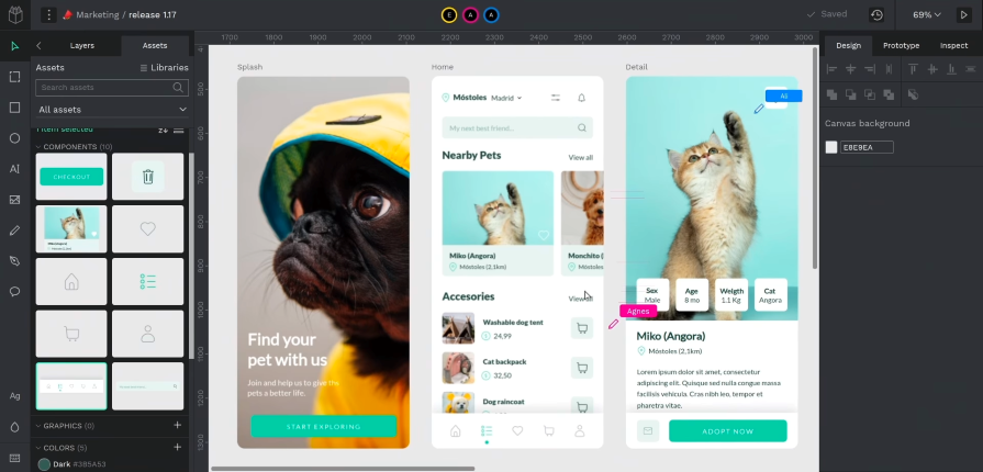
Penpot is an open source design and prototyping tool created for product teams. The creative platform aims to bridge the gap between designers and developers in the product workflow. It delivers a professional UI that is as intuitive to designers as it is to developers, and best of all, teams have the flexibility to host their projects on their cloud service or self-host their own Penpot instance.
Like Figma, it’s a browser-based tool, which makes real-time collaboration between designers and developers efficient. But Penpot has some of its own advantages, which we’ll get into.
Penpot provides powerful design functionality such as reusable components, flexible interfaces that follow CSS standards, interactive prototyping, and developer tools. Users can manage libraries of elements and styles, including custom fonts, color palettes, and advanced styling features that can enhance their workflow.
Penpot’s inclusion of developer-centric features, such as code and properties inspectors and object measurements, offer an intuitive way for developers to be included earlier on in the design process. And if users ever get stuck, Penpot has fostered a public community of users that help each other out and contribute back with their own custom libraries, templates, and code.
Excited about Penpot yet? If you’re not convinced, let’s go over why Penpot matters as a competitor in the collaborative design space.
Penpot has grown its user base to over 250,000 and has accumulated over 20,000 “stars” on GitHub in 2023. Their user numbers took off after the announcement that Adobe intended to acquire Figma, one of their largest competitors, for $20 billion, which ultimately failed to materialize as a result of regulators stepping in. Nevertheless, the news validated the opportunity size for the designer tooling space, which drove the excitement behind Penpot’s offering.
In fact, Penpot’s CEO and cofounder, Pablo Ruiz-Múzquiz, believes that the real opportunity is winning over developers as the next audience for their platform. Current design platforms on the market prioritize the designer’s experience, giving them the necessary tools, features, and collaboration space to brainstorm and design effectively.
However, there is an industry-wide gap that doesn’t address the experience of handing off designs to developers to be implemented into code. There are many challenges within the designer-developer collaboration experience that just aren’t managed well by the existing design solutions on the market.
The current design handoff workflow involves a lot of time, potential for miscommunication, and revisions before designs can be deemed ready for implementation. Not to mention, developers are sometimes not included in the design process early enough to address feasibility or technical concerns due to design teams working in silos.
Penpot aims to capture the developer audience — there’s a high ratio of developers to designers on most product teams. Offering a solution that both designers and developers can use as their main platform for delivering software solutions can unlock a huge opportunity. After raising $12 million last year to accelerate their growth, Penpot has been focused on nothing but achieving that vision.
Figma, one of the largest competitors in the design tool space, attracts millions of users each month, but most of them are designers. Their recent feature addition, Dev Mode, is currently in open beta and further emphasizes the need for developer features — like code inspection, structured handoffs, and code snippet generation — within design tools.
After their failed attempt to be acquired by software giant Adobe, product teams have explored their options by looking at other competitors on the market. One of those contenders is Penpot.
Being an open source solution, teams can opt to self-host their instance of Penpot on their own servers. This brings more freedom to teams in terms of how they handle security and backup policies for their data, as well as customizing the server to suit their needs. Many companies don’t use Figma or other design tools that are closed source because it can potentially expose them to security vulnerabilities, bugs, or other issues.
With open source tools, users can inspect the source code and customize it to connect to other services that they use. This increases the level of trust with the tool and opens opportunities to be used in industries that handle high levels of sensitive data, such as finance, healthcare, education, or government.
Open source software can also give companies peace of mind knowing that the tool, their work, and their data will always be under their control. They won’t have to worry about pricing plan changes or what might happen to the tool in the event of an acquisition.
Good news: Penpot’s Free For Ever policy promises to keep the open source tool free for power users. They plan to deliver as much value as they can in the near future to grow their user base and gain market share. The team also plans to keep the platform open source and free to use so that power users like designers and developers can adopt Penpot as one of the main productivity tools in their product workflow.
The way they plan to monetize in the future is by offering enterprise-level features that medium and large organizations can benefit from. Some potential examples include two-factor authentication (2FA) for legal or security compliance, or multi-team views, controls, and reporting that a senior management might use. They are also considering charging for templates and libraries in a marketplace. The revenue streams from these sources would be reinvested into improving the open source and premium features.
Although the paid options are still being evaluated, Penpot expects their first paid tier to be available by the end of 2024. However, their main focus right now is not on these premium features and rather improving the current open source product.
Aside from its industry-standard features that leading design software tools share, like interactive prototyping, reusable components, and real-time collaboration, Penpot has developed some unique features that are pushing innovation in the software tooling industry. Here are just a few of those features and how users can benefit from using them.
Penpot’s responsive layout feature, Flex Layout, is making design and code easier and faster. It’s the first and only layout system based on dynamic CSS flexbox web standards, making it a powerful feature bridging the gap between design and development:
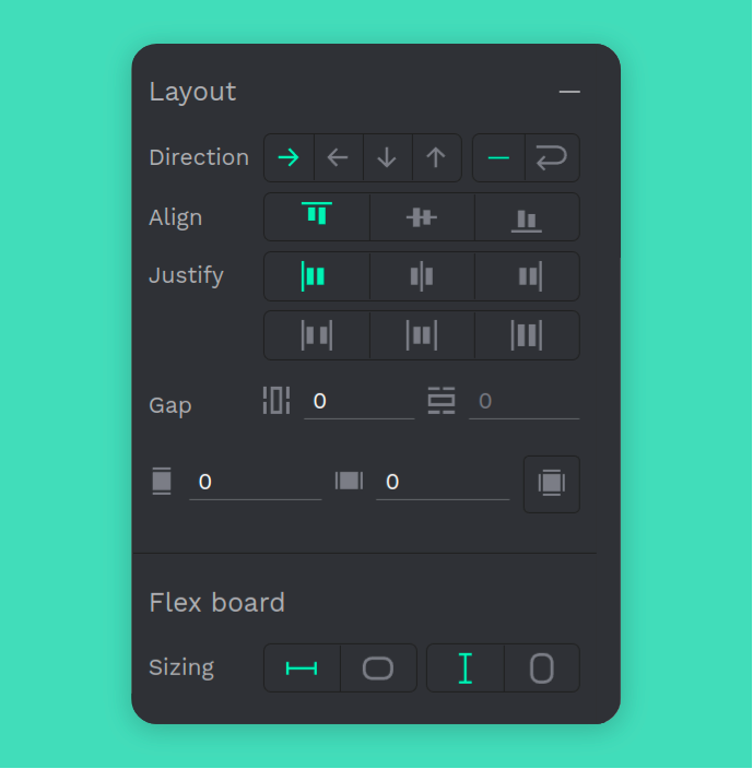
Flex Layout generates instant pixel-perfect code, which users can use to turn designs into reality. Users can automatically adjust their designs using Flex Layout by defining the same properties that are used in CSS flexbox, such as direction (including wrap), align items, justify content, gap, padding, and sizing. This means that users have full control over how their content and containers behave when they are resized or adjusted.
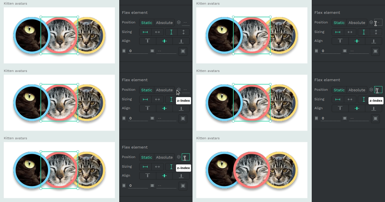
With Flex Layout, users also have the option to set content as static or absolute positioning. A static element will be included in the flex flow, using flex properties, while an absolute element will be excluded from the flex flow, which gives users the freedom to position it anywhere specifically, ignoring the flex properties of the layout.
Another key property of Flex Layout is the z-index option. Changing the z-index allows users to decide the order in which elements overlap each other without changing the order of the layers themselves.
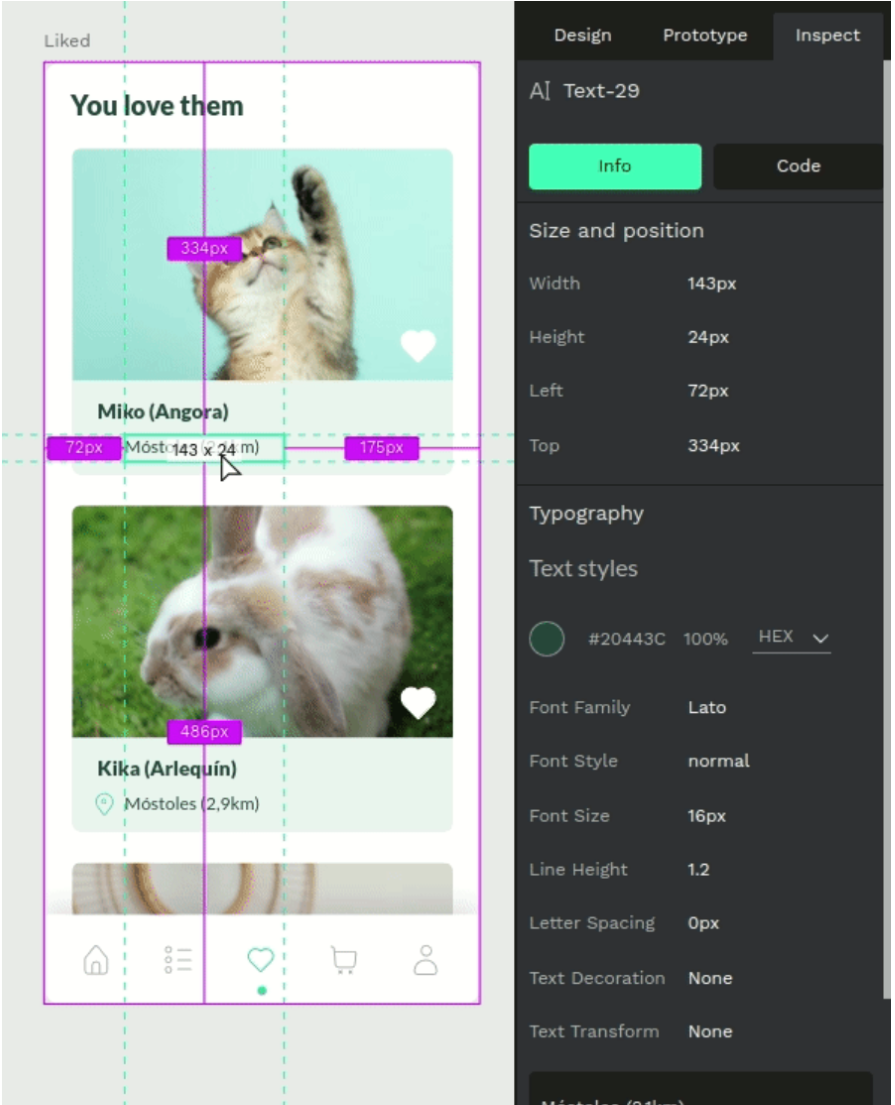
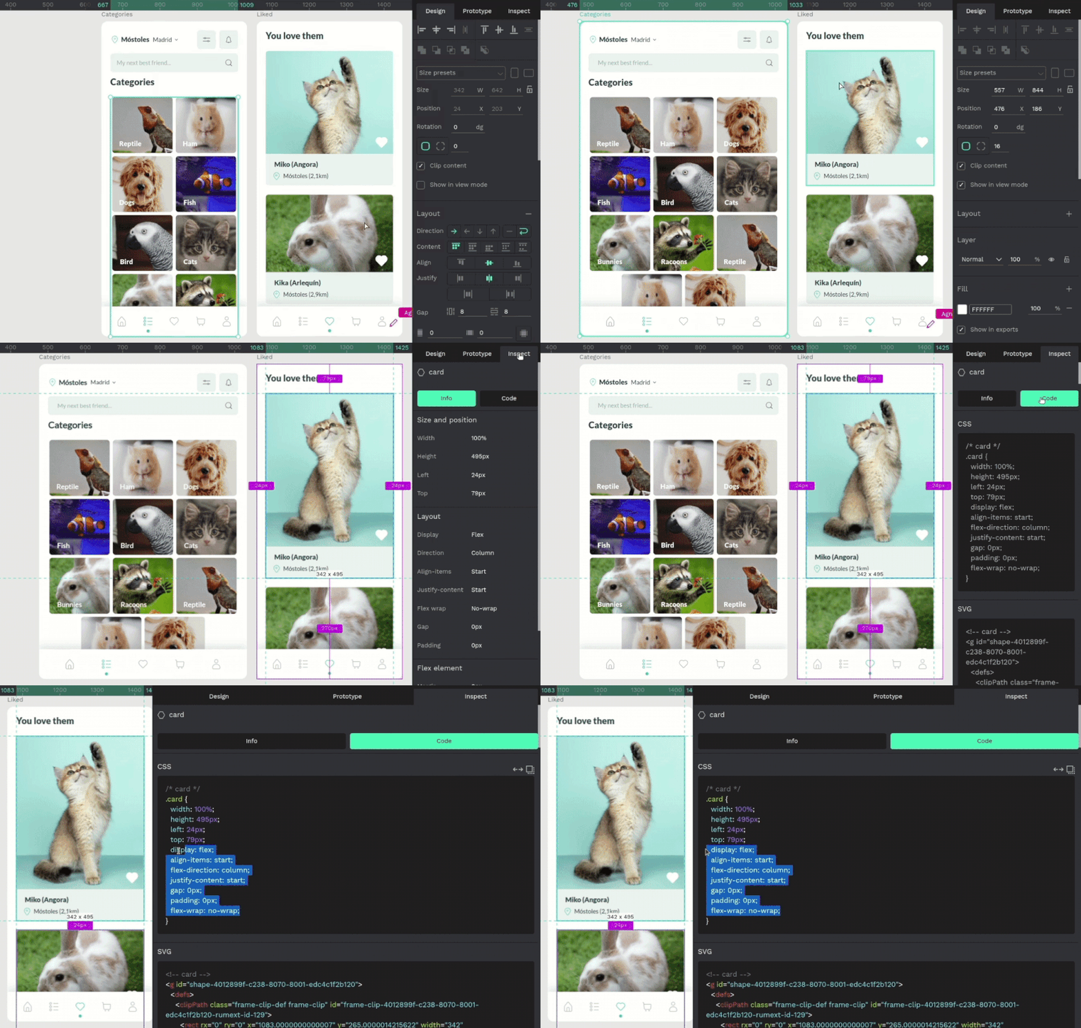
When developers are ready to implement a design, they can access the details they need with Penpot’s inbuilt code and properties inspectors.
They can view measurements like padding and spacing when hovering over a selected element, as well as view its properties in the Inspect panel under the Info tab. Here, the user can see details about the size and position of an element, as well as additional styling properties like text styles and color codes:
Along with being able to view properties of elements, they can also obtain real code snippets in the Inspect panel under the Code tab. Users can inspect production-ready code generated by Flex Layout which currently includes CSS and SVG markup, with more to come in the future. This makes it easier to translate designs into a pixel-perfect implementation. It also eliminates the need for designers to provide design specifications to developers, freeing up time and reducing the possibilities of error during implementation:
Design tools aren’t used in a vacuum. Product teams often use other tools for project management, communication, and analytics. Webhooks allow other applications or websites to be notified when certain events are triggered within Penpot. This can be especially useful to integrate with other services or tools to work together in an ecosystem.
Although there aren’t specific use cases around how webhooks can be used with Penpot, theoretically, teams could use them to track new projects in a project management tool when they create a Penpot file, or provide an analytics tool with data on the number of design system components used across the team’s Penpot files. You could even use them to send a message in Slack when a comment has been made in a Penpot file. There are many opportunities to broadcast team and project activity to other tools using webhooks.
As an open source platform, Penpot Community encourages users to stay connected with their team, share tips and resources with each other, and help shape the future of the platform. With their public community space, Penpot gives users a place to help each other out with troubleshooting and contribute back to the community by sharing libraries and templates. They also have a process in place for the community to contribute translations so that Penpot can fully support multiple languages in their UI.
Penpot’s community is also the place to follow for the latest news about features and fixes, as well as ongoing initiatives. Some announcements that they’ve mentioned in the community include a plug-in system, which would enable developers to create custom plug-ins for the product, as well as posting a link to their public backlog of issues currently being worked on for users to follow along.
Penpot is changing the game of product design and development by bridging the gap between the two disciplines. The industry currently faces many challenges during the design handoff phase involving translating designs into pixel-perfect code, which can be a time-consuming and error-prone process. By serving the developer audience, Penpot has a real shot at winning over product teams who are looking for a more effective way for designer and developers to collaborate.
Their open source approach appeals to a wide audience of teams looking for more flexibility and control over the tools that they use to develop software. This also makes Penpot free to use forever for power users, making it a cost-efficient way to gain more users. Not to mention the advantages of having a public community to support and contribute back to the platform.
It’s safe to say that Penpot presents a viable option for product teams to adopt as their main software design tool and it’s exciting to watch them grow in public. It’s a product that both designers and developers can enjoy.
LogRocket's Galileo AI watches sessions and understands user feedback for you, automating the most time-intensive parts of your job and giving you more time to focus on great design.
See how design choices, interactions, and issues affect your users — get a demo of LogRocket today.

As products evolve into ecosystems, navigation becomes a system-level challenge. This article explores how to align structure, context, and user journeys to create seamless movement across tools without confusion.

Figma’s AI features have exploded in 2026 — from text generation and image editing to full UI drafts and code handoff. But speed isn’t the same as quality. This guide breaks down every major feature, what it’s good at, and where human judgment still does the heavy lifting.

Zero UI works well for screenless, voice-first experiences, but most digital products still require visual interaction. Here’s why multimodal UX offers a more scalable foundation for the future of design.

Multimodal UX goes beyond designing for screens. Learn how context-aware systems, progressive modality, failover modes, and accessibility-first design create better digital product experiences.