If figuring out when to use toast notifications feels as tricky as making the perfect toast, you’re not alone!
Choosing the right notification type to implement in your design can be challenging because it’s a crucial element in ensuring a smooth user experience. But don’t worry — this article will guide you through the ins and outs of toast notifications. You’ll learn the appropriate scenarios to use them, best practices, common pitfalls, and hear practical examples from familiar products.
Let’s get started!
Editor’s note: This blog was rewritten 9 June 2025 by Daniel Schwarz to expand on the original by covering best practices, appropriate use cases, and accessibility considerations. It also updates the discussion by explaining the distinctions between similar notification types and emphasizes practical design tips to enhance user experience.
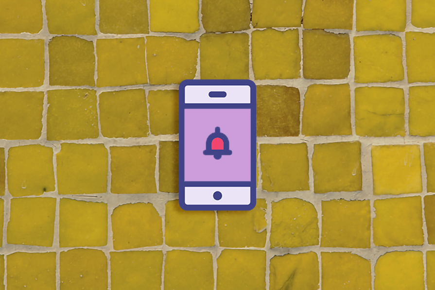
In simple terms, toast notifications are auto-dismissing status messages used to convey information without disrupting user workflows. They’re called “toast” notifications because they “pop up” on the screen like toast! But unlike popups/dialogs, toast notifications are designed to be unobtrusive and don’t require the user to close them. They automatically disappear within seconds.
Other popup types include modals, popovers, banners, and snackbars:
| Popup type | When to use | Example |
| Modal | To take users through a new task flow, making the main document inert until the modal is dismissed | To post on social media, where the modal remains until the post is submitted or cancelled |
| Banner | A simple message of any importance that typically resides at the top of the main document — can be dismissed or ignored | Anything from general warnings to information about online sales |
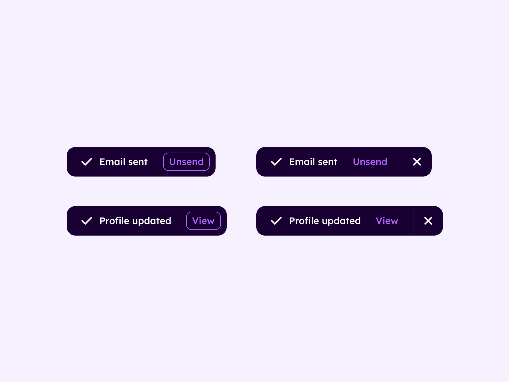
| Snackbar | A small popover dialog that doesn’t disappear automatically | A “profile updated” confirmation, possibly with the ability to “view” |
| Toast notification | A small popover dialog that disappears automatically | A “profile updated” confirmation, possibly with the ability to “view” (less likely as the toast is due to disappear) |
Consider the following scenarios to help you know when to use toast notification:
Toast notifications are ideal for confirming completed actions since they’re brief and provide instant feedback. Users receive immediate assurance that their intended action, such as sending an email or updating their profile, was successful.
Toast notifications are also great for presenting users with secondary actions alongside the message. The brevity of toast notifications ensures that these options are easily noticed and understood, but if the user doesn’t get the chance to interact before the toast notification dismisses itself, no harm no foul.
Use buttons, links, and other simple interactive elements. For instance, in the “profile updated” example, users could briefly be given the option to “view” their profile before otherwise being returned to wherever they were prior to the toast popping up.
While this sounds like a snackbar, it’s still a toast notification as long as the user actions are non-critical and the toast notification still disappears automatically:
While toast notifications should be unobtrusive, they can still grab the user’s attention without disrupting their current task. This makes them suitable for conveying minor alerts such as weather/traffic alerts and incoming messages/notifications that users might want to be aware of but aren’t related to what they’re currently doing. The toast itself can link to more information, if necessary.
While the length of time before a toast notification should dismiss itself heavily depends on its content and what it’s for, the average user attention span for these kinds of alerts are three to eight seconds.
In certain scenarios, opting to use a toast notification might be like using a spoon when you need a knife: ineffective at best or downright obstructive at worst. The table below shows two instances when it would be impractical to use toast notifications:
| Instance | Reason | Example | Alternatives |
| 1. High-priority status messages | If conveyed with a toast notification, high-priority status messages can be easily missed if they self-dismiss before the user reads them | A user attempts to upload a photo, but it fails. A toast notification saying, “Photo upload failed, please try again” would be easily missed | High-priority status messages are best displayed in context (e.g., form error messages are best displayed within the form component), where they don’t disappear. Banners can be used if there’s no particular context |
| 2. Displaying long or complex information | Toast notifications are for brief messages that can be read and understood in the limited time that they’re shown on-screen, not for displaying long or complex information | If a software application has undergone a major update with a long list of changes, trying to communicate all of them through a toast notification would be very obtrusive | Linking to the changes via the toast notification might be more appropriate, but it depends on the exact scenario |
Are you still wondering why it’s important to use toast notifications appropriately in your designs?
Well, this is important because toast notifications are designed to be unobtrusive, making it less likely for users to notice them adequately. Additionally, they lack a sense of urgency and can be unintentionally swiped away, causing users to miss critical information.
I’ve come across instances where designers misused toast notifications to convey failed login attempts. Let me walk you through a scenario to illustrate why this is far from optimal.
Picture this: you’re attempting to sign in to your bank’s mobile app to make a payment at a store. After entering your password, you briefly look up to ask the cashier a question. At this time, the screen displays a toast notification saying, “incorrect username or password,” then it disappears after a few seconds.
When you return your attention to your phone, you’re puzzled as to why your bank app isn’t logged in yet. Perhaps you think you forgot to press enter, so you press it again, quickly checking your pockets to make sure you haven’t misplaced your car keys. Yet, when you look back at your phone, it’s still not signed in.
What’s happening?
This scenario reflects the reality of how our customers typically engage with our products — skimming, scanning, or not paying full attention to every screen detail. This is why it’s crucial to empathize with your users to help you make informed decisions when implementing notifications.
To harness the benefits of toast notifications, try adhering to these three best practices:
They shouldn’t be intrusive. Instead, they should be placed in the corner of the screen. Users somewhat expect them to be in the bottom-right corner, but if that option happens to obstruct something important on the screen, the top-right corner is okay too. Toast notifications are always going to obstruct something, so don’t worry about it too much.
There’s no rule of thumb for the timing. It simply depends on the situation, and so I recommend going with whatever feels right. Consider the amount of content (of which there shouldn’t be a lot), whether or not there are actions for users to consider, and how many toasts could potentially be displayed at once. User attention spans last for three to eight seconds for marketing-style notifications, so that’s something to keep in mind.
Remember, toast notifications aren’t critical, so you shouldn’t feel compelled to use positive or negative reinforcement colors. Toasts should be fairly neutral-looking in terms of typography and interactive elements. Keep them simple. Clear, descriptive icons are fine if space permits.
Accessibility, to the standards of the Web Content Accessibility Guidelines (WCAG), is a human right and the law in many countries. To that end, make sure you:
Code isn’t your responsibility as a UX designer. That said, the web is evolving quickly and new features that developers might not be aware of yet are doing a great job of delivering accessibility right out of the box, so why not mention them during the design handoff process?
One of these is Popover, which enables developers to create non-modal dialogs, which is exactly what’s needed to create toast notifications. Popovers are accessible, meaning that they receive focus automatically, they have the right ARIA attributes (aria-expanded, aria-details, and the group role) already, they can be dismissed using the esc key (if needed), and focus is automatically returned upon dismissal.
Basically, they’re screen reader-compatible from the get-go.
When toast notifications pop up, you’ll want to transition them subtly to ensure that users notice them. A simple slide-in from beyond the viewport should do fine — anything more than that is likely to annoy users.
However, you should suggest that developers use the prefers-reduced-motion media query to disable the transition for those who can get sick from motion effects.
You have several options. You only need to provide one of them:
You’re exempt from these rules if no alternative to the time limit is possible (e.g., if it’s part of a real-time event such as an auction), or if the time limit is more than 20 hours.
Below you’ll find the answers to some of the most frequently asked questions about toast notifications:
When a notification pops up but then disappears (typically after a few seconds), this is called a toast notification. As you might’ve guessed already, this is because when toast is ready, it pops up for a second and then disappears back inside the toaster. Quite a fun name, really.
Toasts are fixed-positioned (typically to the bottom-right corner of the screen), whereas banners typically appear unattached at the top of the main document. Toasts are for real-time alerts and messages, whereas banners are for ongoing ones.
Unlike snackbars, toasts are auto-dismissing. For this reason, snackbars are more likely to have interactive elements such as links and buttons, although it’s fine to include them on toasts as long as they don’t do anything important. Otherwise, they’re exactly the same.
And there you have it, a comprehensive guide to toast notifications: when to use them, how to use them, and when it’s best to consider alternatives.
As you’ve learned, toast notifications are crucial for providing feedback, confirmation, alerts, and updates to users. When used effectively, they can enhance the user’s experience by delivering timely and relevant information without disrupting their workflow.
Remember, effective toast notifications:
By following these best practices and tips, you’ll be well on your way to creating great toast notifications.
Header image source: IconScout

LogRocket's Galileo AI watches sessions and understands user feedback for you, automating the most time-intensive parts of your job and giving you more time to focus on great design.
See how design choices, interactions, and issues affect your users — get a demo of LogRocket today.
As products evolve into ecosystems, navigation becomes a system-level challenge. This article explores how to align structure, context, and user journeys to create seamless movement across tools without confusion.
Figma’s AI features have exploded in 2026 — from text generation and image editing to full UI drafts and code handoff. But speed isn’t the same as quality. This guide breaks down every major feature, what it’s good at, and where human judgment still does the heavy lifting.
Zero UI works well for screenless, voice-first experiences, but most digital products still require visual interaction. Here’s why multimodal UX offers a more scalable foundation for the future of design.
Multimodal UX goes beyond designing for screens. Learn how context-aware systems, progressive modality, failover modes, and accessibility-first design create better digital product experiences.

 Learn more →
