Behavioral design uses behavioral science and psychology to guide how people use our products.

Design influences behavior. Using psychological principles and theories of behavior, we can design for how users behave, building an environment that supports whatever route they take, instead of forcing them to conform to how our products and services work.
I am not a behavioral scientist, just a designer with an interest in this area, and one who is looking for other tools to improve the usefulness of purely visual design. Many of the references I have read go into huge depth on this subject, so I synthesized the essential elements to make an easy to digest guide for the design and product team to learn from, reference, and act upon.
There are so many terms mentioned when researching this topic, such as behavioral science, cognitive science, cognitive bias, heuristics, psychological principles, motivation theory, and so on. It can be overwhelming, but at the core, behavioral design is a systematic understanding of how people make decisions. This understanding draws on a wide range of research from behavioral economics to human computer interaction and can help us make more informed design decisions.
We might want to guide how our users journey through our product by carefully managing the route they take, anticipating obstacles that might stop them from completing their goals. Another example is influencing how our children behave when using social media by guiding them through, not by grand emotional gestures, but by a smarter, more focused approach.
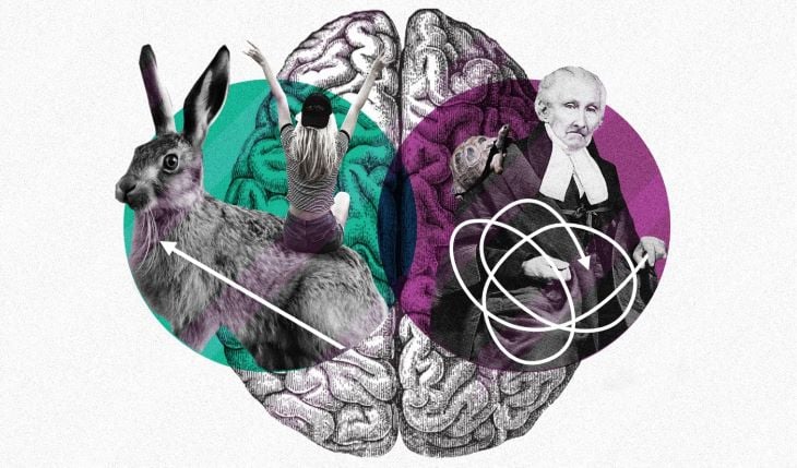
Before we get to the main course, I want to talk briefly about: manipulation.
Okay, we need to talk about ethics.
I started down the behavioral design route full of optimism. It was the new silver bullet. Now I could show users the errors of their ways and change their minds with good design patterns. The more I dug into it, the more I felt uneasy. How much design influence is good influence on the user?
Guiding users toward better behavior sounds delightfully utopian, and something we need to strive for, but considering recent big tech scandals, changing people’s behavior has taken on a more sinister tone, bringing to mind images of fiendish data scientists spying on people from behind the black mirror.
Mike Monteiro says in his excellent book, Ruined by Design, “We’re responsible for the things we put out on the works, we are the gatekeepers.” As product makers, we like to think we are above concerns of privacy and manipulation, since we work in this digital complex. The simple fact is, we are all bound by our biases, aware of them or not, and we should be sure we are not harming anyone.
To guide us through the existential dilemma, between business and user interests, we can use Nir Eyal’s Manipulation Matrix, a simple guide to test where your behavior change design strategy sits on the good and fiendish axis.
Two essential questions to ask of yourself are:
If you can answer these two questions with confidence and aim to be a “facilitator,” then you are off to a good start.
Behavioral scientist Stephen Wendel, who is the inspiration behind this guide, worries how persuasive design has become so pervasive, every designer is now tarred with the same evil brush. He says that he’d challenge anyone “to think of three major digital companies that don’t try to trick you into giving consent to using your data, sign you up for things you don’t want, or encourage you to binge on their products despite your better judgment.”
Wendel’s checklist is:
Don’t harm your users. It’s difficult to know if you’re helping a user, and even if you think it might not help them, or if you wonder if it might harm them, then this is a warning sign.
Be transparent: tell users what you’re doing. Telling the user what you are doing shouldn’t be a problem and is a good thing to do.
Make sure the action is voluntary. We don’t want to coerce the user into doing anything they are not willing to use your product or service.
Ask yourself if this product is really designed to help you? Would you be happy letting your parents or kids use it?
This is a simplistic outline of a massive ethical area that is finally spreading through the design community and I implore you to read Ruined by Design to get you thinking about these issues in greater clarity. With these guidelines in mind, let’s continue doing the right thing.
If you’ve worked in design for a while, this might be second nature to you, but it’s worth reiterating. Knowing some of the behaviors your users are likely to exhibit is the first stage.
An example would be why they never use your carefully crafted support button, even though they really do need help. Why is this? Is it because the support icon looks funny, or is it because they have tried it before and the process took too long? You get the idea. Let’s begin by gaining an understanding of what our users struggle with and what jobs they need to get done.
If you can, interview users about their lives. Find out what makes them tick and what jobs they want to get done.
If you can’t interview your users, make assumptions and verify them later. Yes, I just said make assumptions.
People buy products because they struggle to get a job done. Write out their struggles and unmet needs of your main user or beneficiary as job stories. The beneficiary is the person hiring a product to get a job done, such as a patient who uses a blood pressure monitor to check their health.
A job to be done must have a goal, contain an action or object and must not contain a solution. If we define a solution too early, we are coming up with an undeveloped idea too early.
I like this simple format for building up stories:
When ___ , I want to ___ , so I can ___ .
The “when” focuses on the situation, the “I want” focuses on the motivation, and the “so I can” focuses on the outcome.
Now that we have a few job stories as a basis to plan out the product, let’s get to the behavioral aspects.
Behavior scientist B. J. Fogg, founder of the Behavior Design Lab at Stanford, developed the Fogg Behavior Model to make it easier to understand behavior. There are many more sophisticated models out there, but I like the simplicity and the ease of applying it to any situation.
For the model to work, there must be three elements for behavior to happen:
Once the user’s mind is prompted to think about a potential action, there is an automatic reaction in response. This reaction can be intuitive and automatic. We want to know what the underlying motivations that drive users are. What is their end goal? These can range from sensation, emotion, to wanting to belong in a social group.
Ability doesn’t mean the person’s ability or skill level in performing an action, but in how easy it is for the user to perform an action. Clicking on a sign up button is easy, while filling in a long form is harder. The user must be able to act at once and without obstacles.
The prompt can be internal or external. External prompts happen when there is something in our environment that makes us think about an action. Prompts such as alarms, smells, and TV surround us. Internal prompts happen inside the mind, such as feelings or thoughts that bring about an action. Hunger is a powerful internal prompt, which reminds us to eat.
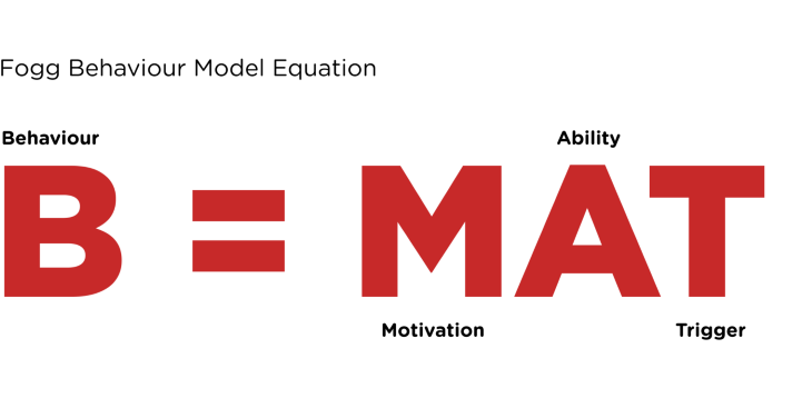
We can extend Fogg’s model, basing it on a model proposed by Stephen Wendel. He includes three further stages; evaluation, timing and experience, with reaction being much like Fogg’s motivation. For the sake of brevity, I find that these further stages are not always needed, but they can add some nuance to the process if needed. I appreciate Wendel’s openness about what he does.
These three strategies, in order of effectiveness, help get the user through to their goal quickly and efficiently. These come from Stephen Wendel, who we mentioned earlier.
The easiest and best strategy is to eliminate the work required by the user. If we can automatically do things with their consent, then we should do it. We can use smart defaults, machine learning, and tailoring.
Two solutions we can use:
The next most effective strategy is to use habits and motivation. We can avoid making the user work for an action and remove conscious effort. Identify a prompt and reward. These rewards need to be immediate, and habits are a powerful way to form repeated behaviors.
One way of creating a habit is by rewarding users. These can be small or large and they “pull us forward — it gives us a reason to repeat a behavior,” Stephen Wendel notes. There are two basic motivations that drive us — extrinsic and intrinsic motivation — and these can guide us to which reward is most effective.
“If I sign up to this product, I will receive some rewards in their loyalty program and get something free next time.”
These motives can come from family, professional environment, competitions, or contests. The motives of this sort encourage the person to deal with the outer world of other people, as there is no other way to achieve the particular goals.
“If I buy this product, I can help disadvantaged people as some of my money goes to charity. It will make me feel good, as I am helping others.”
Intrinsic motivation creates its own rewards, formed through the wishes and needs of the person. It has meaning. If we want users to act, using intrinsic motivation, such as learning a new skill, mastering a sport, is the most powerful tool.
The last way to change behavior is using conscious action. If either of the first two strategies is not available, then you must help the user consciously undertake the target action. This is the hardest and means appealing to their rational and thinking self. Obviously, if you have something that the person feels is trustworthy, helpful, and will get their job done quickly and efficiently, there should be no problem.
Motives are the “whys” of behavior — the needs or wants that drive behavior and explain what we do. We don’t observe a motive; rather, we infer one exists based on the behavior we observe. ~ Jeffrey Nevid from Psychology: Concepts and Applications
Now that we have our job stories developed from step 1, we should be clearer about what the goals of the user are. Stephen Wendel tells us to look for the Minimum Viable Action, “which is the shortest, simplest version of the target action that users absolutely must take so that you can test whether your product idea works.”
After a group discussion, select the best actions based on job stories.
Neil Armstrong had hundreds of steps to go through just to activate the system on Apollo 11, but most of us aren’t sending our product to the moon.
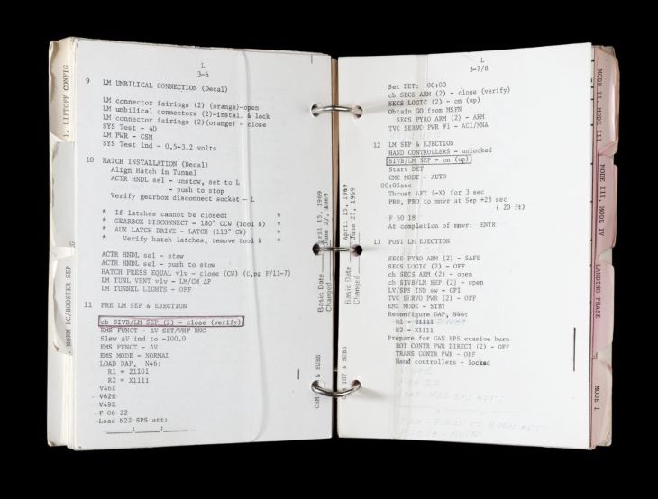
Let’s not get bogged down with every potential action the user might do. This should be a simple flowchart or user journey. If the user has to take too many steps to see some benefit, then we’ve blown it. Think about the sequence of real world steps a user needs to take to complete an action:
To support the action, create an appropriate environment.
Helping people focus on the meaning and impact of their work, rather than on the financial returns it will bring, may be the best way to improve not only the quality of their work but also-counterintuitive though it may seem-their financial success. ~ Amy Wrzesniewsk and Barry Schwartz
There are literally hundreds of psychological principles and cognitive biases to choose from, but again, there is no need in getting overwhelmed. The handful of tactics below is a good start and might be all you need to create a well-developed strategy.
I use non-coercive strategies, meaning that I do not want to force the user to do anything that may be harmful, or go against the user’s will. All product design is coercive on some level. As designers, we create frames into which we influence perception with color, layout, imagery and interaction, but using cynical strategies such as scarcity, loss aversion, and hyperbolic discounting which pushes this much further than we should be comfortable with.
The handful of tactics below are a good foundation and might be all you need to support your user’s actions.
This refers to users’ tendency to perceive attractive products as more usable and so inspire trust.
Commitment gets users to pre-commit to a small action, something they are invested in, and they will lose this if they cannot follow through. Just don’t punish users for this.
Give people the incentive to complete a task if they are given a head start.
Maximize the effectiveness of entry points to a product by reducing barriers, establishing obvious points of entry, and using progressive lures.
Tell the user what the action is in an accessible manner.
Show that other people are taking action, so that the user is more likely to feel the action is worthwhile and valuable.
Show how the user’s peers are doing, say on a scoreboard, and they may try to adjust their behavior to move towards this “norm.” Be careful here though: tell them they are doing well already.
Progressive disclosure is a design technique to ease the cognitive burden by only showing the most frequently required controls by default and making additional controls available on request.
After putting in all this hard work and building and developing our solution, now is the time to test that it will work with users. There are a few measures we can use to test how effective our solution is.
It’s important to outline our objectives and what success or failure looks like. We want to measure how the product behaves based on clear objectives we’ve set. Does it meet these objectives and assumptions we’ve created?
What is stopping the user from reaching their goal? We can find this out through user testing, to watch our product in the real world gain a better insight into how people use the product, and what crisis moments occur and what impact it has.
When we have gathered our testing data, we need to review and create an action plan for improvements. We can put this through our development backlog as UX priorities based on business considerations and behavioral impact.
I hope this guide is useful and practical, and is something that will open up new possibilities for design. Let’s not forget that we are trying to make our user’s daily grind a little easier, and we are responsible for how we treat our users. Balancing the concerns of financial gain and the user is the most challenging part of building products.
Using cognitive biases and behavioral tricks of the trade can lead us down some dark paths if we let it. Keep the user’s genuine needs and wants in mind when designing for behavior change. Let’s always design responsibly and remember that the user should always be the hero of the story.
Dan Lockton has a detailed design toolkit for strategies in “Design, Behavior Change and the Design with Intent toolkit: Theories and Practices of Designing for Change.”
Not related to design but a fascinating account by Robert M. Sapolsky of the evolution of human behavior in Behave.
Nikki Pfarr and Judith Gregory, “Cognitive Biases and Design Research: Using insights from behavioral economics and cognitive psychology to re-evaluate design research methods.”
Header image source: IconScout
LogRocket's Galileo AI watches sessions and understands user feedback for you, automating the most time-intensive parts of your job and giving you more time to focus on great design.
See how design choices, interactions, and issues affect your users — get a demo of LogRocket today.

As products evolve into ecosystems, navigation becomes a system-level challenge. This article explores how to align structure, context, and user journeys to create seamless movement across tools without confusion.
Figma’s AI features have exploded in 2026 — from text generation and image editing to full UI drafts and code handoff. But speed isn’t the same as quality. This guide breaks down every major feature, what it’s good at, and where human judgment still does the heavy lifting.

Zero UI works well for screenless, voice-first experiences, but most digital products still require visual interaction. Here’s why multimodal UX offers a more scalable foundation for the future of design.

Multimodal UX goes beyond designing for screens. Learn how context-aware systems, progressive modality, failover modes, and accessibility-first design create better digital product experiences.