Economics examines human behavior based on principles like the idea that we have unlimited wants but limited resources. This information lays the context for understanding the origination of the concept of satisficing.
In this blog, I talk all about satisficing. I’ll also situate this idea in the context of UI/UX design, and then I’ll analyze some of our favorite apps and brands to see how they employ satisficing in their designs. Read on.
Economist and psychologist Herbert A. Simon first introduced the term satisficing. Satisficing is most commonly explained as the satisfactory option that a user opts for instead of the best option because finding the best option is not worth the extra effort.
Because of the nature of the behavior, the word satisficing is intuitively formed from the combination of the words “suffice” and “satisfy.” A student cramming their syllabus the night before an exam is their brain making decisions of what’s good enough given the time constraints.
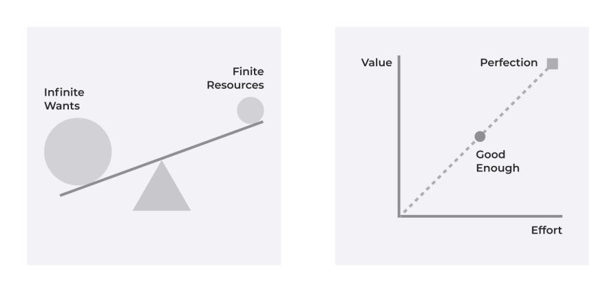
Herbert Simon used a term called “bounded rationality” when discussing satisficing. It suggests that the good enough choice is the best choice based on the human nature of being rational, given constraints such as time, cognitive load, and other situational factors.
The easiest identifiable pattern of satisficing in practice is a user’s shopping behavior on an e-commerce website.
Let’s say the user is searching for a kitchen electronic item, such as a blender.
The user has a budget in mind and might have some preferences, such as whether the blender needs to be powerful enough to grind spices, whether it needs to include a juicing option, what warranty policies it has, and so on.
The website allows the user to sort options based on pricing, brand, reviews, and ratings. The user uses the website’s search option to search for a blender with a juicing option, then filters it to find the option with the best reviews and ratings within their budget. The option they find fits all their needs. So, further delineation to find options with marginally better features and reviews would not be worth the user’s effort.
The user has then “satisficed” on an option, and they’ll now go on to make the purchase. This behavior exemplifies satisficing.
In modern design, we naturally gravitate towards optimizing our products and interfaces to accommodate the short attention span of users.
Let’s consider print media, for example, which is a traditional form of communication. Even in print media, we optimize content for scanability so the user is intrigued to read more. If the content is not optimized to appease the low effort of the user at the beginning, we lose their interest.
This pattern has carried on to web and digital experiences, where we optimize most of our content for scalability and low effort commitment. If the initial impression satisfies the user, they will commit to spending more time on what we offer.
It is, therefore, essential for UX designers to be informed about this invisible pattern that we have naturally been designing for.
Individuals tend to scan text that is well-documented — eye-tracking research shows that. This tendency is a result of the concept of human satisficing.
Understanding how satisficing impacts user behavior, impacts UX designers of all seniority to perform better design thinking practices. The concept of bounded rationality allows designers a new perspective to consider possible outcomes of an action or user’s experience.
But say you’re designing a healthcare application. In that case, you have to consider that satisficing may not be as applicable to this use case because of the critical nature of the user’s need to make a more informed decision. On the contrary, if some information is time-sensitive or more important in the same healthcare application, we might want to implement satisficing constraints to prioritize that content.
This consideration requires critical thought. And designers of all levels can experiment with it to test their former beliefs.
The best digital products to study to explore satisficing in UX design are those such as Netflix, Spotify, YouTube, or even the Google or Apple app stores. The reason is that these popular services present many options to the users, and users have to constantly make a satisfactory choice that best suits their needs given their daily time constraints.
For the sake of brevity in discussion, I’ll explore Netflix’s design mechanics in detail and briefly compare them with other products and how they differ in their satisficing mechanisms.
Netflix starts by asking users about their tastes right from the sign-up stage to understand what shows and movies they like. This is then used to tailor content recommendations to the user from the very beginning. As the user keeps using Netflix, the platform learns more about the user’s likes and preferences based on their viewing history and behavior.
The thumb icons for rating at the top of the screen are present along with the media controls, which subtly nudge the user to submit their feedback at any point in the show:
![]()
The variable that Netflix uses to judge user preferences is knowledge internal to the organization. Still, we can form an educated opinion that Netflix is factoring in all possible attributes, such as even the hours and minutes watched, to gauge the user’s preference.
This understanding is then used to suggest relevant movies and show recommendations so that the user can start watching as soon as they’re on the line, without having to explore for content for a lengthy period just to find something they like.
This caters to the user’s need to just turn on Netflix and immediately start watching something they like. This recommendation gets better over time because Netflix not only recommends content but also starts producing original shows and movies over time to fill the gaps in consumer demand, which they know exists based on user insights.
I said earlier that users scan information. Netflix uses this understanding to design custom artwork for their content to engage users, so they are tempted to explore the content.
Netflix runs about 250 A/B tests per year. These tests not only inform what content to surface to users but also decide what email to send or what personalized landing page to serve the users. The wholistic experience of using Netflix then becomes a fully personalized service tailored to meet the user’s exact needs.
The paradox of choice is one of the fundamental concepts that most UX designers learn right from the beginning of their careers. It suggests that the greater the number of choices, the longer it takes for the user to make a decision.
It is also commonly known as Hick’s Law. Junior designers will hear senior designers talk about the “magic number 7”, which is the understanding that humans can roughly store about seven pieces of information in their short-term memory, give or take two.
Netflix combats this paradox of choice by creating curated lists of recommendations, to help users make quicker decisions.
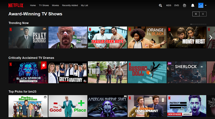
Netflix also has watchlists, where users can save their shows and movies that they find interesting and will watch later. This behavior caters to the user’s need to satisfice — they feel satisfied simply saving the show for later and not having to explore everything at once.
The core insight needed to understand whether we’re catering to the satisficing need of the user is to understand how satisfied the user is at every step of the user journey. And this understanding is developed through the tracking of user engagement metrics.
For instance, we explored that Netflix tracks various variables to recommend content to users. The variables that guide that recommendation then include which shows the user likes or the one they do not like. We can assume that the user will watch a show longer if they like it, but if the user provides negative feedback at the end of the show, we have to factor in that the user was not fully satisfied.
We can also consider another behavior, where a user binge-watches to finish an entire season of a series, which can suggest their intense love for the show. This kind of contextual understanding of the user’s situation guides Netflix to better cater to the user’s satisficing needs.
For instance, Netflix also has an autoplay option where it continues playing the next content in the recommendation lineup, and it requires no effort or decision-making on the part of the user once one show or episode ends.
Even though Netflix has a vast content library across regions, and the options can be endless for a user, they only tend to suggest a small subset of their offering at every step to the user.
Netflix has an intense customer-centric approach, which allows them to cater to the user’s satisficing needs. The actions taken by the user are constantly feeding Netflix’s algorithm to personalize the current needs of the user.
In modern UX, this act of constantly seeking user input as feedback to better serve users is known as a feedback loop. This feedback loop also impacts other organization operations, such as marketing strategies.
Netflix further demonstrates its customer-centricity by keeping its marketing emails and push notifications limited and relevant. Netflix has new shows released all the time, but instead of constantly bombarding users with communication, they only notify the user if a show is relevant to them, or if they have recently spent more time on Netflix and have the bandwidth to watch one more show.
Let’s compare Netflix’s satisficing strategies with that of YouTube and Spotify.
We will realize that Spotify performs similarly to Netflix.
In contrast, YouTube faces more challenges in satisficing users due to the user-generated nature of their content, and the exponential growth rate of their library compared to the more managed content library of Netflix and Spotify.
In the case of YouTube, they tend to overprioritize trending and popular videos to suggest good content — which may not always be relevant to the user and falls short of their satisficing needs. Many YouTubers will also recommend how being consistent is the key driving factor to becoming popular on YouTube, which suggests that it takes a long time for the algorithm to learn. Even then, it is not perfect.
The worst example of satisficing is the Android and Apple app stores, which have minimal satisficing principles at play because their recommendations are limited, and they offer more open exploration, which can lead down a rabbit hole.
The app stores have search, sort, rating, reviews, and category filters. But still, the decision-making dynamics are fairly open and broad because the creators of the app store want to provide the app developers an equal opportunity and not favor anyone through recommendations.
This incentivizes developers to continue putting effort into building apps and making the app store better, but it negatively impacts the satisficing needs of the user. The users are better off long-term, though, because they can avail themselves of better apps, which may not have come into existence if the developers didn’t have the necessary incentives.
As a UX designer, you must consider these trade-offs to identify when to cater to satisficing and when to optimize for the best option.
There are a few applications today that don’t cater to the satisficing needs of users:
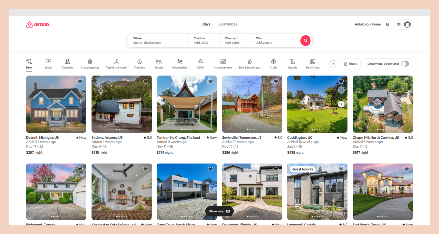
In its early days, Airbnb offered location-specific bookings. But now, it inspires users to plan their trips from the beginning with its quick-access browsing of all the available experiences across the globe.
The pricing and checkout pages of most websites and applications account for the pressing concerns of users so that they can make quick decisions.
For instance, when shopping for a shoe, a user might wonder about return policies if the shoe doesn’t fit.
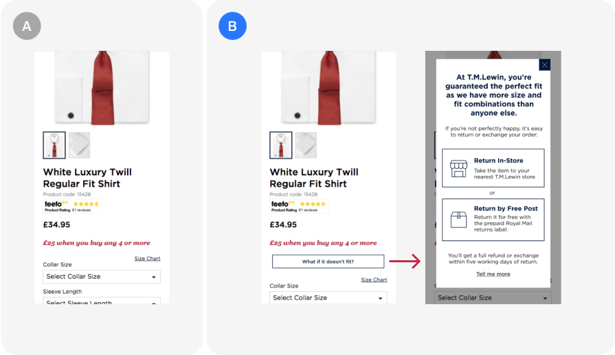
The above screenshot is based on an A/B test by the team at T.M. Lewin. By including the returns policy on the product page, they increased their conversions by 50% and their monthly sales by 7%, as users were able to make quicker decisions.
There’s a challenge with this approach, though.
If the returns policy was not favorable, the positive outcome could not have been potentially achieved. However, the users would still have been able to make a quicker decision — which would have been to not make the purchase but it would have avoided future frustrations of not being able to make a return.
Uber is a great example of the pricing tags that are used on most modern applications and websites.
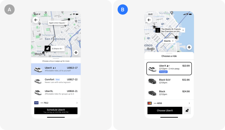
In the above example, the key improvement they iterated on is communicating an exact price instead of a range.
They found that users often assumed the upper limit for the pricing estimate and considered it expensive. So, Uber instead opted for a single price and even included a tag to indicate which option was the cheapest. This reduced the cognitive load on the user to identify their cheapest option and make a quick satisficed choice for their immediate transport needs.
The “Cheapest” tag is similar to other common labels found on pricing pages of most popular websites and applications, which suggests the recommended or popular pricing package allowing the user to commit and become a customer with more immediacy.
In the Uber case, it is important to note that although the new pricing estimate is easier for the users, sometimes the fare can be higher due to unforeseen circumstances where this design approach to satisfice can backfire.
When deciding to satisfice or optimize in UX design, it is crucial that we A/B test and consider the flipside of our strategies backfiring. In the Uber case, we can optimize for the satisficing mechanics to backfire, by utilizing the concept of progressive disclosure, where we inform the user of new information as it becomes relevant.
There might have been no traffic or demand when the user ordered the ride, but as traffic and demand are building up, we can keep the user informed of additional charges and also cap the charges if needed to reduce a negative experience.
LogRocket's Galileo AI watches sessions and understands user feedback for you, automating the most time-intensive parts of your job and giving you more time to focus on great design.
See how design choices, interactions, and issues affect your users — get a demo of LogRocket today.

Zero UI works well for screenless, voice-first experiences, but most digital products still require visual interaction. Here’s why multimodal UX offers a more scalable foundation for the future of design.

Multimodal UX goes beyond designing for screens. Learn how context-aware systems, progressive modality, failover modes, and accessibility-first design create better digital product experiences.

Learn how context-aware mode prioritization and seamless transitions improve multimodal UX and reduce mode confusion.

Research is becoming more democratized, product cycles are accelerating, and AI is transforming synthesis and ResearchOps. Here are the three trends shaping UX research in 2026.