Nowadays, users are overwhelmed with information and options on all their devices. They receive notifications and advertisements constantly. Add onto this all the other social pressures and stressors, and you can see why it’s easy to get overwhelmed.

Cognitive overload is one of the biggest challenges users can face when navigating websites or using apps. They feel overwhelmed and stressed, which prevents them from completing the task, making decisions, and solving their problems.
This is a big issue for businesses that don’t factor in this overwhelm. They lose potential clients — even if their product might have offloaded some mental burden in the long run.
Crafting user-centric solutions can prevent cognitive overload, and of course, UX is at the helm of user-centered design. In this article, we’ll explore the psychology behind cognitive overload and learn UX strategies to reduce it; once you learn this, you can prove to users your product is worth choosing.
To understand cognitive load, we need to know how the human brain processes information. Immediately after learning something new, we process this information in our working or short-term memory.
Our working memory manages tasks such as thinking, reading, and problem-solving and has limited capacity. Short-term memory does not store the information but transfers it to long-term memory. Otherwise, you forget the information within 15–30 seconds.
Due to its limited capacity, short-term memory can only process a certain amount of information at a time. Long-term memory creates lasting memories and it has unlimited capacity.
How can we apply this to cognitive overload? Let me explain.
The model of information processing suggested by Atkinson and Shiffrin in the late 1960s explains how information is processed and stored in the human memory system.
According to Atkinson and Shiffrin’s theory, there are three separate memory stores: sensory memory, short-term memory, and long-term memory, and information moves between them in a linear order. The way information is processed (encoding), how much information can be stored (capacity), and for how long information will be kept (duration) is different for each store:
The diagram illustrates how information moves from short-term memory to long-term memory through various activities, showing the loss of information and the capacity of each store.
The term “cognitive load” was first used by Australian psychologist John Sweller in the 1980s. He was studying problem-solving in education and noticed that learners struggled when faced with complex tasks or information overload.
The key idea of Sweller’s theory is when you exceed the capacity of short-term memory, this can lead to cognitive overload. Sweller found out that the way professors taught material influenced learners’ cognitive load.
To solve the problem, Sweller suggested several strategies to reduce cognitive load in education. Most of them, such as chunking, providing clear instructions, using visual aids, and providing feedback are strategies we can use in UX design.
Among other factors that influence cognitive load are age and experience. For example, young children and seniors often experience higher cognitive load levels than adults, and an expert would have a lower cognitive load than a beginner. For us to prevent cognitive overload, we have to factor our ideal persona into design.
Cognitive overload leads to negative results in user interaction. Users encounter stress and frustration, difficulty in navigating the interface, longer task completion times, and even more.
By understanding user challenges, UX designers can develop better solutions to create more enjoyable interfaces. Here are some of the issues cognitive overload may cause:
Overwhelming interfaces scare users. They feel confused, trying to understand where to look and what to do. Finally, they often leave the site or app to search for simpler solutions.
When users see too many options or information, making a decision becomes difficult. They usually give up and abandon tasks because they’re overwhelmed.
As discussed earlier in this article, cognitive overload leads to errors, making it challenging to complete the task. Users might blame these mistakes on your UI.
Interfaces that require too much mental effort often lead to lower satisfaction and influence users’ loyalty to your product. We’re used to optimized apps that guide us through their experiences with minimal hassle — if your app defies too many user expectations, they’ll take it out on your brand and reputation.
Tons of factors can cause cognitive overload on a webpage, including excessive text, poor hierarchy, and slow site loading speed. Understanding what overwhelms users can help you prevent design mistakes and avoid churn.
Here is a list of common issues on sites that contribute to overwhelming users. These can be easy to fix, so we’ll start here.
Readability directly influences how users process the information. If the text is difficult to read with complex language, long sentences, or a small font size, users may experience cognitive overload.
Is it easy for you to read the text and see the navigation bar on the Zara page? Text is not a priority for Zara; strong visuals sell here. But imagine if you made something like this on a website where information is crucial! What do you feel as a user?:

When the page is busy with design elements, users have no idea where to look and can’t focus their attention. Visual hierarchy helps to organize design elements by importance, drawing users’ attention to the points they should interact with.
As an example, look at the categories in this menu. There’s too little space between categories, too many elements, and they’re all practically the same size. Do you feel confused?:
Consistency helps to create intuitive design. When elements such as buttons, navigation, and layouts are consistent, users quickly learn how to interact with them.
Familiar patterns and elements reduce cognitive overload and make navigation smooth. It’s the way the human brain processes information, making users engage with the interface.
In the following example, there is a lack of consistency in such an important element: the button. It’s difficult to distinguish which button is primary and which is secondary, especially since they vary in color and size throughout the page:
Too many images, too much information, and a lot of colors and sizes create a sense of chaos and confusion, making it difficult for users to focus on what they are looking for. It takes a lot of time and effort to process information, users become mentally exhausted from trying to make sense of what they see. The example speaks louder:
If web users face too many tasks, they need help determining which one is the most important. Reducing the number of options and leaving only the most important can help focus users’ attention on what they need to do.
This simplification makes interactions more effective. This airline’s page looks a bit confusing, as it’s not entirely clear what to do first — search, book, or sign up:
According to eye-tracking research by Nielsen Norman Group, people typically scan websites in the F pattern. This means they first read the headline, then quickly check a few points below, and finally read the first subheading.
After that, users only briefly scan the content downwards to see if there’s anything useful. This happens because people want to minimize the work they need to do to reach their goals. To let people easily scan the text on a webpage, use headings, subheadings, bullet points, and text hierarchy.
Learn more from this video on scannability:
F-Pattern in Reading Digital Content
Eyetracking research shows people read Web content in the F-pattern. The results highlight the importance of following guidelines for writing for the Web. More information: https://www.nngroup.com/articles/f-shaped-pattern-reading-web-content/
According to Steve Krug’s book Don’t Make Me Think, people prefer not to spend a lot of time or effort thinking about the best possible choices. They typically quickly scan a webpage and choose the first reasonable option that meets their needs.
This strategy is known as “satisficing.” This term was coined by the economist Herbert Simon (a cross between satisfying and sufficing). UX designers can help users in decision-making by reducing the number of choices and removing similar functions and options.
When reducing options is not possible, categorizing and grouping products in meaningful ways can be effective.
One more way to prioritize options is to highlight them. It makes users consider one option more strongly than others. This approach simplifies the decision-making process for users while also helping to achieve business goals.
Let’s explore fundamental principles of user experience design based on human psychology to understand how the human brain comprehends information.
In 1956 George Miller conducted research showing that people can remember from five to nine things at a time. George Miller’s work was titled “The Magical Number Seven, Plus or Minus Two: Some Limits on Our Capacity for Processing Information.”
Miller suggested the theory of chunking, breaking down information into small “chunks.” He believed that grouping related pieces of information helps the brain increase the capacity of short-term memory and improve cognitive processing abilities. A classic example of this is how a phone number is divided into chunks, making it easier to remember.
The second example illustrates that a divided number is much easier to comprehend:
Another brilliant example of Miller’s Law applied in UX is the Pinterest dashboard. All items are grouped into categories and further subdivided. This shows how complex information can be presented in a way that is easy to understand and scan for the user:
Hicks Law relates to decision-making. It states that the fewer choices people have, the quicker they make decisions.
In UX design, this means reducing the number of choices, breaking down complex tasks into simple ones, and using progressive disclosure to reveal options gradually. The Miro signup form is a great example of how to reduce unnecessary steps by providing options to sign up with users’ existing accounts:

So, what are the best UX solutions to implement to reduce users’ cognitive overload? Let’s explore the strategies commonly used in the most user-friendly websites.
Keep your site simple and use a lot of white space. Minimal design helps you avoid several common design mistakes that we covered, such as visual clutter, numerous options, and too much text. Simple interfaces help focus users’ attention on the main task and make navigation smooth.
To inspire you, look at the Google search bar. Another user friendly detail from Google is they place the cursor in the search field, allowing you to start typing immediately:
You can achieve simple navigation not only by reducing the number of options but also through typography. Use appropriate fonts and pay attention to hierarchy. Links should be easily understandable by users.
If you use familiar and relevant category names, users will quickly find what they seek. And how you achieve this consistent hierarchy is by highlighting the most important elements. An example of effective navigation is Apple’s website. Even though they have a lot of text in their menu, it has a strong hierarchy and structure, with products highlighted in bold font of a larger size:

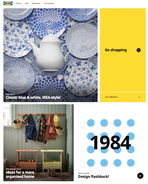
Make sure your content is balanced. Use various elements: images, videos, text, and infographics. Too much content of the same type overwhelms users and leads to cognitive overload. A balanced mix of visuals, text, and icons will help users to understand your product better. Look at the balance on the Ikea landing page:

When you offer clear instructions to users, it helps them understand what occurred and correct their mistakes quickly to continue completing the task. When users are confused, they can’t focus because they think about the problem, and they may forget to complete the task. Look how Mailchimp uses clear instructions in their sign-in form suggesting a solution to the problem:

In this article, we explored why users are overwhelmed with information and options on different devices. Cognitive psychology concepts can help us understand how the human brain and memory process information and why cognitive overload occurs. A UX designer is one part psychologist for this reason!
Now that you have all these tools to prevent cognitive overload, your challenge is to identify it in your own projects. How can you accomplish this? By staying in touch with your users and surfacing insights about their experiences.
Header image source: IconScout
LogRocket's Galileo AI watches sessions and understands user feedback for you, automating the most time-intensive parts of your job and giving you more time to focus on great design.
See how design choices, interactions, and issues affect your users — get a demo of LogRocket today.

Optimization fatigue is real. Here’s why designing only for metrics drains creativity, and how to bring the human back into UX.

Let’s explore why and when to use drag and drop, discussing real-world examples, platform-specific considerations, and accessibility tips.

We’re told to reduce friction, but sometimes friction builds value. This blog explores how scarcity, when designed well, sharpens focus and strengthens user trust.

Discover how to craft UX-friendly hero sections with examples, design tips, and strategies that drive engagement and conversion.