UX designers often perceive site abandonment as a failure. Although this is true in many cases, there are also situations when it is actually a reason to celebrate.
In this article, I’ll examine site abandonment in greater depth, identifying common causes (and how to fix them) and examining when it is actually beneficial.
Not all site abandonment is equal. So, let’s dig in.
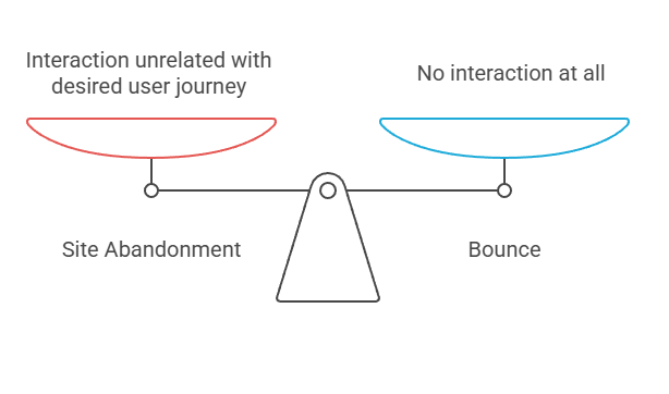
Site abandonment happens when users leave your website without fulfilling the desired next step.
It is often confused with the bounce rate, although there are a few crucial differences:
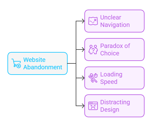
Although there are numerous reasons why users abandon our websites, the few most common ones include:
One of the most common reasons people leave is that they don’t understand where to click next.
Imagine you are shopping for a T-shirt and visit Zara’s website:
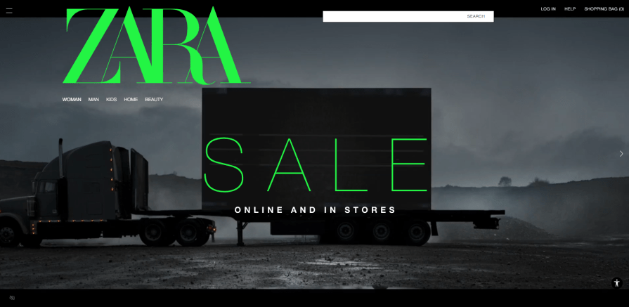
As creative and visually appealing as it is, it takes a while to understand where to look for t-shirts. The whole design highlights ZARA, SALE, and “online and in stores.” None of these are actionable next steps for the user.
Compare it to the Samsung website:
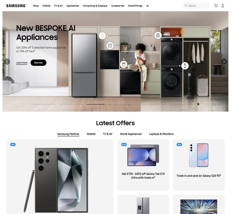
It’s (in my humble opinion) as visually pleasing as Zara, yet it’s significantly easier to navigate. The most common items are displayed upfront, and navigation between categories is straightforward. There’s even a dose of repetition (navbar menu and tab menu in the middle of the screen), ensuring everyone can quickly find whatever they need.
The more choices we have, the lower the chance we’ll make any.
We always want to make the most optimal choice possible, and if there are many choices, analysis paralysis strikes. The abundance of choice can even lead to anxiety — the reason I switched from Android devices to iPhones is not to fret over which phone model to choose every couple of years.
Just looking at Elevenlab’s checkout page makes me nervous:
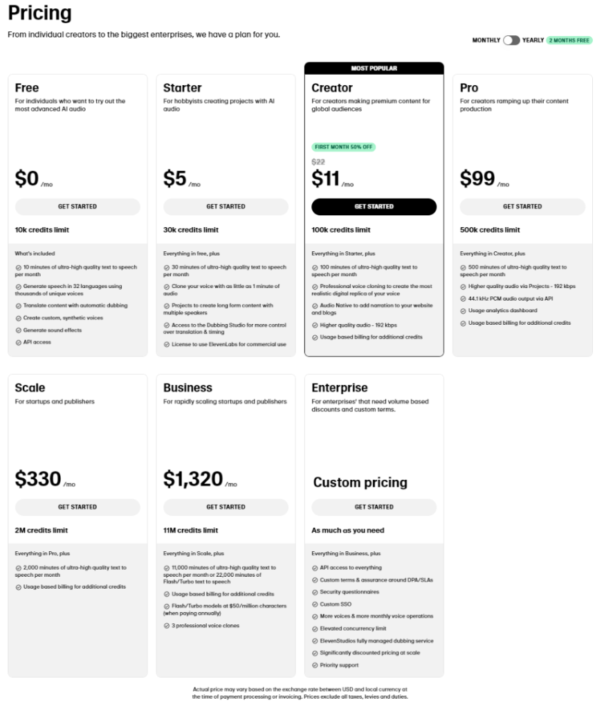
I understand they want personalized plans for every use case, but many people would prefer to pay a few dollars more and not worry about whether they made the right choice.
Compare it to ChatGPT:
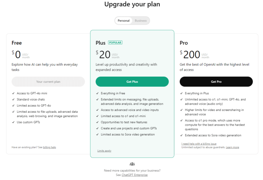
As complex and advanced the ChatGPT is, they stick to a simple 3-tier strategy:
No need for more complexity.
We are becoming increasingly impatient every year. Years ago, 3G mobile speed was a luxury. Today, it’s a punishment.
If your page loads more than one second at any step, you have a problem. I’d rather spend extra time searching for an alternative than wait for loading bars every twenty seconds.
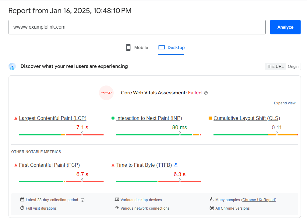
Visit pagespeed.web.dev, paste the link to your homepage, and check the results. If you see any of the core web vitals failing, research deeper into what contributes to it and make relevant changes.
Sometimes, all you need to do is to stop using 4K images on your homepage or embrace some lazy loading.
We are easily distracted, so the cleaner and more focused the page is, the better.
Just compare the dailymail.co.uk and medium.com:
That’s why Dailymail has higher site abandonment rates. However, it also makes it easier for users who stick to go down the rabbit hole and spend hours reading through different articles that catch their attention.
Not all site abandonment is bad, though. There are also reasons to celebrate:
Some products aim to fulfill an immediate need as soon as possible. Take a look at Brainly.com:
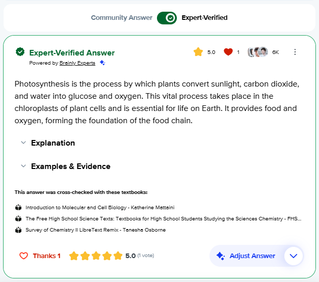
Users visit the page to get an answer. And there are many desired next steps for them to take, such as
But many people will leave just after reading the summary of the answer because it’s all they need.
As long as your growth and monetization models can work with higher site abandonment, there’s nothing wrong with people leaving after a couple of seconds. Just make sure they are leaving because they got a great experience quickly — and not because they got confused or disappointed.
Say you want your users to click on the Register button, but instead, they click on a cost-per-click advertisement and leave your website.
On one hand, they didn’t finish the intended journey. On the other hand, you captured the revenue from this user.
If you get paid based on clicks or referrals, then people choosing ads over the primary user journey isn’t bad at all.
You want some people to leave.
If you provide a service to a specific target segment, you want only people in that segment to go through the funnel. Otherwise, you’ll waste time and resources talking to people who won’t buy.
Take a look at fox.agency:

The clear “Creating opportunity for global B2B tech brands” sets clear expectations of who the service is for. They want people who work in B2C products, local brands, or non-tech industries to leave so that they don’t need to reject them later manually.
How do you know what percent of your site abandonment is good and what percent is bad? There are a few techniques that can help you identify the root cause:
If people try to leave your site (e.g., you spot rapid mouse movements at the top of the page), show users a survey asking why they are leaving.
The vast majority of users will simply ignore it, but some of them will give you valuable insights.
Understand on which pages users leave.
If someone went through almost the whole funnel and left it on a checkout page, it might mean it’s too complex or unclear.
If a user left on the “What we do” page, it probably means they self-filtered.
Look where the users are coming from.
For example, if people come to your website from an ad that clearly states who the product is for, the chance they will self-filter is low, so site abandonment is low.
Session replay tools, such as LogRocket, can help you analyze users’ behavior before they leave your site. They can help you distinguish whether users quickly find the information they are looking for and leave happy or struggle to find what they are looking for and leave annoyed.
Site abandonment is just a metric. It’s neither bad nor good.
There are pages for which a 20% site abandonment rate might be alarming (e.g., ad-driven product pages) and products that can benefit from 90% site abandonment (e.g., very niche service providers).
It’s essential to understand why people abandon your website. Look where they come from and use source analysis, exit intent surveys, and session replays to determine whether they leave for good or bad reasons.
Fix bad reasons, and help people leave quickly for good reasons (e.g., by being very explicit about who your target group is or assisting users in alleviating the immediate pain point quickly), and don’t fall into the trap of “trying to reduce the site abandonment rate” — it’s a pointless and even counterproductive exercise.
After all, the goal isn’t to push as many visitors as possible through your funnel.
The goal is to push as many qualified visitors as possible through your funnel — that is, visitors who are in your target segment and can benefit from your product at a given moment. In some cases, it’s just 10% of your total visitors.

LogRocket's Galileo AI watches sessions and understands user feedback for you, automating the most time-intensive parts of your job and giving you more time to focus on great design.
See how design choices, interactions, and issues affect your users — get a demo of LogRocket today.

Explore the core principles of GUI design and learn how consistency, simplicity, feedback, accessibility, and user testing contribute to better digital experiences.

After five years in UX, I revisited the Daily UI challenge to reconnect with hands-on design. Along the way, I learned that great interfaces come from thoughtful briefs, sound judgment, and user feedback, not just better AI tools.

Learn what makes a great login screen through real-world examples and UX best practices for creating secure, accessible, and low-friction authentication flows.

Skeuomorphism helped define early digital interfaces by mimicking real-world objects to make technology more intuitive. Learn how it compares with flat design and neumorphism, why it declined, and where it still has a place in modern UX.


