
Gantt charts, if applied correctly, can be a strategic asset for keeping your head above the waves of complexities in UX projects.

Interested in everything UX design? Check out these 13 UX podcasts that are sure to be a blast to listen to.
Here are some of the most noteworthy AI tools for UX writing, including their strengths, quirks, and price tags.

With ProtoPie’s compatibility with Figma, it’s easy to integrate this ultimate prototyping tool into your design workflow.

InVision has announced the sale of their design collaboration tool, along with the discontinuation of their services by the end of 2024.
From the simplicity of Apple to the open source diversity championed by Android, we unravel the UX philosophies of their design choices.

Adobe Firefly is a product that uses generative AI and machine learning to create and edit images. Here’s how to use it for UI design.

Discover what content testing is, why you should test your content, and some methods for measuring the effectiveness of your content.
Let’s touch upon how you, as a UX designer, can help solve the subscription churn problem based on an actual story.

How big should buttons be? To make your designs as accessible as possible, follow these guidelines to the best touch target sizes.
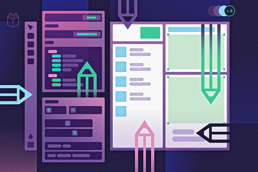
Penpot is an open source design and prototyping tool that aims to bridge the gap between designers and developers in the product workflow.
OpenAI has introduced GPTs, a way for anyone to customize ChatGPT without having to code. Here are 34 you can use in your design workflow.