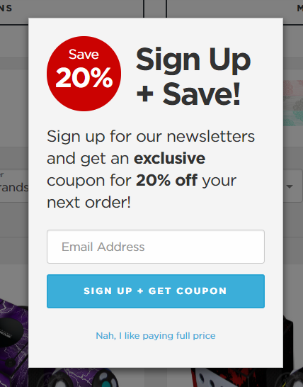
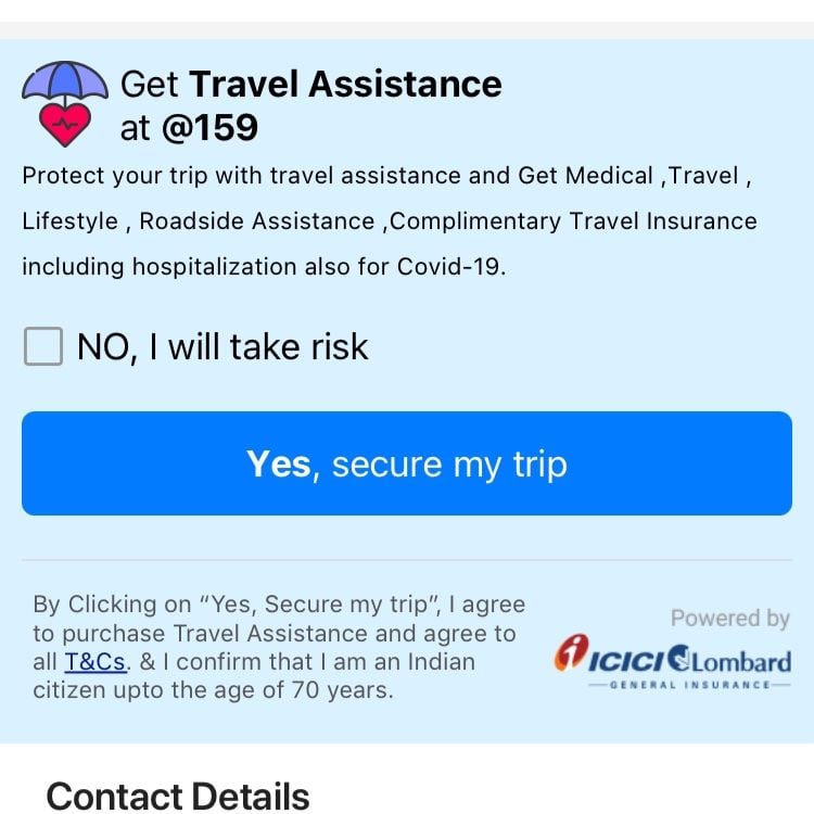
“No, I love wasting money,” and, “Nope, I’m boring and hate fun” sound like unlikely button labels, but they are both examples of a widespread dark pattern known as confirmshaming. The term was coined by the UX expert Harry Brignull, who describes it as an act of deliberately “triggering uncomfortable emotions, such as guilt and shame, to influence users’ decision-making.”
In its most common implementation, the opt-out copy for a promotional offer is worded in a derogatory manner, intentionally mocking or shaming the user for choosing not to engage with the promotion. For instance, you may come across a secondary button labeled, “No, I hate saving money” when declining to give away personal information in exchange for a discount, or be forced to interact with a belittling copy like “Nah, I’m boring” when unsubscribing from an entertainment service.
All of the above are examples of deceptive patterns — another term conceived by Brignull in his homonymously titled book and used to describe interface design that tricks or manipulates the user. Despite their malicious nature, dark patterns are prevalent on the internet, as new examples of intentionally confusing interfaces and coercive content regularly get called out on dedicated forums and social feeds.
In short, it’s used because it works. Confirmshaming effectively targets users’ emotions, increasing the likelihood that they will give in to pressure and comply.
In a recent study conducted by the University of Chicago Law School, the use of manipulative copy resulted in at least 5 percent increase in signups, affecting a disproportionately high number of users with a lower level of education, who are the common victims of many deceptive patterns:

Another side of the same coin is the relatively low cost of employing dark patterns. In the words of the legal scholar Lior Strahilevitz who led the study mentioned above, it’s often “all upside” for companies that receive an almost guaranteed increase in conversion while only risking a slight drop in the user satisfaction.
According to Strahilevitz’s research, confirmshaming had no significant impact on participants’ mood, meaning the small annoyance they may feel when reading the manipulative copy is unlikely to result in a significant change of behavior.
It’s also worth noting that many dark patterns make their way into interface design from the world of advertising, where emotional manipulation is a common practice that, until very recently, went unchallenged. Be it body shaming, gender stereotyping, or the fear of missing out, ad campaigns routinely induce the feelings of guilt and anxiety in order to influence consumers’ behavior, and confirmshaming is a prime example of this practice.
In this context, the better question might be: “Why wouldn’t anyone use confirmshaming?”
More often than not, it comes down to the question of morals: what a company stands for and whether it aspires to serve or exploit its users. Confirmshaming isn’t just manipulative, but often dishonest. It’s commonly paired with other deceptive patterns that create a fake sense of urgency or exclusivity, all pushing the user toward the choice that doesn’t benefit them:
It’s worth pointing out that subtle manipulation of users’ behavior doesn’t always have negative connotations. In his influential book Nudge: Improving Decisions About Health, Wealth, and Happiness, Richard H. Thaler examines the human “tendency to go along with the status quo or default option,” and explains that “encouraging people to choose is not always wise, and remaining neutral is not always possible.”
To differentiate between nudging and deceptive patterns like confirmshaming, we need to examine who truly benefits from the change in behavior. Are users encouraged to make choices that promote their long-term well-being, or are they tricked or shamed into helping the company grow its profit margin?
While employing deceptive patterns may bring some short-term gains, it’s likely to have a negative impact on long-term user engagement and satisfaction, and it can seriously damage the company’s reputation.
Since a Tumblr blog documenting examples of confirmshaming first gained media attention nearly a decade ago, it’s common to see these manipulative patterns getting called out online and in the press. Thanks to increased customer savviness, companies can no longer get away with coercive behavior without risking seriously damaging their reputation:
Finally, deceptive patterns aren’t just immoral, they are also illegal in many countries. While persecuting such ambiguous crimes is often challenging, the recent Federal Trade Commission (FTC) legal complaint alleging that “Amazon used manipulative, coercive, or deceptive user-interface designs known as ‘dark patterns’ to trick consumers into enrolling in automatically-renewing Prime subscriptions” set a strong precedent for legal actions against online deception.
Given more protections trending toward consumer privacy and transparency, we can expect more legal rulings in favor of consumers, and therefore better advertising practices.
When dark patterns show a promise of revenue growth, designers may find themselves fighting a losing battle trying to improve usability. Hopefully, by now you’re convinced that using deceiving patterns is a bad idea, so here are some things you can do to bring your stakeholders and teammates on board:
Since emotional manipulation is much more commonplace in advertising, there is a possibility that some of your colleagues might be unaware of the problem. Take this opportunity to educate them that just because something is common, it doesn’t mean that it’s good.
If quantitative studies show that increased conversions outweigh dropout rates, it might be time for some qualitative user research. Test your designs extensively, ask the participants how they felt when reading the copy and share your findings with the team. Even if the user begrudgingly pays for a subscription, hearing about their annoyance will likely persuade your teammates to change course.
Also known as UX writing, content design is a relatively new discipline, meaning many teams lack dedicated specialists and established practices. Once your design system includes not only UI elements, but also extensive content guidelines, it will be much easier for the design team to defend their decisions.
Confirmshaming is one little annoyance that sparks a big conversation. It’s a ubiquitous example of dark pattern, and though seemingly innocent, confirmshaming fatigues users when they see it out and about on the web.
Ideally, your brand should be welcoming; don’t cut off potential customers by speaking to them disrespectfully.

LogRocket's Galileo AI watches sessions and understands user feedback for you, automating the most time-intensive parts of your job and giving you more time to focus on great design.
See how design choices, interactions, and issues affect your users — get a demo of LogRocket today.

After five years in UX, I revisited the Daily UI challenge to reconnect with hands-on design. Along the way, I learned that great interfaces come from thoughtful briefs, sound judgment, and user feedback, not just better AI tools.

Learn what makes a great login screen through real-world examples and UX best practices for creating secure, accessible, and low-friction authentication flows.

Skeuomorphism helped define early digital interfaces by mimicking real-world objects to make technology more intuitive. Learn how it compares with flat design and neumorphism, why it declined, and where it still has a place in modern UX.
Memos don’t have to be complicated. Just keep them clear, concise, and focused on actionable items. More on that in this blog.


