
Moderated usability testing is one of the most powerful tools in a UX designer’s toolbox. It informs UX designers and helps validate various assumptions while learning more about users and how they interact with your product.
Yet, they’re often conducted based purely on intuition.
Just show the product to the user and ask them to perform a few tasks. Nothing too complicated, right?
But there’s quite a big difference between poorly conducted and truly nailed moderated tests.
In this article, I’ll explain the basics of moderated usability testing and provide a step-by-step guide on designing and conducting tests that bring meaningful insights.
This section is crucial, so don’t skip it just yet. Of course, I’ll cover more than “moderated are moderated, and unmoderated are…unmoderated.”
Unmoderated usability tests are a series of tasks that users perform on a prototype or actual product without the presence of a UX researcher. They are very scalable yet don’t go deep into users’ thinking processes, making them a great quantitative research method.
So, although many designers treat unmoderated usability studies as qualitative research, that’s a rookie mistake. How would five or ten unmoderated tests help you? You can’t really assess overall usability with such a small sample, and the shallow nature of unmoderated tests doesn’t allow for deep, revealing insights.
Given all that, unmoderated tests are best when used:
Moderated tests, however, are much more revealing and inform UX designers, thanks to the ability to follow up with questions. For the same reason, they are not as scalable, so they fall under the umbrella of qualitative methods.
Use moderated tests:
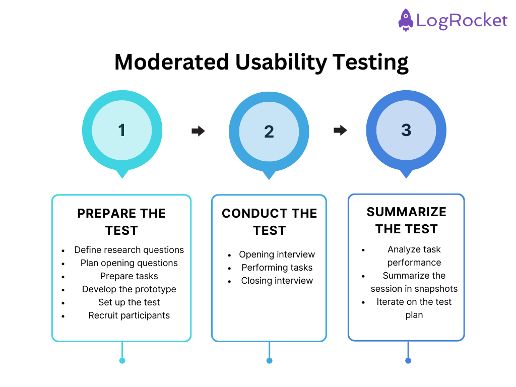
The first thing we should do is clearly map out the research questions we want our test to answer. It’s like preparing for a user interview. Clearly defining research questions will help us plan opening questions and usability tasks and choose the right audience to recruit.
Let’s imagine we are building an AI-driven calorie counter that tells how many calories and macros a meal has based on a picture. Some of our research questions could be:
Starting a moderated usability session with a few exploratory questions is good practice. This will already give you some insights and build an understanding of the user’s actions during the test.
Refer to your research questions and plan opening questions for any other user interview. If you need some inspiration, refer to our user interview questions library.
Some decent opening questions for our AI-calorie tracker case could include:
We also need to define actual tasks that users will perform during the usability test.
You should have at least one task per each category, that is:
An example of each for our example case could be:
Aim for up to three tasks for each category. Otherwise, you’ll make the test excessively long.
The most common mistake when preparing a prototype for a usability test is covering only the journeys you plan to test.
Keep in mind that users rarely will follow the exact journey you envision. They might click different options and make mistakes along the way. You want to see what users do in those paths and if they’ll be able to recover. If your prototype will react only to happy path actions, you’ll miss that learning opportunity.
Last, you need to set up an actual test. Although you could share a prototype link, I strongly recommend you use a professional user testing tool.
A good tool will not only help you handle scheduling, recording, and transcribing but will also automatically measure metrics such as completion rates for your tasks, deviations from the happy path, and time needed for each task. It’ll allow you to focus on the user rather than tracking everything yourself.
My go-to tools include UserZoom, UXCam, and UserTesting.
Make sure the testers you recruit resemble the user persona you target. The most efficient way to ensure that is to use a screener.
There are two ways to recruit participants: you can do it yourself or pay a specialized agency. Do it yourself if you have a robust user base and want to recruit your own users.
Hire someone to do it if you don’t have many users and want to recruit people who haven’t used your product yet.
The opening interview has two objectives — one, to learn more about the user and discover new insights, and two, to build the context and put the participant in a proper state of mind. This way, the user will behave more naturally during the test.
Five to ten minutes is usually enough.
Some universal opening questions include:
Interacting frequently with the participants during the session’s test phase is the most important thing. You want to know what’s going on in their heads and how they perceive the actions they perform.
Ask participants to share the screen (or see it in the usability testing tool if you are using one) and go through the tasks one after another.
Ask them to think out loud whenever they do a task. Whenever you encounter a pause, remind them about sharing their thinking process. Those moments of silence are often when the most important thoughts pass through the participant’s mind.
After each task, ask them to reflect on it and share thoughts about what happened.
Ask follow-up questions frequently:
Reserve some time at the end of the test to ask a few questions about the experience as a whole. Zooming out helps uncover insights that are hard to get when asking about specific tasks.
My go-to closing questions are:
After the test concludes, don’t jump straight into another session. Properly summarizing moderated tests helps you retain and share insights more easily and allows you to improve subsequent tests if needed.
Your usability testing tool should summarize for you key metrics like the completion rate, the time taken to finish a task, and deviations from the happy path.
Review these and look for worrying signals (like a task taking much longer than you expected).
Remember that these are only signals, and you need to follow up with unmoderated usability tests to further validate if a given task is problematic. However, sometimes, even a small sample of moderated tests is enough to spot some critical problems in the prototype.
Do a written summary of the observations and learnings from the usability test. I usually go for quick snapshots:
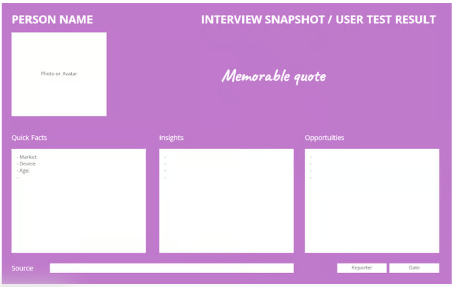
The snapshot includes:
You should revisit your test after every two to three runs. Look at the test results and ask yourself:
It may be that iterating every two or three sessions is too extreme and will make it harder to analyze and compare overall results. I wouldn’t worry about that, though.
Moderated usability tests are qualitative in nature, and the main goal here is to explore as many diverse insights as possible.
You can always follow up with unmoderated tests to build confidence in specific areas.
Moderated usability tests are powerful tools that can bring countless insights and learnings.
They are also a costly tool. You need a skilled researcher to conduct one, moderate those tests manually, and invest adequate time to wrap them up properly. Moderated tests are usually longer and more stressful to participants, so you need a higher incentive to recruit someone.
Given all that, when is the best time to use moderated tests?
They are best suited for early validations. If you are at a stage when you already have a developed idea for a feature that can be prototyped, jump into moderated testing right away.
The closer you are to the actual development, the less sense it makes to run moderated tests. Why invest time and energy if it’s too late to drastically pivot anyway?
Also, you can probably already see that I’m a big fan of combining user interviews with user tests. If you have already recruited a person and scheduled a time in your calendar to moderate a session, why not kill two birds with one stone?
I use moderated usability tests as a tool that delivers significant new insights about users and their attitudes toward the tested solution.
If you need the insights, go for moderated testing.
If you are at a stage when you need solution validation, other research methods, including unmoderated tests, will be a better and often cheaper option.
LogRocket's Galileo AI watches sessions and understands user feedback for you, automating the most time-intensive parts of your job and giving you more time to focus on great design.
See how design choices, interactions, and issues affect your users — get a demo of LogRocket today.
A three-week mobile banking project taught me that the “proper” UX process is not always realistic. Sometimes, the better approach is to work with what you know, identify what you still need to learn, and make the strongest decision possible under real constraints.
A/B testing compares two versions of a design to see which performs better with real users. Here’s how UX teams can use it to test hypotheses, measure outcomes, and make smarter product decisions.
This case study shows how one ad experience redesign increased total ad exposure while lowering perceived friction, proving that timing and context can matter more than raw interruption.

As products evolve into ecosystems, navigation becomes a system-level challenge. This article explores how to align structure, context, and user journeys to create seamless movement across tools without confusion.