Information architecture (IA) is the art of organizing website or app content into a simple, intuitive navigation system. It ensures that visitors can quickly find what they need with minimal effort. That definition is starting to expand. Users don’t always find information by clicking through menus anymore. They might browse a category, type something into search, ask a conversational interface a complete question, or rely on an AI assistant to surface the information for them. The interface might change, but the need for information architecture doesn’t. All of these experiences still depend on having content that is clearly organized, labeled, related, and easy to retrieve.

This means modern information architecture isn’t only about helping users navigate from one page to another. It’s also about making information findable when users search or ask for it directly.
Jared Spool tweeted back in 2016 — “Great design, when done well, is invisible. If the user notices the design, it’s not good enough yet.” Well, the same idea applies to the discipline of information architecture.
There are numerous possible navigation paths on a marketing website or e-commerce app, whether purchasing a product or learning about its technical details. Each path has a starting point, a destination, and intermediary steps. Information architecture maps out these paths, organizes the sections by hierarchy, and labels individual pages with clear, descriptive names. And this approach helps users efficiently achieve their goals.
In this blog, I talk more about how information architecture enhances UX by reducing cognitive load through a simple navigation system that improves consistency across different user paths.
Editor’s note: This article was updated in October 2026 to reflect how AI assistants, conversational interfaces, and modern search are changing information architecture. We added guidance on designing for both browsing and querying, improving metadata and taxonomy, and making content easier for both users and AI-powered systems to find and interpret.
Six key components form the foundation of effective information architecture. And together, these elements create a user experience that improves content discoverability and boosts key metrics, such as conversion rates:
Additional considerations:
Creating the information architecture for a new or existing product is not an easy task.
A lot goes into creating a journey that allows users to navigate through the website or application — identifying the user’s desired paths, mapping out the roads and the different checkpoints, and labeling them accordingly. I’ll describe them in more detail below:
Start by determining the user goals. These could be specific tasks they want to complete, such as finding a product, learning about a service, or contacting support.
What do users aim to complete when using your website or app? Conduct discovery sessions led by researchers to identify gaps between product and user needs.
It’s also helpful to think about how users might express the same goal in different ways. For example, someone looking for pricing information could navigate through Products > Plans, search for “enterprise pricing,” or ask an AI assistant, “Which plan supports SSO?” These are different interfaces for the same underlying intent. When planning your IA, map both the paths users might browse and the questions they might ask. Ideally, both should lead back to the same reliable source of information.
While user intent is key, you need to consider stakeholders’ requirements and expectations, too. For example, building brand awareness is different from driving sales.
Align metrics with C-level objectives. And whenever possible, run user research, interviews, and surveys to better understand user behavior. This step is crucial as it helps you develop personas based on these insights, making you feel more informed and prepared.
I’d suggest using tools like UserTesting or UserZoom to conduct qualitative research, such as interviews or empathy mapping. If your budget is constrained, though, leverage trials or free software like SurveyMonkey or Typeform to create surveys.
Use a spreadsheet to create an inventory of all the existing pages, articles, and media for your product. For a new product, list all pages.
I like to use Google Sheets or Microsoft Excel and the following indicators to classify content:
As search and AI systems become another way users access information, your inventory should document not only where content lives, but what it means and how it relates to other content. Consider adding fields for the primary topic or category, synonyms and alternate terminology, related content, content owner, and the last reviewed or updated date.
Create a visual representation of the content. Develop a sitemap or navigation diagram using either Figma or a sitemap plugin to visually represent the product’s structure. Update this sitemap as research informs better groupings or hierarchies.
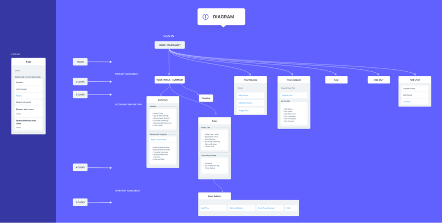
Once your sitemap is developed, it’s time to test and refine it. Test out aspects like navigation and groups using tools like OptimalWorkshop:
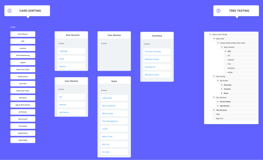
With your research complete, it’s time to design how users will move through and retrieve information. Collaborate with UX writers to refine labels generated in the previous steps.
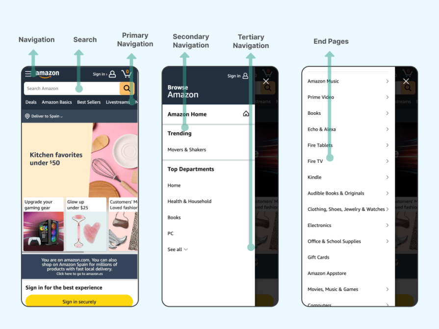
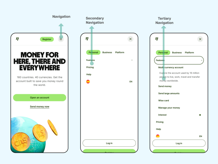
Define the menus — primary, secondary, and, if needed, tertiary. The rest of the navigation will branch from these anchors into subcategories until the final landing page. If search or conversational discovery is an important part of the product, also define how those experiences connect users back to categories, pages, filters, and other parts of the navigation system.
Design wireframes that will visually represent the navigation design and assist testers in navigating through them. Create interactive prototypes to test the navigation flows later.
Design software like Figma or Sketch can be used to design wireframes and craft prototypes.
Use usability testing to validate whether users can find and understand the information they need through the different discovery paths your product supports. This might include browsing navigation, using search, filtering content, or asking questions through a conversational interface.
Set success criteria based on the importance and complexity of each task rather than relying on a universal benchmark. A critical support or payment task, for example, may require a much higher success rate than exploratory browsing.
To review the performance of a product and the success of the information architecture, define a few key performance indicators (KPIs). Here are a few essential ones to begin with:
You might need a data person to create all these tracking elements so that you can make data-driven decisions to refine the information architecture and build a user-friendly product.
Once the design is validated, it’s time to implement. Make sure the design is responsive and adaptable to mobile and desktop screens.
Your documentation should include final designs, sitemaps, labels, translations, and any other insights or documents needed by the development team and stakeholders. Use Confluence or use free tools like Google Docs.
And then, of course, the last step is to collaborate with developers to implement the final information architecture and ensure everything goes as planned.
AI assistants haven’t made information architecture less important. In many cases, they’ve made it less visible.
A user might now ask a question and receive an answer without ever opening a menu or browsing a category. But underneath that experience, the system still needs to understand what content exists, how different pieces of information relate to each other, which information is current, and where the answer came from.
Traditional navigation is still useful when users are exploring, comparing options, or aren’t sure exactly what they need. Search and conversational interfaces are more useful when someone arrives with a specific question or goal.
Good information architecture should support both.
A user might browse from Support to Billing, search for “refund policy,” or ask, “Can I get a refund after 30 days?” These paths look different to the user, but they should ultimately connect to the same accurate information.
AI can generate or summarize an answer, but it still needs information to retrieve.
Clear page titles, headings, taxonomies, metadata, and relationships between content help search systems understand what information is available and when it should be surfaced. If your content is duplicated, inconsistently labeled, poorly categorized, or out of date, adding an AI interface won’t solve the underlying findability problem.
It may simply make that problem harder for users to see.
Metadata has traditionally operated behind the interface, but it increasingly influences which information gets searched, filtered, summarized, or recommended.
Create consistent rules for categories, content types, product names, synonyms, dates, ownership, and relationships between pieces of content. AI can help teams generate or apply metadata at scale, but designers and content teams still need to define the taxonomy behind it and review whether those classifications make sense.
An AI-generated answer isn’t always the end of the user’s journey.
Users may want to inspect the original source, compare alternatives, refine their question, or continue through the product manually. Make it easy to move from an answer into the underlying information architecture by linking to relevant pages, maintaining context, and providing search or navigation alternatives.
The goal isn’t to replace menus with chat. It’s to create an information structure strong enough to support whichever interface the user chooses.
Amazon has built a complex but well-executed navigation system with millions of landing pages. The website has many groups and hierarchies. Despite that complexity, Amazon maintains a relatively understandable structure by combining categories, search, filters, and recommendations.
Apple, too, has hundreds of product offerings on its website. The navigation is minimalistic and clean, allowing users to find products without much distraction.
Wise proves that although banking offerings can be long and complex, a simple navigation highlighting the major features can give out the best UIs.
Information architecture is a complex but vital discipline that ensures users can easily find what they need while businesses benefit from improved metrics.
As interfaces continue to shift between navigation, search, conversational assistants, and other forms of discovery, the underlying challenge remains the same: users need to find the right information with as little friction as possible.
Good IA gives both users and the systems helping them a coherent structure to work from. The interfaces will keep changing, but that structure is what makes them useful.
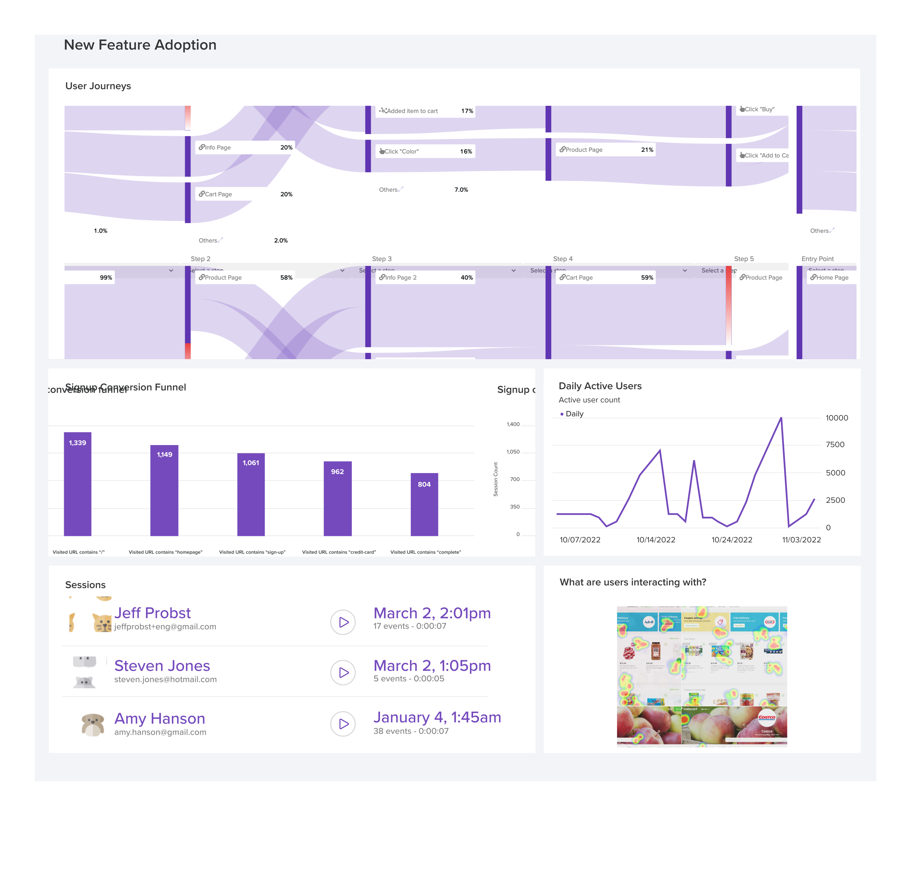
LogRocket's Galileo AI watches sessions and understands user feedback for you, automating the most time-intensive parts of your job and giving you more time to focus on great design.
See how design choices, interactions, and issues affect your users — get a demo of LogRocket today.

Your UX copy documentation isn’t just for human writers anymore. Here’s how to build a copy ecosystem that AI tools and agents can understand too.

Giving designers AI tools is the easy part. I share how our team used office hours, small experiments, hackathons, and shared failures to build better AI habits together.

Through this step-by-step guide, you can learn how to easily import files from Adobe Illustrator to Figma.

Growth design isn’t just about getting more users to convert. It’s about using research, experimentation, and data to improve activation, retention, and long-term user value without sacrificing trust or the quality of the experience.



 Learn more →