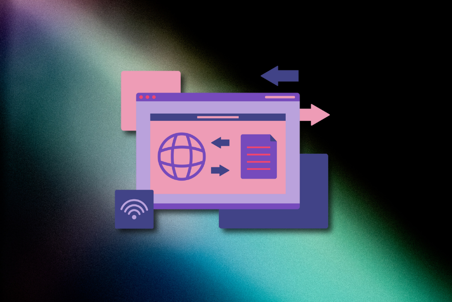
Icons have been with us for quite some time. The first digital icons trace back to the 90s. They’ve shaped the way we navigate websites, use apps, and interact with digital products.
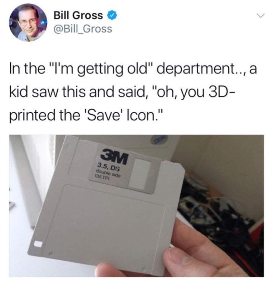
But just as we no longer rely on floppy disks for storage, some icons have outlived their welcome. 2025 calls for an upgrade, a chance to rethink which visual symbols still make sense and which need to evolve.
Let’s take a look at first, why iconography matters so much in UX design, and second, which icons are due for retirement or a modern makeover.
Icons convey meaning faster than words, guide users seamlessly through interfaces, and often provide a dash of aesthetic charm.
Icons are essential for:
See how most modern interfaces would become incomprehensible without them?
However, icons are not static. They must evolve with the times to stay relevant and intuitive. What was universal a decade ago might be puzzling or even obsolete in 2025.
While all icons evolve and change in detail as the trends change, just like company logos do, some are getting a drastic rebranding:
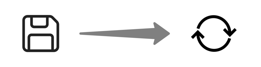
Most people under 25 don’t even know what a floppy disc is, and I have never held one in my hand. So why do we still use it to represent data saving in 2025?
Not to mention that we tend to save things in the cloud more often than on a physical device itself.
That’s why more products opt for the Sync icon, which represents synchronizing data between devices and the cloud.
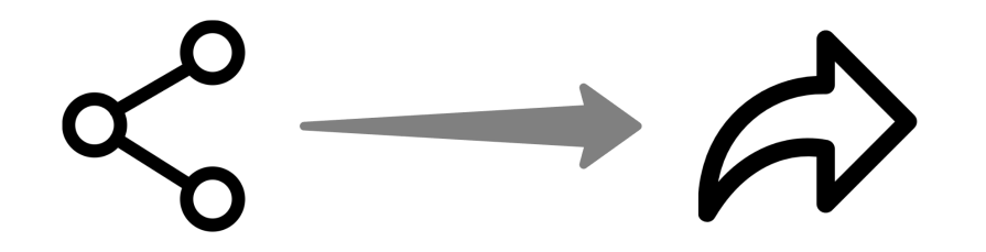
The original “share icon” depicted multiple computer nodes linked together. Although it still makes sense, it’s a very technical representation. And it feels rather outdated.
Although we still share complex data by connecting servers worldwide, most people use the share option to send the latest TikTok to a friend through WhatsApp.
The arrow icon does a better job representing that simplicity than connected nodes.
In the old days, e-mail was the main way to send messages through the internet. And so, using an envelope icon to represent sending messages made perfect sense.
But who sends “digital mail” nowadays? Instant messaging apps dominate, and an arrow or paper airplane icon feels more aligned with modern communication methods.
New “send” icons — mostly arrows resembling a paper airplane — are much more universal.
Even since mobile phones were popularized, the need for landline phones diminished greatly. So why do we keep using it as an icon for phone contact, even though most people will use a smartphone to call?
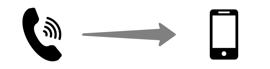
A simple mobile phone silhouette or other modern communication icons look more relevant.
As filtering options are becoming increasingly nuanced and advanced, the classic funnel icon doesn’t fully represent what’s possible.
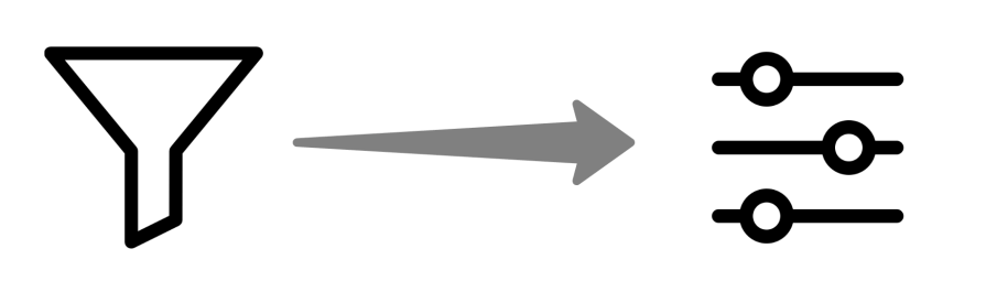
The “adjust” icon (usually represented by three sliders) not only looks more modern but also promises more sophisticated possibilities and customization than just narrowing down criteria.
Although shopping carts haven’t become obsolete, the way we shop has changed quite a lot.
There are people who buy things online before even holding a shopping cart for the first time. With the ability to order groceries online, some of us won’t ever need to use the shopping cart.
The frequency and size of orders also change. Instead of buying many items occasionally, we tend to buy one or two online every few days. The cart doesn’t make much sense when purchasing a pair of sneakers, does it?
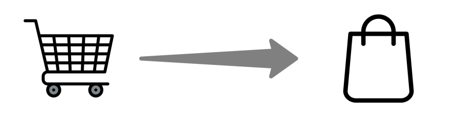
Sure, a cart works if your users are buying bulk groceries. But for fashion shoppers or folks ordering a single coffee mug, a sleek shopping bag might be more relatable.
In an increasingly digitalized world, we often don’t need to keep physical copies of documents. Without documents, there’s no need for file folders. Not to mention, we don’t store just documents but also digital files such as games, videos, and music.
More abstract representations of “data” might make more sense than an old-school file folder.
Many designers could challenge me now and say that we shouldn’t fight with established mental models and recognition patterns. And that’s a valid argument. Changing the Save icon to the Sync icon can make many interfaces confusing, especially for an older audience. People rely on mental models — associations they’ve formed over time — to navigate interfaces quickly.
But does it mean a floppy disc should stick with us for the next couple of hundred years? Not to mention that the recognition patterns are different depending on demographics.
While Mail might be an easily recognizable representation of sending a digital message for older people, the arrow makes much more sense for Gen Alpha, which uses mostly chats.
So, how do you solve this challenge?
If your product is used by a specific age segment, it’s easy. Follow the trends and recognition patterns your users use:
Products used by broader demographics are trickier. One way is to gradually replace icons one by one over the course of years to ensure that people understand what’s going on and get accustomed to new representations.
Another approach is to have two versions of the UI.
As crazy as it might sound, many interfaces are allowed to switch between “Old design” versus “New design”. Dynamic, context-aware icons could bridge the gap between familiarity and innovation. This way, you’ll have a “classic” mode with traditional icons and a “modern” mode with updated visuals. And that would be a bit harder to maintain, but then it allows you to accommodate both segments of users fully. Win.
A third option is not to change anything at all. The floppy disc, file folder, and mail will still be recognizable for years to come. Just keep in mind that many people may perceive your UI as outdated if you stick to old-school icons.
Icon design isn’t just about keeping up with trends. It’s about creating visuals that make users feel understood. Think of how Slack uses its unique emoji-style icons to inject personality. And look at Duolingo, where every icon matches its quirky, friendly tone.
Even subtle updates can make a difference. Spotify’s recent adjustments to its heart icon — from hollow to filled — show how tweaking familiar elements can improve clarity without losing recognition. Just roll out new icons to a small segment of your audience, gather feedback, and iterate. The basics.
After all, great UX is about meeting users where they are today — not where they were 10 years ago.

LogRocket's Galileo AI watches sessions and understands user feedback for you, automating the most time-intensive parts of your job and giving you more time to focus on great design.
See how design choices, interactions, and issues affect your users — get a demo of LogRocket today.

Traditional A/B testing splits traffic evenly, but multi-armed bandits dynamically send more users to the better-performing version. Here’s how the method works, where it helps, and when UX teams should use it over classic A/B testing.

AI agent simulations promise faster, lower-risk UX testing by replacing real users with AI-simulated personas. Here’s how the method works, where it falls short, and when designers should rely on simulated users versus real user testing.
A/B testing is great for comparing two versions of a design, but multivariate testing helps teams evaluate multiple design element combinations at once. Here’s how both methods work, how they differ, and when UX teams should use each one.

Design engineering has always lived between design and code. But with AI tools turning prompts into interfaces and code into editable canvases, that bridge is becoming a new way of building.

 Learn more →
