Words are crucial to a product’s usability. But if you’ve ever tried navigating an app in a different language, you’ll recognize the importance of inclusive UX copy.
Inclusive UX writing is one of the building blocks of inclusive design. Without it, you can’t create digital experiences that truly cater to the needs of everyone.
But what is inclusivity copy all about?
In this guide, I talk about what inclusive UX writing is, its benefits, and how you can write inclusive UX copy. I’ll center this blog on writing for a global audience – users with diverse cultural, linguistic, and geographical backgrounds.
In the context of UX writing, creating inclusive copy means ensuring that the written elements within a digital product intentionally consider the diverse spectrum of human experiences.
This means actively factoring in the needs of those often overlooked in digital content:
The focus of this guide is on UX writing for a global audience, so I’ll establish a definition of the term as our starting point.
Inclusive UX writing for a global audience means using UX copy and communication strategies that consider the diverse backgrounds, cultures, abilities, and experiences of users from various countries and regions.
This idea is driven by the Paradox of Specificity, which states that adapting our efforts to the needs of a more specific group will often result in solutions useful for a wide audience.
While the paradox of specificity is one of the main advantages of creating inclusive copy, there are other significant benefits for users and businesses.
When creating UX copy for a global audience, you should have two goals in mind — reducing the burden on non-native English readers and minimizing the risk of misunderstanding.
Here are five ways you can achieve these goals:
Clarity should be your top priority when writing UX copy for a global audience.
Whether you’re creating a single source text for different regions or planning to localize your copy, starting with a clear UX copy can help ensure that nothing gets lost in translation.
Take a note of these actionable tips to do this:
Whether we like to admit it or not, we’re all biased.
And of all our biases in content designs, ability bias is one of the sneakiest. This bias occurs when we use our abilities as a baseline when creating solutions, unintentionally excluding people with different abilities.
To check if bias is creeping into your work, ask yourself the following questions:
By constantly self-reflecting and seeking the opinions of others, you can reduce the bias in your copy to the barest minimum.
Our culture can influence the way we write. Similarly, our users’ culture can affect how they interpret our copy.
To bridge the cultural gap that can occur when writing for users with different cultural backgrounds, you should:
When writing UX copy for a global audience, you’re essentially writing for users with varying abilities.
To ensure that your copy is accessible to all members of your audience, regardless of their abilities:
Content testing is a crucial part of inclusive UX writing. There are various ways to ensure your content is appropriate for the intended audience, such as A/B testing, highlighter testing, and cloze testing.
However, when extensive user research is not feasible, at the very least, you should do the following to ensure inclusivity:
What does inclusive UX writing look like in practice?
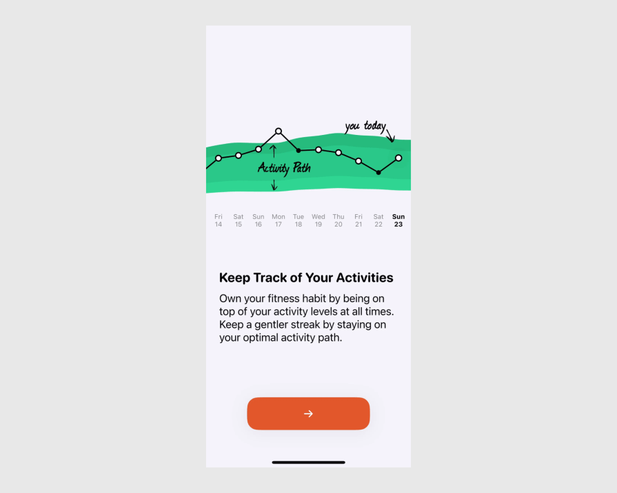
At first glance, the following example might look perfect for a global audience. But is it?

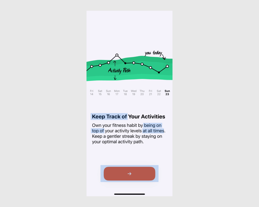
But there are some potential problem areas:

Here’s what a more inclusive version of our example screen will look like:

One of the most common mistakes in UX writing is focusing on the average user’s needs (the center of the bell curve). This approach might exclude those who fall outside this group.
A better approach is to focus on the needs of the outliers.
For example, if most of your users are native English speakers, focus on the minority who are non-native speakers. By addressing their needs, you create UX copy that is easier for everyone to read and understand.
Inclusive writing isn’t a task to just tick off our to-do list.
Rather, it’s an ongoing process that involves actively learning about our users and constantly improving how we write to create a more inclusive experience.
No one is an inclusion expert. The thing is, we’re naturally more inclined to exclude.
So, instead of striving for a perfectly inclusive solution that might end up serving no one, focus on getting a bit better at inclusion.
Considering inclusion efforts as a final step before launching your product can be more expensive and time-consuming in the long run.
You might need to rewrite significant portions of your UX copy to fix problems. But if you prioritize inclusion from the start, you can build inclusive language into your copy, avoiding expensive rewrites later.
Inclusion isn’t about being nice.
When we see inclusion as the right thing to do or a requirement we have to meet, we end up only satisfying the minimum requirements. It’s better to approach inclusion as an essential aspect of effective communication and business strategy.
When you create digital content, people will access it from various parts of the world. And these users will have diverse cultural, linguistic, and geographical backgrounds.
To ensure your UX copy enhances their experience, you must prioritize inclusion.
By following the strategies covered in this guide, you can craft UX copy that is both effective and inclusive.
But remember — inclusive UX writing is not a one-off task; it’s a continuous process that requires active learning and an open mind.
By constantly challenging our assumptions and being open to new ways of thinking and communicating, we can create truly inclusive digital experiences.
LogRocket's Galileo AI watches sessions and understands user feedback for you, automating the most time-intensive parts of your job and giving you more time to focus on great design.
See how design choices, interactions, and issues affect your users — get a demo of LogRocket today.

A three-week mobile banking project taught me that the “proper” UX process is not always realistic. Sometimes, the better approach is to work with what you know, identify what you still need to learn, and make the strongest decision possible under real constraints.

A/B testing compares two versions of a design to see which performs better with real users. Here’s how UX teams can use it to test hypotheses, measure outcomes, and make smarter product decisions.

This case study shows how one ad experience redesign increased total ad exposure while lowering perceived friction, proving that timing and context can matter more than raw interruption.

As products evolve into ecosystems, navigation becomes a system-level challenge. This article explores how to align structure, context, and user journeys to create seamless movement across tools without confusion.