Design trends come and go, and blindly following them can be risky. And at the same time, users expect UIs to feel modern and not outdated. But then, blindly following trends can lead to usability issues and inconsistencies. Trends should serve user experience, reinforcing clarity and functionality rather than overshadowing them.

Take dark mode, for example. It started as a trend but quickly proved its worth by improving readability in low-light conditions and reducing eye strain. On the other hand, neo-brutalism, with its stark visuals and unconventional layouts, doesn’t always translate well into functional design.
The key is balance — knowing when a trend elevates the user experience and when it merely adds noise.
In this article, I will explore how to evaluate trends critically, when to adopt them, and when to let them pass. Let’s start.
As designers, staying up-to-date with industry trends is part of the job. This does not mean applying every trend blindly, but being informed helps avoid outdated UI elements and design practices. I’ll talk more about that:
Keeping up with trends ensures your product aligns with current design standards and user expectations. While trends solely for their popularity shouldn’t dictate your design choices, ignoring them completely can make an interface feel neglected.
Take Apple’s transition from skeuomorphism to flat design in 2013.
With its realistic textures and shadows, Skeuomorphism helped users transition to digital interfaces. Apple leveraged this approach to make early iOS interfaces feel familiar, mimicking real-world objects like notepads and calculators. However, as flat design gained traction — adopted by Google and later by Apple in iOS 7 — skeuomorphic interfaces quickly felt outdated, prompting a shift towards a cleaner, more scalable design language.
Look at the calculator for reference:
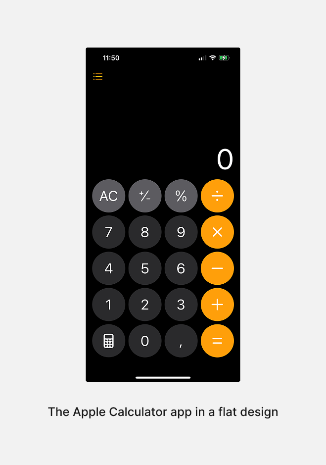
This shift highlights how some trends evolve into long-term design styles. Products that fail to adapt to meaningful trends risk losing credibility and user trust.
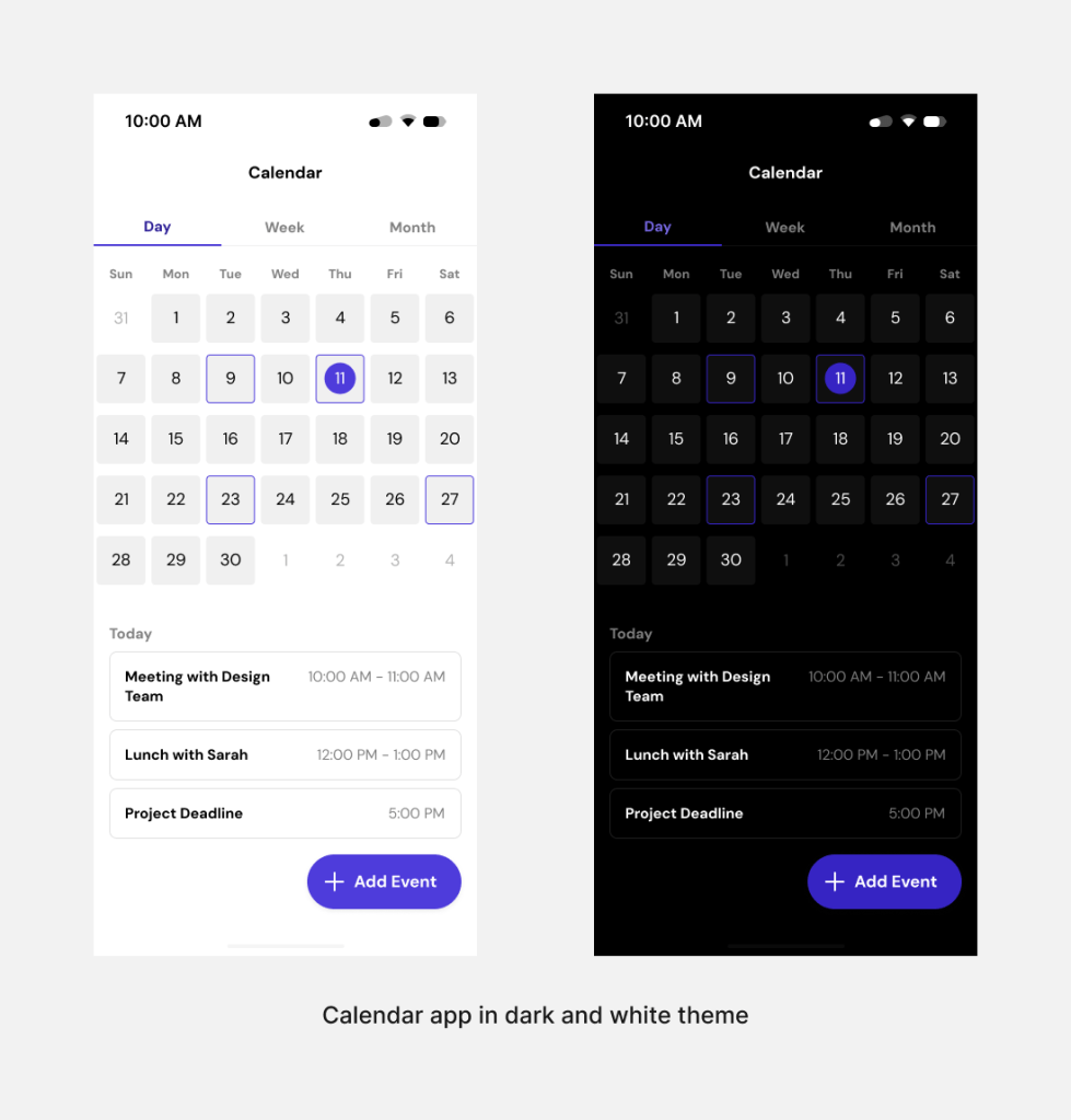
One key factor in evaluating trends is user demand and expectations. Dark mode is a perfect example. Initially, most apps had light themes, but as some applications introduced dark mode, user adoption skyrocketed. The functional benefits — battery savings and reduced eye strain — drove widespread demand.
As more users requested dark mode, companies had to integrate it to stay competitive. When a trend shifts from novelty to expectation, its adoption becomes strategic rather than superficial.
A great example is the calendar app in dark and light themes — users now expect both options, not just as aesthetic choices but as functional necessities for different lighting conditions and accessibility needs:
Clients may request trendy UX design styles, but trends should always be evaluated for their effectiveness.
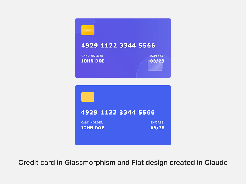
For example, a bank might ask for a glassmorphism design because it’s trendy. But:
These are important questions to ask before accepting the client’s request:
Ask the client why they want this design style. Their competitors may use it, or a manager likes it (which is not a good reason). Before accepting any design style, ask why they want it. Sometimes they have good reasons, but sometimes it’s just because it’s trendy.
I recommend creating the same design in different styles to show the client why a trend is good or not. This is easy to do today. If you have an HTML file, you can copy it to Claude, Cursor, or Windsurf and ask it to change the design style. This way, the client and you can quickly see if the design style meets the product’s needs:
Another thing to consider is the product stage. For a new product, there’s more flexibility to experiment. For an existing product, major UI shifts require careful consideration:
Before starting the change, ask yourself these questions to make it a smooth process.
Keeping up with trends is easy with platforms like Dribbble, Muzli, and Behance. Scroll through them, and you’ll see patterns that repeat in many apps — and that’s a trend. Observing the apps you use daily also provides insight into industry shifts.
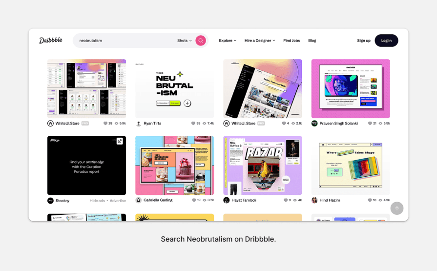
A recent example is the bento UI grid design, inspired by Japanese bento boxes, emphasizing modular, digestible sections within an interface. This layout enhances scannability and organization, making it particularly effective for dashboards and control panels.
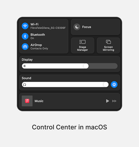
So, the first step is to know what exists.
When you notice a trend, you can research it to understand what it includes and why it’s popular.
First, if you see a pattern but don’t know its name, upload it to an AI tool to find out. Once you know the name, you can learn where the trend comes from, its characteristics, and how to use it. To go deeper, I recommend expert resources. There are many great YouTube channels, Medium articles, and famous blogs. You can also find information on TikTok and Instagram.
Long content is better for understanding, but short content can be useful too. For example, a short video showing different design examples from a specific trend can give you many ideas in 30 seconds or less.
The most important thing is to use credible resources with the correct information.
There’s a difference between being aware of a trend and mastering it. To learn a trend, you need to create something with it to understand it and how to apply it.
But will learning specific trends help you grow as a product designer? Yes, but since we have limited time, we need to focus on what helps us grow the most.
For example, if your company needs a specific trend, you should learn how to implement it. But if your company focuses on analyzing user data and you are inexperienced at analyzing data, it’s better to focus on that. This is because it’s relevant to your current role.
So, while learning about new trends is helpful, mastering them is not always necessary:

Focus on what helps you grow, not just what’s trendy.
Some designers think you can understand a trend by reading about it, but the truth is, you really learn by working and designing with it.
I like to start working first and then read more deeply because it helps me understand better.
For example, if you want to study a trend like neumorphism, find a design that uses this style and copy it exactly. This will help you understand all the details, like colors, stroke widths, shadows, and spacing.
You can also start designing your product with this trend right away. Don’t be afraid to make mistakes. It’s part of the process. Making mistakes and iterating is how you improve and fully understand the trend.
I also suggest AI tools for design. For example, you can use Lovable to create your design and then ask the AI to change it to a specific style. Then, tweak yourself to improve the AI’s work. This method is new, but it will become more popular among designers because it helps you work faster and get quick results.
Here are some points that will help you to prevent mistakes when thinking about adopting a trend or not:
A trend should only be adopted if it enhances the user experience.
Before integrating a trend, ask: Will this improve usability? If not, it may not be worth the effort.
Don’t ignore design principles when adding a new trend to the interface. Hierarchy, contrast, and typography selection are more important.
Sometimes, it is not straightforward how to use the trend. In these cases, there can be many problems that make the interface difficult to use, so you must solve them before using the trend.
For example, in a glassmorphism design, make sure the text on the glassmorphism element, like a card, is readable:
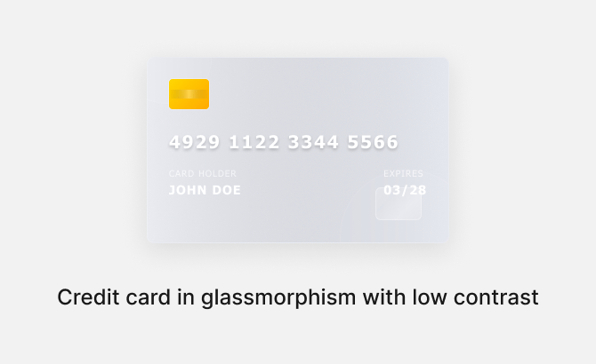
If you do not know how to fix it, play with the design until you get it. If it does not work, ask an AI tool like ChatGPT. You will quickly get an answer that solves the issue.
When adding a trend to the interface, it should support the brand, not fight against it.
Trends can be additional to the brand, which is the product or company’s identity, so use them carefully.
For example, Apple has adopted the bento design trend on its website. This trend focuses on organization, which fits the Apple brand, so they used minimalism with it. Neo-brutalist design, which is bolder and screen-heavy, might not work as well.
A good example is Gumroad, which uses neo-brutalism to characterize its brand. They use powerful colors, shapes, and bold design:
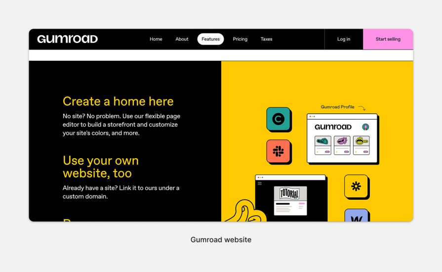
I believe that this style also supports their idea to empower creators to sell their products, so the bold visual supports the idea of empowering sellers.
When adapting a trend to the interface, remember both design and development costs:
Redesigns require time, coding, and stakeholder alignment. Consider feasibility before committing.
Some trends can also affect app or website performance, so be aware of this.
Adding animations to a website has become a big trend, especially with tools like Framer making it super easy to implement. But go overboard, and you risk slowing down your page. Heavy animations can bog down performance, leading to longer load times and a frustrating user experience.
On the flip side, keeping things simple — like opting for flat design — can actually speed things up. Flat design relies on minimal visuals and basic shapes, which are lightweight and quick to load, making for a smoother, more efficient experience.
Once a trend is integrated, track KPIs to measure its success:
If a trend negatively impacts usability or business goals, reconsider its implementation.
Trends can modernize interfaces and improve usability, but blind adoption can create problems. The best approach is to be strategic — adopting trends that align with user needs, brand identity, and core design principles.
Here’s a quick checklist for you:
A trend is worth adopting when:
Adapting to a trend is not ideal when:
Trends come and go, but great UX design endures. The key is knowing which trends to embrace and which to leave behind.
LogRocket's Galileo AI watches sessions and understands user feedback for you, automating the most time-intensive parts of your job and giving you more time to focus on great design.
See how design choices, interactions, and issues affect your users — get a demo of LogRocket today.

Multimodal UX goes beyond designing for screens. Learn how context-aware systems, progressive modality, failover modes, and accessibility-first design create better digital product experiences.
Learn how context-aware mode prioritization and seamless transitions improve multimodal UX and reduce mode confusion.

Research is becoming more democratized, product cycles are accelerating, and AI is transforming synthesis and ResearchOps. Here are the three trends shaping UX research in 2026.

Voice support is not the same as multimodal UX. Here’s how to design systems with true mode continuity and context-aware interactions.