Editor’s note: This article was updated on 12 November 2024 to incorporate both UX and UI perspectives, expand on core principles and types of filters, include specific guidance for search filters and advanced filtering UI design, and more.

When designing a user interface for a product with large amounts of content or data, it’s important to create an intuitive filtering UI design that delivers a seamless user experience. Effective search filters are crucial in improving UX, allowing users to quickly narrow down their options and find exactly what they’re looking for without having to scroll through irrelevant results.
Benefits of good filtering UI design include simplifying decision-making, saving precious time, and more:
However, search filters can be implemented incorrectly, hurting the user experience and negatively impacting metrics like the bounce rate. A poorly implemented filtering UI design can have significant drawbacks:
It’s not enough to simply have search filters available. They need to be designed and implemented well to support a better user experience. So what should we avoid when designing the search filtering UI for our products? And what principles can we apply to deliver a better UX?
In this post, we’ll examine various examples of poorly implemented search filters and highlight some tips you can use to produce a satisfying filtering experience. Let’s begin!
Designing a good filtering UI and UX requires you to carefully consider various usability principles that help any design meet its user’s needs. Let’s look at some core principles that will inform the design of our application filter systems.
Filters must allow users to find what they are looking for quickly and accurately. To achieve this, the filtering interface should provide clear, context-relevant options that align with the user’s search goals.
For instance, an ecommerce website might allow filtering by price, brand, or product rating, helping users access the items they want without unnecessary effort. This part might seem obvious, but it needs to be done right.
Ask yourself: Does the filter UI allow users to accurately refine their choices and access the desired information?
Efficiency in filter UI/UX revolves around minimizing the number of steps required for users to find what they’re searching for. This could involve implementing features like dynamic filtering, where results update in real-time as filters are selected, or pre-selecting commonly used filters based on user preferences.
A system that supports common user tasks with minimal input enables higher productivity.
Ask yourself: Once users understand the filter system, can they use it to refine their search efficiently with minimal effort?
A good filter system should prevent users from making unintentional or irreversible actions, such as removing all applied filters accidentally or selecting contradictory criteria. Design safeguards such as confirmation dialogues when clearing filters or visual cues highlighting incompatible filter combinations to help reduce user errors.
Ask yourself: What measures are in place to prevent errors in filter usage, and how easily can users recover if mistakes occur?
Filters should be tailored to the specific context and provide functionality that supports the user’s goals. For example, a job board should include filters for location, job type, and experience level. Irrelevant or redundant filters can frustrate users and diminish the system’s utility.
Ask yourself: Does the filter offer a comprehensive and appropriate set of options for refining results in meaningful ways?
Shareability is a UX feature that can increase user satisfaction, especially in a collaborative context. A filter system should allow users to share their refined results easily while preserving the selected filters. This is especially valuable in collaborative contexts, such as planning trips, reviewing team projects, or recommending products.
Implementing features like export options or sharable URLs that encode the filter parameters ensures that other users can view the same filtered results without needing to reapply the criteria. This not only enhances usability but also fosters a seamless collaborative experience.
Ask yourself: Does the filter system provide a mechanism for users to share their refined results while maintaining the same filters across devices or with other users?
Different types of filter UI patterns are tailored to various data types and user needs. Let’s go over some common filter design types:
| Filter type | Purpose | Example | UI considerations | UX considerations |
|---|---|---|---|---|
| Sorting filters | Sorting filters allow users to organize the content in a hierarchical order. | An ecommerce app that allows users to sort products by price, rating, or new arrivals. | – Use a collapsible menu – Provide a clear default that aligns with typical user behavior (e.g., Recommended, Relevance) – Prioritize these filters’ visibility as they’re among the first things shoppers search for |
– Sorting should be fast and intuitive. – Allow for resetting or removing sorting. |
| Checkbox filters | Checkbox filters allow users to select multiple options within a category. This method is particularly useful when users want to create a search query composed of multiple products for easy comparison. | A travel booking site where users can filter hotel results by amenities, star rating, or location. | – Use a vertical list for multiple checkboxes. – Display the number of matching items dynamically (e.g., “Pet-friendly (20)”). |
– Allow multi-selection – Use progressive disclosure for long lists (e.g., “Show more”). |
| Range filters | Range filters allow users to narrow down results by specifying a minimum and maximum value for certain criteria, such as price, size, or ratings. This empowers users to quickly find products that fall within their desired range, enhancing the overall shopping experience. | A real estate app that allows users to specify the square footage and price range to curate a list of potential properties from a database. | – Use a slider with dual handles for range selection. – Allow manual input of values for precision. |
– Show real-time updates of results as the range parameters change. – Use appropriate scales |
| Dropdown filters | Dropdown filters offer a list of predefined options for users to choose from, suitable for categories with limited options. | A job board that users can filter by industry, role, employment type, and salary. | – Compact dropdown menus with searchable options. – Group related options logically (e.g., industries by sector). |
– Ensure dropdowns are keyboard and screen-reader accessible. – Close the dropdown after selection to reduce clicks. |
| Toggle filters | Used for binary or on/off selections, toggle filters are ideal for simple, mutually exclusive filtering options. | An online store where you can show or hide out-of-stock items, products with or without a specific feature, or items on clearance. | – Use clear and simple switch controls (e.g., sliders or buttons). – Position toggles at the top or in a highly visible location. |
– Reflect changes immediately when toggled (e.g., refresh results dynamically). – Use straightforward labels (e.g., “Available Now” instead of “Toggle Availability”). |
One final filter type worth mentioning is tag filters. Similar to dropdown filters, tag filters offer an array of categories (tags) to offer a more precise search result. Spotify uses this on their search page when you search for a song or artist.
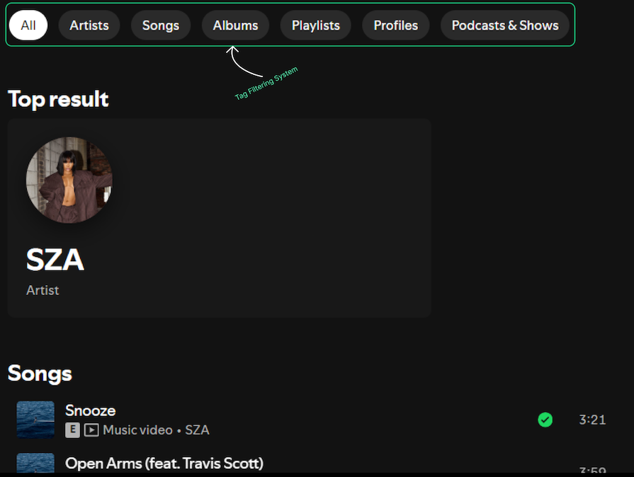
You will see these filters in action momentarily. However, the way filters are grouped into categories (e.g., gender, color, product type, availability) is just as important as the mechanism used to filter (e.g., toggles, sliders, dropdowns).
Thoughtful categorization ensures that users can intuitively find what they’re looking for, while a well-designed filter mechanism enhances interaction and satisfaction. You should maintain a balanced approach to both aspects is critical for providing a seamless user experience.
Delivering the best filtering experience requires balancing both UX and UI considerations. You should know your product well enough to understand when to prioritize one over the other.
The primary focus of filter UX is on usability — ensuring the filtering system meets users’ needs intuitively and efficiently. We already covered some key aspects like:
You should prioritize UX if your goals are focused on:
The focus of filter UI is on visual design and interaction elements—ensuring that the filtering system is aesthetically pleasing, consistent, and easy to interact with. Key aspects include:
You should prioritize UI if your goals are focused on:
While UX ensures the filtering process is logical and goal-oriented, UI transforms that functionality into a visually engaging and intuitive experience. For example:
Striking the right balance is essential. In my view, the UX of a filter system matters more because it is naturally more complex to design an intuitive and effective filtering experience than to create the best filter interface out there. The most effective designs prioritize usability without compromising visual appeal, ensuring both functional and delightful interactions.
Implementing effective filters requires careful consideration of user needs and the nature of your content. Here are some key principles to follow:
As mentioned earlier, a search filter is one of the first components a user looks for when they land on your ecommerce product. It is, therefore, necessary to position this element strategically, ensuring your user has no friction trying to reach it.
Here’s a comparison of a few common filter component placements:
| Location | Pros | Cons |
|---|---|---|
| Sidebar | Allows for vertical scrolling; good for many filter options | Can take up valuable screen real estate on mobile devices |
| Inline | Integrates seamlessly with content; good for minimal filter options | Can be overlooked if not designed in such a way that captures attention without distracting users from their task |
| Filter bar | Highly visible; works well for both desktop and mobile | Limited space for complex filter options |
You will find various positioning methods across the web, so ensure you choose the placement that best suits your content and user needs. Let’s take the fashion store below for example:
The clothing company in the image makes a mistake by concealing the filter panel behind a fairly unnoticeable “Filters” button. Forcing the user to make an extra click to view the panel is unnecessary — especially when there is enough real estate to display it in desktop view. The panel also visually cuts off some results when expanded.
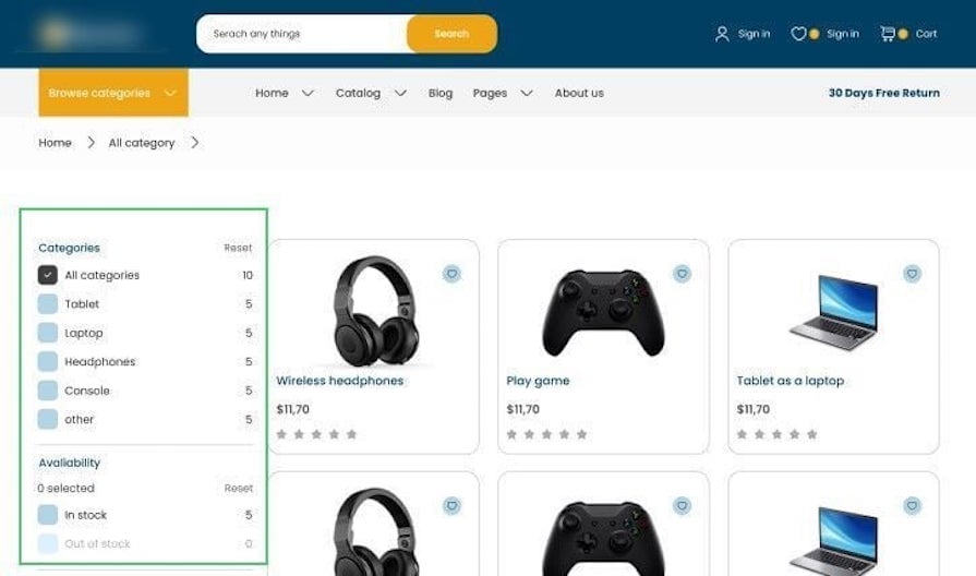
A better approach to this would be to keep the panel visible at all times, and reserve the button for a mobile view:
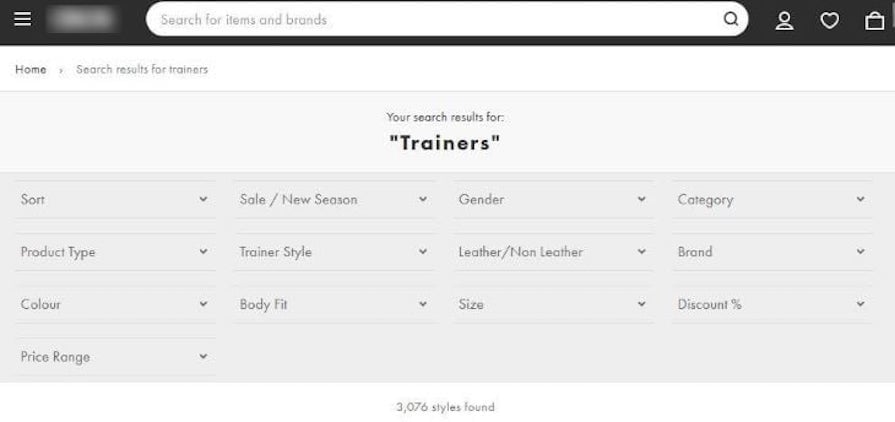
Another example of a satisfactory filter layout is this sticky, horizontal filter panel that stays in view as a user navigates the product listing:
In general, the position of a filter system helps the user complete their tasks faster.
Making all applied filters visible to the user will help them better understand how these filters affect their search results. This feedback mechanism will go a long way in ensuring your users aren’t frustrated when they don’t find what they want since they can easily tweak the filter parameters.
It is also necessary to make it easy for the user to remove the applied filters. This allows them to easily modify their search experience when they are not getting the results they want, or if they want to see more (or fewer) results.
Here’s an example of this in action:
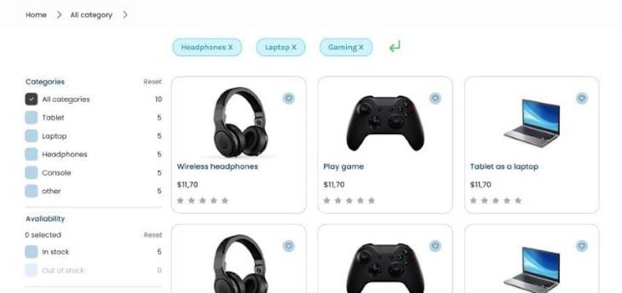
Overall, the goal of making applied filters visible and easy to remove is to give the user more control and flexibility in their search or browsing experience and to make it easier for them to find what they are looking for.
Providing clear and descriptive labels for your product’s filtering system can help users find what they are looking for more easily. When labels are not clear or descriptive enough, users may have difficulty understanding what the filter does or what content will be included when they apply it.
Avoid using vague labels like “Other” or abbreviations, as they can confuse users about what results they’ll get. Instead, use clear and descriptive labels to enhance the user experience and encourage effective use of the filtering system.
Storing a user’s filter configurations for future reuse is a huge bonus for any product’s user experience. In doing so, the user can easily pick up where they left off or build on top of previous filter parameters to create a new query. This can lead to better user satisfaction and increased usage of your filter system:
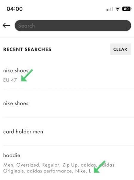
This technique can be beneficial if the filters are complex or if the users want to apply the same filters to multiple sets of data.
Feedback is a vital component of any successful design used to engage, explain, and improve user satisfaction. There are a few ways that filtering systems can provide good feedback to end users:
Overall, good feedback from a filtering system should help the user understand how the filters affect their results and give them the tools they need to find what they are looking for.
An organized catalog with each item tagged correctly in a tagging system will provide a pleasant filtering experience to end users. If an item is appropriately tagged to its correct category, a filter can easily make its computations based on these tags and return relevant results to the user.
Ecommerce and media giants that keep their catalogs organized are already benefiting from this practice, allowing them to retain their user’s attention:

Take Netflix, for example. It’s a common joke that users often spend more time scrolling through Netflix’s vast library than actually watching something, ending up with cold food and no show selected. As a solution, Netflix provides a collection of unique codes that a viewer can use to filter programs by categories like Sci-Fi, Anime, Classics, Horror, etc.:
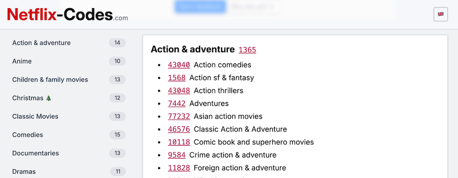
Searching Netflix using one of these codes will bring up collections of media that fall under that category:
This significantly cuts the searching time if the viewer has an idea of what genre they’re looking for. In general, having organized tags will be helpful for both your admin system and users.
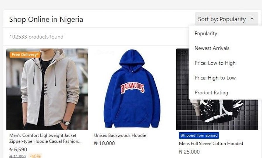
While filters give a user significant control over the organization of their search results, adding a sorting tool in the mix will greatly enhance the search experience. Sorting helps arrange data into meaningful order so that your users can analyze it more effectively.
Sorting can make it easier for a user to find the information they are looking for by organizing the data in a way that resonates with them.
For example, suppose a user is on a budget and is searching for an affordable item on a website. In that case, they may be able to find it more quickly if they have the option to sort the search results by price rather than the items being presented in random order:
In UX design, sorting and filtering are complementary tools that enhance the user experience by helping users manage large sets of data, but they serve distinct purposes:
While sorting and filtering are crucial for a positive user experience, they address different needs. Filtering helps users refine their search results while sorting enhances the structure and presentation of those results.
When filters are optimized for search, users can quickly narrow down results, ensuring a smoother and more productive experience. Below are strategies and specific practices to improve filtering UI for search-oriented tasks:
1. Progressive disclosure
Progressive disclosure helps manage complexity by revealing filters gradually based on user needs or context. Instead of overwhelming users with an extensive list of options upfront, filters can be categorized and collapsed, allowing users to expand only what they need. For instance:
2. Dynamic updates
Filters that update search results in real-time as users make selections create a more interactive and responsive experience. This eliminates the need for users to repeatedly apply and check filters, streamlining the search process. Key considerations include:
3. User-friendly layouts
An effective layout ensures filters are easy to find, understand, and use. Key aspects include:
In data-heavy enterprise applications, filtering UI design becomes critical for managing and presenting vast amounts of information in a user-friendly way. An advanced filtering system must cater to users who require precision and efficiency in their workflows, as well as consider things like:
We’ll use LinkedIn as a case study to explain how we can approach designing effective filtering experiences for users, exploring key considerations for designing multi-layered, nested, and configurable filter systems for complex applications.
Multi-layered filters allow users to refine results progressively without feeling overwhelmed:
For instance, on LinkedIn, recruiters can filter candidates by location, industry, and skills, refining each layer to match suitable profiles.
Nested filters address use cases where filter options depend on previous selections. They are essential for maintaining context and ensuring accurate results in complex queries:
Enterprise applications serve a wide range of users with different objectives. Configurable filters allow users to customize the filtering interface to suit their specific workflows.
While filters can significantly enhance user experience, designing an effective filter system comes with its own set of challenges. Here are some key gotchas to be aware of:
Designing an effective filter system is more than just adding a few dropdown menus or checkboxes. It’s about creating an intuitive, user-centric experience that helps people find exactly what they need with minimal friction.
Carefully considering principles like effectiveness, efficiency, safety, and utility can help you transform a potentially overwhelming search process into a smooth, almost effortless journey. The key is to balance complex functionality with visual simplicity, ensuring that users feel empowered rather than overwhelmed by the filtering options.
Ultimately, a well-designed filter system is a critical component of user experience that can significantly impact conversion rates, user satisfaction, and overall product success. Whether you’re building an ecommerce platform, a job board, or a media streaming service, investing time in thoughtful filter design pays dividends.
Make sure you prioritize user needs, provide clear feedback, and continuously iterate based on user behavior to create a filtering interface that not only meets user expectations but speeds up your business’ conversion process. Remember, the most effective filters are those that feel so natural and intuitive that users hardly notice they’re using them — they simply find what they want, when they want it.
Header image source: IconScout
LogRocket's Galileo AI watches sessions and understands user feedback for you, automating the most time-intensive parts of your job and giving you more time to focus on great design.
See how design choices, interactions, and issues affect your users — get a demo of LogRocket today.

As products evolve into ecosystems, navigation becomes a system-level challenge. This article explores how to align structure, context, and user journeys to create seamless movement across tools without confusion.

Figma’s AI features have exploded in 2026 — from text generation and image editing to full UI drafts and code handoff. But speed isn’t the same as quality. This guide breaks down every major feature, what it’s good at, and where human judgment still does the heavy lifting.

Zero UI works well for screenless, voice-first experiences, but most digital products still require visual interaction. Here’s why multimodal UX offers a more scalable foundation for the future of design.

Multimodal UX goes beyond designing for screens. Learn how context-aware systems, progressive modality, failover modes, and accessibility-first design create better digital product experiences.