Since ChatGPT’s mainstream release in 2022, AI Large language models (LLMs) have continuously expanded their footprint on the digital landscape. They’ve gone multimodal — generating images, audio, even video. But their most reliable feature remains understanding and producing human language.
That core function is not reshaping how we search. No more skimming result pages or guessing the right keywords to find what you want. Ask a question in natural language, and an AI system will process information from relevant data sources across the internet to generate a coherent, well-sourced, and often accurate answer in one go.
This shift isn’t hype anymore. We’re now four years into the LLM era, and AI capabilities are becoming infrastructure. In many products, especially search-driven ones, AI isn’t just a feature — it is the interface.
For example, e-commerce shoppers can now find products and ask follow-up questions through conversational interfaces. In Google Photos, searching “Chinwike in glasses” actually returns photos of me wearing glasses. Nifty features like these are raising the bar for user experiences in modern apps.
In this article, we’ll explore best practices for designing AI-powered search experiences that go beyond novelty. Ones that are useful, trustworthy, and well-integrated into the broader product system. But first, we need to define what it really means for a product to be “AI-powered.”
Adding a model doesn’t mean your product is smart. The key variable is agency — how much thinking and doing you let the AI handle. Think of agency as a spectrum:
You’re not just searching — you’re delegating.
Now, contrast that with static systems, such as recommendation engines. They might feel automated, but don’t adapt or reason. This is where AI agents come in. From a UX lens, agents are high-level systems that support hands-off interactions. They leverage LLMs to understand goals, reason through steps, and take action within a product.
Note — In this article, I use AI agents and AI systems interchangeably.
AI is undeniably powerful — it helps us solve complex problems and find answers faster. But integrating this power comes with responsibility. And users have valid concerns.
Some feel that AI systems operate like black boxes — they generate results without clearly explaining how. Others struggle to phrase queries in a way the system understands. Some even find AI’s presence in everyday apps invasive or overwhelming.
These concerns point to core UX issues: trust, control, and clarity. If designers ignore these, the user experience suffers — no matter how advanced the underlying model may be.
So, how do we design around these pitfalls?
While researching this topic and exploring common challenges in AI-powered search, I developed a set of guidelines to help teams deliver more reliable, transparent, and user-centered experiences. Here’s the short list:
I also drew from the paper Guidelines for Human-AI Interaction, published by researchers at Microsoft and the University of Washington. They started with over 150 potential UX heuristics for AI systems, which they refined into 18 key principles through heuristic evaluations, a user study, and iterative feedback.
Some of these aligned directly with my own thinking, especially in the context of search and task-based AI. I’ve highlighted the most relevant ones below, along with two additional guidelines of my own:
Let’s review these guidelines using a problem-solution lens to illustrate how they apply to a real-world scenario. We’ll also validate these guidelines against well-known UX heuristics:
Related guideline — Help the user understand what the AI system can do
UX heuristic — Provide help and adequate documentation
When users try an AI-powered product, they often don’t know the scope of what’s available. Can it summarize? Recommend? Are there prompts or triggers they should know?
Solution — As soon as you onboard users, educate them on the possibilities and boundaries of your tool. Use onboarding demos, tooltips, welcome messages, and attach links to in-depth YouTube videos of your product. This sets user expectations at the start and reduces the cognitive load of figuring things out through trial and error.
This AI-powered email app called 0.email does this well:

Related guideline — Make clear how well the system can do what it can do
UX heuristic — Create a match between the system and the real world
Many AI products are introduced with ambitious marketing claims. But when users interact with the actual product, they discover it’s great at a few things, and just okay or even bad at others. That expectation gap creates confusion, frustration, and loss of trust.
Solution — Be transparent about the system’s strengths and weaknesses. Use microcopy, interface hints, or scoped modes to indicate where the model performs best. For example, ChatGPT uses system messages and contextual warnings to set expectations. Its footer even has a warning, “ChatGPT can make mistakes. Check important info.”
Related guideline — Make clear why the system did what it did
UX heuristic — Ensure visibility of system status
Humans are generally skeptical. Most users will want to understand the reasoning behind a solution, especially given the inherently probabilistic nature of AI models and their well-documented tendency to hallucinate. If you’ve spent any time pushing their limits on complex tasks like coding, you’ll know exactly what that means.
That’s why product teams need to be intentional about where and how they apply these models. In certain contexts, mistakes can carry real-world consequences. Think of a user relying on your expertly marketed AI-powered financial assistant, only for it to misclassify expenses and trigger a tax audit, mess up your taxes, and create legal consequences. One bad experience like that doesn’t just break trust; it can become a legal and reputational nightmare.
Here’s an example of DeepSeek R1’s reasoning model explaining its thought process when I asked it if the moon landing was faked:
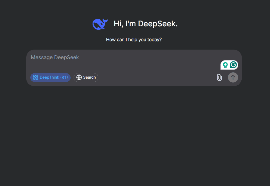
Note that your micro-explanations don’t need to expose your model’s algorithm to give the user a sense of understanding.
Related guidelines — Support efficient invocation and dismissal
UX heuristic — Enable user control and freedom
Even if users are familiar with the general domain, forming a precise query can involve a significant amount of trial and error. On the other hand, once the AI gets going, it can sometimes go off track or hallucinate, and users need a way to step in and regain control.
Solution — Lower the barrier to entry in your AI app by providing clear triggers. These can include call-to-action buttons that run example prompts, or predictive autocomplete that guides users on how to phrase their queries. Voice commands can also offer a low-friction way to express intent, especially in hands-free or mobile contexts.
Here’s an example of an e-commerce store with easy invocation and example prompts:

Similarly, users should always have the ability to interrupt or dismiss the AI at any point. If the system starts hallucinating or delivering irrelevant results, users need a clear escape hatch, whether it’s a stop button, an “undo,” or a quick toggle to pause AI assistance. Letting users easily opt in and out helps build trust, especially among those still skeptical of automated systems.
Related guidelines — Enable graceful recovery with fallback/failure states
UX heuristic — Help users recover from errors
Not every prompt will work, and that’s fine. What’s not acceptable is when the system gives up without helping the user recover. If a query returns no results or a confusing error with no explanation, the experience stalls.
Solution — Design the AI search interface to anticipate and gracefully handle instances where the system cannot fulfill a request or provides unsatisfactory results. This involves providing clear and informative feedback to the user when failure occurs.
Here’s an example where I’m asking an LLM to generate a visual for a task. Because this is an expensive task and there’s traffic on the network, the interface notifies me and offers to send a notification when the process is done:

Related guidelines — Strive for consistency
UX heuristic — Maintain consistency and standards
Striving for consistency is a fundamental principle of product design. It is crucial for allowing users to learn and navigate the interface effectively, making the system easier to remember.
Solution — Design the AI interface with consistency in mind, both within your product and in relation to the broader ecosystem. Internally, ensure that similar tasks follow the same interaction patterns, use consistent terminology, labels, and visual design. Externally, align with familiar conventions from other AI-powered tools so users don’t have to relearn common patterns.
For example, chat interfaces are now widely understood as a default for AI interactions, and icons like the star symbol have become recognizable indicators of AI-powered features.
Related guidelines — Remember recent user interactions
UX heuristic — Recognition rather than recall — the system should remember recent user interactions to reduce cognitive load and help users build on prior steps.
In multi-step search tasks, losing context is like starting over every time. Users expect the system to track what’s been said or selected in the same session. Anything less will feel broken.
Solution — Maintain short-term session memory. Store the user’s recent search queries. Allow users to commit certain instructions to the model’s memory. This streamlines the user experience and strengthens the bond between your users and your product.
Keep in mind that this solution is more about taking care of the “recall” for the user — that is, the model should remember what’s been said so the user doesn’t have to. You can strengthen the “recognition” aspect by designing features such as a scrollable chat history or the ability to view or request a summary of the items stored in the model’s memory:

Related guidelines — Provide global controls
UX heuristic — Enable user control and freedom
Giving users AI without giving them control will cause real friction. Some users may want the full experience, others will prefer a minimal one, and forcing one path usually frustrates both.
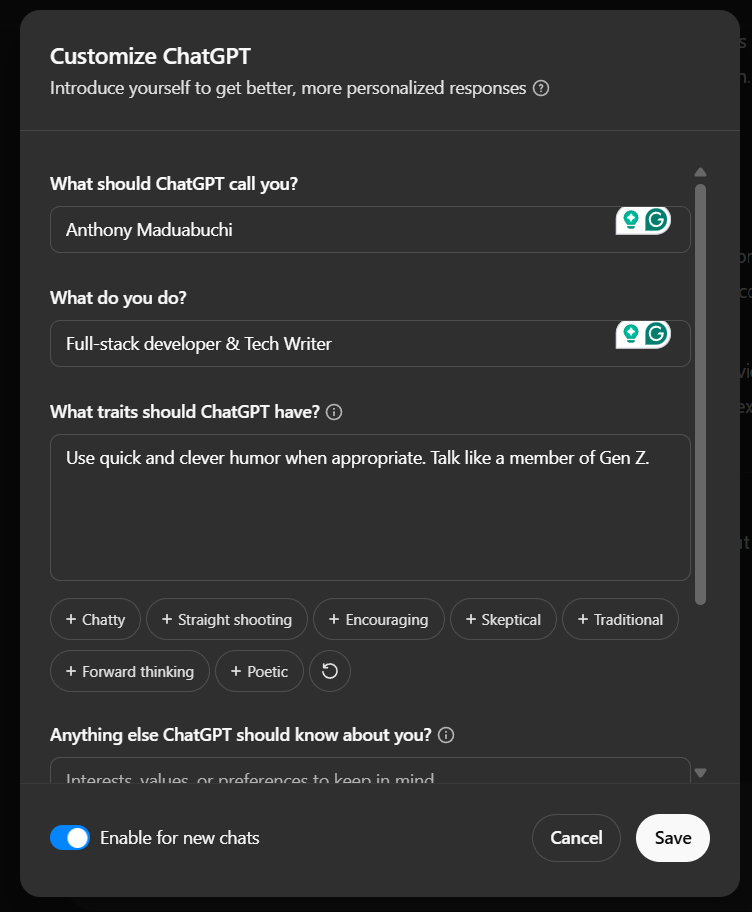
Solution — Offer granular control over AI features through a central settings hub. This is especially important for power users and those concerned about privacy.
ChatGPT’s personalization page is a great example — it allows users to toggle memory, adjust how the model responds, and more:
AI models are impressive, but that alone won’t make your product great. If you slap a powerful LLM under the hood but ignore how people actually use, trust, and control the system, you’ll end up with frustrated users — and churn.
From my experience, the difference between an AI feature people love and one they tolerate is how thoughtfully it’s designed. It’s not about chasing the biggest, flashiest model. It’s about focusing on real user needs: clarity, control, predictability, and respect.
If you’re building or integrating AI search, don’t treat it as magic you can just switch on. Invest time in:
This isn’t just best practice — it’s how you build trust and loyalty in a world flooded with AI hype. Because at the end of the day, users don’t just want smart tech. They want AI that feels like a helpful, reliable teammate.
If you take away one thing from this article, let it be this. Great AI UX isn’t about complexity — it’s about thoughtful simplicity. Get that right, and your users won’t just use your AI-powered search — they’ll rely on it.
LogRocket's Galileo AI watches sessions and understands user feedback for you, automating the most time-intensive parts of your job and giving you more time to focus on great design.
See how design choices, interactions, and issues affect your users — get a demo of LogRocket today.

Learn how context-aware mode prioritization and seamless transitions improve multimodal UX and reduce mode confusion.

Research is becoming more democratized, product cycles are accelerating, and AI is transforming synthesis and ResearchOps. Here are the three trends shaping UX research in 2026.

Voice support is not the same as multimodal UX. Here’s how to design systems with true mode continuity and context-aware interactions.

AI tools can generate beautiful UI concepts in minutes, but most teams struggle to integrate those outputs into real design systems. This guide explores why AI drifts toward generic patterns and how to build governed workflows that keep speed without sacrificing brand consistency.