Editor’s note: This article was updated on 12 February 2025, to include the latest trends in search bar UI, including voice search, natural language processing, and predictive search. We’ve also added insights on how modern tools and technologies can enhance search functionality, making it faster, smarter, and more user-friendly.

Should your website have a search bar? If your platform is content-heavy or ecommerce-driven, the answer is almost always yes. A well-designed search bar isn’t just a convenience — it’s a critical navigation tool that helps users find what they need quickly, reducing frustration and improving engagement. Especially in large catalogs or information-dense sites, users often rely on search to bypass complex menus and get straight to their goal.
In this article, I will explore the main considerations for designing an effective search bar with autocomplete. I’ll dive into usability principles, design choices, and common pitfalls to avoid. I’ll also share a list of tools and services to help you create a search bar that works it all out for your users.
Before you start designing any UI component for your website, step back and take into consideration how some basic best practices and principles of UX design can apply to search bars:
Not all searches are created equal. Users approach search bars with different goals, and understanding these intents is key to designing an effective search experience.
Generally, search behavior falls into three categories:
| Search Type | Common Use Cases | Example | UX Implications | Example User Journey |
|---|---|---|---|---|
| Navigational search | SaaS platforms, enterprise dashboards | A Notion user searching for “My Templates” to access saved layouts | Ensure quick, direct access to known locations |
|
| Transactional search | Ecommerce platforms | A user on ASOS searching for “men’s winter boots” with purchase intent | Provide high-relevance results, strong filtering, and clear CTAs |
|
| Informational search | Help centers, blogs, educational platforms | A Figma user searching “how to create a component” in the help docs | Ensure well-structured content, clear search snippets, and scannable results |
|
Jakob’s Law states that users prefer websites that are similar to others they have used in the past. In the case of search bar UX, that means the user expects to find the search bar placed in the same location that they find it on most other websites — at the top of a website, and both clear and easy to identify. Here’s what I mean:
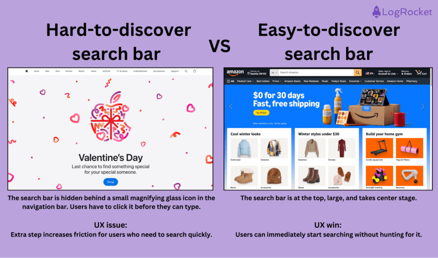
Ensure that the search bar integrates with the overall UI and maintains consistency in placement, typography, and interactions.
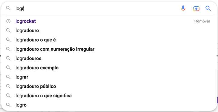
Bolding search terms in autocomplete results, for example, allows users to quickly scan through relevant matches.
Users prefer interfaces that are easy to understand and won’t demand cognitive effort, so use labels, icons, minimalism, and intuitive UI design in your search bar.
A great example of that would be Figma’s search bar. It doesn’t have an overwhelming design and provides an icon, so the user can quickly skim through the page and find it.
Additionally, a placeholder text provides a clue about what can be searched. Spotify does this exceptionally well with the placeholder text — “What do you want to play?”:

Your search algorithm should be able to understand the user’s intent and return the most relevant results. It should also be able to handle misspellings, synonyms, and other variations in the user’s search query.
To accomplish this, your developer team might use a combination of:
And, yes, we also have APIs that can do a good job — we will talk more about them later.
User feedback, too, can help you refine the search UI. Consider adding a small feedback mechanism (e.g., “Was this search result helpful?”) to continuously improve the search experience.
The search function should be fast and responsive. This means that it should return results quickly without making the user wait, and it should be able to handle large volumes of data without slowing down your page.
The specific amount of time that is considered acceptable will depend on the context and the user’s expectations, but users don’t want to wait. If you can, keep it below two seconds.
According to a study by Portent, a slow website will directly affect your conversions. So fast search results are super critical.
The search function should allow users to customize and refine their search results. This means that it should provide users with options to filter or sort their results, as well as to save and access their previous search queries and results.
Let’s look at LinkedIn:
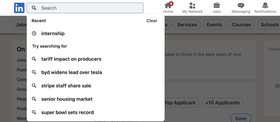
LinkedIn shows a list of trending searches based on what other users are looking for, such as popular job titles, skills, or companies.
Why it works — Trending searches encourage users to explore popular topics and help them discover opportunities they might not have considered. It also keeps the search experience dynamic and relevant to current trends.
Per Jakob’s Law, your search bar needs to be familiar enough for new users to navigate. A good search bar includes:

![]()


Imagine that your website was actually a physical space, and your user arrives at this space looking for something. Would that person need help?
A well-designed information architecture on a website helps users to find the content they’re searching for. However, if they’re in a hurry or need a little extra guidance to find something, a search bar can ease friction and enhance UX.
In general, a search bar is a valuable addition to any website that has a large amount of information or content:
In these cases, a search bar can help users easily find the information they’re looking for and make their experience on the website more efficient.
However, for websites with simple navigation and a small amount of content, it may be worth testing and verifying whether a search bar is truly necessary. For example, you may not need a search bar for sites like:
Overall, the decision to include a search bar on a website should be based on its specific needs and goals and the amount and complexity it contains.
Search has come a long way from just typing in keywords and hoping for the best. Today’s search experiences are smarter, faster, and more intuitive. Here are some modern trends that are changing how users find what they need:
With voice assistants like Siri, Google Assistant, and Alexa, more people are searching hands-free. Adding voice search to a website can make things easier, especially for mobile users or those who prefer talking over typing
Think of how Google’s search bar has a little microphone icon — tap it, say what you’re looking for, and get results without lifting a finger.
Instead of forcing users to type rigid keywords, modern search tools understand conversational language. That means users can search the way they naturally talk.
For example, instead of typing “laptop 16GB RAM under $1000,” someone might say, “I need a laptop with 16GB of RAM for less than $1000,” and still get relevant results.
Ever seen something cool but didn’t know what to call it? Search by image lets users upload a picture to find similar products, places, or even information.
Google Lens, for example, lets you snap a picture of a product, and it’ll find similar ones online. Shopping apps like Amazon and ASOS also let users upload images to find matching or related items.
Search is getting better at reading minds (well, almost). Autocomplete suggests search terms as users type, while predictive search offers results before they even finish their query.
Netflix doesn’t just autocomplete searches — it suggests movies or shows based on what you’ve watched before.
Search results are now tailored to individual users based on their history, preferences, and behavior.
Spotify, for example, personalizes search results by pushing your favorite genres, artists, and frequently played songs to the top.
Amazon’s search bar is large and prominent and supports autocomplete suggestions based on past searches, trending items, and categories:
Key features:
Amazon’s search bar UX design ensures users can quickly find what they’re looking for, even if they don’t type in the exact product name.
Google’s search bar is the gold standard for simplicity and efficiency, designed to handle everything from basic queries to complex search commands.
Key features:
See how Google proves that a simple design can still be incredibly powerful when backed by strong search algorithms:
How Google Search continues to improve results
When you come to Google Search, our goal is to connect you with useful information as quickly as possible. Learn how we continue to improve results and how Search has evolved to include not only a list of blue links to pages across the web, but also useful features to help you find what you’re looking for even faster.
Airbnb’s search bar helps users refine their search before they even hit enter, making the experience smooth and intuitive.
Key features:
Airbnb’s search reduces user effort by anticipating needs and providing the right inputs at the right time.
Building a search bar isn’t just about placing an input field on your site — it requires the right tools to ensure usability, efficiency, and accuracy. And depending on your website’s needs, you may need design systems, prototyping tools, or advanced search engine APIs. So here are some of the most useful tools categorized by their specific function:
Consistency is key in UI/UX design, and design systems provide a structured approach to ensure that search bars align with the overall look and feel of a website or app. These systems offer pre-designed components, guidelines, and best practices to maintain usability and coherence across platforms:
| Tool | Description | Best for |
| Material Design | Google’s comprehensive design framework for creating visually and functionally consistent UI components. | Websites and apps that need a standardized design system with responsive components. |
| Apple Human Interface Guidelines (HIG) | A set of official Apple guidelines ensuring consistency across iOS, macOS, watchOS, and tvOS. | Apple ecosystem apps requiring a native iOS/macOS look and feel. |
Before implementing a search bar, it’s important to test its usability and design through prototyping. These tools allow designers to create interactive mockups, test different search UI designs, and refine interactions based on user feedback:
| Tool | Description | Best for |
| Figma | A browser-based design tool that enables real-time collaboration for UI/UX mockups. | Teams that need cloud-based collaboration for UI/UX design. |
| Sketch | A lightweight, Mac-exclusive vector-based UI tool ideal for high-fidelity prototypes. | Designers working in macOS environments who need vector-based UI tools. |
| Adobe XD | A powerful tool for interactive prototyping with advanced animations and user testing. | Creating interactive search bar prototypes with realistic animations. |
If you want to add a functional search bar to your website without writing custom code, search bar generators can be an effective solution. These tools allow you to quickly integrate a search function by embedding a simple script or using a third-party service:
| Tool | Description | Best for |
| Google Custom Search | Embeds a Google-powered search engine into your site, filtering results to relevant pages. | Websites that want Google-powered search without a complex setup. |
| Freefind | A free, no-code search engine generator that can be embedded with a simple code snippet. | Small to medium websites needing a quick search bar solution. |
For sites built on CMS platforms like WordPress, plugins provide an easy way to enhance search functionality without requiring deep technical expertise. Many plugins offer advanced features such as autocomplete, relevance ranking, and filtering options:
| Tool | Description | Best for |
| WP Google Search | Integrates a Google-powered search bar into WordPress for more accurate results. | WordPress sites wanting to replace default search with Google’s engine. |
| Relevanssi | Enhances WordPress search with advanced indexing, fuzzy matching, and weighted results. | Content-heavy WordPress sites needing better filtering and relevance. |
| SearchWP | Allows deep customization of how search results are ranked and displayed. | Websites that need highly customizable on-site search. |
For developers looking to build a fully customized search experience, search engine APIs provide flexible options for indexing, ranking, and displaying results. These APIs integrate advanced features like AI-driven ranking and real-time search updates:
| Tool | Description | Best for |
| Google Custom Search API | Enables a Google-powered search tailored to specific sites or the entire web. | Websites wanting Google-level search within their own domains. |
| Algolia API | Provides ultra-fast, predictive search with AI-powered personalization. | Ecommerce and content-heavy sites needing instant, smart search. |
| Elasticsearch | A scalable, open-source search engine optimized for handling vast data in real time. | Large-scale applications requiring powerful search and analytics. |
Accessibility, of course, should be a priority when designing search functionality. These tools help improve usability for all users, including those with disabilities:
| Tool | Description | Best for |
| searchBOX Accessibility Plugin | Ensures search bars are compatible with screen readers and keyboard navigation. | Websites prioritizing WCAG-compliant search experiences. |
| Lunr.js | A lightweight JavaScript search engine that supports fuzzy matching and accessibility features. | Developers wanting an easy-to-integrate, accessible on-site search. |
| Voice Search API (Web Speech API) | Enables hands-free search functionality through speech recognition. | Websites that want to support voice-based search for accessibility and convenience. |
A key takeaway from this discussion is that deciding whether or not to incorporate a search bar depends on the size and nature of your website’s content.
A search bar with autocomplete is a game-changer for content-rich platforms like ecommerce sites, SaaS tools, or educational resources. It not only enhances discoverability but also streamlines user navigation by providing faster access to relevant results. The key is to design a search bar that reflects the user’s intent, integrates seamlessly with your site, and utilizes modern trends like voice search and predictive text.
Take the time to carefully craft a search bar that supports your users’ goals, and you’ll boost both the usability and overall experience of your site. With the right tools and approach, your search bar can be an essential feature, helping users find exactly what they need in no time.
LogRocket's Galileo AI watches sessions and understands user feedback for you, automating the most time-intensive parts of your job and giving you more time to focus on great design.
See how design choices, interactions, and issues affect your users — get a demo of LogRocket today.
A three-week mobile banking project taught me that the “proper” UX process is not always realistic. Sometimes, the better approach is to work with what you know, identify what you still need to learn, and make the strongest decision possible under real constraints.
A/B testing compares two versions of a design to see which performs better with real users. Here’s how UX teams can use it to test hypotheses, measure outcomes, and make smarter product decisions.
This case study shows how one ad experience redesign increased total ad exposure while lowering perceived friction, proving that timing and context can matter more than raw interruption.

As products evolve into ecosystems, navigation becomes a system-level challenge. This article explores how to align structure, context, and user journeys to create seamless movement across tools without confusion.