Images, as they say, speak a thousand words. And in UX, specifically, design imagery serves as a visual language that condenses complex ideas into expressive, engaging forms that effectively convey information to users.

The role of imagery in digital products is more than just beautiful pixels and aesthetics — it has the power to captivate, inform, and guide. Within the first few seconds of interaction, the right visuals can evoke emotions, establish credibility, and massively influence user behavior.
Imagery in digital products is powerful, yes. But misusing it or misapplying it can turn those thousand words you aim to convey into a poor message.
In this article, I will go through everything you need to know about using the right imagery in digital products to provide users with the best experience. I will take you through the types of imagery, best practices, and case studies of successful use of imagery by top brands.
Oh yes, imagery has different types. Not all visuals serve the same purpose. It actually depends on the context. Different types of imagery can enhance engagement in unique ways. Let’s break them down:
This is probably the most common type of imagery in UX.
Photography captures real-world visuals. It’s important for digital products as it connects users emotionally to the product and builds trust in storytelling. High-quality photographs create a sense of authenticity, reassuring users about the credibility of the brand.
Real-world photographs are particularly useful in areas like hero sections, product pages, or testimonials. Photography in UX should focus on specific elements that enhance usability and storytelling, such as:
Here’s an example from a watch collection website:
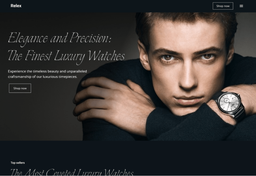
The hero section features a model wearing a luxury watch, representing elegance and sophistication. The photograph not only communicates the brand’s premium nature but also builds trust by visually affirming the product’s quality and exclusivity.
Users instantly feel confident they’re exploring a high-end, trustworthy product.
That’s the power of photography in digital products.
Illustrations are custom, hand-drawn, or digitally created visuals designed to communicate ideas, explain concepts, and add an aesthetic flair to a product. In the context of UX design, illustrations aren’t just about making things look pretty — they’re about adding functionality, creativity, and clarity. Well-crafted illustrations can turn a mundane interface into an engaging, intuitive, and human-centered experience.
In UX design, illustrations serve a variety of purposes, and their strategic use can significantly enhance usability. Below are several ways illustrations can be effectively applied to digital products:
Explainer illustrations are among the most effective ways to communicate complex concepts. In UX design, users often encounter new features or unfamiliar workflows, and explainer illustrations can help guide them through these processes in a more approachable way.
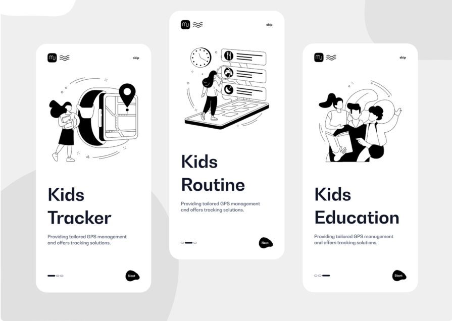
Micro-illustrations are small, often subtle visuals that enhance user interactions. These include icons, loading animations, progress indicators, and button states.
But how can micro-illustrations fit as an explainer illustration?
A good example would be pairing icons with text. This improves clarity and aids in explaining the function of the text by using visual illustrations. Airbnb used this in their platform:

Hero illustrations are large, eye-catching visuals often placed prominently on landing pages, home screens, or key sections of a website. They serve to capture attention, set the tone for the brand, and convey a sense of the product’s purpose or emotional appeal.
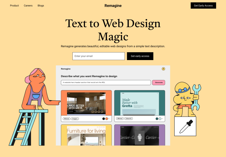
Cinemagraphs and GIFs are dynamic visuals that blend still imagery with subtle motion or looping animations:
In UX design, they are excellent tools for adding personality to a product, drawing a user’s attention, or explaining interactions.
The trick with these visuals is to use them sparingly. While they’re great for adding flair, too much motion can quickly become overwhelming and distract from the core content. Imagine trying to read a page while the background is filled with flashing, bouncing, and swirling animations — not exactly the most pleasant experience, right?
When done right, cinemagraphs and GIFs can make interfaces feel fresh, modern, and interactive. They turn static designs into something more lively and engaging, which helps create a more memorable experience for users. Plus, they show that you’re keeping up with current design trends while still focusing on user-friendly, functional design.
3D renderings bring designs to life with realistic, detailed visuals made using 3D modeling software. They add depth and dimension, which makes them a great choice when showcasing products.
In UX, you’ll often see 3D renderings in e-commerce, where users can rotate or zoom in on items to examine them closer. They’re also used in gaming, architecture, and virtual reality to create lifelike simulations that feel real.
Creating stunning 3D renderings is made possible by some seriously powerful design tools, like Blender, Autodesk Maya, and Cinema 4D. These programs allow designers to craft detailed 3D models that can then be turned into lifelike renderings. With the right tools, designers can add textures, lighting, and other elements that give their renderings a sense of realism, making them a key part of the UX design process.
Imagery in UX design should be accessible and optimized to give users the best experience. Follow these best practices to create engaging visuals while also maintaining high performance:
| Format | Features | Best use cases |
| JPEG (Joint Photographic Experts Group) | It supports lossy compression and small file size. It reduces file size significantly and, more often than not, reduces the quality. | Photos without transparency. |
| PNG (Portable Network Graphics) | There is lossless compression and transparency support. It preserves quality but may result in larger file sizes than JPEG. | Graphics with sharp edges, text, or transparency, such as logos or icons. |
| SVG (Scalable Vector Graphics) | Scalable and lightweight. Not compressed, because it’s a vector-based format the file size depends on the complexity of the paths. | Icons, logos, and graphics that need to scale across devices without losing quality. |
| WebP (Web Picture format) | Supports both lossy and lossless compression. Superior compression (30% smaller than JPEG/PNG) with high quality. | Both photos and graphics require transparency for modern browsers. |
| AVIF (AV1 Image File Format) | Superior compression and quality. Provides even better compression than WebP while maintaining excellent quality. | Amazing performance with fallback options for older browsers. |
Align visuals with the product’s color palette and style to maintain brand consistency and build trust with users. Take these two things into consideration when working with design imagery in UX:
Make sure to add alt text for screen readers and ensure images have enough contrast to be readable by all users, even those with visual impairments.
Let’s go a little in-depth on how to get the best out of alt text.
First of all, alt text can be descriptive and contextual:
Now, if the image is more for decoration, you can use null alt text (alt="") to signal to screen readers that the image does not convey meaningful content. Also, with the advancement of AI, it is possible to use AI to generate alt text.
Optimize the imagery for different screen sizes by adopting a mobile-first approach. Start by ensuring images load well on smaller screens and adapt seamlessly to larger ones. This includes using lightweight images for mobile and higher-quality visuals for desktops to maintain performance and clarity.
Other ways to optimize responsiveness for the images include:
Match imagery with UI elements, like stroke weights and proportions, to ensure visual harmony. Balance text and visuals so that images complement the content without overpowering it.

Imagery in UX design goes far beyond aesthetics. From the authenticity of photography to the creativity of illustrations, the subtle motion of cinemagraphs, and the realism of 3D renderings, each type of visual plays a distinct role in crafting engaging and intuitive user experiences. By following best practices — optimizing performance, ensuring accessibility, and aligning visuals with user intent — you can create imagery that informs, guides, and resonates emotionally.
However, as powerful as visuals can be, their misuse can hinder user experience. Overloading interfaces, using generic stock photos, or neglecting responsiveness can turn captivating imagery into a distraction. The key is to balance beauty with function, ensuring that every image serves a purpose and enhances the overall design.
When thoughtfully integrated, design imagery becomes more than a visual element — it’s a language that speaks directly to users, creating seamless, memorable, and meaningful interactions.
LogRocket's Galileo AI watches sessions and understands user feedback for you, automating the most time-intensive parts of your job and giving you more time to focus on great design.
See how design choices, interactions, and issues affect your users — get a demo of LogRocket today.

As products evolve into ecosystems, navigation becomes a system-level challenge. This article explores how to align structure, context, and user journeys to create seamless movement across tools without confusion.
Figma’s AI features have exploded in 2026 — from text generation and image editing to full UI drafts and code handoff. But speed isn’t the same as quality. This guide breaks down every major feature, what it’s good at, and where human judgment still does the heavy lifting.

Zero UI works well for screenless, voice-first experiences, but most digital products still require visual interaction. Here’s why multimodal UX offers a more scalable foundation for the future of design.
Multimodal UX goes beyond designing for screens. Learn how context-aware systems, progressive modality, failover modes, and accessibility-first design create better digital product experiences.