As organizations and product teams grow, it becomes increasingly difficult to maintain alignment across teams and designers.

This often leads to waste from UX designers repeating similar research and experiments and a lack of overall cohesiveness and consistency across design choices.
The best way to address this omnipresent scaling problem is to create, maintain, and share ongoing UX documentation. Let’s start with a quick overview of the most important artifacts for UX documentation and then dive deeper into how to build a healthy UX documentation culture.
First things first, there’s no silver bullet approach as to what type of UX documentation a team or company should maintain. It’s heavily dependent on the type of product you work on and your team’s current needs and objectives.
There is, however, a set of artifacts that almost any product team can benefit from, and these include:
One of the most important things you should document and frequently revise is your current knowledge about users and customers.
To achieve that, most teams use user personas, empathy maps, or both simultaneously:
The primary objective here is to establish a source of understanding and empathy toward end users that’ll help you make the most optimal design choices. After all, user empathy is a key to user-centered designs.
You’d be surprised how many designers have a problem clearly articulating what the value proposition of their product is, that is:
The value proposition canvas is a great tool for summarizing and visually representing that value proposition. It’ll help you in:
It’s essential to have a high-level, easily accessible, and understandable skeleton of your product experience in one place, and user journey maps and user flows are great tools to achieve this.
User journey maps give everyone a big picture of the overarching user experience, whereas user flows help us zoom in and evaluate the exact steps of the journey.
Not only does a clear picture of current user experience serve as an excellent tool for problem identification and solution ideation, but it also helps the team see how various changes impact the bigger picture, not only the part they are currently focused on.
The truth is, sometimes, a presumably small change in one part of the flow requires you to adjust the experience in numerous different places, and it’s easy to miss these nuances if the whole flow is mapped only in your head:
Every designer knows the value and importance of user interviews. However, we often neglect the second most important part — actually storing and propagating the knowledge captured during these interviews.
Without proper wrap-up, user interviews are a waste of time.
I recommend creating an interview snapshot for each conducted interview, containing the following:
This format will help you retain and organize your interview learnings and serve as a digestible source of knowledge for other designers.
I won’t beat around the bush. Keeping UX artifacts up-to-date is a time-consuming and sometimes tedious task. Unsurprisingly, many designers procrastinate on that part of the job.
However, the benefits of maintaining and revising these artifacts on an ongoing basis have a tremendous impact on the day-to-day work of the whole design department.
The most prominent ones include:
UX artifacts help ground the entire design team in known facts about end-users and how they interact with the product as it is. This information helps solidify the empathy towards users, resulting in more user-centric design solutions.
It’s not uncommon to research a particular topic just to learn post-factum that someone already did it.
Ongoing UX documentation helps everyone in the company gain easy access to information, thus avoiding needless rework or repetition of already conducted studies. It turns out design teams perform twice as effectively if they don’t repeat the same research over and over again.
When we talk about consistency, most designers tend to think about design systems and style guides, and while they are the key to keeping the UI layer consistent, they rarely address the UX part of the design.
If all design solutions are grounded on the same UX documentation, it helps keep intangible UX factors, such as messaging, value communication, information architecture, and overall experience direction consistent across different teams and solutions.
Let that sink in. Consistency in design goes beyond just the design system and shared components.
Ongoing UX documentation not only helps to foster internal knowledge alignment across teams and departments but works like magic when it comes to onboarding of new team members and employees.
By onboarding, I don’t only mean brand new employees but also situations when designers need to partake in new projects within the company. Proper UX documentation helps newly formulated project teams hit the ground running fast.
UX documentation is also a great way to derisk initiatives and maximize the chances that your design solutions succeed. After all, proper documentation ensures that the majority of your choices are based on known facts and research, not merely a gut feeling. It establishes healthy boundaries for designers to work with.
The biggest challenge with UX documentation is to ensure that it’s up-to-date and that other team members actually use it. After all, there’s hardly a bigger waste than spending hours to prepare perfect documentation just to let it collect dust in a forgotten Google Drive.
Although, again, the exact approach will depend heavily on your particular context and organizational culture, a few tactics seem to work well in most contexts.
While organizing your documentation under categories such as “user interviews,” “usability studies,” “A/B tests,” etc. might work at first, but it quickly becomes unusable at a scale. You can’t expect people to browse through all of it whenever they need to get some insights or validation.
What does work, however, is categorizing the knowledge under specific core beliefs you hold about your users. For example, if you work for an EdTech company and most of your recent research indicates that most of the time, the parent pays for the service, organize all corresponding evidence under the “parents are the final buyers” core belief.
This single belief is already a way more useful and digestible insight than twenty loose user interview snapshots and survey results that led you to this insight:
As a rule of thumb, I tend to keep between eight and fifteen key insights for each user persona or target segment we have. It seems to be a sweet spot between keeping the most crucial information well organized and up-to-date without flooding ourselves with an abundance of documentation and insights. Pareto principle at its finest.
In an ideal world, everyone would update relevant artifacts as soon as they gather a new insight or piece of evidence, but then, life happens. People forget. Don’t click “save” or simply procrastinate on the task.
That’s the type of situation where standardized processes really shine. To put it simply, each month, every designer in our team has to write a quick Slack update on a dedicated channel where they either:
That creates an extra dose of accountability and motivation in the whole team. No one wants to be the only person who hasn’t learned anything about our users in the past month, so it pushes people to capture and document even the smallest learnings.
A good follow-up to the monthly review is a mandatory knowledge-sharing meeting. During this meeting, every designer summarizes once again each change they made to UX artifacts and invites the rest for a discussion and Q&A session.
During these meetings, we also decide what our research focus should be next month and whether we should make any changes to our core beliefs document.
There’s one detail, though. Make sure this meeting is mandatory. It’s just too easy to skip this type of meeting when working under pressure and chasing a deadline, which, as we know, happens more often than we’d like to. Knowledge sharing and aligning are simply too important in the UX design process to settle for a 50 percent attendance rate.
When it comes to storing UX documentation, there’s only one rule to follow. Make it as accessible as possible.
By accessibility, I mean not only access to the files but also their findability and scannability. If someone in your team needs to check if a particular piece of evidence exists in your documentation, it should take them a minute or two to find the relevant learnings.
Let me share two examples of how my teams work with UX documentation.
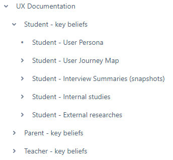
This method works for storing company-wide UX documentation for bigger organizations and design teams. I’ll use Confluence as an example, but this approach should work for any file-based software:

If I work with three personas, say, student, teacher, and parent, I’d split the documentation into three folders for each persona separately, with key beliefs as the primary parent file since this information is the most important one.
Although splitting documentation for different personas will lead to some duplication (e.g., one research might be relevant for two or more personas), most documentation tools allow you to link pages to various parents without actually duplicating the content. Although it’s still extra effort, it makes looking for relevant information significantly easier down the road.
Lastly, all my subpages start with a persona name (e.g., Student). It might seem like repetition, but it makes the files easier to find from the search option.
In some cases, it doesn’t make sense to have the UX documentation distributed between different files and subfolders. Imagine you are working as a one-man-army design team on an MVP in a company with eight employees.
While you still need the documentation — either for your own reference or to align with future hires — it should be lightweight and extremely easy to maintain.
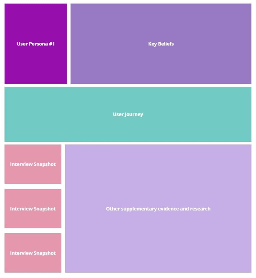
My preferred method is to use a single organized Miro board (although any whiteboarding tool will work). Similarly to the first method, I recommend splitting relevant pieces of evidence per persona to make it easier to work with:

The best part about using a whiteboard is the ability to easily connect related pieces of information with arrows. Although it does become messy at some point, for small-scale documentation, this messiness is what often leads to breakthrough ideas and solutions:
I hope that after reading this article, you got some extra appreciation for the less pleasant part of the design job: documentation. The benefits are just too great to skimp on the ongoing documentation process.
Focus on maintaining core beliefs, ensuring each designer reviews their learnings at least monthly, and ensuring they actually talk to each other about what they discover. Cover these three parts, and you’ll be on the right track to a usable documentation process.
Lastly, do not worry if the process isn’t perfect. Most likely, it will never be. Documentation will get outdated. People will skip alignment meetings, forget to capture insights in documentation, and so on. I’ve never seen a setting in which the documentation process works perfectly.
But at the end of the day, it’s not about perfection but about avoiding repetition and using captured insights to make design decisions. As long as you achieve that most of the time, it’s okay that your documentation structure gets messy from time to time, and not everything is fully captured. UX documentation is just a means to an end.
LogRocket's Galileo AI watches sessions and understands user feedback for you, automating the most time-intensive parts of your job and giving you more time to focus on great design.
See how design choices, interactions, and issues affect your users — get a demo of LogRocket today.

As products evolve into ecosystems, navigation becomes a system-level challenge. This article explores how to align structure, context, and user journeys to create seamless movement across tools without confusion.

Figma’s AI features have exploded in 2026 — from text generation and image editing to full UI drafts and code handoff. But speed isn’t the same as quality. This guide breaks down every major feature, what it’s good at, and where human judgment still does the heavy lifting.

Zero UI works well for screenless, voice-first experiences, but most digital products still require visual interaction. Here’s why multimodal UX offers a more scalable foundation for the future of design.

Multimodal UX goes beyond designing for screens. Learn how context-aware systems, progressive modality, failover modes, and accessibility-first design create better digital product experiences.