Visual aesthetics can hinder usability and the overall user experience when used incorrectly. By visual aesthetics, I mean art (e.g., illustrations and other decorative elements) and ambient user interface properties (e.g., colors, fonts, shadows, animations, and so on).
Although there’s nothing wrong with apps and websites being aesthetically pleasing, getting the aesthetic-UX balance right remains a difficult thing to master, evidenced by the fact that many of today’s “nice-looking” apps and websites are also considered difficult to use. Given a choice between the two, users would choose UX almost unanimously; however, it’s not too tricky to have the best of both worlds.
In this article, you’ll learn how to avoid loading up designs with too many decorative elements and how to use the decorative elements that you do implement effectively, crafting a visual aesthetic that looks incredible without negatively impacting UX.
It’s so easy to fall into a creative rabbit hole (especially when working solo) and eventually emerge from it with a fully “designed” product without having done any research or even validating any problems for it to solve. Before even thinking about the visual aesthetic (or anything for that matter), we must validate the problem(s) for it to solve. In fact, visual aesthetics are commonly referred to as “surface layers” since they’re mostly applied last (like makeup, or the icing on a cake).
Skipping steps (i.e., market research, user research, UX research, and anything else that a product designer or UX designer should do) results in polished-looking products that aren’t as useful as their presentation would suggest. This leads to negative reviews (at best) and/or customers churning (at worst), and ultimately, a huge waste of time, money, and resources.
So while aesthetics alone can make a product sell, the long-term outcome probably won’t be in the ballpark of success, and the only path forward at that point is to realize failure by talking to customers via user interviews or exit surveys. However, most businesses are financially tapped out at that point, ending their run without ever knowing what actually went wrong.
Investopedia describes this as “not satisfying a need”, which is one of the top reasons why businesses fail.
Show and tell platforms for designers are difficult to avoid because the visual ideas shown on them are too tempting to ignore, but you must.
If you look at the designs shown on Dribbble for example, you’ll notice that not a lot of thought has gone into many of them beyond their visual aesthetic. Many of them are trying to solve unvalidated problems that might not exist or are for hypothetical products where no such problems exist for sure. In fact, it’s not entirely uncommon to see designs that aren’t feasible due to technical limitations, including for devices that don’t even exist.
In short, there’s a lot of show and not a lot of tell because they’re essentially just art pieces with apps and websites as the subject matter.
While I think that this is pretty cool from an artistic/hobbyist perspective, the takeaway from a design/practical perspective is that we should be mindful of where we take inspiration from and the dangers of investing in visual ideas too much, too early (especially now that AI-generated art is becoming trendy and accessible). Don’t trick yourself into thinking that you’ve designed a sustainably marketable product just because it’s polished and finished-looking.
Similarly, don’t let others trick you with their likes and upvotes. Focus on what real customers and users say, and avoid social platforms for designers altogether. This isn’t to say Dribbble and platforms like it are bad, just be wary of the fact that a large portion of the work showcased there isn’t baked in reality.
After validating the problem(s), you can then validate the solution(s) by designing an MVP (Minimum Viable Product) or even an MLP (Minimum Lovable Product). It goes without saying that this should essentially be a wireframe with hardly any visual aesthetic at all that you’ll validate with user research (particularly, user testing).
If you find it difficult to put aesthetics aside and stay problem-focused, try following a product design framework. Product design frameworks help product teams stay problem-focused and avoid building products around features and visual ideas that look cool but users didn’t actually ask for.
The design sprint and design thinking frameworks are great because they promote rough sketching in the early stages.
Once you have a validated MVP or MLP, then it’s time to start thinking about visual aesthetics (sort of).
User experience — is this where we start thinking about the visual aesthetic? The answer is yes and no (mostly no), but you might be surprised to discover that this is the most important step in terms of crafting the surface layer even if the visual aesthetic isn’t really our concern at this stage.
The reason for this is that user experience, particularly usability and accessibility, somewhat steers our visual design choices. Here are some visual design choices that you’ll want to make early on and how they impact usability and/or accessibility but lay the foundations for a good visual aesthetic later:
Touch targets (e.g., buttons) should be at least 44×44 pixels according to the WCAG (Web Content Accessibility Guidelines) or 48×48 pixels according to web.dev to make it easy for users to interact with them.
Personal tip: for buttons, implement horizontal padding that’s 1.5x the height to ensure good spacing and width-to-height ratio.
I’d also recommend that you implement rounded corners to make them look more three-dimensional and thus interactive (1.3x the height, to be more specific). To the same effect, consider implementing drop shadows too. I go into all of this in more detail in my article about designing good CTAs, but all-in-all you should end up with something that looks like this:
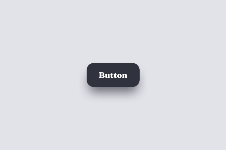
Notice how aesthetically pleasing this is even though we focused on usability and accessibility? Next: typography.
For accessibility reasons (to the benefit of all users), typography should be legible and readable. This means that font sizes should ideally be 16 pixels at least (which is the default in web browsers anyway), and there should also be a logical visual hierarchy among headings (if needed, use a type scale calculator to generate the font sizes).
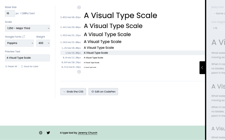
Also, the WCAG specifies that line heights should be at least 1.5x the font size; plus, letter spacings at least 0.12x, word spacings at least 0.16x, and paragraph spacings at least 2x.
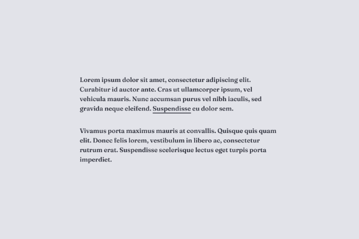
When it comes to links, I like underlines to be under the font’s descenders so that they don’t strike through them.
Again, putting all this together, this makes text content so nice to look at.
Next: color.
A color contrast checker will check that text and icons are accessible according to the WCAG. It goes without saying that things that stand out, well…stand out!
With all of these design heuristics in place, not only should designs feel good to use and be accessible to everyone, they also should look quite aesthetically pleasing despite not having thought about it that much from that perspective. This approach is how great products look incredible without feeling cluttered and difficult to use.
That being said, let’s talk visual aesthetics.
This is the point where we can start to think purely about the visual aesthetic; but again, rather than think in terms of what we can add, embrace the “what can we do to what’s already there?” mentality.
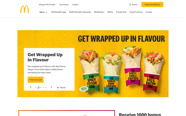
For example, you’ll almost certainly need to implement brand colors — do this before adding decorations that’ll increase clutter. Typically, you’d use brand colors on CTAs (i.e., buttons and important links), marketing elements, and some backgrounds.
McDonald’s does this particularly well:
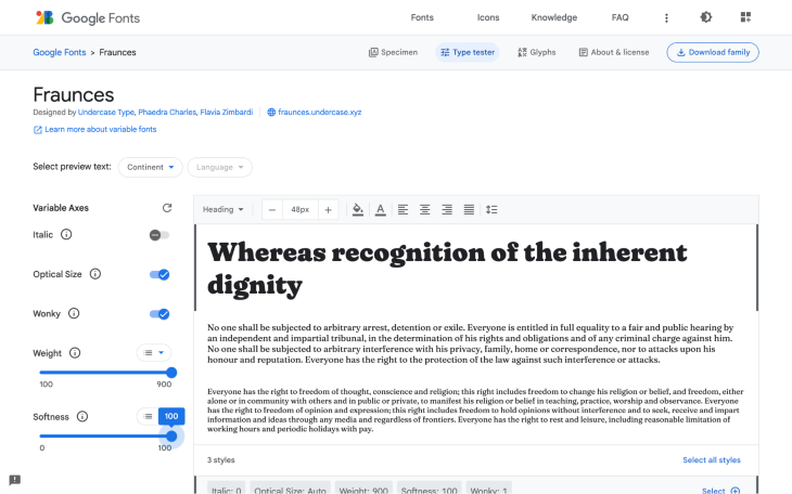
Next, let’s revisit typography; specifically, variable fonts. Most UI design tools and code languages support variable fonts, providing designers and developers with not only an incredibly granular level of control over certain type properties, but modern type properties such as slant, wonk, and softness that can’t be customized with traditional font formats. To better understand how variable fonts can be used to craft a more unique visual identity, I’d recommend playing around with the Fraunces Google Font.
As you might have noticed already, taking a “less is more” approach to visual design enables us to think of the surface layer as not just visual appeal, but expression. With that in mind, consider measuring visual aesthetics by what and by how much they express rather than the physical space that they occupy.
In other words, you can do a lot artistically just by ensuring that the barebones of the design offers a great user experience. And then, if you still feel like it needs something more, leave it until the end. This is where you might want to start thinking about adding decorative elements such as photographs, patterns, illustrations, and abstract visuals (AI-generated or otherwise).
There are endless ways to go about creating these (as would be the case if you were creating on a traditional canvas), but here are a few of my favorite go-tos:
Good visual design is one of the most important things, particularly for apps and websites that users are expected to visit time and time again. A good product doesn’t even need to have a unique selling point, it can essentially be a complete clone of another product but perform better thanks to a better visual aesthetic or overall user experience.
However, products also need to be useful and efficient. A visual aesthetic mustn’t suppress what’s great about the product; it should elevate it to its full potential, otherwise it’s just better off not being there.
Header image source: IconScout
LogRocket's Galileo AI watches sessions and understands user feedback for you, automating the most time-intensive parts of your job and giving you more time to focus on great design.
See how design choices, interactions, and issues affect your users — get a demo of LogRocket today.

Optimization fatigue is real. Here’s why designing only for metrics drains creativity, and how to bring the human back into UX.
Let’s explore why and when to use drag and drop, discussing real-world examples, platform-specific considerations, and accessibility tips.

We’re told to reduce friction, but sometimes friction builds value. This blog explores how scarcity, when designed well, sharpens focus and strengthens user trust.
Discover how to craft UX-friendly hero sections with examples, design tips, and strategies that drive engagement and conversion.