AI (Artificial Intelligence) has been a long time coming, especially in the world of UX design. As an industry, we’ve been talking about AI in UX design for a while, but now it’s finally looking like AI could be a part of everyday UX design workflows.

In this article, we’ll take a look at the different AI tools out there, how they can be used in a UX design setting, and how effective they actually are.
Using AI to straight-up generate a design to perfection, or at least to the point where it could be tweaked to perfection, is the ultimate dream (perhaps not for designers, but certainly for businesses). However, AI can’t do that, and there’s nothing to suggest that it’ll ever be able to, so feel free to skip to the next section if you’re only interested in the positive outcomes.
For this experiment, I chose what I think is a 10/10 web page design (albeit a simple one) in terms of user experience, including visual appeal.
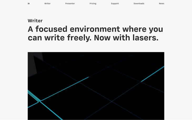
I asked 10 people to rate it on a scale of 1–10 to loosely confirm that it is in fact a good design. I then wrote an AI prompt (“A landing page with great UX for a markdown-based writing app. Include a navigation, 5 content blocks, and a call-to-action. Monospace font, minimal, modern, UI, UX, design.”) describing its objective properties, hoping that the AI would generate something of similar quality. The results weren’t great, roughly gauged using my personal opinion and that of 10 others, just like before. Also, it’s worth noting that the AI prompt went through several iterations, so the generations below are probably the best that AI can come up with at this moment in time.
First though, let’s bear in mind that these are generated based on the design of what exists on the web already, which might not be good or even real (e.g., the AI could be using Dribbble shots to generate our requests, which have a bad reputation for being poor quality in terms of design). AI-generated images will not be based on your user’s needs or any users for that matter, as they don’t hold any intelligence on what users want — the generated designs are just a likeness of what’s described in the AI prompt.
With that in mind, these types of AI tools can only ever be useful for design inspiration; therefore, the following analysis is simply based on output quality and accuracy. In addition, the generations are static images, so these AI tools don’t replace mocking up designs in any way. Let’s dive in though.
DALL-E 2 generated the following monstrosities:
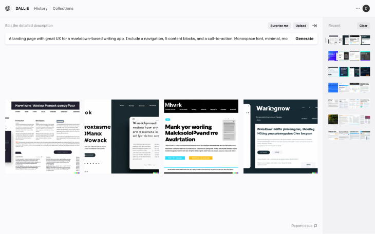
These are obviously not visually appealing and there are also several objective UX flaws from a design heuristics perspective. The AI doesn’t generate real text (which is fine), however, this meant that it failed to generate the monospace font. Also, due to the square frame limitation, my request for 5 content blocks was completely ignored (in fact, this made the output look super glitchy).
At best, there are a couple of interesting takeaways from an artistic point of view; however, considering how much time was spent on refining the AI prompt, it would have been better and faster to just get some design inspiration from Dribbble.
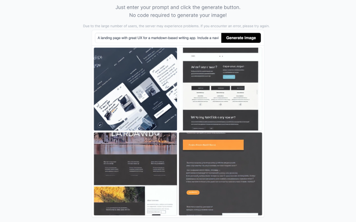
With Stable Diffusion, the results were pretty much the same.
Midjourney was surprising though:
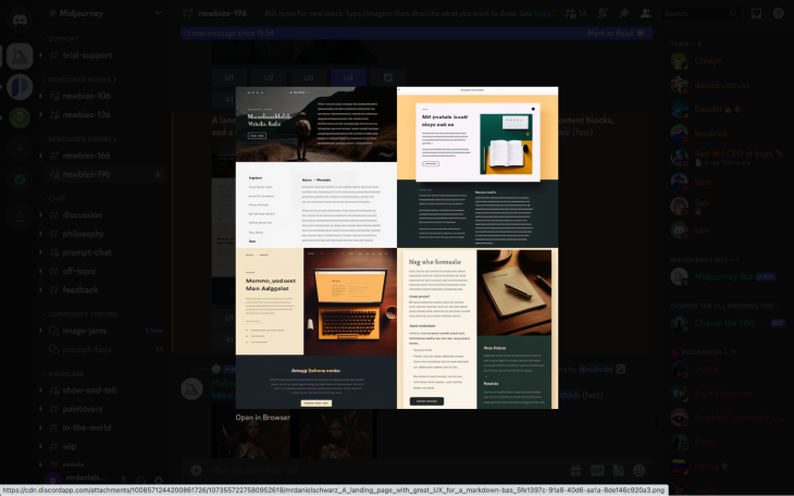
These are far more visually appealing. They’re also better in terms of design heuristics, especially when it comes to typography (the AI even knew to lay the text over the top of the darkest/blockiest part of the image, ensuring good readability). It also generated an actual layout, whereas DALL-E 2 and Stable Diffusion just seemed to misunderstand the assignment completely. With that in mind, I’d say that using Midjourney as a supplementary method of getting design inspiration would be worth it (see the more elaborate example below) if it was free, which it’s not.
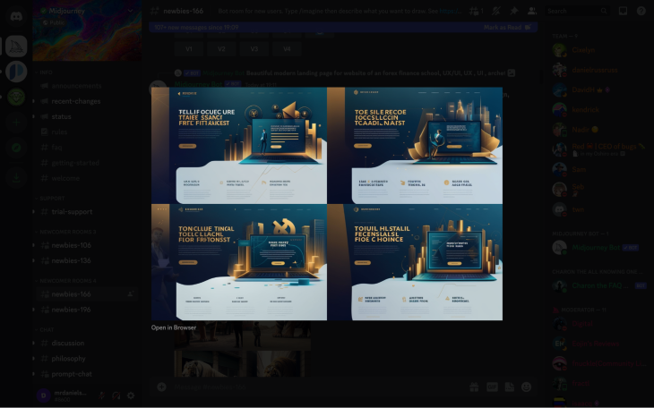
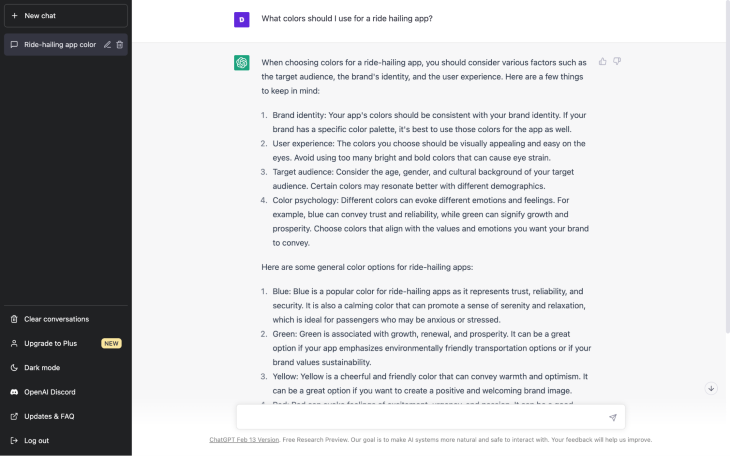
All-in-all, these types of AI tools are absolutely incredible for generating art, but they’re not suitable for UI design. What’s interesting is that if you ask ChatGPT a question about design, it’ll share some relevant design tips but it’ll also say that it depends on the target audience at the end of the day, which DALL-E 2, Stable Diffusion, and Midjourney know nothing about.
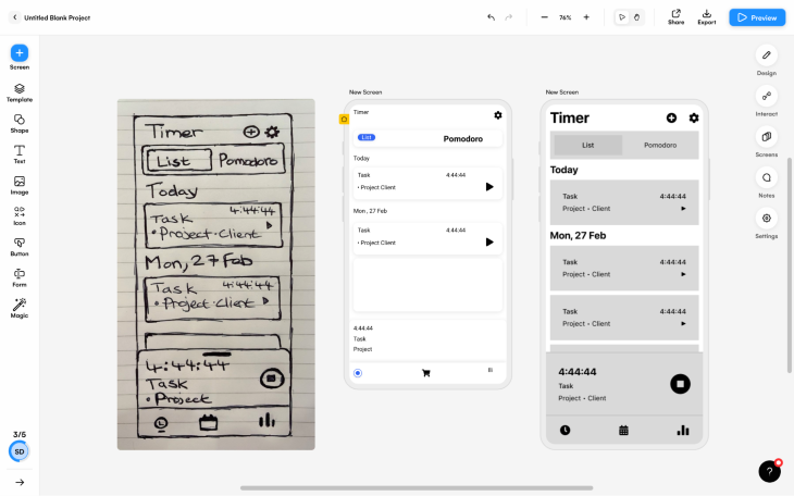
Using AI to convert sketches into mockups is a better direction for AI in UX design since it replaces manual labor while keeping the thought process. Airbnb uses their own sketch-to-code tool, which helps them jump from idea to testing at lightning speed; however, we’ll be focusing on Uizard, a UI design tool that’s fairly typical but comes with an AI “wizard” that converts sketches into mockups, since Airbnb’s tool isn’t available to the public.
Converting a sketch into a mockup was much faster than mocking it up using a UI design tool (Figma in my case). With elaborate sketches, the time saved was astonishing despite obviously having to spend a few minutes fixing it up and adding a few things that the AI missed (it seemed to have the most trouble with icons).
What surprised me the most though was how fun it was, so I think you’ll have a hard time not using Uizard to convert all of your early-stage sketches into mockups just to make them look a little more real, something that isn’t really feasible to do when required to mock them up manually.
Check out the side-by-side:
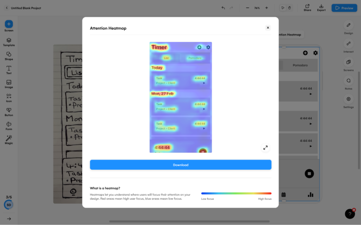
Once I got into Uizard, I unexpectedly stumbled upon a bunch of other AI-UX tools such as heatmap prediction (no user testing required), mockup copy generation, theme generation, and the ability to convert screenshots of designs into styles or mockups.
The heatmap prediction felt accurate but would have taken too long to verify.
The mockup copy generation was relevant to the design. At the very least, it provides a quick and easy way to generate copy that looks real enough to begin validating a product idea; however, there’s also no reason why you couldn’t A/B test some of the AI-generated ideas rather than setting aside time to ideate.
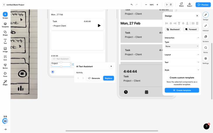
Converting what’s essentially a mood board into a theme worked spectacularly (I went with the “Create theme from scratch” option and chose a few presets).
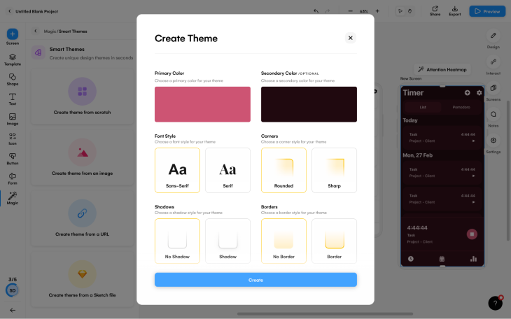
Similarly, converting a screenshot of a design into an editable mockup (ideal for modifying inspiration) worked flawlessly as well.
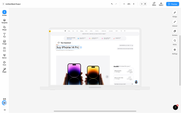
Text → UI is an upcoming AI tool (a Figma plugin) that generates UI elements and components based on a description (this is particularly useful for those less enthusiastic about sketching).
Dhvanil on Twitter: “I built a UI creator in Figma using @OpenAI’s GPT3.Define your UI component in simple English, and GPT3 + @figmadesign will create full blown mockup for you. With accurate text, images and logos.Very impressed with GPT3! It is absolutely incredible⚡️How it works? Read on… pic.twitter.com/ryqO48VDPc / Twitter”
I built a UI creator in Figma using @OpenAI’s GPT3.Define your UI component in simple English, and GPT3 + @figmadesign will create full blown mockup for you. With accurate text, images and logos.Very impressed with GPT3! It is absolutely incredible⚡️How it works? Read on… pic.twitter.com/ryqO48VDPc
Besides using ChatGPT to generate mockup copy ideas, you can also use it to write research scripts such as surveys. While there are many adaptable starter templates to be found online, I still find AI to be faster even if I have to make some minor or cosmetic changes and/or change a question or two. Plus, ChatGPT usually comes up with at least one question that I wouldn’t have thought of.
In this case, I asked ChatGPT to “Create a survey that I can send to users of my ride hailing app. The questions should help me to understand how good the user experience of the booking process is. The survey should include qualitative and quantitative questions. Include a welcome message, some tips for completing surveys, and a thank you message.”
The generated result was nearly perfect (you can see some of it in the screenshot below), without a doubt faster than anything that I could have written or found online.
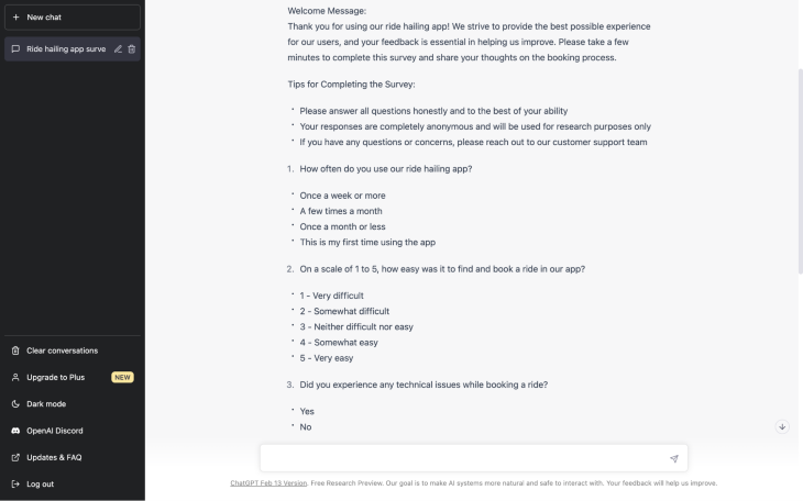
Beware: a single word can radically affect the outcome, so do take the time to reread and reiterate your AI prompt. In my case, “booking flow” resulted in some very generic survey questions, whereas “booking process” tailored the questions to the task flow specified.
Its plagiarism score was a whopping 37%; however, this is to be expected since it contains a lot of standard survey formatting. It also doesn’t really matter in this case, I just thought it was interesting.
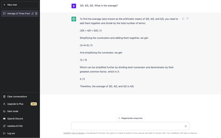
Using ChatGPT again, let’s start with quantitative research. I asked the AI: “3/5, 4/5, 5/5. What is the average?” The AI not only gave me the correct answer, it also revealed how it calculated it, for peace of mind. I used the shortest AI prompt that I could think of as you’d typically want to be able to just copy the research results into ChatGPT.
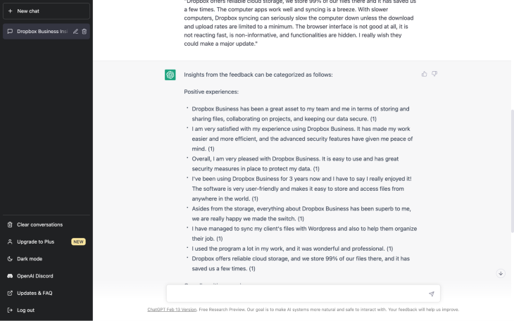
Next, I tried affinity mapping some open-ended feedback using the following AI prompt format: “Affinity map the following feedbacks, quantifying how often each insight occurs: ‘<feedback 1>’, ‘<feedback 2>’, ‘<feedback 3>’, …”.
The AI did an incredible job of instantly summarizing the feedback into three categories — positive, negative, and mixed — however, my request to make the synthesis quantifiable didn’t work no matter how I worded it. Still, summarizing the data with AI is without a doubt faster (instant!) than summarizing it manually.
The following AI tools are a bit more cosmetic. They weren’t specifically built for UX design but they can still be useful to UX designers, especially if your team is missing a visual artist.
removebg removes backgrounds from images using AI. Normally this would require Photoshop (or a tool that’s similar to Photoshop), a fair bit of time, and a godly amount of skill rarely seen in UI designers (typically you’d have to get a graphic designer to do this); however, removebg can do it in a few seconds. Also, unscreen does the same thing for videos.

Let’s Enhance increases image resolution using AI, something that’s not really possible otherwise. Normally we’d have to forgo using an image if it’s just not large enough.

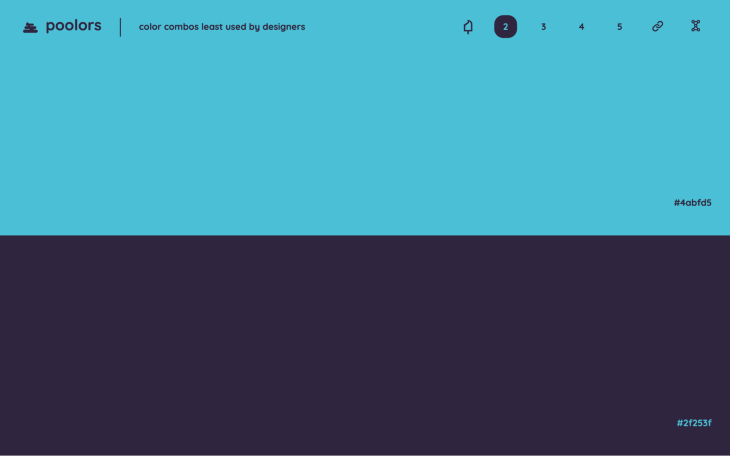
Poolors uses AI to bring you the color combinations least used by UI designers. The gotcha is that they’re actually rather appealing, so if you’re looking for something more unique/recognizable (which is a huge win in the realm of branding), then this AI tool is pretty decent.
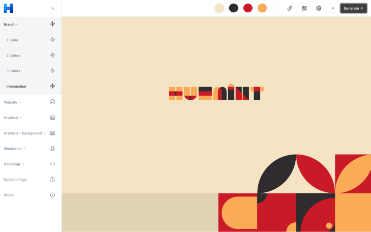
Huemint just generates great color schemes.
Runway is an AI-powered graphic design suite that includes background editing, the ability to generate imagery from a description (like DALL-E 2), the ability to regenerate or smart-edit a specific part of an image, and much more. Basically, it enables you to craft something that’s closer to the image that you have in your head rather than repetitively rolling the dice on other AI tools.
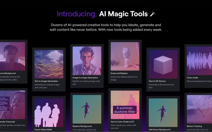
With Ando, a Figma plugin, you’ll describe not only with text but images and shapes too. By “shapes,” I mean that you can roughly sketch (digitally) what you’re looking for.

I love UX design. I wish that I could skip certain aspects of it, but for the most part it’s my passion and I’m happy doing it for personal enjoyment as well as to pay the bills. For that reason, I don’t want AI to replace design even if stills requires a human behind the wheel (an apt metaphor actually, since I imagine that many people feel the same way about self-driving cars).
Now, I can’t say for sure whether or not AI will replace designers (I’m almost certain that it won’t), however, it does seem as if AI tools could become a familiar part of the everyday designer’s toolbox, and I think we should embrace that for now considering what AI can and can’t do well. For now, what AI does well are the things that I’m more than happy for it to take care of.
That being said, it probably comes down to individual taste. Which design processes are you happy for AI to take care of? Which ones would you rather take care of yourself? Let us know in the comment section below, and if there are any interesting AI tools that you think we should know about, feel free to mention those too!
LogRocket's Galileo AI watches sessions and understands user feedback for you, automating the most time-intensive parts of your job and giving you more time to focus on great design.
See how design choices, interactions, and issues affect your users — get a demo of LogRocket today.

I’ve spent enough time designing with WCAG 2.2 to know it’s not enough. Here’s why I’m skeptical and cautiously hopeful about WCAG 3.0.

I learned this lesson the hard way. Good UX doesn’t survive endless approval loops. Here’s what went wrong — and how to protect your vision.
I’ve reviewed “final” designs more times than I can count — and the copy almost always gives users a reason to hesitate.

The checkbox is one of the most common elements in UX design. Learn all about the feature, its states, and the types of selection.