Editor’s note: This article is an updated take on toggle button UI design, incorporating fresh insights, refined best practices, and a broader look at modern design tools. Special thanks to the original contributor, Chris Kernaghan, and the revising author, Neel Dozome, for enhancing this guide to better serve designers looking to create seamless, intuitive interactions.
Buttons have been in use in human culture for over 2,000 years. In ancient times, they were mostly decorative, showing off status and wealth. Later, they became functional fasteners. Fast forward to the late 19th and early 20th centuries, and buttons took on a new role — hundreds of patents were filed for “electric buttons” or “push-buttons,” leading to their use in everyday devices like doorbells and elevators.
The word “button” itself comes from the French bouton, meaning pimple or projection, and to push or thrust forward. Thanks to skeuomorphism, buttons have become one of the most important user interface controls on the web and in apps.
Toggle buttons are a specific kind of UI control, and if they’re not designed well, they can be confusing. When should you use a toggle button instead of a checkbox, though? Understanding design principles and cognitive psychology (like minimizing cognitive load) helps make the right choice for a smoother user experience.
Here’s the good part — you don’t need advanced tools to prototype toggle button designs. What really matters is knowing when and how to use them effectively. And that’s what I’ll talk about in this blog.
Toggle buttons help users make quick selections, switch views, or sort elements. They’re commonly found in menus, filters, and feature settings — think enabling/disabling notifications, toggling dark mode, or managing media playback. By reducing the need for separate settings pages, toggle buttons keep interactions simple and intuitive.
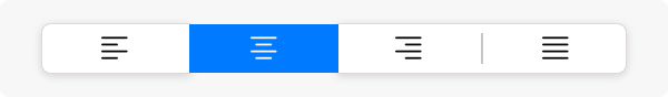
Take Google Docs, for example. You can toggle between left, center, right, or justified text alignment. This is an exclusive selection toggle button — only one option can be active at a time:
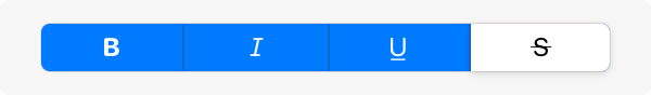
Formatting options like bold, italic, and underline, on the other hand, are multi-select toggle buttons, allowing you to activate multiple options at once:
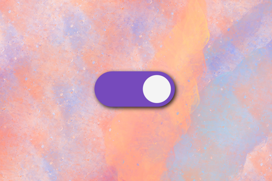
People often use “toggle switch” and “toggle button” interchangeably, but they’re not the same.
Apple and Google refer to toggle buttons as segmented controls, which fall into two types:
The physical toggle was patented in 1917 and became popular in industrial settings for its simplicity, durability, and versatility. In digital UI, toggle switches offer immediate feedback, while segmented buttons function more like radio buttons, providing structured choices.
Picking the right UI control depends on cognitive load and interaction type:
Keep in mind a few things, though. Note that:
The specifications of UI components are constantly being updated to keep pace with technology upgrades, style trends, and new platforms being innovated. Changes are often related to typographic size, color, and shape of components.
A good discipline to keep on top of this is to read the resources created by Google (Material Design) and Apple’s human interface guidelines. Meta Horizon’s UI component guidance for virtual reality is super fascinating, too.
With all that, here are my main giveaways on best practices for your next toggle button design:
When all segments have equal width, a segmented control feels balanced. To the greatest extent possible, it is best to keep icon and title widths consistent, too. And labels (text or icons) should clearly indicate each button’s function.
Both Material Design and Apple recommend keeping toggles between 2-5 options on mobile and up to 7 on larger screens to prevent overwhelming users.
Users should be able to:
Tab, Space, and Enter via the keyboard should allow navigation and selection as a substitute for clicking or swiping — so ensure your toggle buttons support keyboard navigation.
The accessibility label for a segmented button should be the same as the visible label text. If the segmented button displays icons without label text, the accessibility label should describe the action that the button is expressing.
This is why button labels should be concise (generally one word in length) and understandable at a glance.
Toggle button spacing should adapt to different screen sizes. Apple, for example, limits segmented buttons on watchOS and provides platform-specific guidelines for iOS, macOS, and tvOS.
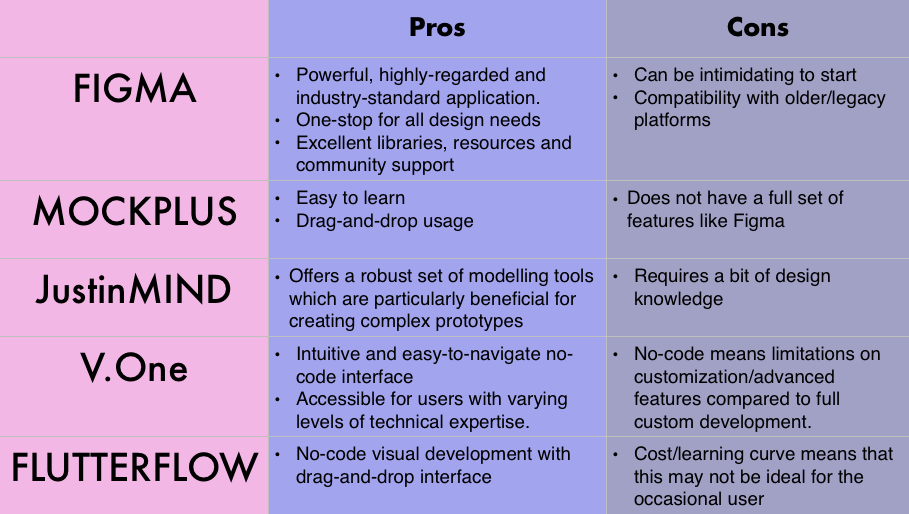
You don’t need to code from scratch — there are plenty of UI design tools to make the job easier. Some focus on rapid prototyping, while others are built for seamless developer handoff.
A toggle button is only as good as how well it fits into its context. Choosing the right one isn’t just about aesthetics — it’s about understanding the different button types, their purpose, and the design principles that make them intuitive. These principles are shaped by logic, historical convention, and psychology, ensuring that users don’t have to think twice before making a selection.
Toggle buttons (or “segmented controls”) help streamline interactions, making it easier for users to access features without unnecessary friction. Good design means keeping things consistent, avoiding visual clutter, prioritizing accessibility, and ensuring responsiveness across different devices.
Luckily, designers today have no shortage of tools at their disposal. Whether it’s open-source frameworks like React and Bootstrap, design powerhouses like Figma, or drag-and-drop/no-code solutions, the right choice comes down to familiarity, flexibility, and the needs of the project.
Kodak’s old slogan — “You press the button, we do the rest!” — captures the essence of good toggle button design. A well-crafted toggle should feel just as effortless.

LogRocket's Galileo AI watches sessions and understands user feedback for you, automating the most time-intensive parts of your job and giving you more time to focus on great design.
See how design choices, interactions, and issues affect your users — get a demo of LogRocket today.
AI has made polished, confident content easy to generate, but that does not make it trustworthy. This article explains how UX teams can design stronger quality signals using source transparency, validation, confidence communication, and reputation.
Inclusive design is evolving beyond accessibility alone. This guide explains how UX designers can create more inclusive products through usability, accessibility, neurodiverse UX, adaptive personalization, multimodal design, and culturally aware product experiences.

I was working with an intern on a UX research project, and before we even started, we both had private […]

AI has accelerated design execution, but speed can come at the expense of intentionality. Learn how UX teams can preserve product thinking and judgment.

 Learn more →
