The UX world is riddled with frameworks and processes designed to simplify complex user behavior. While the intention is sound and makes sense, there’s a catch. Real users rarely follow the script. Their journeys aren’t linear, they don’t discover features in a specific order, and their needs and expectations differ greatly.
Don’t get me wrong. UX frameworks are still helpful tools that make our lives easier. You do need, however, to keep in mind their imperfections. Design for real users, not for frameworks.
Simplifying user behavior makes it more manageable to act on it or communicate with stakeholders. But it can also make us overlook the interesting, nuanced aspects of how users actually interact with products.
Let’s take a look at a few examples.
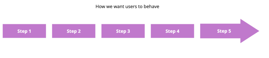
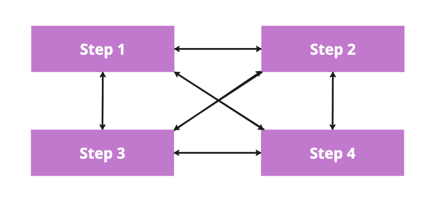
One of the most common simplifications is mapping user paths linearly. Whether it’s a simple flowchart or a fully developed user journey map, we tend to present it step by step, like this:
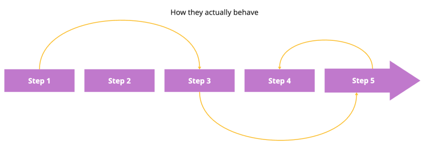
But reality is different. Users often skip steps, start from different places, or even move backwards through your idealized flow. Like this:
I recently wasted a few minutes at a self-checkout. I assumed I could enter my discount code during the payment step. Instead, the system required me to input it during item scanning. I had to reset the process and start over.
I’m sure this made perfect sense on their user journey map, but in reality, it was neither aligned with my expectations nor had clear affordances that I should put the input code so early.
User personas are often misunderstood. Beyond the frequent confusion between personas and proto-personas, we tend to over-rely on persona information as fact.
In reality, user personas aren’t scientific — they’re directional. They’re meant to:
Use user personas as a starting point — to get a high-level sense of direction and how the solution should work. But always back them up with targeted research and user testing to understand how real users will actually behave.
We tend to design flows in a clean and efficiency-focused way — add only as many buttons as needed, ask for a minimal amount of information, and move users step-by-step towards the goal.
It all makes sense. On paper. But real users:
And all that creates a need for flexibility within workflows and different navigation paths — even if the final product is less “clean.” At the end of the day, following key UX heuristics such as error prevention and tolerance, recognition over recall, flexibility, and efficiency of use triumph over a beautiful and clean UI.
Let’s cover a few examples when users break the idealistic, framework-like path, often damaging their product experience.
Many users skip onboarding, especially in B2C products. I could never get onboarding completion rate above 20% (unless it was forced).
Sometimes it’s because users are in a rush. Sometimes it’s because they’d rather discover the product on their own.
Assuming that people are aware of particular features and options thanks to the onboarding is often a flawed belief.
People don’t always follow the expected sequence.
We already discussed my self-checkout experience. Another example is of European expense laws. Legally, users must request an invoice before paying. But most people expect to do this after payment.
This mismatch led to confusion and, eventually, stores posting signs — “Ask for invoice before the transaction.” The world would be so much better if government institutions followed a proper design thinking process instead of guessing what’s right.
We like to assume that users start with basic features and, as they master them, they move towards more advanced features.
That couldn’t be farther from the truth.
There are segments of users that will only use basic features. There are also segments of users who come to your product specifically for an advanced feature. Don’t assume advanced users have mastered the basics.
Like I said in the beginning, attention spans are shrinking. “TikTok attention span” is a thing now.
Users often switch tasks or jump between tasks without completing them. Not to mention that sometimes multitasking is needed to get the job done. But many flows still assume uninterrupted focus and perfect memory. And that’s a recipe for friction.
There are a few ways to easily identify where your UX is detached from the actual user behavior:
Session recording tools are the best way to understand how users actually behave with your product. There are two main ways to use these tools:
Aggregated analysis
Thanks to AI, we no longer need to watch each recording. For example, tools like Galileo AI can intelligently identify friction points, deviation from the desired path, and aha moments —
which gives you a hint at what the main problem or opportunity areas are, and which videos are worth watching the most.
Combine this aggregated analysis with heatmaps and other analytics, and you have a truly valuable knowledge bomb.
Deep dive review
As helpful as aggregated analysis is, sometimes spending an hour or two watching all the videos (in 2x speed if needed) can also be insightful. It’s like talking to actual users vs reading an interview summary. The latter is more time-efficient, but the former helps build empathy and identify nuanced patterns that are not immediately apparent.
While usability testing often happens in controlled environments, it still helps uncover users’ mental models and where they diverge from your flow. But it’s just one part of the puzzle — real-time behavioral data from live users can reveal much more.
Ask users to complete specific tasks (like using a promo code) and observe how they approach it.
Modern tools like user pathfinders and journey analytics can map how users actually navigate, showing you where your assumptions break down:
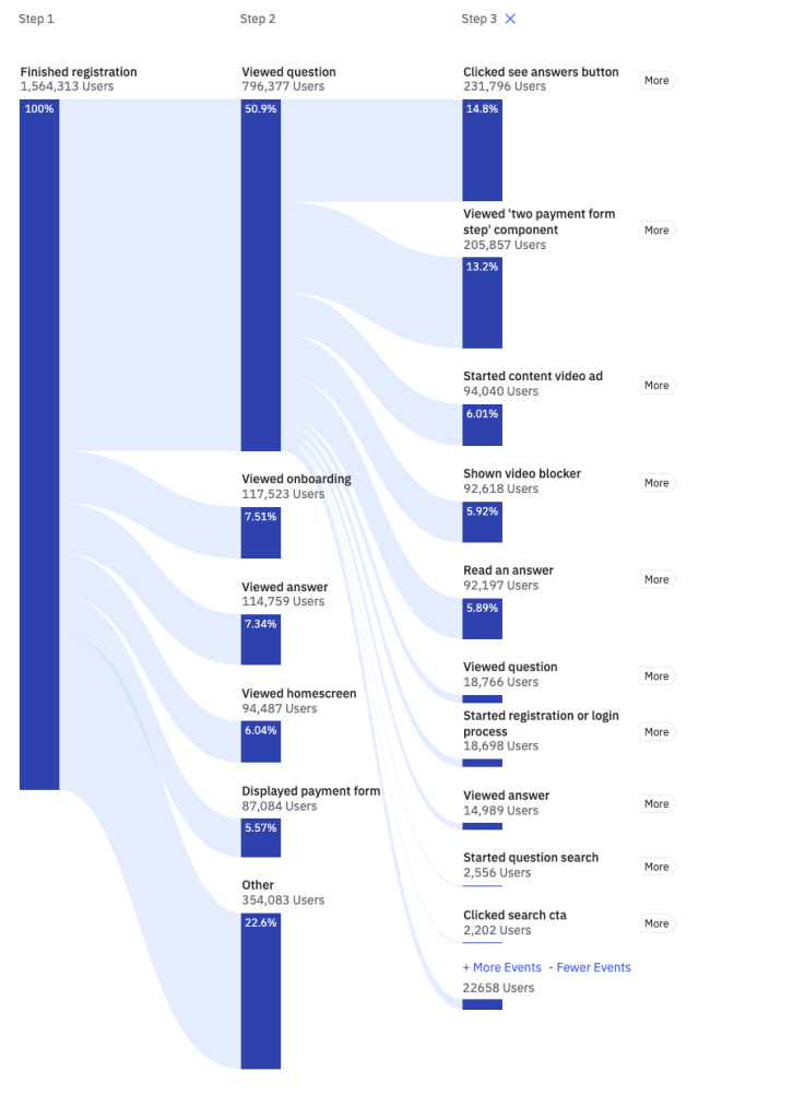
It analyzes all events related to users and automatically creates step-by-step journeys the user took, with percentage data on how many users go through which paths. It’s a great way to understand if your and actual user journeys align.
The more you combine observed behavior, real usage patterns, and structured testing, the easier it becomes to bridge the gap between how you think users engage — and how they actually do.
Designing for real users is all about constantly observing how users behave in your product and adjusting the experience to match that behavior. There are, however, some best-case practices that are applicable in the majority of scenarios:
Instead of front-loading everything, show users only what’s essential at first. Then add contextual onboarding whenever a user discovers a new feature.
This way, you onboard people to things they need when they need them.
Redundancy isn’t bad.
If a salesperson wants to call a lead, they should be able to do it from the summary view, the lead’s details, and the all-leads database.
That’s not clutter — it’s flexibility.
Users might start from different places or skip steps. Let them.
While it’s okay to optimize for a linear step-by-step journey — if you did your research well, that should be the most common path — make other paths at least usable for your users:
That includes:
Sometimes it’s impossible to complete a particular step without completing the previous one. In cases like that, provide clear error states for users and explain to them what they need to do. Ideally, include a hyperlink to the related missed step in the error message itself so that the user doesn’t have to look for it.
Even if you onboard users, they’ll forget details after a while. Exploring a new product already places a significant cognitive load on users, so any information that doesn’t seem essential at first tends to slip away.
A great solution is to provide contextual help whenever needed. And the easiest way to achieve that is to provide helpful tooltips for advanced features and complex information. Something like this:

Some designers believe that the tooltip is a last resort and a lazy solution for an overly complex product. However, with users coming from different places and skipping steps, the product will be overly complex for some of them.
Watch user recordings, conduct usability testing, and analyze data such as dropout points or time-on-page to understand where you have the most friction. Common friction points include
Assuming it’s not poor design itself, the second most common cause of friction points is misalignment between your idealized user journey and the actual needs and understanding of your users at a given step. Figure out what exactly it is (e.g., by talking to these users) and iterate on the design.
Lastly, consider completely different user paths for different user segments.
Say you are building a teacher portal for schools. You might learn that middle school, high school, and college teachers have different ways of doing things and rely on different features.
You could ask them at the very beginning where they teach and, based on their answer, provide them with a customized experience that better aligns with their goals and behavior.
That’s the most expensive option, but also the most effective one.
For example, Canva asks you during the onboarding, “What will you be using Canva for?”. It’s not just for getting marketing insights.
Depending on your choice, they offer you different templates and highlight various features first. It helps reduce the cognitive load for users and makes the journey much more aligned with end-user needs.
Frameworks are great for getting started and aligning teams. But they oversimplify.
Their simplified nature makes them focus too much on the “ideal world”. Clear user persona, step-by-step user journey, and efficient workflows with a minimal amount of options make sense on paper, but they rarely survive contact with more than a single user.
Invest time in watching user recordings, conducting usability testing, and analyzing user paths from a data point of view to understand where the actual user behavior differs from your idealized framework behavior. Then iterate on your design to accommodate the needs of diverse users.
Use design frameworks as a starting point. But nothing more than that.

LogRocket's Galileo AI watches sessions and understands user feedback for you, automating the most time-intensive parts of your job and giving you more time to focus on great design.
See how design choices, interactions, and issues affect your users — get a demo of LogRocket today.
AI agent simulations promise faster, lower-risk UX testing by replacing real users with AI-simulated personas. Here’s how the method works, where it falls short, and when designers should rely on simulated users versus real user testing.
A/B testing is great for comparing two versions of a design, but multivariate testing helps teams evaluate multiple design element combinations at once. Here’s how both methods work, how they differ, and when UX teams should use each one.
Design engineering has always lived between design and code. But with AI tools turning prompts into interfaces and code into editable canvases, that bridge is becoming a new way of building.
A three-week mobile banking project taught me that the “proper” UX process is not always realistic. Sometimes, the better approach is to work with what you know, identify what you still need to learn, and make the strongest decision possible under real constraints.


