The iPhone’s UI design has largely remained the same since iOS 7 — announced at the WWDC keynote on June 10, 2013, and released on September 11 of that year. iOS 7. That release marked Apple’s last major mobile UX redesign until June 9, 2025, when it unveiled an “entirely new expressive material” called Liquid Glass.
In the words of Alan Dye, VP of Human Interface at Apple, iOS 7 “redefined their design language for years to come.” Now, Liquid Glass is framed as an “opportunity to lay the foundation for the next chapter of their software,” and Apple’s “broadest design update ever.”
As expected, the fallout has been massive. The internet lit up with hot takes — and, honestly, it’s a breath of fresh air. Before this, the most exciting iPhone updates were a couple of buttons (the Action button and camera control) and maybe the Dynamic Island. It had become a running joke. The iPhone hadn’t really looked new in years.
Apple is also renaming its operating systems to match the year of release. The iPhone is jumping from iOS 18 to iOS 26, macOS from version 15 to 26, and so on — all part of a broader move to “create a harmonious experience as you move between products.”
The beta version of the new OS is already out — and reactions have been anything but harmonious.
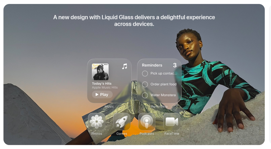
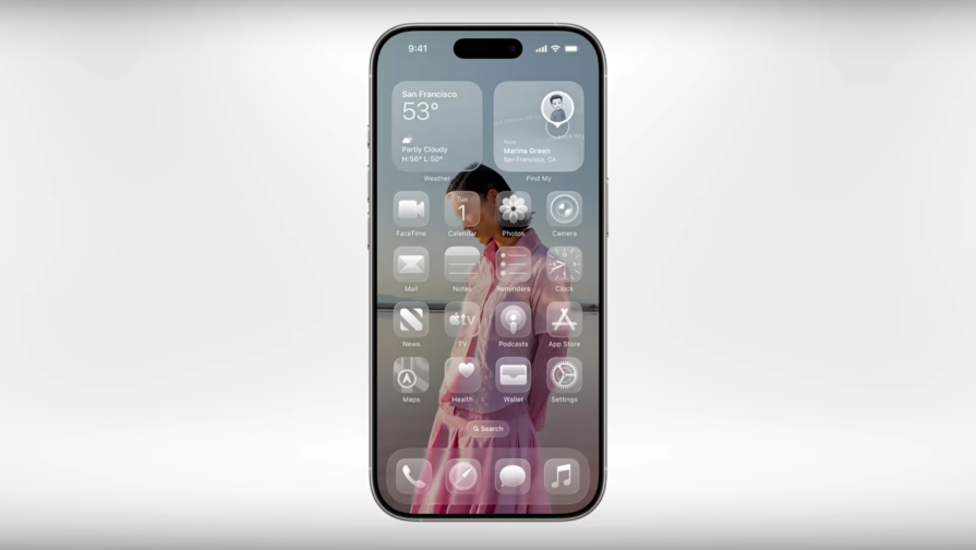
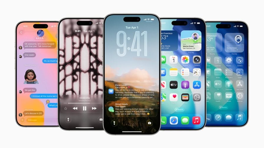
Liquid Glass comes in light and dark modes, with colorful tints and a new “clear” aesthetic. Many agree it looks stunning. But have concerns about readability:
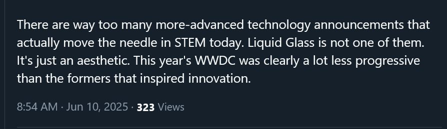
Tech YouTuber Marques Brownlee (MKBHD) was among the first to react. He posted a screenshot on X with the caption, “I’m a bit concerned with readability.” Here:
In his YouTube breakdown, he said the “all clear” option “is a little much and readability might be tough.” He also said that, while the glass aesthetic looks good, it’s also hard to read sometimes because of the backgrounds, and “backgrounds are needed to provide contrast and make things easier to see.”
He’s not alone. Arun Maini, Mrwhosetheboss, captioned his own post — “Isn’t this a recipe for readability issues?” Fisayo Fosudo, another Tech YouTuber, posted a GIF of Jake Peralta squinting, captioned — “Me trying to identify apps.”
They have a point. Transparent UIs can be tricky to work with. Low contrast, difficulty distinguishing the background from UI elements in the foreground, weak blur handling, and unclear borders. Makes you question the practicality of the transparent devices and holographic displays we see in movies, like Real Steel and Pacific Rim.
The all-clear Liquid Glass design looks great with dark backgrounds, though. And sure, users can reduce transparency — but then you’re left with an ordinary Gaussian blur. That undermines the whole “revamp” narrative.
Some call Liquid Glass a disaster. Others say it’s a long-overdue aesthetic update. The positive feedback mostly praises the “insane” attention to detail in Liquid Glass animations. Or they claim that UI/UX design has “peaked.” But those takes are outnumbered by memes and critiques. Plus, most of the praise is vague — while the criticism is specific and grounded in usability.
Still, it’s worth noting that this is a developer beta, not a final release. But Apple made it available to the public, so it’s fair game for feedback. And in this era of rage-baiting and impression farming, some of the blowback is probably exaggerated.
Another criticism of Liquid Glass is Apple’s habit of rebranding old ideas as breakthroughs. CEO Tim Cook opened the keynote promising “some exciting new innovations.”
Now, “new innovations” is already redundant — innovations are, by definition, new — but fine, we’ll let that slide.
Translucent glass UIs aren’t new. Windows Aero did it in 2006 with Vista. Aero stood for Authentic, Energetic, Reflective, and Open — and the whole theme centered around “animation, glass, and translucency.” Sound familiar?
Windows Vista wasn’t well received, but Aero lived on in Windows 7. It was basically Liquid Glass before Liquid Glass. Microsoft later dropped it with Windows 8’s flat design, but the aesthetic lingered — even spawning a nostalgia-driven trend — Frutiger Aero, defined by gloss, skeuomorphism, and reflective UI effects.
Many online have pointed out the similarity. Why is Apple’s 2025 headline featuring something Microsoft tried nearly two decades ago?
Liquid Glass is a new material that combines the optical qualities of real glass with a sense of fluidity:
Inspired by visionOS, it’s now Apple’s go-to design language across all devices and platforms. Their goal is to establish harmony. That means your iPad UI will feel familiar to your iPhone — visually aligned, but contextually adapted.
In typical Apple fashion, their description is loaded with sleep technical jargon. Look closely, and you’ll see phrases like “adapts to content or context” and “personalized experience with a focus on intuitive content.”
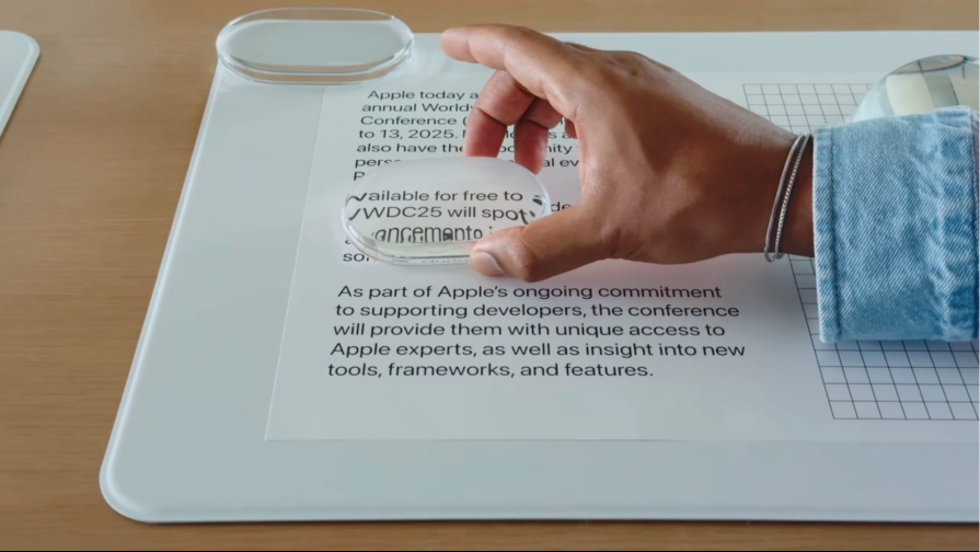
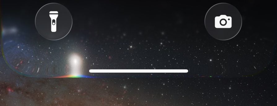
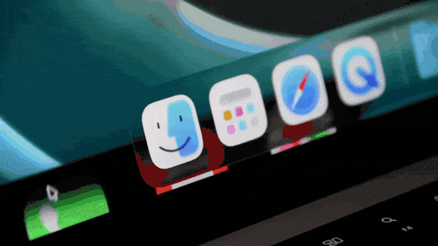
Apple took the properties of real glass and recreated them digitally. When in motion, it distorts the UI elements behind it — just like a curved glass distorting paper underneath. Here’s a screenshot from the WWDC keynote:
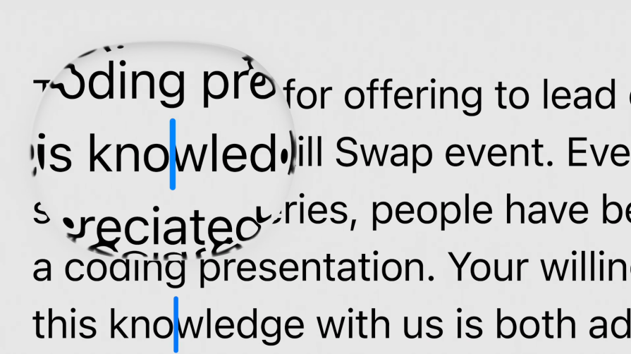
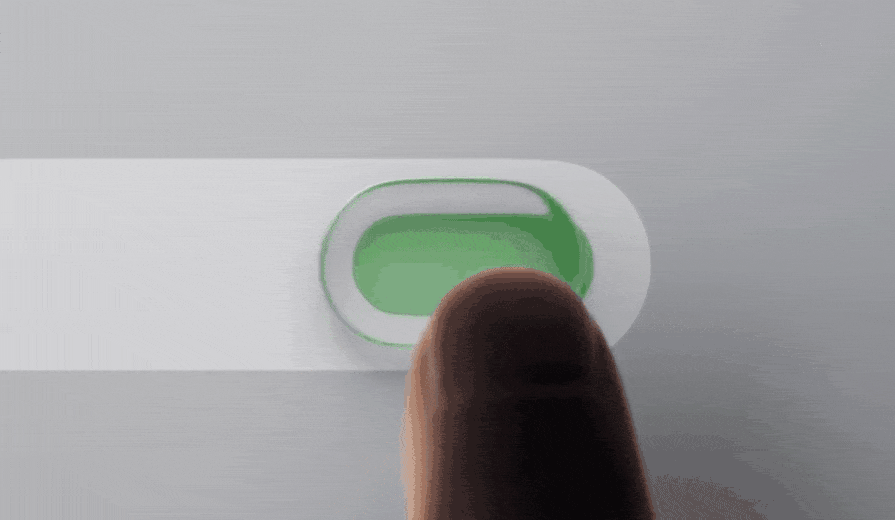
And here’s what happens when you move the cursor to highlight text — the text bends around the digital “glass” edge, simulating light refraction:
It even replicates dispersion, breaking white light into the colors of the rainbow:
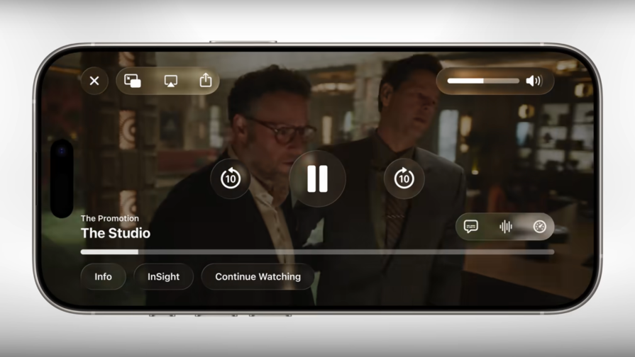
Say what you want about usability — this is visually impressive. The animations are fluid, and interactive UI elements morph like water.
Liquid Glass is doing everything it can to convince you that it’s actually, naturally, factually glass. These details really shine during animation. But when the UI is static? It loses some of its magic.
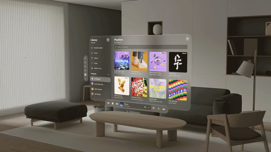
When I first saw it, I thought, “Isn’t this just glassmorphism?” In still frames, it looks like the same effect we’ve seen before — albeit fancier:
Memes followed quickly after the keynote — one had a placard that read, “Background Blur is not Liquid Glass.” But under the hood, I see filters, box-shadows, borders, and displacement maps — tools a frontend developer can replicate with CSS and SVGs.
Glassmorphism is a UI design trend built around translucent, glass-like backgrounds, soft blurs, and layered depth. It’s been popular in luxury and tech-focused UIs for years.
Liquid Glass builds on that — but with Apple’s signature move — tightly coupled software and hardware to make it feel seamless.
Apple’s approach is rooted in skeumorphism — borrowing from the physical world to shape digital behavior. Where skeuomorphism mimicked real objects (buttons, dials), glassmorphism and neumorphism are its modern, abstract descendants. Liquid Glass is clearly a branch on that same tree.
When people hear “glassmorphism,” they think of “frosted glass” — but it’s more than that. It includes borders, gradients, and carefully layered shadows. So yes, Liquid Glass isn’t just background blur. But it’s still very much glassmorphism.
And if anything, it might need more blur. One could argue the biggest issue isn’t that Apple copied the aesthetic — it’s that they didn’t copy it well enough to make it legible.
Maybe the backlash wouldn’t sting so much if the launch hadn’t been wrapped in such grandiosity. Apple helped popularize modern glassmorphism with iOS 7 — and now they’ve returned to it with a more refined (but divisive) take.
This move aligns with Apple’s AR/VR push. Liquid Glass shares a design lineage with visionOS — and glassmorphism is well-suited to immersive, layered interfaces.
Apple has long been accused of “borrowing” from Samsung and, by extension, Android. The new Liquid Glass direction echoes that. Case in point: Apple is rolling out a unified UI for the first time — much like Samsung’s OneUI design philosophy. The goal was “connecting various devices together to provide a seamless experience.”
Samsung even simplified its icons — something Apple is also doing in this latest update.
Fundamentally, all three companies are now following the same playbook. Unify platforms, simplify UIs, and build a design language that can flex across form factors.
Glassmorphism features prominently in all three ecosystems. Here’s a comparison of quick settings from iOS 26 beta, Samsung’s OneUI 7, and Google’s Android 16:
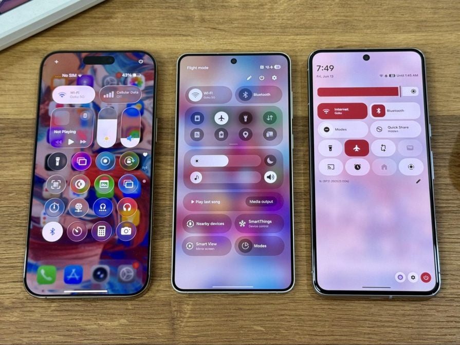
The blur gets progressively less intense. It seems Apple prioritizes aesthetics, Samsung is well-balanced, and Android is all about accessibility. Some online summarized it this way: Apple is beautiful, Samsung is professional, and Android is lazy.
Despite the backlash, the real sting might come from expectations. People wanted a revolutionary experience. What they got was an animated version of a 2006-era design trend — new icons, shiny transitions, and translucent layers.
Apple likely hoped for awe. Instead, they’re fighting memes.
But can we really blame them?
Generative AI is fast becoming the standard for smart devices — and for once, Apple is late to the party. Later than usual.
Apple Intelligence, its much-hyped AI system, was announced at WWDC 2024. Demos were flashy, and the marketing framed it as a major leap forward. One year later, and all we got was a rainbow animation for Siri. There are a few AI-powered features sprinkled throughout, but none of the lofty promises have been delivered. In fact, Apple was even sued for false advertising.
One user on X put it plainly:
Liquid Glass has been called everything from “embellishment” to “ugly,” “pointless,” “Windows Aero 2.0,” and “a distraction.” And you get why Apple users are frustrated. They didn’t ask for visual frosting — they wanted cutting-edge functionality. Meanwhile, Samsung and Google are leapfrogging Apple in GenAI integration.
Tim didn’t exactly Cook with the UX, but let’s be fair — Apple absolutely cooked the animations. When you scroll, it genuinely looks like you’re seeing content through real glass:
Toggles morph into liquid, ripple, and snap back. Some say it’s not physically accurate, but come on — the animation craft here is top-tier:
With the right background and just enough blur, it’s undeniably beautiful. But when the initial excitement wears off, the places where Liquid Glass doesn’t excel become clearer.
Readability is the loudest, most consistent complaint. Users find it difficult to read text layered over the transparent UI, especially on bright or complex backgrounds. The low contrast and transparency create real accessibility issues for those with low vision or contrast sensitivity.
Liquid Glass also increases cognitive load — it demands more mental energy to interpret the interface. Instead of reducing fiction, it adds more.
Motion and light effects, while impressive, don’t always serve the user. In fact, they can be distracting and disorienting — especially for those with motion sensitivity. Performance issues are already being reported — laggy transitions, bugs, overheating, and battery drain.
This is still a developer beta, so some of this is expected. But it raises a bigger concern: does Liquid Glass scale across devices, use cases, and users? Or is it a designer’s dream and a user’s frustration?
From the Y2K era to skeuomorphism, flat design, and now glassmorphism/neumorphism — UI trends have always cycled through aesthetics, abstraction, and mimicry.
Apple’s history mirrors that timeline:
We might be standing at the beginning of a new visual era. The aesthetic stakes are rising again. This time, it’s not just about how UIs look — it’s about how they move, respond, and react to context.
It’s easy to mock Apple’s slow AI rollout or to reduce Liquid Glass to fluff. But even with its missteps, Apple is still setting the pace — visually, if not functionally.
This is an opportunity to learn from Apple. The issues have been well-documented. Can you do better?
Liquid Glass introduces a new way of thinking about interface behavior. It responds to light and motion in real time. It simulates physics, bends light, and adapts dynamically to surrounding UI elements.
It’s ambitious, flawed, and worth paying attention to.
Designers and devs should start thinking of how to replicate the good aspects of Liquid Glass. Figma is already bringing Liquid Glass to its platform. Apple has also updated its design guidelines for those who want to build for its platforms. It’s coming — whether you love it or not.
I’m waiting for the first third-party Apple apps that’ll be brave enough to use Liquid Glass in their design.
The bigger question is this:
Liquid Glass may not be perfect, but it signals something big. Apple’s own words sum it up:
The stage is set for something new that will enable great experiences for years to come.
Time to decide what that “something” will be. You can’t control Apple’s roadmap — but you can control how you design through the noise.

LogRocket's Galileo AI watches sessions and understands user feedback for you, automating the most time-intensive parts of your job and giving you more time to focus on great design.
See how design choices, interactions, and issues affect your users — get a demo of LogRocket today.
Learn how context-aware mode prioritization and seamless transitions improve multimodal UX and reduce mode confusion.

Research is becoming more democratized, product cycles are accelerating, and AI is transforming synthesis and ResearchOps. Here are the three trends shaping UX research in 2026.
Voice support is not the same as multimodal UX. Here’s how to design systems with true mode continuity and context-aware interactions.

AI tools can generate beautiful UI concepts in minutes, but most teams struggle to integrate those outputs into real design systems. This guide explores why AI drifts toward generic patterns and how to build governed workflows that keep speed without sacrificing brand consistency.


