Nowadays, everyone can be a designer. With the advancement of design tools, design systems, and AI tools, long gone are times when one had to spend hundreds of hours learning how to put things together.

But it doesn’t mean everyone can be a good designer. Design is more than just drawing rectangles and putting visual elements together.
It’s also about making decisions. Both small design decisions, such as the color of the button, and big ones, such as information architecture, have tremendous impact on both user experience and business effectiveness.
However, a set of well-established practices can guide you in making those decisions. Below, you’ll find 16 design practices I’m willing to bet my career on.
On a macro level, there are two groups of users we must take into consideration:
To maximize your chances of conversion, you need to win both groups.
You do that by optimizing the first impression for fast thinkers while offering an alternative flow for slow thinkers.
Let’s take an example of our approach when designing the checkout experience at Brainly. When you land in our purchase funnel, you first see a checkout with a minimal amount of information and an already preselected plan. If you are a system 1 thinker, you just need to click a button:
However, if that amount of information is not enough for you to decide (you are in system 2), there’s a “see all plans” option, which moves you to a more robust checkout experience with additional choices and information:
The order of operations is critical — always optimize for system 1 thinkers first.
If we showed a full checkout at first, we would scare fast thinkers off. Slow thinkers, on the other hand, tend to read line by line, so they’ll find the small “see all plans” button without an issue and won’t mind a few extra seconds spent in the flow.
How do I know that works? Well, introducing this particular experience improved our conversion rate by a freaking 30 percent.
This one is more copy-related, but I know that designers are often responsible for suggesting or writing the copy.
There’s a tendency, especially among early-level UX writers, to write clever copy. That is:
This often leads to a clever but unclear message, and clarity is the most important thing to optimize for. If your users don’t understand your message, no amount of humor or novelty will help.
Let’s take a look at Basecamp’s old homepage messaging:
“We’ve been expecting you” grabs most of the attention, but it tells me nothing. The problems listed are unclear (what does “hair on fire” mean, really?), so I don’t really know what “Basecamp solved them” means. I can’t even figure out what Basecamp is.
Unsurprisingly, they changed the approach entirely later on.
The messaging tells from the beginning that it’s project management, and it even clarifies that it’s optimized for small teams, which reconfirms whether it’s a tool for me.
Although I still don’t have all the details (it’s not a goal of a hero section, anyway), I have much more clarity on what Basecamp is all about and whether it’s for me.
Clarity over everything else.
Each screen on your website should be focused on a single call to action.
I know it’s often tempting to add more than one CTA, but the truth is, if with a single CTA it’s already hard to convert users, additional ones will only make your life harder.
Your conversion chances grow significantly if the whole page focuses on a singular action.
Timing is everything.
If you ask users to do something too early, they will not be convinced enough to convert, and you’ll most likely scare them off.
If you ask too late, your system 1 thinkers might grow impatient and confused and bounce.
Take a look at old Wizzley’s website:
It starts with a header and then moves immediately to a registration call-to-action. Why would I even register, though? I don’t even understand what it is and how it works yet.
The new site gives you more time to explore before registering.
One of the ways to find the right timing is using the Psych! Framework. Assess what level of user psych is required to complete the action, and then, design a user journey that boosts the psych to the necessary level and immediately follows up with the ask.
I am genuinely surprised there are no dedicated “form designers” out there yet. Forms are one of the most crucial design challenges when improving funnel conversion.
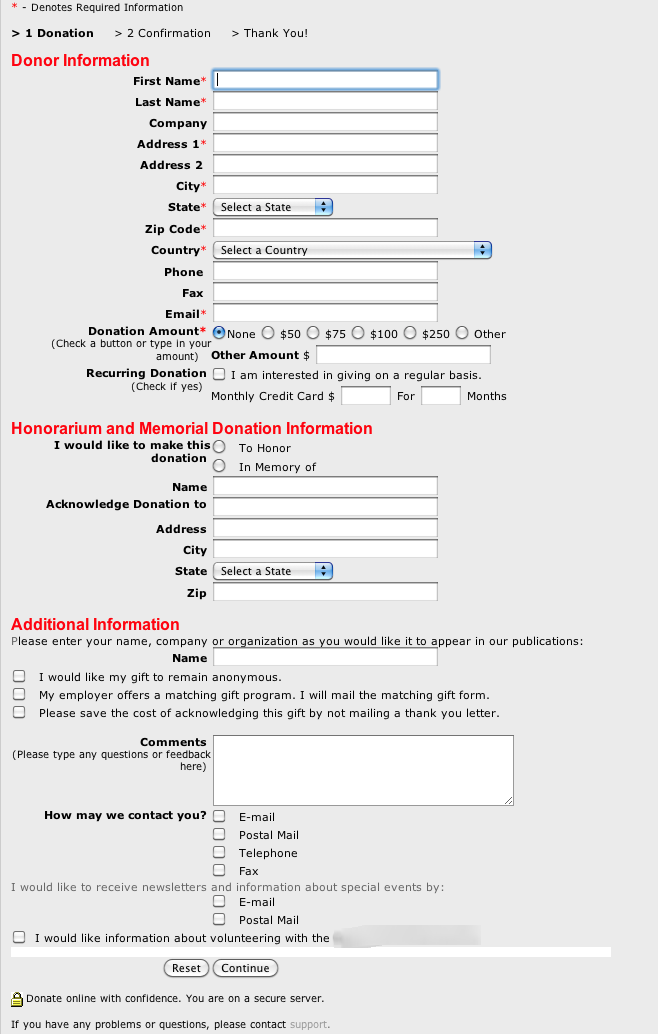
Take a look at the form that’s needed to send a donation:

If I saw it, I would close the tab and never return. Giving away my hard-earned money is already a considerable effort, and if I also need to do additional heavy lifting to do so, I’d rather spend it elsewhere.
Of course, that example is rather drastic. Still, most forms on the internet could use some optimization.
As a starter, here’s a handful of best practices to live by:
There’s an endless debate as to what color should a call-to-action have. There are even hundreds of A/B tests seemingly proving that one color is better than the other.
But the color doesn’t matter. The only thing that matters is contrast.
Yes, in one test, red CTA performed 21 percent better than green CTA. The catch? The dominant color on the whole page was green, and that’s the entire story:

Always make sure your CTAs contrast with the rest of the page; this way, they grab more attention.
One of the biggest surprises I’ve had when working on conversion rate optimization (CRO) is how big of an impact scroll optimization can be.
Scroll optimization is about maximizing both:
Improving these two metrics leads to better conversions in general.
But does it mean you must shout “scroll down” on your hero section or arrows pointing down? Not necessarily.
Sometimes, it’s about small visual cues that show people there’s something interesting below. Sparking curiosity is key.
Let’s take a look at ClickUp’s homepage:
On the most common viewport, people can see a snippet for the section below. Showing just a part of the picture below, combined with playful colors, creates a strong pull to scroll just to see what’s there.
And when people scroll more, they usually read more, and the more they read, the higher the chance they’ll convert.
No matter how much you optimize for scrolling, there’ll always be hardcore system 1 thinkers who’ll never scroll. They usually decide whether to move to the next step within a few seconds.
Thus, no matter how long and detailed your page is, ensure the hero section alone fulfills the page’s objective. Anything below the fold should just be reinforcement and extra details that system 2 thinkers need:
For example, although Buffer has quite a robust landing page, the hero section (in red) already:
The rest of the page might not exist, and the hero already does all the heavy lifting.
With an estimated 56 percent of global internet traffic originating from mobile devices and only 39 percent from desktops, it should be only natural to optimize the design process for mobile.
However, that’s often not the case. Many companies first design on desktop and then try to make the design work on mobile.
Not only does optimizing for a smaller audience, but it also tends to make mobile designs cluttered. Expanding from mobile to desktop is easier than the other way around since you are getting more space, not less.
Although there are exceptions (e.g., if your audience users are primarily desktop users), mobile-first will become an increasingly significant rule in the design process.
A bad designer focuses only on usability.
A good designer understands that accessibility is crucial.
A great designer knows that inclusivity is the future.
The fact that the website must be usable is a no-brainer. I hope I don’t have to explain it to anyone.
Accessibility adds to that by making life easier. This is not only for impaired users but often also for casual audiences. I’m not vision-impaired, yet I prefer properly contrasting and clear fonts.
Inclusivity helps create the feeling of belonging to everyone. It’s especially helpful for winning the loyalty of underserved minorities.
You create accessible designs by:
You achieve inclusivity by:
Airbnb is truly an innovator in its space, and it has changed the way we travel and plan holidays.
But you know which area they don’t innovate in? The way they approach design.
Let’s take a look at their calendar picker:
It’s no different from any other calendar picker on the internet, and that’s good. People intuitively know how to use it, and it just looks natural.
Don’t reinvent the wheel in areas that don’t need the innovation. It’s a wasted effort that only harms the user experience.
It must be crystal clear what’s going on at any point of the user journey. Getting users confused is the fastest way to increase bounce.
What I like to do is to visit every page on the website I’m working on and ask the following questions:
A page that answers these four questions within a couple of seconds passes my clarity audit. Otherwise, improvements are needed.
Using people’s photos to establish trust and credibility is one of the oldest marketing tactics.
Seeing happy faces on the website invokes positive emotions, which makes buying easier, and seeing photos of relevant specialists builds extra trust. We all know that the “dentist recommend” is an overused marketing tactic, yet it still works.
You don’t need to forcefully put these photos in your designs, but if you see an opportunity to add this human touch while maintaining a clear layout, go for it.
However, make sure to use original photos.
Stock photos tend to have 1 percent of photos that sell the most, which leads to repetitiveness, which actually reduces trust.
Look at the photo below. I’ve seen that lady on four websites already. If I see it on yours, I’ll only scream, “cheap fake”:
Although AI-generated pictures are not that repetitive, many people will be able to spot that these are not actual photos, and this can damage credibility. Why would I trust you if you can’t even get a photo of a happy customer and must use AI to fake that?
Sometimes, the only way to improve the website’s clarity is to use the right visuals.
Our brain processes visuals fifty times faster than text. Use it to your advantage.
In the old days, Square offered physical plugins that you put into your phone’s jack and swipe credit cards to collect payment.
Let’s take a look at how their website looked back then:
The picture perfectly showcases how the product works. How many words would you have to use to describe the image? Too many.
Visual hierarchy is what guides users through the website experience. It dictates where users look first, which in turn dictates what thoughts and feelings the website provokes.
Let’s take a look at the website of a grill producer.
The very first thing that catches attention is the big picture of freshly grilled meat. I’m not sure about you, but it already makes me drool. It makes the vision of buying a grill even more compelling.
The second thing is the hierarchy, which is the header, which, in this case, clearly explains what the page is all about — an essential goal of any website.
Then, the attention goes to the CTA; if you are a system 1 (fast) thinker, that’s your next step. But if you need more convincing, there’s an extra explanation (4) and a promo banner (5) to seal the deal.
If buying is not what you are looking for, you can always use the navigation (6).
There’s nothing random on this page. Using a smaller picture, you’d lose that hunger-invoking first impression. A more prominent navbar would steal the attention from elements that matter.
Take visual hierarchy seriously. If you want to learn more about the topic, take a look at our deep dive into visual hierarchy.
At each step of the user journey, people ask themselves various questions. Anticipate them and focus your designs on answering these doubts.
Say you are designing a checkout experience for a footwear store. What are the questions people might ask themselves before clicking pay?
Since the size might not fit, they might be worried about returns, so make sure the page clearly states your (hopefully favorable) return policy to address this doubt.
Whenever you think about what you should put on a page, think about what doubts people might have at that particular step and focus your design on addressing them.
Good design is a result of good design principles. These principles are what distinguishes exceptional designers from pixel-pushers after a boot camp.
The list is by no means exhaustive. There are hundreds of practices, and various designers hold different beliefs about which are most important. Since my area of expertise lies in product monetization, the practices I’m a proponent of are, naturally, biased towards optimizing conversion rates.
However, optimizing for conversion is very similar to optimizing for user experience – you don’t have one without the other — so these principles are pretty universal. To recap, these are:
Meet all the checkboxes, and you’ll have a truly well-designed website.
Header image source: IconScout
LogRocket's Galileo AI watches sessions and understands user feedback for you, automating the most time-intensive parts of your job and giving you more time to focus on great design.
See how design choices, interactions, and issues affect your users — get a demo of LogRocket today.

Design engineering has always lived between design and code. But with AI tools turning prompts into interfaces and code into editable canvases, that bridge is becoming a new way of building.

A three-week mobile banking project taught me that the “proper” UX process is not always realistic. Sometimes, the better approach is to work with what you know, identify what you still need to learn, and make the strongest decision possible under real constraints.

A/B testing compares two versions of a design to see which performs better with real users. Here’s how UX teams can use it to test hypotheses, measure outcomes, and make smarter product decisions.

This case study shows how one ad experience redesign increased total ad exposure while lowering perceived friction, proving that timing and context can matter more than raw interruption.