After ten years of working with designers across teams and reading online about designers struggling to develop an efficient design workflow, I have recognized the challenges they face.
Designers tend to think that because the design process is creative, they can’t add some guidelines and work in a clear workflow structure.
Because of this lack of structure, designers often struggle to finish their work on time. They also move back and forth in the design process without making concrete decisions or finishing projects.
I have faced this challenge, too. It took me time to understand how I could create an efficient design workflow that would work well for my creative goals.
In this article, I share ten super actionable tips for creating an organized design workflow that allows you to work more efficiently and quickly.
When you give people you work with confidence about the process and the output they will get, they will be confident in you, and it will be easier for them to work with you. Moreover, showing that you have a defined process sharpens your focus on the tasks you need to do, ensures you feel accountable, and gives you more confidence.
For each part of the UX design process, show and explain your actions to the product or design team you work with; if you do it, they understand you better.
For example, if a product manager comes to you with a request, you must show them how you will work on it.
Describe how, first, you will conduct user interviews. Then, you will create some solutions and share them with the PM and the developers. After that, you will start working on the details, the edge cases, and the visual design.
Pro tip — Always explain to them the “why” behind why you’ll take a certain action to solve the issue. For example, you’ll conduct user interviews. But why? — to better understand the user and gather valuable insights.
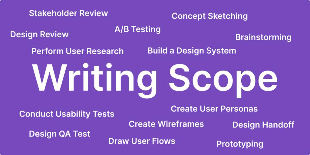
The first task in making the process of design planning successful is to define the scope, or, in other words, what is necessary.
Without a clear scope, you will not know what you should do, and worse, the people who work with you and you will not know how to make the decisions about the design.
The scope is the root of the entire process, and it should include information about the user, who they are, what they want, and why they want it. In addition, you must write what the feature (solution) will include and what it will not include.
The design process will start well once everyone on the team has agreed on the scope:

Many tasks have the same structure.
Think of writing a script for a user interview. Because this is a task you don’t have to do daily, you could use a guide that details what needs to be done.
Now imagine having a thorough guide and a checklist you could read each time you conduct a user interview.
The guide details best practices, previous experiences, valuable insights you learned, and the mistakes you made. It could also list some questions you should ideally ask in the interview. And in the checklist, you’ve listed all the essential steps — email the user you want to interview, share the link to the call, and send a “thank-you” email after the meeting.
You’ll know exactly what to do!
A clear workflow like this will condition your brain about the work process, allowing you to leverage your previous experience to minimize errors in your design project. A structured, iterative approach like this ensures that no critical step is overlooked.
Pro tip — Learn from your previous errors. Refine and revise your checklist continuously to avoid recurring errors and improve your design workflow.
When you work on tasks you must do repeatedly, do not start every time from zero. Instead, write templates or style guides, which you can use over and over again every time you begin the task.
The secret is to make the template for the task while you’re actively working on it instead of spending time beforehand building templates and then using them.
For example, if you need to create a user interview script, develop a template with sections for the key components, such as the opening, icebreaker questions, core questions, and summary. Of course, you’ll need to alter the core questions for every user interview.
Pro tip — If you already have a script in hand, use ChatGPT to create a template out of it. It will save you a lot of time.
A guided process also helps you focus on the important stuff and put aside the things that are not important for the process.
It’s like having a roadmap to reach your destination. Knowing where you are going and how to get there, you can easily avoid taking wrong turns and wasting time.
A simple example is when the product manager asks you to deliver a design as soon as possible, but they do not write a clear scope for the work.
If you have a clear, well-defined workflow, you recognize the importance of establishing a clear scope before beginning any task. So you can approach the manager and say, “Great, but let’s first write and agree on a clear scope so I can understand in detail what the goal is and what is necessary. Because if we don’t have it, we cannot make informed decisions.”
Having a structured approach like this not only streamlines your workflow but also facilitates effective communication and decision-making:
You must know the people you work with well to reach them when needed.
As designers, we typically think of the developers and the product managers. But more often than not, more people are involved in building a design product.
Think of when you need to include usability testing in your design process. You know you need the users who participate in the usability test to sign an NDA document. So, you will need to talk to the legal team and ask for this document. And they may need to prepare it in advance so you can use it.
Therefore, to accelerate the design process, building strong relationships with colleagues in different departments is necessary rather than starting the relationships right away.
To do it, you can:
Next step — establish how you communicate with these people.
Good communication solves many issues in the process, not only because things are agreed upon but also because it makes it easy for people to make decisions, enhancing overall efficiency.
For example, when you send someone new a message, ask if they’re comfortable communicating via message or prefer a video meeting.
Here, I’m not talking about the software you’ll use. I’m talking about tools that help you think through and solve problems.
For example, when creating a website from scratch, you’ll select various tools to ensure it meets user needs and differentiates itself from the competition.
Key tools can include:
If you focus on a specific design task like improving a paid form on your website, you might use one tool.
For example, suppose users do not understand how to fill out the form and have not completed the payment process. In that case, you can only improve the UX writing to clarify the form instructions and information requirements, making the form easier for users to understand and use.
In general, you can select the tools before you start working. It does not mean you need to write it in stone and not deviate from it, but preparing and understanding the tools you work with makes the difference.
The next step is to master these tools to improve your design process. Doing so will allow you to work much faster and spend less time figuring out how to do a certain thing using a tool.
Read online guidebooks and watch tutorials about the tool you are working with. Use tips from the tutorials. You’re sure to notice how your design workflow picks up pace.
For example, it is essential to master the shortcuts for your daily tasks and the main features of your design tools. In Figma, this includes understanding auto layout and components.
One of the most critical aspects of the design process is making decisions. And decision-making can be challenging because you fear making errors. But it is essential for progress.
The worst outcome here is indecision, which stalls the process and prevents forward movement. So, do not be afraid to make the decisions as soon as possible so you can move to the next step faster.
I can almost hear you say, “Hey, Edward! It’s easy for you to ask me to make decisions with fear.”
But I realize the difficulty, which circles back to my tip here – just build a process for you to follow every time you need to make a decision.
Of course, it’s easy to make design-related decisions, like choosing the colors or visual elements for the project. So, my focus here is on decisions about user workflow and interactions, such as how the user moves between screens.
For decisions like these, you will need consensus from others on the team because it largely affects the developers’ and users’ workflows. For example, a simple workflow for the user can add much more work for the developers. This will require you to balance the decision with the feasibility of the solution.
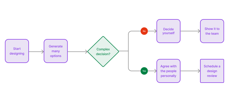
Conduct a design review every time you feel some decisions need to be made so that all of you and all the team members can agree on the solutions.
Pro tip — My personal tip is to meet team members individually and explain the solution.
For example, have a quick meeting with the PM and one with the developers before you schedule a design review meeting. That way, you can solve their issues separately and have a common starting point for the review meeting.
Here’s a workflow you can follow:
You send all the information to the developers at the end of the design process.
The best way to do this is with a clear handoff process, which should be well-structured, not only from your side but also from the developers’ side.
Here are some concrete steps you can take in this pursuit:
It’s essential to agree with the developers on how you will share the information and how they can ask questions.
For example, create a link to Confluence (or another tool like Notion) that comprehensively lists access to all the design decisions, links to Figma files, and other supporting documents.
The most important aspect is to work on collaborating effectively, ensuring it meets their needs and leads to a seamless design handoff.
AI technology is work underway. But you can automate tasks, improve accuracy, and speed up your design process with AI. Here are some examples of how:
In this article, we looked at how to build an efficient design workflow.
First, I showed that a clear design process is necessary, as it helps you focus on the essential points and prevents human errors.
Then, we looked at tips that help you understand the people you work with in the process and also focus on how you will solve the design task you need to solve, like communicating well with the team and knowing the people you need to interact with for design feedback.
Ultimately, we moved to see how you can build a clear workflow. I illuminated the importance of creating a clear flow, mastering the design tool you need to work with, making confident decisions, and why working with templates and AI will make the process much faster.
LogRocket's Galileo AI watches sessions and understands user feedback for you, automating the most time-intensive parts of your job and giving you more time to focus on great design.
See how design choices, interactions, and issues affect your users — get a demo of LogRocket today.

As products evolve into ecosystems, navigation becomes a system-level challenge. This article explores how to align structure, context, and user journeys to create seamless movement across tools without confusion.
Figma’s AI features have exploded in 2026 — from text generation and image editing to full UI drafts and code handoff. But speed isn’t the same as quality. This guide breaks down every major feature, what it’s good at, and where human judgment still does the heavy lifting.
Zero UI works well for screenless, voice-first experiences, but most digital products still require visual interaction. Here’s why multimodal UX offers a more scalable foundation for the future of design.

Multimodal UX goes beyond designing for screens. Learn how context-aware systems, progressive modality, failover modes, and accessibility-first design create better digital product experiences.