
As developers, we should aim to build websites and web apps that adapt content and components automatically to the viewer’s screen size. This approach ensures that images, text, navigation menus, tables, forms, and other content do not exceed the width of the screen, providing a good UX across various devices.

You’ve probably dealt with responsiveness while designing a web application in React. CSS media queries and container queries provide ways to deal with adaptive layouts based on the viewport size.
However, while it’s quite easy to do something based on the entire screen in CSS, how exactly do you do something based on the size of individual elements? You might be tempted to opt for a package like react-resize-detector, but the ResizeObserver Web API already present in your browser has all the features you need.
At the end of this tutorial, you’ll have a strong understanding of how to create highly responsive and adaptable web interfaces that adjust the content layout, sizing, and aesthetics based on the dimensions of their containers in React applications by leveraging the ResizeObserver API.
To effectively follow along with this tutorial, you should have the following:
useState() and useEffect()Are you ready? Let’s begin.
The Replay is a weekly newsletter for dev and engineering leaders.
Delivered once a week, it's your curated guide to the most important conversations around frontend dev, emerging AI tools, and the state of modern software.
ResizeObserver APIThe ResizeObserver JavaScript API allows developers to monitor changes in the size of an element on a webpage. As the name implies, a ResizeObserver observes whenever an element’s dimensions change due to changes to the viewport size, the layout, or other factors.
In more detail, whenever ResizeObserver observes a change in element size, it allows for an execution of a callback function in response to these changes. This is particularly useful for implementing dynamic or component-specific adjustments in response to size changes.
The following analogy could help you understand ResizeObserver. Let’s think of a ResizeObserver like a concerned coach of a football team, who’s constantly thinking about the in-game performance and condition of the players.
An attentive coach might observe factors such as fatigue, potential injuries, or changes in form, and then switch up the team’s strategy accordingly. For example, the coach might notice a player slowing down during a game and decide to substitute players or change the player formation.
When a player’s condition changes (like getting tired or injured), the coach can tell and take action to keep the team performing well. Likewise, ResizeObserver monitors elements on a web page so that when an element changes size, it triggers a callback function.
This callback function allows developers to run code in response to the resize event. In other words, it allows developers to take action accordingly, such as by adjusting the layout, resizing other elements, or improving the overall UX to ensure that the website’s “team” performs at its best.
ResizeObserver vs. media queries and container queriesBefore ResizeObserver, developers primarily relied on media queries, container queries, and JavaScript event listeners to react to changes in the window. These are effective strategies that play important roles in our day-to-day development work.
Media queries, introduced in CSS3, are a CSS feature that enables the application of styles based on the condition of the overall width, and height:
@media (max-width: 300px) {
  /*Stylesheet*/
}
Container queries, an alternative to media queries, is a CSS feature that aims to apply styling rules based on the size of a container element rather than the viewport. This allows for more component-specific design systems:
@container  (max-width: 300px) {
  /*Stylesheet*/
}
So, media and container queries are used for their respective reasons when it comes to responsiveness. Meanwhile, to get the element’s new dimensions after a resize, we could opt for the getBoundingClientRect() and getComputedStyle() JavaScript methods.
With this combination of JavaScript methods and CSS properties, developers can gain higher control over responsiveness — good and fine! But this doesn’t address scenarios where elements alter their dimensions independently. This is where ResizeObserver shines the most.
ResizeObserver doesn’t replace media and container queries. Rather, understanding how and when to use each of these tools can yield better results for your responsive designs. The specific benefit of the ResizeObserver API is to independently read the new size and then resize and style any element in your browser.
ResizeObserver in ReactWe’ve already seen the role ResizeObserver plays alongside media queries, container queries, and JavaScript methods. Let’s look more closely at a few of the specific advantages it offers:
ResizeObserver focuses on individual elements, making it perfect for responsive components within a complex layoutResizeObserver offers an efficient way to monitor size changes, helping to avoid performance issues associated with frequent polling or the overuse of resize events that can lead to costly DOM layout recalculationsResizeObserver is invaluable for web components that need to adjust their layout or functionality based on their size, such as dynamic grids, collapsible sidebars, or adaptive typographyNext, let’s put our knowledge into action.
ResizeObserver syntaxThis is how you would typically set up a ResizeObserver:
const observer = new ResizeObserver(callback);
observer.observe(targetElement);
Let’s break down the components, and explain why they exist.
ResizeObserver(callback)The ResizeObserver(callback) creates a new ResizeObserver() object. This object allows you to receive information whenever an element’s content has changed size.
The callback is a function that is called whenever an observed element’s size changes. The callback function receives a list of ResizeObserverEntry objects and the observer instance itself as its arguments. We’ll see more about this function below.
ResizeObserverEntryAs mentioned above, within the callback function, you’re provided with a list of ResizeObserverEntry objects. Each ResizeObserverEntry object represents an element being observed for which a resize has been detected.
The ResizeObserverEntry object contains the following properties of interest:
target: The DOM element that was observed to have a size change. This is the element you’re interested in monitoringcontentRect: Provides a DOMRectReadOnly object with the new content rectangle of the observed element. This rectangle gives you the new size of the element. It includes properties such as width, height, top, right, bottom, and leftcallback functionThe callback function you provide to the ResizeObserver is where you handle the observed size changes. It’s defined as follows:
(entries) => {
    for (let entry of entries) {
        // entry.target is the observed element
        // entry.contentRect contains the size information
        console.log(
            `New size: ${entry.contentRect.width}px by ${entry.contentRect.height}px`
        );
    }
};
Its purpose is to react to changes in element size. It does so by iterating over the entries and taking the appropriate action. This is where we will update our application’s state, all based on the new sizes.
ResizeObserver in ReactLet’s walk through a step-by-step guide on implementing ResizeObserver in React. We will start by creating a React application:
npx create-react-app resizeables
We called this application resizeables. Next, we’ll create a functional component, which will be the container where you want to observe size changes. In our example, the component is named ResizableDiv():
import React from 'react';

const ResizableDiv = () => {
  return (
    <div>
      {/* Our contents would go in here */}
    </div>
  );
};

export default ResizableDiv;
The next step is to attach a ref to the element you want to observe. To do this, we will need to import the useRef Hook.
We’ll use the useRef Hook to create a reference to the DOM element we want to observe. This ref will be then attached to a target element using the ref attribute. This allows you to directly interact with the DOM element in the component:
import React, { useRef } from "react";

const ResizableDiv = () => {
    const observedElementRef = useRef(null);

    return <div ref={observedElementRef}>{/* Content goes here */}</div>;
};
Finally, we’ll initialize ResizeObserver. To do this, we’ll need to import the useState() and useEffect() Hooks. It’s important to note that we could use the useLayoutEffect() Hook instead of the useEffect() Hook.
These Hooks will instantiate the ResizeObserver and provide a callback function. This callback function will be executed whenever the observed element’s size changes.
We will use this callback to perform actions based on the size change, such as updating the component’s state to re-render the UI with the new size information. Use the useState Hook to keep track of the element’s dimensions and update them when they change:
import React, { useState, useEffect, useRef } from "react";

const ResizableDiv = () => {
    const [dimensions, setDimensions] = useState({ width: 0, height: 0 });
    const observedElementRef = useRef(null);

    useEffect(() => {
        if (observedElementRef.current) {
            const observer = new ResizeObserver((entries) => {
                for (let entry of entries) {
                    setDimensions({
                        width: entry.contentRect.width,
                        height: entry.contentRect.height,
                    });
                }
            });

            observer.observe(observedElementRef.current);

            // Cleanup function
            return () => {
                observer.disconnect();
            };
        }
    }, []);

    return (
        <div ref={observedElementRef}>
            {/* Display the dimensions */}
            <div>Width: {dimensions.width}px</div>
            <div>Height: {dimensions.height}px</div>
        </div>
    );
};
Lastly, we handle cleanups to prevent memory leaks. This is very important, as cleaning up after your component helps avoid memory leaks, especially when you’re directly interacting with the DOM or using observers like ResizeObserver.
In the useEffect Hook, we will return a cleanup function that will be called when the component unmounts. In this cleanup function, call observer.disconnect() to stop observing the element and free up resources:
return () => {
    observer.disconnect();
};
Here’s the output:
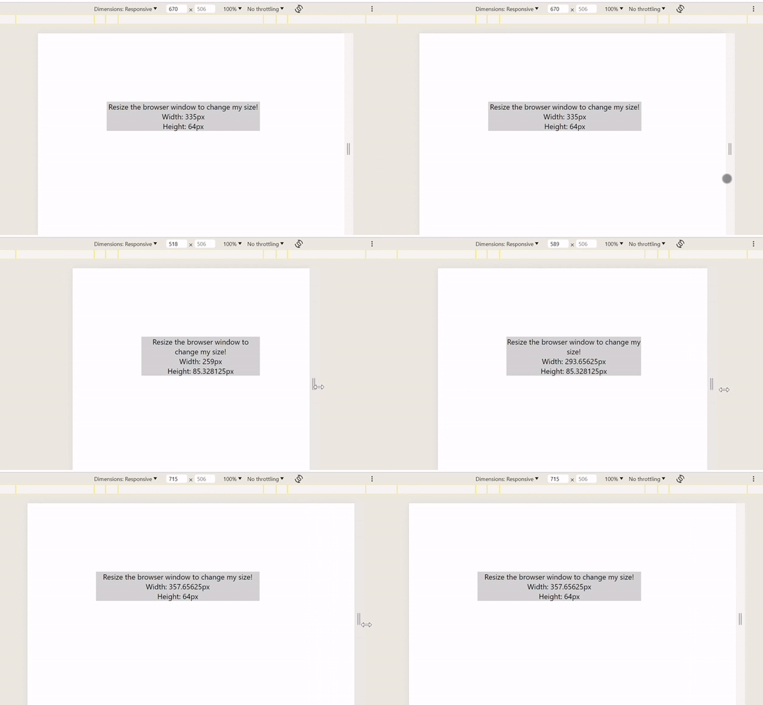
The syntaxes we used in our application above may or may not be familiar to you, but these syntaxes are responsible for our work with ResizeObserver in React applications. Hopefully, the explanations and the use cases we’ll discuss below will do justice to providing you with a broad understanding.
ResizeObserver with flexboxIn this section we look at two examples of using ResizeObserver with the CSS flexbox module. The first example shows how to create responsive card components. The second example demonstrates how to create responsive typography.
ResizeObserver to create responsive card componentsAt the end of this example, we’ll have a responsive project that looks like the GIF below:
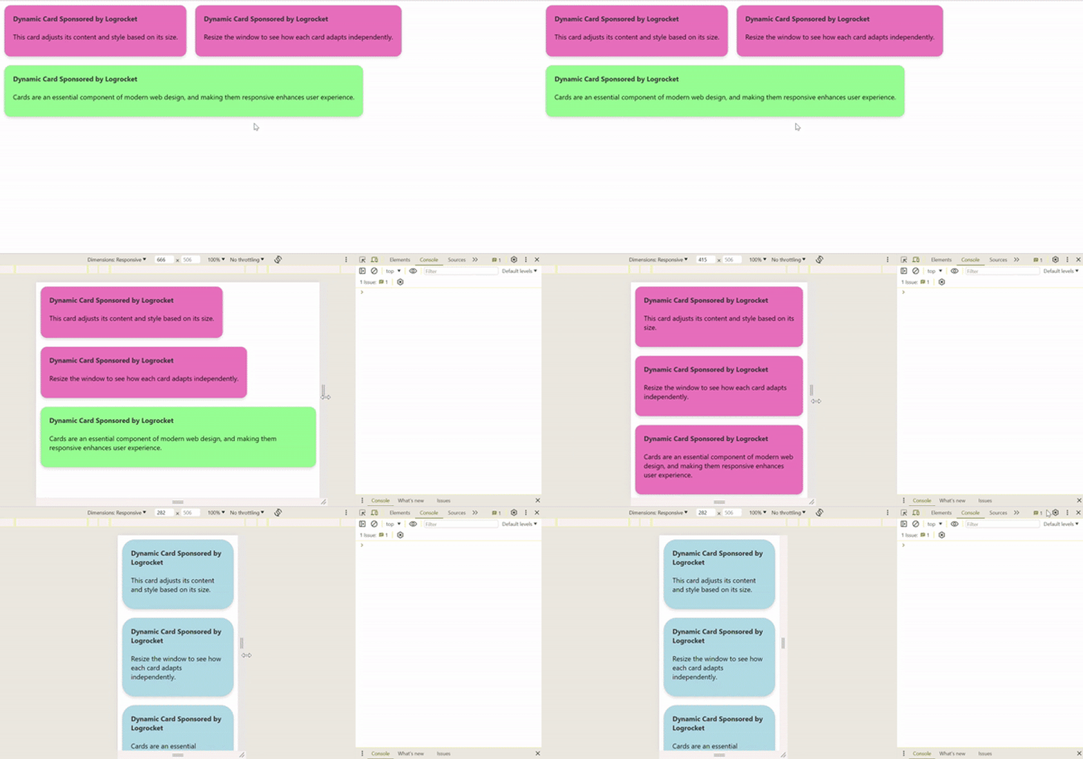
Let’s go ahead and implement this with the help of ResizeObserver. We will create a ResponsiveCard.js component which will be responsible for the resizeObserver() function. This is what it looks like:
import React, { useLayoutEffect, useRef, useState } from "react";
import "./App.css";

function ResponsiveCard({ children }) {
    const cardRef = useRef(null);
    const [cardSize, setCardSize] = useState("small");

    useLayoutEffect(() => {
        const observeTarget = cardRef.current;
        if (!observeTarget) return;

        const resizeObserver = new ResizeObserver((entries) => {
            for (let entry of entries) {
                const { width } = entry.contentRect;
                if (width < 300) {
                    setCardSize("small");
                } else if (width >= 300 && width < 600) {
                    setCardSize("medium");
                } else {
                    setCardSize("large");
                }
            }
        });

        resizeObserver.observe(observeTarget);

        return () => {
            resizeObserver.unobserve(observeTarget);
        };
    }, []);

    return (
        <div ref={cardRef} className={`card ${cardSize}`}>
            {children}
        </div>
    );
}

export default ResponsiveCard;
Let me break down the responsive logic in our ResponsiveCard.js file above. Within the useLayoutEffect(), we instantiated a ResizeObserver and set it to observe cardRef.current, the DOM element of the card.
The observer’s callback function is executed whenever the card’s size changes. Within this callback:
entry.contentRect.width"small", "medium", or "large", and the corresponding cardSize state is updatedcardSize state is then used to dynamically assign CSS classes to the card — small, medium, or large. This in turn, changes the card’s styling, which is handled by the CSS file we’ll set up laterNext, let’s set up our App.js component:
import ResponsiveCard from "./ResponsiveCard";
import "./App.css";

function App() {
    return (
        <div className="app">
            <div style={{ display: "flex", flexWrap: "wrap" }}>
                <ResponsiveCard>
                    <div className="card-content">
                        <h4>Dynamic Card Sponsored by Logrocket</h4>
                        <p>This card adjusts its content and style based on its size.</p>
                    </div>
                </ResponsiveCard>

                <ResponsiveCard>
                    <div className="card-content">
                        <h4>Dynamic Card Sponsored by Logrocket</h4>
                        <p>Resize the window to see how each card adapts independently.</p>
                    </div>
                </ResponsiveCard>

                <ResponsiveCard>
                    <div className="card-content">
                        <h4>Dynamic Card Sponsored by Logrocket</h4>
                        <p>
                            Cards are an essential component of modern web design, and making
                            them responsive enhances user experience.
                        </p>
                    </div>
                </ResponsiveCard>
            </div>
        </div>
    );
}


export default App;
Lastly, we’ll set up our application styles in our App.css file:
.card {
  border: 1px solid #ccc;
  margin: 10px;
  padding: 20px;
  transition: background-color 0.9s ease, box-shadow 0.3s ease, transform 0.2s ease;
  cursor: pointer;
  box-shadow: 0 4px 6px rgba(0, 0, 0, 0.1);
  border-radius: 15px;
}

.card:hover {
  transform: translateY(-5px);
  box-shadow: 0 12px 16px rgba(0, 0, 0, 0.2);
}

.small {
  background-color: lightblue;
  border-radius: 30px;
}

.medium {
  background-color: rgb(240, 128, 190);

}

.large {
  background-color: lightgreen;

}

.card-content h4 {
  margin-top: 0;
  color: #333;
}

.card-button {
  background-color: #007bff;
  color: white;
  border: none;
  padding: 10px 20px;
  border-radius: 5px;
  cursor: pointer;
  transition: background-color 0.2s ease;
}

.card-button:hover {
  background-color: #0056b3;
}
It’s important to note that each ResponsiveCard() component operates independently because:
useRef Hook, which points to its DOM element, allowing it to monitor its own size irrespective of other elements on the pageResizeObserver within each card’s useLayoutEffect() Hook ensures that the logic for adjusting styles based on size is contained and executed per card independentlyWith that, our first example is done! Let’s look at example two next.
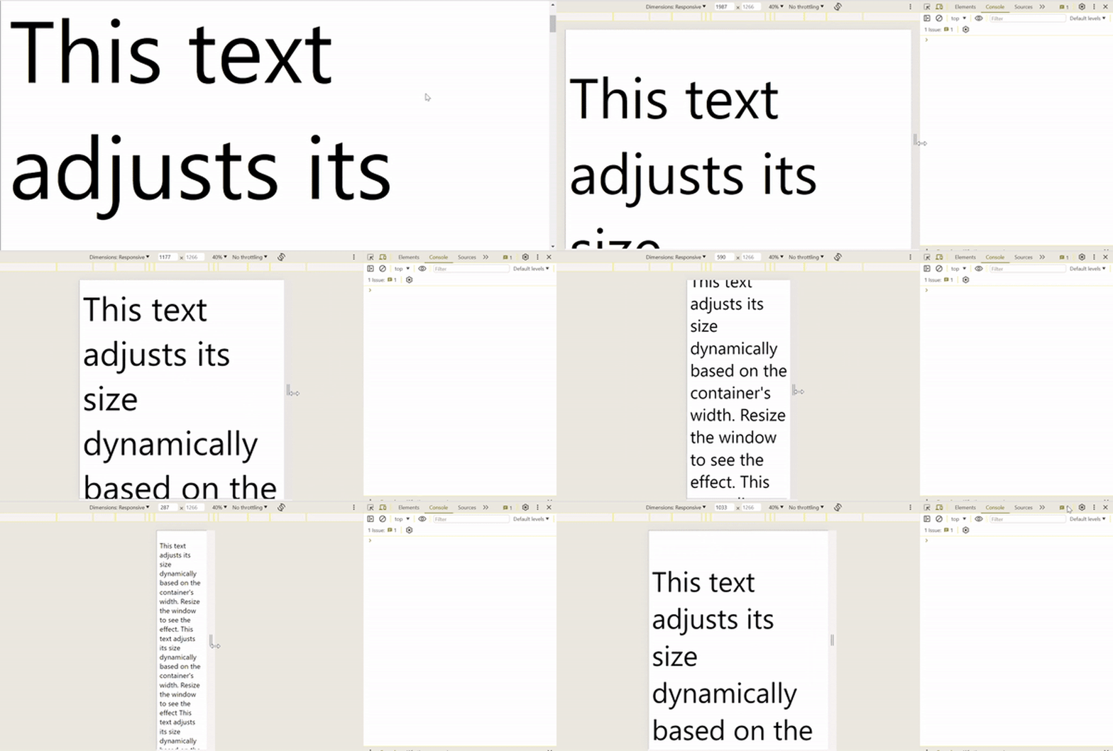
ResizeObserverAnother handy application of the ResizeObserver API is adaptive typography.
Usually, when a container’s dimensions decrease, the text does the same — and often doesn’t maintain the appropriate line spacing. Using ResizeObserver ensures that text remains readable and the user doesn’t have to zoom in when the window shrinks. This helps make text stand out no matter what device the user is on.
To achieve a great reading experience across different devices and window sizes, you might want to adjust text sizes or line spacing based on the container’s dimensions. With ResizeObserver, you can monitor the container’s size and dynamically adjust the typography settings, providing a better reading experience.
Let’s take a look at the implementation in React:
import React, { useEffect, useRef, useState } from "react";

const AdaptiveTypography = () => {
    const containerRef = useRef(null);
    const [fontSize, setFontSize] = useState("1rem");

    useEffect(() => {
        const container = containerRef.current;
        const resizeObserver = new ResizeObserver((entries) => {
            for (let entry of entries) {
                const containerWidth = entry.contentRect.width;
                const newFontSize = `${Math.max(1, containerWidth / 100)}rem`;
                setFontSize(newFontSize);
            }
        });

        if (container) {
            resizeObserver.observe(container);
        }

        return () => {
            if (container) {
                resizeObserver.unobserve(container);
            }
        };
    }, []);

    return (
        <div
            ref={containerRef}
            style={{ width: "100%", border: "1px solid black", padding: "20px" }}
        >
            <p style={{ fontSize: fontSize }}>
                This text adjusts its size dynamically based on the container's width.
                Resize the window to see the effect. This text adjusts its size
                dynamically based on the container's width. Resize the window to see the
                effect This text adjusts its size dynamically based on the container's
                width. Resize the window to see the effect
            </p>
        </div>
    );
};

export default AdaptiveTypography;
And here’s how the result should look:
ResizeObserverSeveral libraries — like use-resize-observer, ResizeObserver Polyfill, and react-resize-detector — leverage ResizeObserver to simplify and enhance the implementation of resize detection in React components. For example, react-resize-detector deals with ResizeObserver by providing a React component or Hook you can easily integrate into your app to monitor the size changes of elements.
The primary advantage of using a library like react-resize-detector is its ease of use via Hooks, which allows developers to focus on the responsive behavior of their components without diving into the lower-level details of ResizeObserver as explored above. With a few lines of code, we can add responsiveness to our application:
import React from "react";
import { useResizeDetector } from "react-resize-detector";

const ResponsiveCard = ({ title, content }) => {
    const { width, ref } = useResizeDetector();

    // Dynamic style adjustments based on the card's width
    const textStyle = {
        fontSize: width < 150 ? "12px" : "16px", // Smaller font size for narrow cards
        color: width < 150 ? "#666" : "#000", // Dim text for smaller cards
    };

    return (
        <div
            ref={ref}
            style={{
                width: "100%",
                margin: "10px",
                padding: "20px",
                border: "1px solid #ccc",
                boxSizing: "border-box",
                display: "flex",
                flexDirection: "column",
                alignItems: "center",
                justifyContent: "center",
            }}
        >
            <h2 style={{ fontSize: "1.25rem", textAlign: "center" }}>{title}</h2>
            <p style={textStyle}>{content}</p>
        </div>
    );
};

const CardGrid = () => {
    const cardsData = [
        {
            title: "Logrocket Card 1",
            content:
                "This card adjusts its text styling independently based on its own width.",
        },
        {
            title: "Logrocket Card 2",
            content:
                "Each card in this grid responds to its size changes, not the window size.",
        },
        {
            title: "Logrocket Card 3",
            content:
                "Resize the cards or the window to see how each card adapts individually.",
        },
        // Add more cards as needed
    ];

    return (
        <div
            style={{
                display: "grid",
                gridTemplateColumns: "repeat(auto-fit, minmax(150px, 1fr))",
                gap: "20px",
                padding: "20px",
            }}
        >
            {cardsData.map((card, index) => (
                <ResponsiveCard key={index} title={card.title} content={card.content} />
            ))}
        </div>
    );
};

export default CardGrid;
The example above, which uses the react-resize-detector library, would result in the following outputs for different screen sizes. For wide screens:
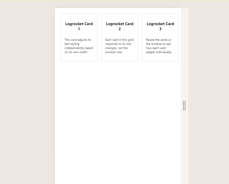
For small screens:
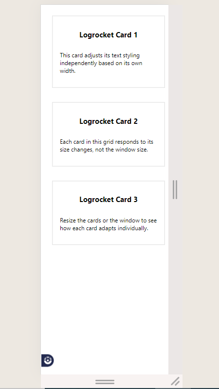
ResizeObserver APIThe ResizeObserver API is available on all modern major browsers. Take a look at its CanIUse stats below:

This means we can safely use ResizeObserver and enjoy the expected behaviors and benefits in our projects.
ResizeObserver directly vs. with a libraryThe choice between using ResizeObserver directly or a library in your project boils down to your particular needs. Using ResizeObserver directly in your project is a lightweight and simple strategy, as it’s a built-in browser feature that gives you complete control over the observation and handling of resize events.
On the other hand, using a library brings certain advantages. Libraries like ResizeObserver Polyfill or react-resize-observer provide cross-browser compatibility, ensuring your code will work in older browsers or browsers with very limited support.
Another benefit of using libraries is the additional features you can leverage, such as debouncing and throttling, which can be useful in specific use cases.
If you want to accommodate older browsers, the libraries are good options. However, in most other cases, it’s important to keep your project lightweight, so it may be best to use ResizeObserver directly.
Responsive designs are not only beautiful, but also important in modern frontend development, which tends to emphasize a mobile-first approach. With ResizeObserver, your users can enjoy aesthetic designs that look and behave as you intend no matter what device they’re using.
ResizeObserver is a great tool that makes responsiveness much easier and even allows us to make components responsive independent of each other. I hope that at this point, you not only agree with me, but feel confident enough to use this and take it ahead in your development journey.
I do want to specially thank you for reading this far — your time is greatly appreciated. Keep coding!
Install LogRocket via npm or script tag. LogRocket.init() must be called client-side, not
server-side
$ npm i --save logrocket

// Code:

import LogRocket from 'logrocket';
LogRocket.init('app/id');
// Add to your HTML:

<script src="https://cdn.lr-ingest.com/LogRocket.min.js"></script>
<script>window.LogRocket && window.LogRocket.init('app/id');</script>

Learn how AI-assisted development governance uses rules, agents, hooks, and protocols to help AI coding tools produce safer, more consistent code.

A step-by-step guide to building your first MCP server using Node.js, covering core concepts, tool design, and upgrading from file storage to MySQL.

Using security headers in your Next.js apps is a highly effective way to secure websites from common security threats.

A deep dive into May 2026’s AI model and tool rankings. We break down performance, usability, pricing, and real-world capabilities across 50+ features to help you pick the right tools for your development workflow.
Hey there, want to help make our blog better?
Join LogRocket’s Content Advisory Board. You’ll help inform the type of content we create and get access to exclusive meetups, social accreditation, and swag.
Sign up now