Editor’s note: This guide to using Material UI with React Hook Form was last updated by Isaac Okoro on 8 June 2023 to reflect recent changes to React. This update also expands on the advantages of employing React Hook Form. For a review of React Hook Form fundamentals, refer to our introductory guide.

React Hook Form is one of the most popular libraries for handling form inputs in the React ecosystem. Getting it to work correctly can be tricky if you’re using a component library such as Material UI. In this guide, we’ll demonstrate how to use Material UI with React Hook Form.
This tutorial is also helpful if you want to integrate some other React UI libraries, such as Ant Design or Semantic UI. To follow along, you should already have some exposure to Material UI and React Hook Form. We won’t dive too deep into how to use those libraries. Instead, we’ll focus on the integration between them. Let’s get started, shall we?
Jump ahead:
text input componentController component
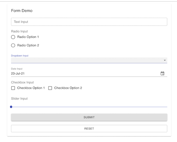
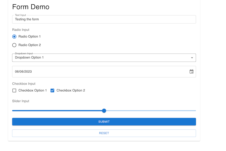
radio input componentTo show how to use Material UI with React Hook Form, we will build a complete form with the most-used input components provided by Material UI: the text input, radio input, dropdown, date, checkbox, and slider. The form will also have reset functionality. It will look like this:
If you’re more of a visual learner, check out the accompanying video tutorial:
Material UI with React Hook Form
In this video, I have shown how we can use React Hook Form with Material UI to create re-usable forms. All the codes are in this repo https://github.com/Mohammad-Faisal/react-hook-form-material-ui
The React Hook Form is one of the most popular libraries for handling forms in React. There are various reasons why you might consider using it in your application. First, it has straightforward APIs that make creating and managing forms in React easy. It uses a Hook based approach that makes it very easy to handle forms with little code.
The React Hook Form can be seamlessly incorporated with various form validation libraries and also with various libraries like Material UI, Ant Design, and Bootstrap. The React Hook Form also comes with out-of-the-box support for TypeScript.
We will build different input fields with the React Hook Form and learn how it works with Material UI. We will see how to work with datepickers, radio buttons, dropdowns, and sliders. We will build each component separately and then import it into a separate file. This file will handle the functionality of getting the various values from each input and logging the values.
This method will showcase the capabilities of React Hook Form and how to work with them. React Hook Form exports various utilities from the famous useForm Hook, which you use inside your input components. First, import the useForm Hook:
import { useForm } from "react-hook-form";
Then, destructure the utilities from the Hook:
const { register, handleSubmit, reset, control, setValue } = useForm();
You can then use the utilities inside a typical input that might look like this:
<input type="text" ref={register} name="firstName" />
Look closely here: we passed the register as a value to the ref of the actual input component. All the magic happens behind the scenes. Reactstrap provides a similar prop named innerRef, which can be used to pass our register for seamless integration with react-hook-form.
Unfortunately, this is not the case when we use Material UI; the library does not yet provide any similar prop to pass the register as a value to the ref prop.
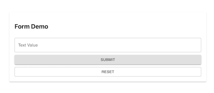
text input componentLet’s start with a simple form component. This component will have only one text input in it. To build this form using the traditional approach without any library, we need to handle the input change separately. We also have to take care of the reset functionality and validation ourselves. It will probably look something like this:
import TextField from "@material-ui/core/TextField";
import React, { useState } from "react";
import { Button, Paper } from "@material-ui/core";

export const FormWithoutHookForm = () => {
  const [textValue, setTextValue] = useState<string>("");

  const onTextChange = (e: any) => setTextValue(e.target.value);
  const handleSubmit = () => console.log(textValue);
  const handleReset = () => setTextValue("");

  return (
    <Paper>
      <h2>Form Demo</h2>

      <TextField
        onChange={onTextChange}
        value={textValue}
        label={"Text Value"} //optional
      />

      <Button onClick={handleSubmit}>Submit</Button>
      <Button onClick={handleReset}>Reset</Button>
    </Paper>
  );
};
Here, we are storing the value by using the useState Hook provided by React itself:
const [textValue, setTextValue] = useState<string>("");
Also, we’re setting the value from the input in our onTextChange function:
const onTextChange = (e: any) => setTextValue(e.target.value);
If we look at the TextInput component provided by material-ui, we can see two important props passed to it: value and onChange. value takes care of the actual value of the input, while onChange determining what happens when the input changes. No matter how we use this form, we must take care of these two things.
The output will look like the image below:
Controller componentReact Hook Form includes a wrapper component called Controller to work with component libraries where you can’t access the ref directly. According to the React docs, this is a render prop — a function that returns a React element and provides the ability to attach events and values into the component. The skeleton of this special Controller component is as follows:
<Controller
  control={control}
  name="test"
  render={({
    field: { onChange, onBlur, value, name, ref },
    fieldState: { invalid, isTouched, isDirty, error },
    formState,
  }) => ( WHATEVER_INPUT_WE_WANT )}
/>
Let’s break down what’s going on here. First, the control prop is what we get back from the useForm Hook and is passed into the input. The name is how React Hook Form tracks the value on an input internally. When we look at our render prop, keep in mind that it is the most important prop. We use it to pass a render function.
The render property of Controller is the most important prop to understand. The function has three keys: field, fieldState, and formState. We’re going to focus on field for now. The render prop also points to the input we want to use.
The field object exports two things (among others): value and onChange. We have already seen that we need these two things to control almost any input.
In refactoring our form, we will use the Controller to solve the problem of accessing the ref of the form. We’ll use the Controller and pass the TextInput inside the render function. We will also export this input into a different file and then pass the needed props from the parent file we will also create. The props are:
name: The key for the inputcontrol: This is used to get access to the functionalities of React Hook Formlabel: The label for the input (optional)Create a form-component folder, add a FormInputText.tsx file inside the form-component, and paste the code below into it:
// src/form-component/FormInputText.tsx
import { Controller } from "react-hook-form";
import TextField from "@mui/material/TextField";
import { FormInputProps } from "./FormInputProps";
export const FormInputText = ({ name, control, label }: FormInputProps) => {
  return (
    <Controller
      name={name}
      control={control}
      render={({
        field: { onChange, value },
        fieldState: { error },
        formState,
      }) => (
        <TextField
          helperText={error ? error.message : null}
          size="small"
          error={!!error}
          onChange={onChange}
          value={value}
          fullWidth
          label={label}
          variant="outlined"
        />
      )}
    />
  );
};
In the code block above, we use the Controller to access the ref of the text field, which we point to in the render function. Next, create a FormDemo.tsx file and import our newly created FormInputText.tsx component, as shown below:
import { FormInputText } from "./FormInputTextGood";

export const FormWithHookForm = () => {
  // rest are same as before
  return (
    <form>
      <FormInputText
        name={"textInput"}
        control={control}
        label={"Text Input"}
      />
    </form>
  );
};
This form works just like the previous one. The magic happens thanks to the field property of the render function provided by the Controller. The output should look like this:

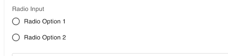
Radio input componentThe second-most common input component is Radio. If you have used Radio from Material UI, you already know that you need the RadioGroup component as the parent and a bunch of options inside, such as individual Radio buttons, as children.
Create a FormInputRadio.tsx inside the form-components folder and paste the code below into it:
// src/form-component/FormInputRadio.tsx
import {
  FormControl,
  FormControlLabel,
  FormLabel,
  Radio,
  RadioGroup,
} from "@mui/material";
import { Controller } from "react-hook-form";
import { FormInputProps } from "./FormInputProps";
const options = [
  {
    label: "Radio Option 1",
    value: "1",
  },
  {
    label: "Radio Option 2",
    value: "2",
  },
];
export const FormInputRadio: React.FC<FormInputProps> = ({
  name,
  control,
  label,
}) => {
  const generateRadioOptions = () => {
    return options.map((singleOption) => (
      <FormControlLabel
        value={singleOption.value}
        label={singleOption.label}
        control={<Radio />}
      />
    ));
  };
  return (
    <FormControl component="fieldset">
      <FormLabel component="legend">{label}</FormLabel>
      <Controller
        name={name}
        control={control}
        render={({
          field: { onChange, value },
          fieldState: { error },
          formState,
        }) => (
          <RadioGroup value={value} onChange={onChange}>
            {generateRadioOptions()}
          </RadioGroup>
        )}
      />
    </FormControl>
  );
};
The main concept is the same here. We just use the onChange and value from the render function field object and pass it to the RadioGroup.
Note: We didn’t use the
labelhere. If you want to use that, you will need to add theFormControlandFormLabelcomponents of Material UI. You should also keep in mind that we used a special function,generateRadioOptions, to generate the individualradioinputs. We added theoptionsas a constant inside the component. You can have them as props or any other way you see fit.
Import this file into the FormDemo.tsx to see the output, which should look like the image below:
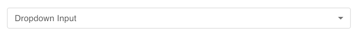
DropdownAlmost all forms need some kind of dropdown. So, create a FormInputDropdown.tsx file inside the form-component folder and paste the code below into it:
// src/form-component/FormInputDropdown.tsx

import { FormControl, InputLabel, MenuItem, Select } from "@mui/material";
import { Controller } from "react-hook-form";
import { FormInputProps } from "./FormInputProps";
const options = [
  {
    label: "Dropdown Option 1",
    value: "1",
  },
  {
    label: "Dropdown Option 2",
    value: "2",
  },
];
export const FormInputDropdown: React.FC<FormInputProps> = ({
  name,
  control,
  label,
}) => {
  const generateSingleOptions = () => {
    return options.map((option: any) => {
      return (
        <MenuItem key={option.value} value={option.value}>
          {option.label}
        </MenuItem>
      );
    });
  };
  return (
    <FormControl size={"small"}>
      <InputLabel>{label}</InputLabel>
      <Controller
        render={({ field: { onChange, value } }) => (
          <Select onChange={onChange} value={value}>
            {generateSingleOptions()}
          </Select>
        )}
        control={control}
        name={name}
      />
    </FormControl>
  );
};
Import this file into the FormDemo.tsx to see the output. It should look like the image below:
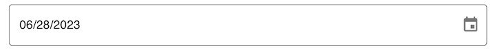
DateThis is a common yet special component. Material UI doesn’t have a Date component that works out of the box. We need to use some helper libraries. First, install the package below:
yarn add @mui/x-date-pickers
We also need to wrap our data input component with a special wrapper, LocalizationProvider. This will inject the datepicker functionality for us. Remember, this is not a requirement for React Hook Form; Material UI requires it. So, if you’re using any other design library, such as Ant Design or Semantic UI, you don’t need to worry about it.
Create a FormInputDate.tsx file inside the form-component folder and paste the code below into it:
// src/form-component/FormInputDate.tsx

import { LocalizationProvider } from "@mui/x-date-pickers/LocalizationProvider";
import { AdapterDateFns } from "@mui/x-date-pickers/AdapterDateFns";
import { DatePicker } from "@mui/x-date-pickers/DatePicker";
import { Controller } from "react-hook-form";
import { FormInputProps } from "./FormInputProps";
export const FormInputDate = ({ name, control, label }: FormInputProps) => {
  return (
    <LocalizationProvider dateAdapter={AdapterDateFns}>
      <Controller
        name={name}
        control={control}
        render={({ field: { onChange, value } }) => (
          <DatePicker value={value} onChange={onChange} />
        )}
      />
    </LocalizationProvider>
  );
};
Import this file into the FormDemo.tsx to see the output, which should look like the image below:
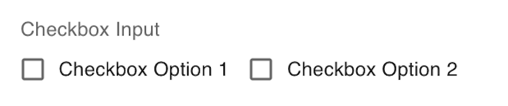
Checkbox groupIf you want to use a simple checkbox that works like a switch, it’s easy to use. You just need to use it like the previous components, so I won’t show the same thing once again. However, complexities arise when you want to create a group of checkboxes and set the selected values as an array of selected items.
The main challenge here is that Material UI doesn’t provide a multi-select checkbox component. There is no clear example of how to use this component with React Hook Form. To enable this functionality, we have to maintain a local state of selected items.
Create a FormInputMultiCheckbox.tsx file inside the form-component folder and paste the code in there:
// src/form-component/FormInputMultiCheckbox.tsx
import React, { useEffect, useState } from "react";
import {
  Checkbox,
  FormControl,
  FormControlLabel,
  FormLabel,
} from "@mui/material";
import { Controller } from "react-hook-form";
import { FormInputProps } from "./FormInputProps";
const options = [
  {
    label: "Checkbox Option 1",
    value: "1",
  },
  {
    label: "Checkbox Option 2",
    value: "2",
  },
];
export const FormInputMultiCheckbox: React.FC<FormInputProps> = ({
  name,
  control,
  setValue,
  label,
}) => {
  const [selectedItems, setSelectedItems] = useState<any>([]);
  // we are handling the selection manually here
  const handleSelect = (value: any) => {
    const isPresent = selectedItems.indexOf(value);
    if (isPresent !== -1) {
      const remaining = selectedItems.filter((item: any) => item !== value);
      setSelectedItems(remaining);
    } else {
      setSelectedItems((prevItems: any) => [...prevItems, value]);
    }
  };
  // we are setting form value manually here
  useEffect(() => {
    setValue(name, selectedItems);
  }, [name, selectedItems, setValue]);
  return (
    <FormControl size={"small"} variant={"outlined"}>
      <FormLabel component="legend">{label}</FormLabel>
      <div>
        {options.map((option: any) => {
          return (
            <FormControlLabel
              control={
                <Controller
                  name={name}
                  render={({ field }) => {
                    return (
                      <Checkbox
                        checked={selectedItems.includes(option.value)}
                        onChange={() => handleSelect(option.value)}
                      />
                    );
                  }}
                  control={control}
                />
              }
              label={option.label}
              key={option.value}
            />
          );
        })}
      </div>
    </FormControl>
  );
};
So, in this component we are controlling the value and onChange manually. That’s why we are not using the field prop inside the render function anymore. To set the value, we are taking another new prop named setValue here. This function is a special function of react-hook-form for setting the value manually.
You may be wondering why we are doing this if we are manually handling the inputs? When you use react-hook-form, you want all your inputs in one place. So, we are giving this MultiSelectCheckbox component a special treatment so that it works with other components easily. Import this file into the FormDemo.tsx to see the output:
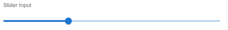
SliderOur final component is a Slider component, a fairly common component. The code is simple to understand, but there is one catch: the onChange function provided by Material UI does not work with the onChange of React Hook Form because the signature is different.
As a result, when we try to use the Slider component inside a Controller component from React Hook Form, it throws an error. Once again, we must maintain a local state to control the onChange and set the value manually. The complete code for this component is as follows:
// src/form-component/FormInputSlider.tsx

import React, { useEffect } from "react";
import { FormLabel, Slider } from "@mui/material";
import { Controller } from "react-hook-form";
import { FormInputProps } from "./FormInputProps";
export const FormInputSlider = ({
  name,
  control,
  setValue,
  label,
}: FormInputProps) => {
  const [sliderValue, setSliderValue] = React.useState<number>(30);
  useEffect(() => {
    if (sliderValue) setValue(name, sliderValue);
  }, [name, setValue, sliderValue]);
  const handleChange = (event: any, newValue: number | number[]) => {
    setSliderValue(newValue as number);
  };
  return (
    <>
      <FormLabel component="legend">{label}</FormLabel>
      <Controller
        name={name}
        control={control}
        render={({ field, fieldState, formState }) => (
          <Slider
            value={sliderValue}
            onChange={handleChange}
            valueLabelDisplay="auto"
            min={0}
            max={100}
            step={1}
          />
        )}
      />
    </>
  );
};
Import this file into the FormDemo.tsx to see the output:
Now, let’s use all of these components inside our form. Our form will take advantage of all the reusable components we just made while inside the FormDemo.tsx file, as shown below:
import { Button, Paper, Typography } from "@mui/material";
import { useForm } from "react-hook-form";
import { FormInputText } from "./form-components/FormInputText";
import { FormInputMultiCheckbox } from "./form-components/FormInputMultiCheckbox";
import { FormInputDropdown } from "./form-components/FormInputDropdown";
import { FormInputDate } from "./form-components/FormInputDate";
import { FormInputSlider } from "./form-components/FormInputSlider";
import { FormInputRadio } from "./form-components/FormInputRadio";
interface IFormInput {
  textValue: string;
  radioValue: string;
  checkboxValue: string[];
  dateValue: Date;
  dropdownValue: string;
  sliderValue: number;
}
const defaultValues = {
  textValue: "",
  radioValue: "",
  checkboxValue: [],
  dateValue: new Date(),
  dropdownValue: "",
  sliderValue: 0,
};
export const FormDemo = () => {
  const { handleSubmit, reset, control, setValue } = useForm<IFormInput>({
    defaultValues: defaultValues,
  });
  const onSubmit = (data: IFormInput) => console.log(data);
  return (
    <Paper
      style={{
        display: "grid",
        gridRowGap: "20px",
        padding: "20px",
        margin: "10px 300px",
      }}
    >
      <Typography variant="h4"> Form Demo</Typography>
      <FormInputText name="textValue" control={control} label="Text Input" />
      <FormInputRadio
        name={"radioValue"}
        control={control}
        label={"Radio Input"}
      />
      <FormInputDropdown
        name="dropdownValue"
        control={control}
        label="Dropdown Input"
      />
      <FormInputDate name="dateValue" control={control} label="Date Input" />
      <FormInputMultiCheckbox
        control={control}
        setValue={setValue}
        name={"checkboxValue"}
        label={"Checkbox Input"}
      />
      <FormInputSlider
        name={"sliderValue"}
        control={control}
        setValue={setValue}
        label={"Slider Input"}
      />
      <Button onClick={handleSubmit(onSubmit)} variant={"contained"}>
        Submit
      </Button>
      <Button onClick={() => reset()} variant={"outlined"}>
        Reset
      </Button>
    </Paper>
  );
};
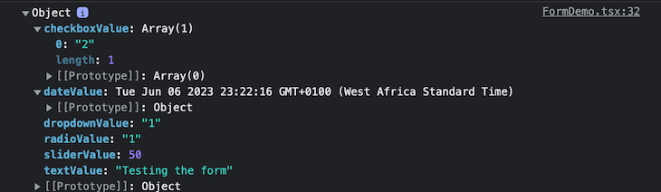
When we select different values from each of our inputs and then press SUBMIT, we see that the form gets each value because of the Controller and logs the values to the console, as shown below:
When we click SUBMIT and check the console, we get the logs as shown below:
Now, our form is significantly more streamlined and efficient. From here, we can easily add our form validation logic and error handling. To play around with this example on your own, check out the complete code on GitHub.
Install LogRocket via npm or script tag. LogRocket.init() must be called client-side, not
server-side
$ npm i --save logrocket

// Code:

import LogRocket from 'logrocket';
LogRocket.init('app/id');
// Add to your HTML:

<script src="https://cdn.lr-ingest.com/LogRocket.min.js"></script>
<script>window.LogRocket && window.LogRocket.init('app/id');</script>

We built the same app in TanStack Start RSC and Next.js RSC. TanStack shipped 40% less JS and built 4x faster — but Next.js is still the safer production bet.

From RSC vulnerabilities and the Vercel breach to TypeScript 7.0 Beta and AI agents — the nine frontend storylines that defined H1 2026, ranked.

AI tools generate working React code fast, but miss race conditions, empty states, debouncing, and accessibility. Here’s how to catch bugs before production.

Learn how to use Gemini CLI subagents to delegate frontend, backend, testing, and docs tasks to specialized agents with guardrails and clear ownership.
Would you be interested in joining LogRocket's developer community?
Join LogRocket’s Content Advisory Board. You’ll help inform the type of content we create and get access to exclusive meetups, social accreditation, and swag.
Sign up now

 Learn more →
