Editor’s note: This post was updated by Carlos Mucuho in January 2025 to restructure and simplify the tutorial and focus solely on using React-Bootstrap.

In this tutorial, we’ll walk through the process of adding React-Bootstrap to your React application, explore how to use it to create a simple component, and then build a fully responsive layout.
React is the most-used JavaScript framework for building web applications, and Bootstrap is the most popular CSS framework, powering millions of websites on the internet.
React-Bootstrap is a complete rebuild of Bootstrap components using React, eliminating the need for Bootstrap’s JavaScript and jQuery dependencies. Instead of manipulating the DOM directly, you work with React components that maintain Bootstrap’s functionality and styling.
If you’re just getting started with these frameworks, I’d suggest skimming through the official React and React-Bootstrap documentation.
The Replay is a weekly newsletter for dev and engineering leaders.
Delivered once a week, it's your curated guide to the most important conversations around frontend dev, emerging AI tools, and the state of modern software.
The most straightforward way to add React-Bootstrap to your React app is by installing it as a dependency:
npm install react-bootstrap bootstrap
Note that React-Bootstrap doesn’t come pre-installed with Bootstrap itself. The package only exports common Bootstrap classes as React components, which is why we also install Bootstrap as a dependency.
Once the installation is complete, we need to include Bootstrap’s CSS file in our app’s entry file:
// Import Bootstrap CSS
import 'bootstrap/dist/css/bootstrap.min.css';
In the case of a project built with Vite, that would be in the src/main.jsx file.
React-Bootstrap components can be imported individually from the package. For example, importing the Button component would look like this:
// ✅ Best approach - import individual components
import Button from 'react-bootstrap/Button';

// ❌ Not recommended - importing from the main entry point
import { Button } from 'react-bootstrap';
The first approach is recommended over the second because when you import components individually, your bundler only includes the specific components you’re actually using in your final application bundle. This means less code gets sent to your users’ browsers, resulting in faster load times and better performance, especially as your project grows and you add more React-Bootstrap components.
Bootstrap can be used directly on React-Bootstrap components in your React app by applying the built-in classes. To demonstrate the use of Bootstrap classes and React-Bootstrap components, let’s create a basic theme switcher React component:
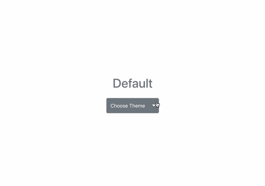
As shown in this demo, we’re using a React-Bootstrap dropdown component to implement our theme switcher. We are also using Bootstrap classes to set the size and color of the dropdown button.
Now, let’s write the code for our theme switcher component.
Ensure you have a React app already set up. In your src folder, create a new file called ThemeSwitcher.jsx for the component and add the following code snippet to it:
import { useState } from "react";
import Dropdown from 'react-bootstrap/Dropdown';
import ButtonGroup from 'react-bootstrap/ButtonGroup';
import Button from 'react-bootstrap/Button';

const ThemeSwitcher = () => {
  const [theme, setTheme] = useState(null);
  const resetTheme = () => {
    setTheme(null);
  };

  return (
    <div>
      <div
        className={`text-capitalize h1 mb-4 w-100 text-center text-${theme}`}
      >
        {`${theme || "Default"} Theme`}
      </div>
      <Dropdown as={ButtonGroup} size="lg">
        <Button
          className="text-capitalize"
          variant={theme ? theme : "secondary"}
        >
          {theme ? theme : "Default"}
        </Button>
        <Dropdown.Toggle
          split
          variant={theme ? theme : "secondary"}
        />
        <Dropdown.Menu>
          <Dropdown.Item onClick={() => setTheme("primary")}>
            Primary
          </Dropdown.Item>
          <Dropdown.Item onClick={() => setTheme("danger")}>
            Danger
          </Dropdown.Item>
          <Dropdown.Item onClick={() => setTheme("success")}>
            Success
          </Dropdown.Item>
          <Dropdown.Divider />
          <Dropdown.Item onClick={resetTheme}>
            Default Theme
          </Dropdown.Item>
        </Dropdown.Menu>
      </Dropdown>
    </div>
  );
}
export default ThemeSwitcher;
In the code above, we created a very simple theme switcher component using React-Bootstrap’s dropdown component and a few built-in classes.
Using React’s useState Hook, we created a state theme and set its initial value to null. We also defined the setTheme method to modify this state. Then we created a resetTheme function that resets the theme’s value to null.
Next, in our component markup, we rendered a React-Bootstrap dropdown with four dropdown items. The first three items allow us to switch between different themes: primary, danger, and success. The last dropdown item allows us to reset the theme value to null using the resetTheme() function.
Finally, replace the boilerplate code in the App.jsx file with the following to display the ThemeSwitcher component:
import './App.css'
import ThemeSwitcher from './ThemeSwitcher'
function App() {
  return (
    <>
      <ThemeSwitcher />
    </>
  )
}
export default App
In this example, we see how easy it is to use React-Bootstrap’s components with Bootstrap classes in our React app.
Now that we have our basic theme switcher, let’s try to use as many Bootstrap classes and React-Boostrap components as possible to add more details to our app.
Let’s start by creating a new app with Vite:
npm create vite@latest detailed-app -- --template react
Next, install the dependencies as follows:
npm install axios react-bootstrap bootstrap
Notice that we installed Axios as a dependency. Axios is a promise-based HTTP client for the browser and Node.js. It will enable us to fetch posts from the Bacon Ipsum JSON API.
Let’s make a little modification to the src/main.jsx file to include the Bootstrap minified CSS file. It should look like the following snippet:
import { StrictMode } from 'react'
import { createRoot } from 'react-dom/client'
import './index.css'
import App from './App.jsx'

// Add Bootstrap minified CSS
import 'bootstrap/dist/css/bootstrap.min.css';

createRoot(document.getElementById('root')).render(
  <StrictMode>
    <App />
  </StrictMode>,
)
Next, we’ll create a new directory named components inside the src directory of our project. In this new components directory, create a file called Header.jsx and update it with the following contents:
import logo from '../assets/react.svg'
import Container from 'react-bootstrap/Container';
import Row from 'react-bootstrap/Row';
import Col from 'react-bootstrap/Col';
import Form from 'react-bootstrap/Form';
import Button from 'react-bootstrap/Button';
import Navbar from 'react-bootstrap/Navbar';
import Nav from 'react-bootstrap/Nav';
import NavDropdown from 'react-bootstrap/NavDropdown'
const AVATAR = 'https://www.gravatar.com/avatar/429e504af19fc3e1cfa5c4326ef3394c?s=240&d=mm&r=pg';

const Header = () => (
  <Navbar collapseOnSelect fixed="top" bg="light" expand="lg">
    <Container >
      <Navbar.Brand href="#home">
        <img
          src={AVATAR}
          width="36"
          className="img-fluid rounded-circle"
          alt="Avatar Bootstrap logo"
        />
      </Navbar.Brand>
      <Navbar.Toggle aria-controls="basic-navbar-nav" />
      <Navbar.Collapse id="basic-navbar-nav">
        <Nav className="me-auto">
          <Nav.Link href="#home">Home</Nav.Link>
          <Nav.Link href="#home">Events</Nav.Link>
          <NavDropdown title="Learn" id="basic-nav-dropdown">
            <NavDropdown.Item className='font-weight-bold text-uppercase' disabled>Action</NavDropdown.Item>
            <NavDropdown.Divider />
            <NavDropdown.Item >Documentation</NavDropdown.Item>
            <NavDropdown.Item>Tutorials</NavDropdown.Item>
            <NavDropdown.Item>Courses</NavDropdown.Item>
          </NavDropdown>
        </Nav>
        <Nav className='me-auto d-flex align-items-center'>
          <img
            src={logo}
            width="50"
            className="img-fluid"
            alt="React Bootstrap logo"
          />
        </Nav>
        <Nav className='d-flex align-items-center'>
          <Form >
            <Row>
              <Col xs="auto">
                <Form.Control
                  type="text"
                  placeholder="Search React Courses"
                  className=" mr-sm-2"
                />
              </Col>
              <Col xs="auto">
                <Button variant="outline-primary" type="submit">Search</Button>
              </Col>
            </Row>
          </Form>
        </Nav>
      </Navbar.Collapse>
    </Container>
  </Navbar>
);
export default Header;
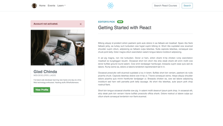
The component we just created in the snippet above is the Header component, which contains the navigation menu. Next, we will create a new file named SideCard.jsx — also in the components directory — with the following contents:
import Button from "react-bootstrap/Button";
import Alert from 'react-bootstrap/Alert';
import Card from "react-bootstrap/Card";
import CardImg from "react-bootstrap/CardImg";
import CardBody from "react-bootstrap/CardBody";
import CardTitle from "react-bootstrap/CardTitle";
import CardSubtitle from "react-bootstrap/CardSubtitle";
import CardText from "react-bootstrap/CardText";

const BANNER = "https://i.imgur.com/CaKdFMq.jpg";
const SideCard = () => (
  <>
    <div className="mt-4 mt-md-0">
      <Alert variant="danger" className="d-none d-lg-block">
        <strong>Account not activated.</strong>
      </Alert>
      <Card>
        <CardImg className="img-fluid" width="10%" src={BANNER} alt="banner" />
        <CardBody>
          <CardTitle className="h3 pt-2 font-weight-bold text-secondary">
            Glad Chinda
          </CardTitle>
          <CardSubtitle
            className="text-secondary font-weight-light text-uppercase"
            style={{ fontSize: "0.6rem" }}
          >
            Web Developer, Lagos
          </CardSubtitle>
          <CardText
            className="text-secondary mt-2"
            style={{ fontSize: "0.75rem" }}
          >
            Full-stack web developer learning new hacks one day at a time. Web
            technology enthusiast. Hacking stuffs @theflutterwave.
          </CardText>
          <Button variant="success" className="font-weight-bold">
            View Profile
          </Button>
        </CardBody>
      </Card>
    </div>
  </>
);
export default SideCard;
Once that’s done, create a file named Post.jsx in the components directory and add the following code snippet to it:
import { useState, useEffect } from "react";
import axios from "axios";
import Badge from "react-bootstrap/Badge";
const Post = () => {
const [post, setPost] = useState(null);
useEffect(() => {
axios
.get(
"https://baconipsum.com/api/?type=meat-and-filler¶s=4&format=text"
)
.then((response) => setPost(response.data));
}, []);
return (
<>
{post && (
<div>
<div className="text-uppercase text-info font-weight-bold">
Editor's Pick
<span className="ms-2 text-uppercase text-info font-weight-bold">
<Badge
bg="success"
className="text-uppercase px-2 py-1 ml-6 mb-1 align-middle"
style={{ fontSize: "0.75rem" }}
>
New
</Badge>
</span>
</div>
<span className="d-block pb-4 h2 text-dark border-bottom border-gray">
Getting Started with React
</span>
<article
className="pt-4 text-secondary text-start"
style={{ fontSize: "0.9rem", whiteSpace: "pre-line" }}
>
{post}
</article>
</div >
)}
</>
);
};
export default Post;
In the code above, we created a Post component that renders a post on the page. We initialized the component’s state by setting the post property to null.
After the component was mounted, we used the useEffect Hook and Axios to retrieve a random post of four paragraphs from the Bacon Ipsum JSON API, and changed our post field to the data returned from this API.
Finally, modify the src/App.jsx file to look like the following snippet:
import './App.css'
import Container from 'react-bootstrap/Container';
import Row from 'react-bootstrap/Row';
import Col from 'react-bootstrap/Col';
import Header from './components/Header'
import SideCard from './components/SideCard';
import Post from './components/Post';

function App() {
  return (
    <>
      <Header />
      <main className="my-5 mx-0">
        <Container >
          <Row>
            <Col
              xs={12}
              md={4}
            >
              <SideCard />
            </Col>
            <Col
              xs={12}
              md={8}
              className='ps-md-4'>
              <Post />
            </Col>
          </Row>
        </Container>
      </main>
    </>
  )
}

export default App
In the code above, we simply included the Header, SideCard, and Post components in the App component. Notice how we used a couple of responsive utility classes provided by Bootstrap to adapt our app to different screen sizes.
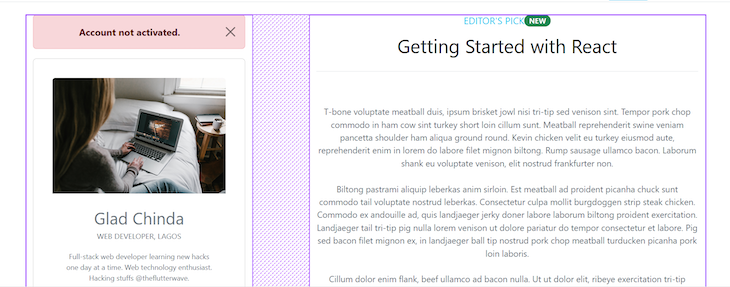
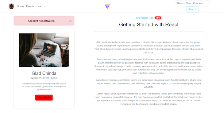
If you run the app now with the command npm run dev, your app should start on port 5173 and look like this:
In the previous section, we employed a set of utility classes to adapt our app to different screen sizes. These utility classes are parts of the Bootstrap grid system, which is a utility that allows us to create responsive and adaptable layouts. It is based on a 12-column flexbox grid, which can be customized to create layouts of varying complexity:
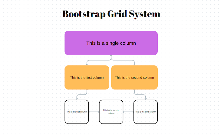
Bootstrap uses a series of containers, rows, and columns elements that work together to align content on different screen sizes.
ContainerInBootstrap, the Container element is essential for grid layouts because it houses other grid elements. Bootstrap offers two containers: a Container with a fixed, centered width for standard layouts, and a Container fluid for full-width layouts.
RowThe Row element, used within the Container element, forms horizontal containers for columns, ensuring proper alignment and equal height.
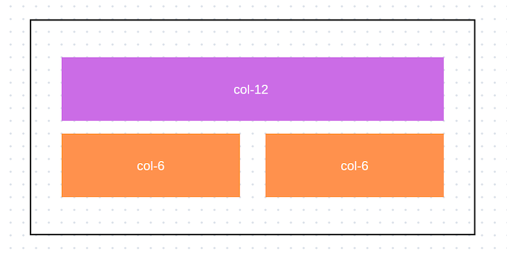
ColumnThe Column element is the primary building block of the grid system. It is placed inside rows and defines how much horizontal space each item occupies. The columns are designated by the col- class, which is followed by a number from one to 12. For example, col-6 will create a column that spans half the width of its parent row:
Bootstrap also provides responsive breakpoint classes that allow you to control the layout of columns at different screen sizes. These classes are typically applied alongside the col- classes:
col-sm-: Applies to small screens, with a minimum width of 576px
col-md-: Applies to medium screens, with a minimum width of 768px
col-lg-: Applies to large screens, with a minimum width of 992px
col-xl-: Applies to extra-large screens, with a minimum width of 1200px
>
Here’s a simple example of a Bootstrap grid layout:
<div class="container">
  <div class="row">
    <div class="col-md-4">Column 1</div>
    <div class="col-md-4">Column 2</div>
    <div class="col-md-4">Column 3</div>
  </div>
</div>
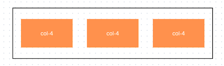
In this example, we have a container that holds a row with three columns. On medium-sized screens and larger, each column occupies four out of 12 available columns, creating a three-column layout:
Alternatively, Bootstrap offers an auto-layout feature that enables users to create responsive layouts without specifying the exact widths of columns. In an auto-layout, columns with a col class will automatically size themselves to be equal in width within the same row. This means that if you have three columns with col classes inside a row, each will take up an equal portion of the available width:
<div class="container">
  <div class="row">
    <div class="col">Column 1</div>
    <div class="col">Column 2</div>
    <div class="col">Column 3</div>
  </div>
</div>
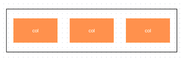
In this example, the output reflects the previous one: all three columns are of equal width, each occupying one-third of the row:
Upon closer inspection of the App.jsx code, you’ll notice that we used a slightly different syntax when creating our columns. This is because the col element in React is a component from the React-Bootstrap library that receives its responsive classes as props:
<Container >
  <Row>
    <Col
      xs={{ size: 12, order: 2 }}
      md={{ size: 4, order: 1 }}
    >
      <SideCard />
    </Col>
    <Col
      xs={{ size: 12, order: 1 }}
      md={{ size: 8, order: 2 }}
      className='ps-md-4'>
      <Post />
    </Col>
  </Row>
</Container>
In this example, we used the Container, Row, and Col components from the React-Bootstrap library to structure our grid. We also specified the column widths using the xs (extra small) and md (medium) props.
There are 12 columns in this grid. On md (medium-sized) and larger screens, the column containing the SideCard component takes up 4 columns, and the column containing the Post takes 8 columns:
On extra small screens, each column spans the entire row, but with an ordering of 2 and 1, respectively. This means that the first column appears after the second column on extra small screens, and the second one appears before the first.
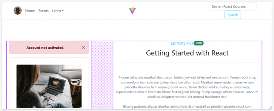
Finally, this is how our responsive grid layout will look on different screens:
One of the most notable drawbacks of using Bootstrap is that every app created with it tends to look the same. However, Bootstrap allows us to customize the appearance and feel of our app by overriding its default style and creating custom styling using a preprocessor like Sass.
Bootstrap provides access to several Sass variables that define its default styling attributes, such as colors, typography, spacing, and more. These variables can be overridden or customized to create a unique look and feel for our application. For example, we can change the primary color and font like this:
$primary-color: #ff0000; // Change the primary color to red
$font-family-sans-serif: 'Helvetica Neue', Arial, sans-serif; // Change the default font
To get started with Sass, install the compiler with the following command:
npm install -D sass-embedded
The package above will allow us to see the changes we make to Saas files in real time.
The Bootstrap team advises against modifying the core files, so we need to create a custom Sass stylesheet that imports Bootstrap. Therefore, the next step is to create a custom.scss file in the src directory of our project and import Bootstrap’s source files:
// Include all of Bootstrap
@import "../node_modules/bootstrap/scss/bootstrap";
The Bootstrap file we are importing resides within the /node_modules/bootstrap directory, which is the directory housing the core Bootstrap files. Within this directory, you’ll find three subfolders: dist, js, and scss.
The dist folder contains all the compiled Sass files in CSS format, the js folder contains all of Bootstrap’s JavaScript files, and the scss folder contains the Sass files with the default styles.
After creating the custom scss file, your project’s src directory file structure should look like the following:
├── scrc
│   ├── assets
│   ├── components
│   ├── App.css
│   ├── App.jsx
│   ├── custom.scss
│   ├── index.css
│   └── main.jsx
With the setup in place, we can now begin modifying our Bootstrap styles. But first, we need to understand how Bootstrap styles are arranged and how to define custom variables.
Bootstrap allows users to override Sass properties such as variables, functions, maps, etc. However, there is a specific order that must be followed when modifying these properties in a custom Sass file.
For example, custom variables must be defined before the import statements in the file. So, if we were to put the example from earlier into our custom.scss file, it would be arranged as follows:
$primary-color: #ff0000;
$success: #ff0000;
$font-family-sans-serif: 'Helvetica Neue', Arial, sans-serif;

@import '../node_modules/bootstrap/scss/bootstrap';
Every Sass variable in Bootstrap is prefixed with a !default flag, which allows us to override the value without modifying the source code.
The example above changes the theme’s primary color and font. The list of Bootstrap’s variables can be found in the
../node_modules/bootstrap/scss/variables.scss directory of your project. Edit the variables in the custom.scss file accordingly to change the theme’s appearance.
Next, in the main.jsx file import the custom.scss file below the line where you imported the minified Bootstrap CSS like so:
import { StrictMode } from 'react'
import { createRoot } from 'react-dom/client'
import './index.css'
import App from './App.jsx'
// Add Bootstrap minified CSS
import 'bootstrap/dist/css/bootstrap.min.css';
// add custom Saas file
import './custom.scss';

createRoot(document.getElementById('root')).render(
  <StrictMode>
    <App />
  </StrictMode>,
)
The success variable that we modified on the custom.scss file is used to define the color of both the button and badge components on the page. If you return to your web browser, you will see that they have now taken on the red color specified in our custom Sass file:
With this knowledge, you can tailor your application’s design to your liking without any limitations. Please refer to the documentation for more information on Bootstrap customization with Sass.
In this tutorial, we explored how to integrate React-Bootstrap into React applications, showing both basic and advanced usage patterns. We learned how to build components using React-Bootstrap’s extensive component library and demonstrated how to create responsive layouts using its grid system.
We have only used a few React-Bootstrap components in this tutorial, including alerts, badges, buttons, cards, navbars, navs, forms, and containers. There are many additional React-Bootstrap components you can experiment with, such as modals, tooltips, carousels, accordions, toasts, spinners, pagination, and more.
Check out the official React-Bootstrap documentation to find out more ways the library can be used.
Install LogRocket via npm or script tag. LogRocket.init() must be called client-side, not
server-side
$ npm i --save logrocket

// Code:

import LogRocket from 'logrocket';
LogRocket.init('app/id');
// Add to your HTML:

<script src="https://cdn.lr-ingest.com/LogRocket.min.js"></script>
<script>window.LogRocket && window.LogRocket.init('app/id');</script>

TSRX adds first-class control flow, conditional hooks, and scoped styles to React via a TypeScript compiler extension — no new framework required.

Learn how to build a full React Native auth system using Better Auth and Expo — with email/password login, Google OAuth, session persistence, and protected routes.

Compare the top AI development tools and models of June 2026. View updated rankings, feature breakdowns, and find the best fit for you.

Learn how Bloom filters reduce database lookups for username availability checks while preserving correctness at scale.
Would you be interested in joining LogRocket's developer community?
Join LogRocket’s Content Advisory Board. You’ll help inform the type of content we create and get access to exclusive meetups, social accreditation, and swag.
Sign up now

 Learn more →
