Ensuring a smooth website loading experience relies on the browser’s ability to identify visible and non-visible parts of the page and understand the influence of specific elements on the current display.

To enhance the browser’s efficiency in managing a webpage’s performance, web standards have introduced containment in CSS, represented by the CSS contain property. This property signals whether or not an element’s contents are distinct from the rest of the page, facilitating optimization of specific areas and improving user experience.
This tutorial will explore the CSS contain property, delve into its significance, understand its functionality, and examine its implementation through various examples.
The Replay is a weekly newsletter for dev and engineering leaders.
Delivered once a week, it's your curated guide to the most important conversations around frontend dev, emerging AI tools, and the state of modern software.
To understand CSS containment, it is essential to understand the three critical tasks performed by web browsers during the process of displaying a webpage to the user:
Web browsers perform a series of background operations to optimize web page performance, whereas frontend developers have a deeper understanding of how elements and interactions impact a web page’s performance.
For performance benefits, developers can maintain flatter HTML nodes, optimize CSS, and reduce HTML and CSS manipulations using JavaScript to decrease the burden on browsers for layout calculations, paints, repaints, and reflows. However, achieving this may be challenging in practical scenarios due to varying frontend frameworks and design requirements.
To navigate this complexity, developers can take advantage of CSS containment. This tool allows them to explicitly define specific elements to browsers, avoiding unnecessary computations and improving rendering performance.
Think of CSS containment as a way to put different parts of a webpage in a virtual box. This makes webpage rendering more efficient by avoiding simultaneous layout, paint, size, and style calculations.
The main goal of CSS containment is to boost website performance by creating independent sections within the site. Elements with the contain property act like architects, forming a self-contained area that doesn’t affect or get affected by elements outside it.
This innovation introduces the contain property, providing four crucial values: layout, paint, size, and style. These values can be used in combinations with each other based on the requirements and can also be implemented with additional standard keywords for two different combinations. Developers can use these values to specify parts of the webpage, reducing the impact of changes within that area on the whole page:
<selector> {
  contain: layout | size | paint | style | strict | content;
}
It’s important to note that the performance benefits might be small for minor cases but can be significant for larger applications. As this primarily relates to performance, the changes brought about by containment may not always be visible in the UI. In the next few sections, we’ll dive deeper into these various types of containments.
Layout containment establishes a protective border around an element, keeping its internal layout separate from external influences and vice versa. This turns the component into a containing block, forming its independent stacking context. The stacking context organizes elements in a hierarchy, deciding their position relative to others.
With its stacking context, the contained element becomes a distinct layer on the page, shielding its contents from affecting the overall layout or being affected by elements outside its boundaries.
This isolation simplifies the browser’s rendering process by allowing it to treat the contained element as a self-contained entity, reducing the complexity of layout calculations. Instead of considering the entire page, the browser can focus solely on the contents within the containment boundary, significantly improving performance and preventing layout shifts.
The example below illustrates the effectiveness of layout containment by showcasing how it tightly encases its contents, including both floated and fixed-positioned elements, ensuring that they remain unaffected by external layout changes. You can observe how the contained element maintains its integrity while the surrounding elements shift and adjust by toggling between layout containment and no containment:
See the Pen
CSS Contain: Layout Containment by Rahul (@_rahul)
on CodePen.
This implementation highlights the independent nature of elements optimized with layout containment. They operate autonomously, disregarding external factors when determining their internal appearance and ensuring that their contents do not influence the rest of the page. This isolation enhances performance and promotes a more predictable and stable user experience.
Paint containment establishes a clear boundary around an element, ensuring its content is only rendered within its visible area. This optimization technique significantly improves rendering performance by instructing the browser only to paint the visible portions of the element, omitting any content that falls outside its bounds.
In more detailed terms, paint containment enables the browser to intelligently identify the specific portions of an element that require rendering and those that can be skipped. This selective rendering process effectively decreases the overall workload on the browser, resulting in quicker page load times and more seamless user experiences.
This approach is particularly beneficial for frequently hidden or partially visual components, such as menus with toggleable display states, collapsible sections, or dynamically revealing content.
Here’s a demo you can use to toggle between no containment and paint containment to see how it effectively clips content that falls outside its bounds, similar to hiding the overflow of elements:
See the Pen
CSS Contain: Paint Containment by Rahul (@_rahul)
on CodePen.
Moreover, paint containment helps to prevent layout shifts, which occur when elements unexpectedly change their position or size, causing the page to jump or rearrange itself. By confining the content within the element’s boundaries, paint containment ensures that changes to the element’s interior do not affect the surrounding layout, maintaining a stable and predictable user experience.
Size containment instructs the browser to treat an element as if it has no content when determining its size. This means that the browser disregards the intrinsic dimensions of the element’s contents and instead relies solely on the specified size properties, such as width and height.
This optimization technique is beneficial in situations where the size of an element is dynamically modified using JavaScript or other code, as it prevents an infinite loop of size calculations.
The concept of size containment can be seen as telling the browser to focus solely on the external dimensions of the given element, treating it as an empty box. This approach simplifies the browser’s task and prevents it from getting bogged down in recalculating the element’s size every time its contents change:
See the Pen
CSS Contain: Size Containment by Rahul (@_rahul)
on CodePen.
Size containment has several advantages in terms of performance and layout stability. Firstly, it reduces the complexity of layout calculations, allowing the browser to determine the positions of elements on the page more efficiently. Secondly, it can help prevent layout shifts, which occur when elements unexpectedly change their size, causing the page to jump or rearrange itself.
Style containment is a specialized feature designed for counters and quotes. It influences counters and quotes by confining them to the subtree, generating new instances instead of incrementing existing ones.
This containment has a narrow scope of implementation benefits and is particularly effective in straightforward scenarios where the style features like counter or quote usage are simple and uncomplicated:
See the Pen
CSS style containment example by Rahul (@_rahul)
on CodePen.
All four primary containment values can be combined and utilized in various combinations. Additionally, a couple of standard shorthand values can be employed.
The content value of the contain property indicates that the element’s content is independent of the rest of the document. This allows the browser to optimize rendering by isolating the element’s layout, paint, and style calculations.
The strict shorthand is employed to specify all containment aspects, namely layout, paint, style, and size. It offers robust isolation for the element and its subtree, making it suitable for scenarios where optimization is desired across all aspects of rendering:
.contain-strict {
  /* contain: layout paint style size; */
  contain: strict;
}

.contain-content {
  /* contain: layout paint style; */
  contain: content;
}
In the upcoming sections, we’ll implement content containment; as we’ve just mentioned, it involves combining layout, paint, and style. As style does not significantly impact performance, our primary focus will be layout and paint containments.
In this section, we’ll explore some practical implementations of CSS containment, focusing more on performance than appearance. The aim here is to replicate cases commonly found in web apps. Following these examples, you can experiment with CSS containment in your projects and observe the performance differences.
Before we continue, remember that the performance reports in dev tools may not always indicate better results, especially for smaller cases. This depends on the browser’s intelligence in dynamically allocating resources and memory. After a few attempts, we can assess the average performance with and without containment and decide whether to proceed with it or not.
Imagine a webpage that dynamically loads or adds elements to certain sections using JavaScript. These dynamic additions can be triggered by clicking buttons, scrolling down the page, etc.
The following implementation allows you to test the layout with or without CSS containment. To observe the changes the page undergoes, open it on CodePen and view it in debug mode so that you can handle performance monitoring using dev tools.
Alternatively, you can clone this GitHub repository containing all examples, including this one, to check the page’s performance more effectively:
See the Pen
CSS Containment: Layout Performance Example by Rahul (@_rahul)
on CodePen.
To use the above example, configure containment using the select box and then use the Add an item button to inject items dynamically. To observe changes, utilize the developer tools in your browser, navigate to the Performance tab, and record performance with different containment configurations. Observe the changes in rendering, including layout and paint segments.
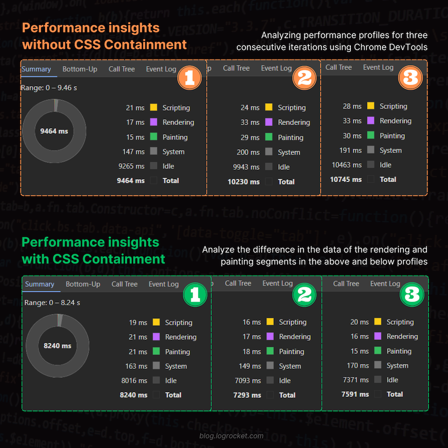
I collected analytical data from my performance analysis of the sample example and formulated the following insights, as depicted in the image below:

While this improvement may not seem significant for this small example, it can benefit a more extensive application that performs similar but frequent manipulations on a larger scale. This helps the browser save time in recalculations, repaints, and reflows, making the overall process more efficient and faster.
When working with CSS animations, you may encounter challenges such as awkward animation effects that disrupt the overall presentation of a webpage. This can happen when animated elements overlap or conflict with other elements on the page.
To illustrate this issue, consider the example below, which demonstrates an animation without CSS containment. As you can see, the animation disrupts the page layout, causing the content below to shift unnecessarily:
See the Pen
Fixing CSS Animations: Without CSS Containment by Rahul (@_rahul)
on CodePen.
To address this issue, we can implement CSS containment, which isolates the animated element and prevents it from interfering with the rest of the page.
By applying strict containment, which encompasses layout, paint, size, and style containments, we can ensure that the animation remains confined to its designated area and doesn’t disrupt the overall layout. Observe the improved presentation with strict containment in action:
See the Pen
Fixing CSS Animations: With CSS Containment by Rahul (@_rahul)
on CodePen.
Indeed, the previously unruly animation now appears improved and behaves appropriately without disrupting the other elements on the page. You may consider the animation performance comparison task as an assignment.
In the case of hidden elements, for instance, paint containment allows the browser to disregard the hidden contents until they are revealed to the user. This optimization prevents the browser from wasting resources on rendering elements that are not visible, saving processing power and improving overall performance.
Here’s an example to illustrate the performance of some details disclosure elements that inherently allow the user to reveal or hide additional details on the go. In this case, we will compare scenarios with and without containment, utilizing content containment to leverage paint and layout containments:
See the Pen
CSS Containment Experiment with HTML Detail Disclosure Widgets by Rahul (@_rahul)
on CodePen.
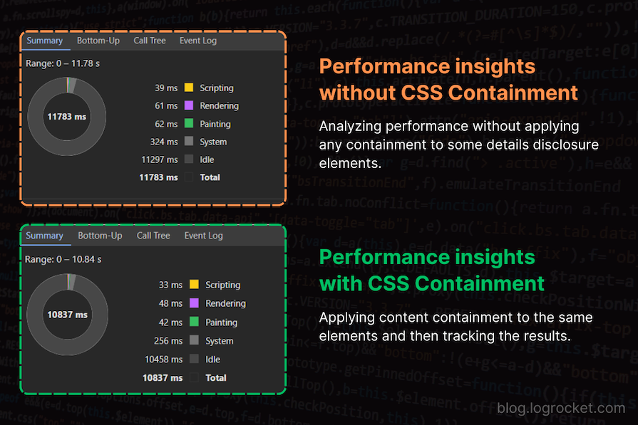
In the example above, I conducted performance tracking after toggling the menu five times for each type of containment and found some improvements in rendering and painting areas. Here are the results I obtained:

You can also take this comparison further with a menu on the page that stays hidden until the user wants to use it. Here’s a CodePen showcasing a similar example, which you can use for further performance comparisons.
Anticipating the height of images, iframes, and videos is crucial in controlling Cumulative Layout Shifts (CLS). Combining this approach with CSS containment not only enhances performance but also isolates the entire block from the overall page, reducing the browser’s workload and allowing for utilizing the benefits offered by containment techniques.
A prime illustration of layout shifts impacting user experience can be seen in third-party ads, which may undergo unpredictable dimensions or font sizing changes. Below is an example showing how layout shifts caused by ads can spoil the user experience. Try to re-run the demos if you didn’t notice the layout shift:
See the Pen
Layout Shift caused by third-party ads by Rahul (@_rahul)
on CodePen.
Developers commonly address this uncertainty by enclosing ads in a fixed-size div with hidden overflow, providing stability.
Choosing CSS containment over the overflow property provides an additional advantage by segregating specific ad blocks from the page. This improves performance and ensures strict encapsulation, preventing ad bleeding beyond the wrapping div.
Here’s the improved demo you saw above, utilizing the paint containment instead of hiding the overflow. I’ve intentionally modified the font size and dimensions of the injected ad in the demo below to illustrate that it won’t affect the ad container’s size in any way due to the containment applied to it:
See the Pen
A slightly better fix to Layout Shift w/ CSS Containment by Rahul (@_rahul)
on CodePen.
CSS containment is widely supported, extending to all major browsers, including mobile browsers such as Safari for iOS and Opera Mobile.
Despite having extensive support, contain isn’t widely popular among developers. It would be interesting to see more developments, increased awareness, and the emergence of more use cases for this specific enhancement.
In this article, we explored different CSS containments with illustrative examples, providing insights into their diverse applications. Now, we have a clearer understanding of how each works individually and in combination.
While CSS containments aim to enhance your websites, it’s essential to note that they are not a one-size-fits-all solution. Before deploying to production, assessing the performance impact they introduce is crucial. Carefully select CSS containments for your layouts, considering the difference they bring to the overall performance and, consequently, the website’s user experience.
As web frontends get increasingly complex, resource-greedy features demand more and more from the browser. If you’re interested in monitoring and tracking client-side CPU usage, memory usage, and more for all of your users in production, try LogRocket.

LogRocket lets you replay user sessions, eliminating guesswork around why bugs happen by showing exactly what users experienced. It captures console logs, errors, network requests, and pixel-perfect DOM recordings — compatible with all frameworks.
LogRocket's Galileo AI watches sessions for you, instantly identifying and explaining user struggles with automated monitoring of your entire product experience.
Modernize how you debug web and mobile apps — start monitoring for free.

A step-by-step guide to building your first MCP server using Node.js, covering core concepts, tool design, and upgrading from file storage to MySQL.

Using security headers in your Next.js apps is a highly effective way to secure websites from common security threats.

A deep dive into April 2026’s AI model and tool rankings. We break down performance, usability, pricing, and real-world capabilities across 50+ features to help you pick the right tools for your development workflow.

A practical guide to Agent Browser CLI. Learn how AI agents navigate, snapshot, and interact with web pages using stable references, enabling efficient automation and exploratory testing.
Would you be interested in joining LogRocket's developer community?
Join LogRocket’s Content Advisory Board. You’ll help inform the type of content we create and get access to exclusive meetups, social accreditation, and swag.
Sign up now