You work for days, maybe months, to build a sleek web page. Everything looks great at first, but then you start scrolling… and suddenly, your sticky elements — navigation menus, headers, or the sidebar calls to action — either don’t stick at all or don’t stay where they’re supposed to.

Frustrating, right?
What might seem like a minor bug at first can quickly become a real headache, and if left unresolved, can significantly hurt your site’s engagement.
In this guide, we’ll tackle these most common sticky positioning problems:
overflow propertyoverflow on the body elementThen we’ll walk through how to troubleshoot these sticky positioning problems with practical examples and tips to make you a sticky positioning professional! You can also find an overview of the position property and CSS sticky position after we’ve gone through the common issues.
The Replay is a weekly newsletter for dev and engineering leaders.
Delivered once a week, it's your curated guide to the most important conversations around frontend dev, emerging AI tools, and the state of modern software.
The first and simplest troubleshooting step is to ensure that an offset is specified using properties such as top, right, bottom, or left:
.sticky-heading {
  position: sticky;
  top: 0; /* Offset not defined - sticky behavior won't activate */
}
Without an offset, the sticky behavior won’t activate. Additionally, ensure that the applied offset is appropriate for the intended scroll direction. For example, top or bottom for vertical scrolling, and left or right for horizontal scrolling.
The CodePen below demonstrates sticky elements inside grid containers:
See the Pen
Sticky element inside grid containers by Ibaslogic (@ibaslogic)
on CodePen.
In the CodePen, the headings stick because the container holding each of them has enough scrollable space. To better visualize the layout, try adding borders around the content. This will help you see how each heading stays in place as you scroll through the sections.

In the HTML code, the headings are placed within grid containers, and grid items naturally stretch to fill the available space. However, this stretching can prevent a sticky element from having enough room to scroll and stick.
To resolve this, we applied align-items: start to the grid container. This prevents the sticky element from being stretched, ensuring it has enough space to function as intended:
article {
  align-items: start;
  /* ... */
}
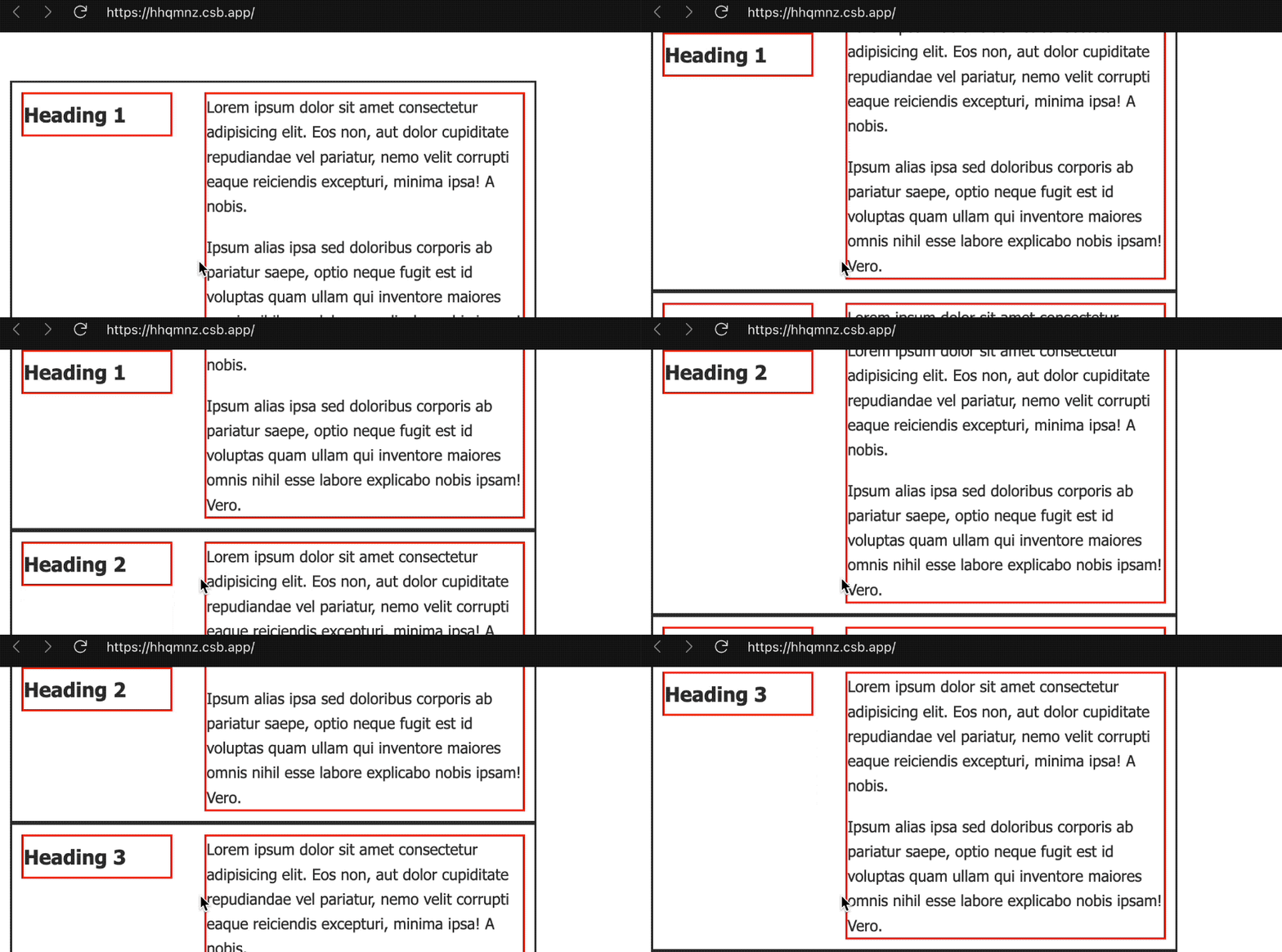
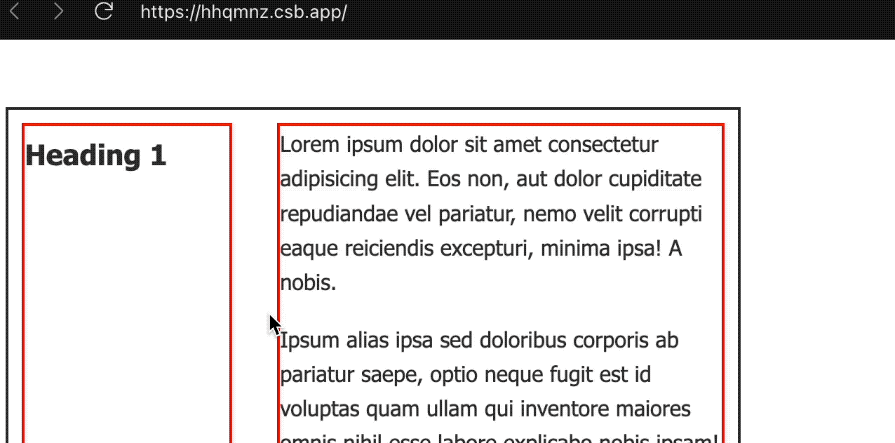
Without align-items: start, the grid container would stretch the heading to fill the available space, preventing the element from sticking to the top of the viewport. This happens because there wouldn’t be enough scrollable space for the element to properly attach as demonstrated below:

While the example shows the implementation for the grid, the same solution applies to flexbox layouts as well.
As you interact with the CodePen below and scroll the viewport to observe the sticky behavior, you’ll notice that the first sticky element doesn’t work as expected, while the second one functions correctly — even though the layouts appear visually similar:
See the Pen
Sticky element with container height by Ibaslogic (@ibaslogic)
on CodePen.
As mentioned earlier, for the sticky element to function properly, its container must have enough height or scrollable space. Let’s take a closer look at the containers. In the first layout, the sticky element is enclosed within an extra <div>:
<div class="container">
  <div>
    <div class="sticky-element">
      I can’t stay fixed; I'm limited by the boundaries of my container!
    </div>
  </div>
  <p>Some other content here...</p>
</div>
Because the wrapper doesn’t provide any height (collapsing to the height of its content), it restricts the sticky element. As a result, there isn’t enough height in the parent container for the sticky element to work properly when you scroll.
In contrast, the second container places the sticky element directly within the parent container, without an extra wrapping <div>:
<div class="container container-2">
  <div class="sticky-element">
    I can stick, my parent container is tall enough!
  </div>
  <p>Scroll down to see me stick!</p>
</div>
This structure enables the sticky element to function properly because its parent container has sufficient height.
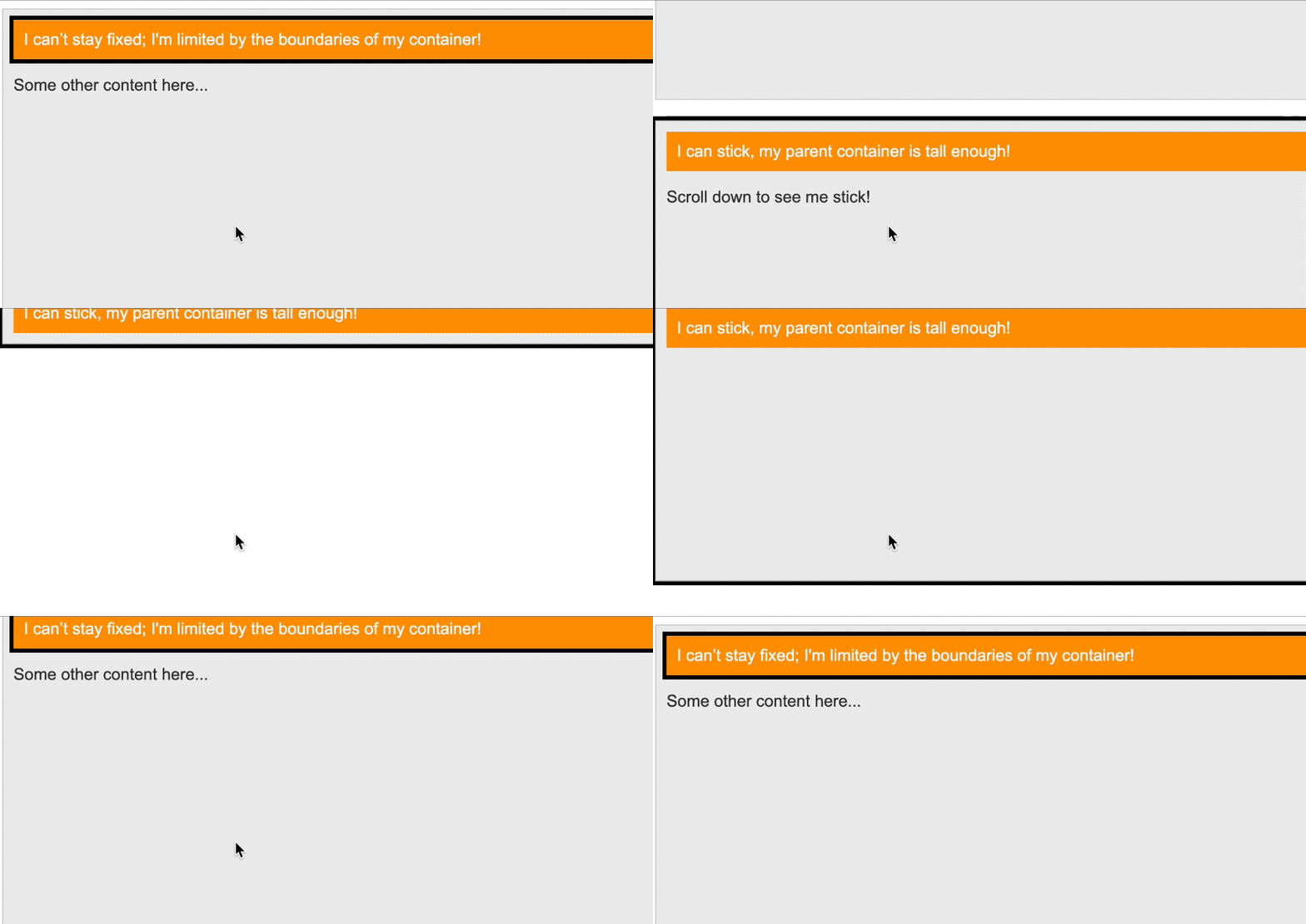
The GIF below illustrates how the height of the wrapper element affects the sticky element’s behavior, highlighting the impact of the wrapper’s height on its functionality. We’ve also added a border to the parent element to better visualize its height:

To ensure that sticky positioning functions correctly, it’s essential to structure your HTML so that the sticky element is placed directly within a container that provides sufficient height or scrollable space. In this case, removing unnecessary wrapper elements will help achieve the desired sticky effect.
overflow propertySticky positioning often fails because an ancestor element has an overflow value set to something other than the default visible.
To understand this better, it helps to know that a sticky element sticks to its nearest ancestor that has a scrolling overflow, like hidden, scroll, auto, or overlay. This is true even if that ancestor isn’t the closest one that actually scrolls.
In simpler terms, a sticky element is positioned relative to the nearest ancestor with an overflow value other than visible. If no such ancestor exists, it sticks relative to the viewport.
By default, web elements have overflow: visible, allowing sticky elements to stick relative to the viewport. However, if an ancestor element — like a <section> in our first CodePen example — has an overflow property set to auto, scroll, or hidden, it creates a new scrolling context, making the sticky element’s reference point the ancestor instead:
<section style="overflow: auto;">
  <!-- ... -->
</section>
In this situation, the sticky element no longer sticks relative to the viewport but within the boundaries of the section, potentially breaking the expected sticky behavior if it’s meant to stick to the viewport.
Scroll the viewport in the CodePen below to see how the sticky headings no longer behave as expected:
See the Pen
Sticky element with ancestor overflow by Ibaslogic (@ibaslogic)
on CodePen.
The sticky elements no longer adhere to the viewport; instead, they have the potential to stick within the boundaries of their section. To see that take effect, the section needs a defined height to create a scrollable area:
section {
  overflow: auto;
  height: 200px;
  /*...*/
}
In the CodePen below, you can scroll the section to observe how the sticky headings now stick within the section itself. A border has been added to visualize the scrollable area:
See the Pen
Sticky element within scrollable section by Ibaslogic (@ibaslogic)
on CodePen.
overflow on the body elementSetting overflow on the body element typically doesn’t break sticky positioning as it might with other ancestor elements:
<body style="overflow: auto">
  <section>
    <!-- ...  -->
  </section>
</body>
This is because the body creates the primary scrolling context for the entire page, and sticky elements still stick relative to the viewport in this case:
See the Pen
Sticky element with body overflow by Ibaslogic (@ibaslogic)
on CodePen.
Even though a scrolling mechanism is created, it doesn’t interfere with the sticky behavior as it would within smaller containers — except when setting overflow: hidden, which removes the ability to scroll any content that overflows the viewport.
Now that we’ve covered the common sticky issues, you can read a more general overview of the position property and sticky position.
position propertyThe CSS position property controls how elements are positioned on a web page. With values like relative, absolute, fixed, or sticky, you can adjust an element’s placement using the top, right, bottom, and left properties within its containing block or the viewport. These values also enable elements to be positioned in relation to one another using z-index.
However, keep in mind that these offset properties (i.e., top, right, bottom, left) and z-index don’t apply to elements with the default static positioning.
When it comes to troubleshooting sticky positioning, it’s helpful to revisit what sticky value entails. Understanding its behavior will provide a clearer picture of common issues and how to address them effectively.
sticky positionWhen you apply position: sticky to an element, it behaves similarly to a relatively positioned element by maintaining its place in the document flow. However, it also gains the ability to become “sticky” and respond to scrolling.
If you define an offset, such as top: 10px, the element will stick to that position as you scroll down, behaving like it is using position: fixed. For horizontal scrolling, you can use offsets like left or right to achieve a similar effect. It’s important to note that the sticky behavior only applies within the element’s containing block. Once you scroll past the boundaries of that block, the sticky element will scroll away like any normal element.
The CodePen below demonstrates the sticky behavior. Scroll the viewport to see the sticky headings in action:
See the Pen
Sticky element inside grid containers by Ibaslogic (@ibaslogic)
on CodePen.
Each HTML heading is styled with position: sticky and top: 0, ensuring it sticks to the top of the viewport as you scroll through the content. However, the sticky headings remain confined to their respective sections. Once a section’s content is fully scrolled past, its heading moves up, allowing the next heading to stick in place. This demonstrates that sticky elements do not escape their parent container.
Building a webpage can be frustrating when sticky elements don’t function as expected. However, understanding key factors like ancestor overflow properties and parent container heights can help you troubleshoot sticky positioning issues.
With the examples and tips in this guide, you’ll be able to ensure that sticky navigation, headers, and sidebar calls to action work smoothly. If you found this guide helpful, feel free to share it online. And if you have any questions or contributions, join me in the comments section!
As web frontends get increasingly complex, resource-greedy features demand more and more from the browser. If you’re interested in monitoring and tracking client-side CPU usage, memory usage, and more for all of your users in production, try LogRocket.

LogRocket lets you replay user sessions, eliminating guesswork around why bugs happen by showing exactly what users experienced. It captures console logs, errors, network requests, and pixel-perfect DOM recordings — compatible with all frameworks.
LogRocket's Galileo AI watches sessions for you, instantly identifying and explaining user struggles with automated monitoring of your entire product experience.
Modernize how you debug web and mobile apps — start monitoring for free.

useEffect breaks AI streaming responses in ReactSee why useEffect breaks AI streaming in React, and how moving stream state outside React fixes flicker and stale updates.

A real-world debugging session using Claude to solve a tricky Next.js UI bug, exploring how AI helps, where it struggles, and what actually fixed the issue.

CSS wasn’t built for dynamic UIs. Pretext flips the model by measuring text before rendering, enabling accurate layouts, faster performance, and better control in React apps.

Why do real-time frontends break at scale? Learn how event-driven patterns reduce drift, race conditions, and inconsistent UI state.
Would you be interested in joining LogRocket's developer community?
Join LogRocket’s Content Advisory Board. You’ll help inform the type of content we create and get access to exclusive meetups, social accreditation, and swag.
Sign up now