One of the biggest challenges in frontend development is delivering high-quality UIs under tight deadlines. Clients want apps that are faster, shinier, and production-ready yesterday.
There are just too many UI libraries and frameworks. Will you use Tailwind CSS, MUI, Bootstrap, SCSS, or just vanilla CSS? Maybe you want to use Tailwind, but the client keeps messaging, “How’s the development going?” A meeting is coming up. You don’t know what to do. Which CSS framework should you choose?
In this article, we’ll cover six CSS frameworks and libraries that were either released or gained traction after 2024. These tools can help you move faster, build cleaner interfaces, and deliver on tight deadlines.
The Replay is a weekly newsletter for dev and engineering leaders.
Delivered once a week, it's your curated guide to the most important conversations around frontend dev, emerging AI tools, and the state of modern software.
Beer CSS is a CSS framework based on Material Design 3 principles. You might find yourself needing to build a web app with Material Design, but you don’t have enough time to create a consistent system from scratch. Beer CSS solves this by offering sleek, ready-to-use components that minimize setup time.
Beer CSS shines when you need to implement Material Design quickly and consistently, without writing everything from scratch. It reduces bloat by offering prebuilt, modular components and eliminates the need for a heavy setup thanks to its CDN-first approach.
To include Beer CSS in your project, add the following to index.html:
<link href="https://cdn.jsdelivr.net/npm/[email protected]/dist/cdn/beer.min.css" rel="stylesheet">
<script type="module" src="https://cdn.jsdelivr.net/npm/[email protected]/dist/cdn/beer.min.js"></script>
<script type="module" src="https://cdn.jsdelivr.net/npm/[email protected]/dist/cdn/material-dynamic-colors.min.js"></script>
Once added, you can immediately use Beer CSS components. For instance, we can create a new vite-react app via npm create vite@latest and add components directly into App.jsx:
function App() {
  return (
    <>
      <button>
        <i>home</i>
        <span>Button</span>
      </button>
      <progress class="circle"></progress>
      <label class="slider">
        <input type="range" value="25" />
        <input type="range" value="50" />
        <span></span>
      </label>
    </>
  );
}

export default App;
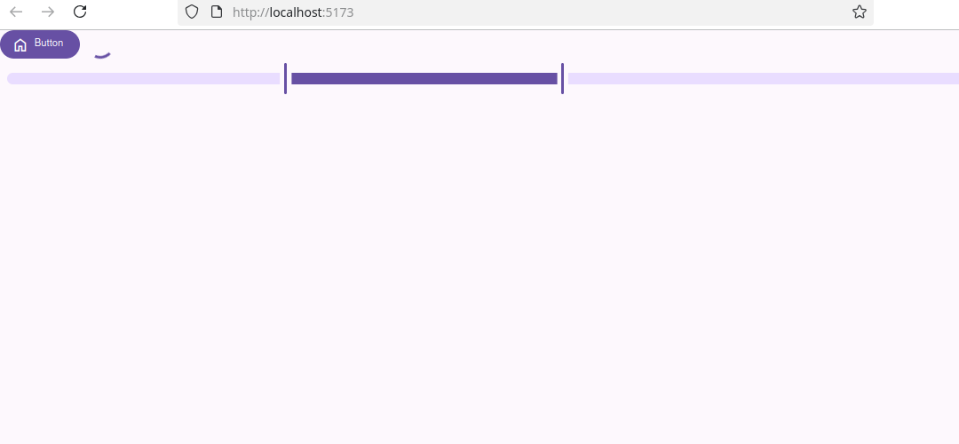
This code will add a button, a circular progress bar, and a slider to show how those elements look on the page:
When using JSX, replace class with className and close all self-closing tags (e.g., <input />, <img />).
Daisy UI is a Tailwind CSS plugin designed to make development faster, cleaner, and easier. It offers a collection of component class names (like card or hero), allowing developers to build common UI elements quickly without writing long strings of utility classes like you would with vanilla Tailwind.
Daisy UI solves one of the biggest hurdles in Tailwind CSS: verbosity. While Tailwind is powerful, building complex components often requires long strings of utility classes. DaisyUI abstracts those patterns into readable class names like card, significantly improving readability and development speed.
In this tutorial, we’ll create a Vite + React app and install DaisyUI. You can also follow the official installation page for other frameworks.
To create a Vite + React app:
npm create vite@latest ./ -- --template react
Then install Tailwind CSS and DaisyUI:
Add Tailwind CSS to vite.config.js:
import { defineConfig } from "vite";
import tailwindcss from "@tailwindcss/vite";
import react from "@vitejs/plugin-react";

export default defineConfig({
  plugins: [tailwindcss(), react()],
});
Replace contents of App.css with:
@import "tailwindcss";
@plugin "daisyui";
With DaisyUI installed, you can start using its component classes in your HTML or JSX. For example, creating a visually appealing Hero section is straightforward.
In a React component (App.jsx):
<div
  className="hero min-h-screen"
  style={{
    backgroundImage:
      "url(https://img.daisyui.com/images/stock/photo-1507358522600-9f71e620c44e.webp)",
  }}
>
  <div className="hero-overlay"></div>
  <div className="hero-content text-neutral-content text-center">
    <div className="max-w-md">
      <h1 className="mb-5 text-5xl font-bold">Hello there</h1>
      <p className="mb-5">
        Provident cupiditate voluptatem et in. Quaerat fugiat ut assumenda excepturi exercitationem
        quasi. In deleniti eaque aut repudiandae et a id nisi.
      </p>
      <button className="btn btn-primary">Get Started</button>
    </div>
  </div>
</div>
You’ll see a polished hero section rendered in seconds:

Daisy UI speeds up development, but customizing components still requires a working knowledge of Tailwind CSS.
Cirrus UI is a simple, modular, and responsive SCSS framework that aims to accelerate the developer’s work through pre-built components and utility classes. It offers a streamlined developer experience, enabling rapid prototyping and custom design without starting from scratch or managing complex CSS architecture.
Cirrus UI helps solve common frontend challenges such as repetitive CSS patterns and maintaining design consistency. By providing a suite of pre-styled components and utilities, it significantly reduces the time required for prototyping and iteration.
Its modular architecture also helps avoid unnecessary bloat; developers can include only what they need. This leads to faster load times, a cleaner codebase, and easier long-term maintenance. Sass integration adds another layer of customization, empowering teams to implement deeply personalized designs without rewriting core styles.
Cirrus is a CSS framework like Tailwind or Bootstrap.
If you’re using npm (a package manager for JavaScript), you can install Cirrus with this command:
npm i cirrus-ui --save
After installing, you need to import it so your project knows to use Cirrus’ styles.
If you’re using a tool like Vite, in your main JS/JSX file (main.js or main.jsx), write:
import "cirrus-ui";
Once it’s set up, try using some built-in styles.
In this example, the developer writes a simple React component to test Cirrus-styled buttons:
function App() {
  return (
    <>
      <button class="btn btn-plain">Plain</button>
      <button class="btn btn-transparent">transparent</button>
      <button class="btn btn-light">light</button>
      <button class="btn btn-dark">dark</button>
      <button class="btn btn-black">black</button>
      <button class="btn btn-primary">primary</button>
      <button class="btn btn-link">link</button>
      <button class="btn btn-info">info</button>
      <button class="btn btn-success">success</button>
      <button class="btn btn-warning">warning</button>
      <button class="btn btn-danger">danger</button>
    </>
  );
}

export default App;
We will be presented with the following page:
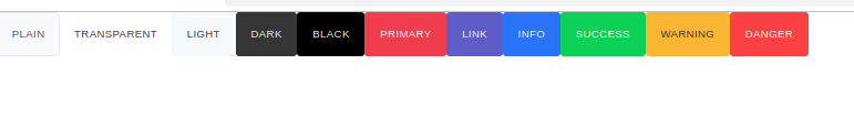
This renders a clean, fully styled button set right out of the box, a great starting point for any SCSS-based UI.
Halfmoon is an open source, responsive CSS framework that positions itself as a highly-customizable, drop-in replacement for Bootstrap. It stands out for its heavy use of CSS variables for theming, built-in dark mode, and multiple core themes, all while leveraging the familiar Bootstrap ecosystem.
Halfmoon provides a unique aesthetic layered on top of the Bootstrap foundation, offering more direct control through CSS variables. It’s a good fit for developers who want to benefit from Bootstrap’s component ecosystem but need a more customizable and themeable framework.
It also solves a longstanding Bootstrap pain point: building responsive, functional sidebar layouts. With Halfmoon’s dedicated sidebar component, you can skip third-party workarounds and reduce custom layout code.
For this tutorial, we’ll use a vanilla JavaScript project with a Vite template. Once the project is set up, follow these steps:
npm i [email protected]
main.jsimport "halfmoon/css/halfmoon.min.css";
Since Halfmoon doesn’t include its own JavaScript, it relies on Bootstrap for component behavior. Add the following lines to your HTML:
<link href="https://cdn.jsdelivr.net/npm/[email protected]/dist/css/bootstrap.min.css" rel="stylesheet" integrity="sha384-..." crossorigin="anonymous">
<script src="https://cdn.jsdelivr.net/npm/[email protected]/dist/js/bootstrap.bundle.min.js" integrity="sha384-..." crossorigin="anonymous"></script>
Halfmoon uses Bootstrap under the hood for JavaScript-driven components like modals and dropdowns. Without it, these features won’t work.
Let’s render some buttons to test that everything is working. In your main.js file, add the following:
import "halfmoon/css/halfmoon.min.css";

document.querySelector("#app").innerHTML = `
  <div>
    <button type="button" class="btn btn-success">Success</button>
    <button type="button" class="btn btn-danger">Danger</button>
    <button type="button" class="btn btn-warning">Warning</button>
    <button type="button" class="btn btn-info">Info</button>
    <button type="button" class="btn btn-light">Light</button>
    <button type="button" class="btn btn-dark">Dark</button>
    <button type="button" class="btn btn-link">Link</button>
  </div>
`;

setupCounter(document.querySelector("#counter"));
We will see the following output:
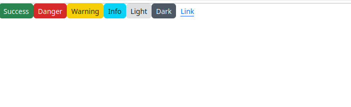
You’ll quickly see why it feels familiar to Bootstrap, and why Halfmoon markets itself as a streamlined alternative.
Halfmoon depends on Bootstrap’s JS runtime. Always verify that Bootstrap is correctly loaded in projects using Halfmoon.
Pico CSS is a minimalist, lightweight CSS framework designed around semantic HTML. Its core philosophy is to style native HTML elements, such as <button>, <table>, <nav>, and <article>, so they appear elegant and responsive by default, without the need for extra utility classes or custom CSS.
With its motto, “Write HTML, add Pico CSS, and voilà!”, Pico offers a clean, accessible UI with minimal effort.
Pico tackles two common front-end pain points: overly complex CSS frameworks and cluttered HTML filled with utility classes. Instead of forcing you to style every element manually, Pico provides a lightweight foundation that looks polished out of the box.This encourages developers to focus on writing semantic, well-structured HTML, without sacrificing design.
Getting started with Pico CSS reflects its minimalist philosophy. Just add the following CDN link to the of your HTML file:
<link
  rel="stylesheet"
  href="https://cdn.jsdelivr.net/npm/@picocss/pico@2/css/pico.min.css"
/>
That’s it! No JavaScript, build tools, or extra configuration required.
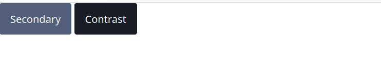
Once the stylesheet is linked, Pico automatically applies styles to standard HTML elements. For example, to see how buttons are rendered, you can add:
<button class="secondary">Secondary</button>
<button class="contrast">Contrast</button>
These buttons are styled immediately, without any additional setup
CodeStich takes a different approach from other frameworks in this list. Instead of offering components and utilities for a skeleton UI, it provides a curated library of pre-built pages that serve specific use cases. These come with ready-to-use HTML, CSS, and JavaScript snippets.The core value: developers can quickly assemble production-ready web pages by copying and pasting, visually appealing blocks that are already “stitched together”.
CodeStitch primarily addresses the need for extremely fast prototyping. It’s especially useful for freelance developers or agencies that frequently handle similar types of projects and need to jump into customization quickly. For teams facing tight deadlines or those who prefer not to reinvent common sections like contact forms, feature lists, or headers. CodeStitch provides a shortcut by offering production-ready code blocks that can be copied, pasted, and adapted with ease.
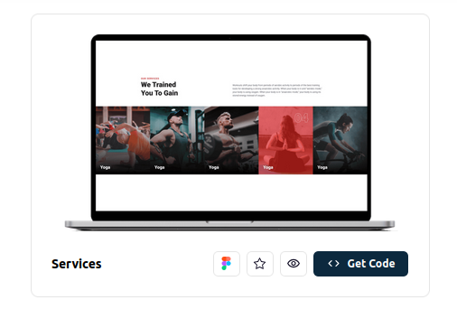
Getting started with CodeStitch doesn’t involve installation in the traditional sense. Instead, it’s all about browsing their online library and copying the code you need.For example, if you find a testimonials section you like, you would copy the HTML markup into your HTML or JSX file and the corresponding CSS (or SCSS/LESS) into your stylesheet, selecting the format that best fits your project.Let’s say you are building a gym website for a client. Rather than designing each section from scratch and assembling components manually, you can browse CodeStitch’s templates, choose one that fits, and start customizing right away. A polished layout can be up and running in seconds:
Because the code is given next to it:
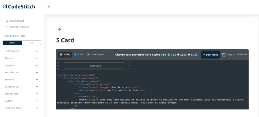
If we click to the Get Code button, we’ll see the following page:
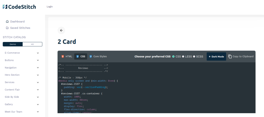
Everything in the CodeStitch library is completely free to use and customize. You can easily modify any layout or section to fit your project’s branding or structure.CodeStitch is not just for full-page dashboards. For instance, if you want to add a testimonials section, simply navigate to the Reviews category in the sidebar, choose a layout you like, and customize as needed:
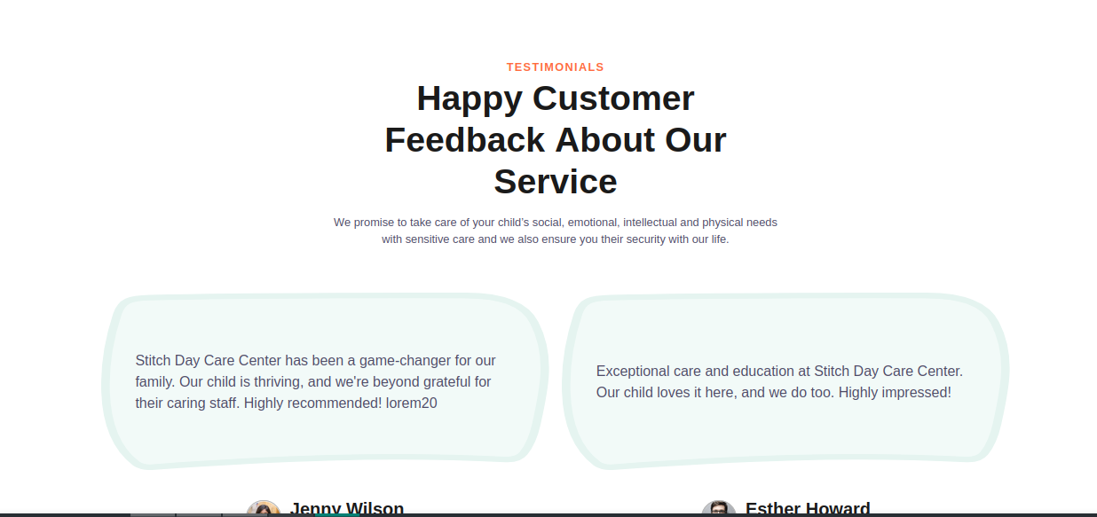
The code for it:
CodeStitch provides raw snippets, so it’s up to you to adapt them to your framework. For instance, when using React, you’d have to convert standard HTML attributes like class to className and properly close self-closing tags like <img /> and <input />.
Phew, what a ride! We just explored six modern CSS frameworks that offer fresh, efficient approaches to front-end developers in 2025.
From the Material Design simplicity of Beer CSS, to the Tailwind-powered components of Daisy UI, the Sass-powered structure of Cirrus UI, the Bootstrap compatible customization of Halfmoon, the semantic elegance of Pico CSS, to the ready-to-ship templates of CodeStitch – each framework provides a unique path to building faster, more maintainable UIs.
Each tool has its strengths. Whether you’re looking for prebuilt components, granular utility control, minimalist styling, or drag-and-drop sections, there’s something here to match your workflow and development style.
The “best” framework isn’t one-size-fits-all; it’s the one that fits your project’s needs, your team’s familiarity, and your timeline. Expanding your toolkit with modern CSS options doesn’t just make development easier; it makes you more adaptable and efficient.
We hope this list has given you a few new tools to explore and maybe even a favorite to carry into your next project. Now go forth and strengthen your CSS toolkit, and build faster, cleaner, and more polished web experiences in 2025.
As web frontends get increasingly complex, resource-greedy features demand more and more from the browser. If you’re interested in monitoring and tracking client-side CPU usage, memory usage, and more for all of your users in production, try LogRocket.

LogRocket lets you replay user sessions, eliminating guesswork around why bugs happen by showing exactly what users experienced. It captures console logs, errors, network requests, and pixel-perfect DOM recordings — compatible with all frameworks.
LogRocket's Galileo AI watches sessions for you, instantly identifying and explaining user struggles with automated monitoring of your entire product experience.
Modernize how you debug web and mobile apps — start monitoring for free.

This article showcases a curated list of open source mobile applications for Flutter that will make your development learning journey faster.

Discover what’s new in The Replay, LogRocket’s newsletter for dev and engineering leaders, in the April 1st issue.

This post walks through a complete six-step image optimization strategy for React apps, demonstrating how the right combination of compression, CDN delivery, modern formats, and caching can slash LCP from 8.8 seconds to just 1.22 seconds.

Learn what vinext is, how Cloudflare rebuilt Next.js on Vite, and whether this experimental framework is worth watching.
Would you be interested in joining LogRocket's developer community?
Join LogRocket’s Content Advisory Board. You’ll help inform the type of content we create and get access to exclusive meetups, social accreditation, and swag.
Sign up now

 Learn more →
