This is the first time I’ve written an article like this. Most of my articles are sparked by an idea I have, and then I do the research to make it work, but this article is inspired by a recent project I conducted with the e-learning platform Kognity, who were interested in providing their users with a top-notch accessibility experience when using their platform.

Among the many parts of the platform that we made accessible was an interactive glossary of terms from their textbook that was available as an expandable/collapsible sidebar on their online platform. Since we had a really good experience building a successful, accessible solution, I would like to share it.
The Kognity solution is written in Vue.js, but as much of its functionality is specific to their platform — and because I’d like to make things as generic as possible for this post — I will be implementing a similar solution in vanilla JavaScript. It should be easy to rework this implementation for various other frameworks.
We’ll cover the following in this post:
There can be significant differences between screenreaders and browser combinations, and many of the screenshots in this article will show how a screenreader works. I’m primarily on a Mac, and therefore most of my screenshots will be of using VoiceOver across Firefox, Chrome, and Safari. However, code presented in this article has been tested with NVDA and Firefox on Windows. In cases where there is a difference in behavior, that difference is noted.
As a result of these significant differences, you may want to consider using a solution like Assistiv Labs for testing because they can provide VMs with different screenreader setups you can access remotely. In any case, it would be a mistake to test this code on just one screenreader/browser combination because of the wide variation in their output and capabilities, and you can easily miss problems.
So, first, let’s look at how the Kognity glossary works. In the following screenshot, you can see part of a Kognity biology textbook and the button to open the glossary in the upper right hand corner.

When you click the glossary button, the glossary opens and you see something like the following:
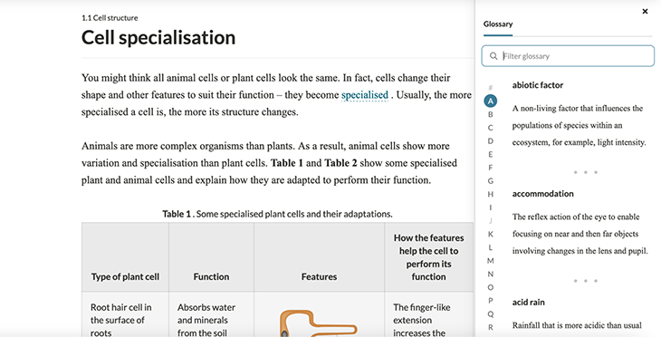
You will see some letters in the glossary are grayed out — these are the letters that do not have any entries associated with this particular part of the textbook. As you can see, the letter A has a teal circle around it to indicate that it’s the selected letter when the glossary first opens (assuming, of course, that there are entries under A).
There is some additional functionality associated with this glossary, such as filtering by text input; I won’t be implementing similar functionality in this article, but am mentioning it for completeness.
I’m sure you’ve seen something like this before: letters in the alphabet are listed out, and clicking one of the letters shows you some content related to the letter. In this case, it is a glossary, but you see a similar UI pattern for navigating video offerings, for example here on HBOMax:
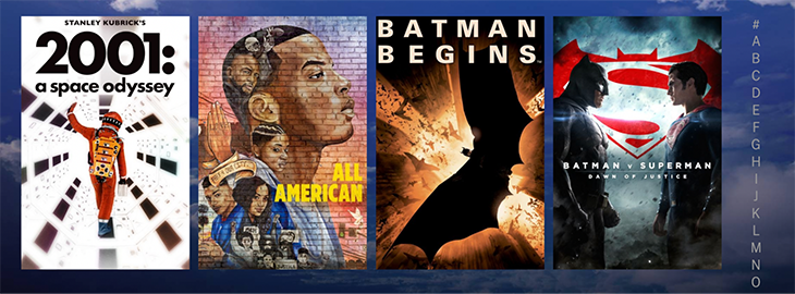
If you click one of the letters in the right-hand sidebar, the page scrolls down to the first film with a title that begins with that letter.
So I guess we can agree it’s a common design, but what is less common is a well-thought-out, accessible one. We’ll demonstrate this a bit more with this HBOMax example in a subsequent section.
In essence, accessibility is a UX problem, and every developer and designer has to use their imagination to grapple with it, just like they must do about any use of their application. No matter what particular set of abilities you might have, that set won’t match those of all your users.
This act of imagination is essentially the key to making a reasonably accessible application, but note the caveat. I say reasonably accessible to emphasize that, while there are parts that will be very difficult, the programming effort required to make apps accessible is trivial, as long as you have done the necessary work of imagining how the application will be used in the case where someone’s capabilities are perhaps diverging from your own. And often, that necessary work of imagination is not especially draining, either!
Let’s first picture how users with different, particular sets of abilities will use the content and tools for interacting with the content on your site. Having a set of user profiles can be helpful. To build our glossary, we shall imagine three distinct profiles, as follows:
This includes those who don’t use assistive devices or techniques, but still may need them or lack some capacity that is not easily fixed with corrective devices. So, aside from the person who is completely free of any problems whatsoever, in this category, we will put:
We can think of this as our baseline normal user.
This includes those who exclusively use the keyboard and tab shortcuts to navigate a site, i.e., those without the ability to use a mouse or touchpad.
There are a number of people who might fit this description. There are those who are able to see the page well enough to interact without a screenreader, such as those who have dyslexia or other language processing difficulties, but like to use a screenreader for help. Then, there are people with visual difficulties who are not officially blind might still prefer to use a screenreader to help them. Finally, there are those users who are blind and absolutely need a screenreader.
You can read a breakdown of screenreader usage stats from the ninth WebAim Screen Reader User Survey, which was last updated June 30, 2021.
Developers who are new to testing accessibility issues decide to test how everything works by tabbing through it. If you can tab to things, interact with them, and ensure they work correctly, then it is assumed that the website is accessible.
It is certainly a requirement for accessibility that all interactive elements should be reached by the tab key, but it is a requirement mainly for our users in group two, since using the tab key is fine for someone with mobility issues who can also visually process the content of the page.
However, users of screenreaders require other ways to order and process the contents of the page, and we should consider this in our solution.
Specifically, every screenreader has a way to read useful parts of the page separately from the normal page order. This is useful for finding what you want to do on a website, and navigating to the parts of the page that interest you.
As an example, in VoiceOver, this is called the web rotor (or just the rotor). Below is a view of the rotor on Kognity with the glossary closed.
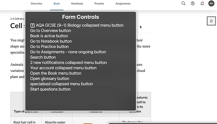
The first thing you will notice is that there are only 13 form controls with the glossary button closed. That’s great! Imagine if you were interacting with this while it was open: there would be 12 buttons, plus 26 buttons for the English alphabet, which totals 38 entries to read out. That is a lot! And, in the case of those in user group 3 who have some sight, they will of course be able to use the screenreader element’s view visually.
To ensure that people can make optimal use of the glossary on our page, we should design a workflow that is sensible. If the workflow for interacting with the page is not well thought-out, our page will not be usable.
As an example of an implementation with accessibility problems, I’m going to pick a bit on HBOMax. I don’t have anything against them (although I was hoping for a lot more classic Warner Brothers content), but I just got a membership and I notice these kinds of things because I am a developer.
Let’s say we’re on one of the pages with the glossary-style navigation, such as Comedy Movies A–Z. If we are using VoiceOver and decide to check the rotor, the rotor will have approximately 38 buttons available to use:
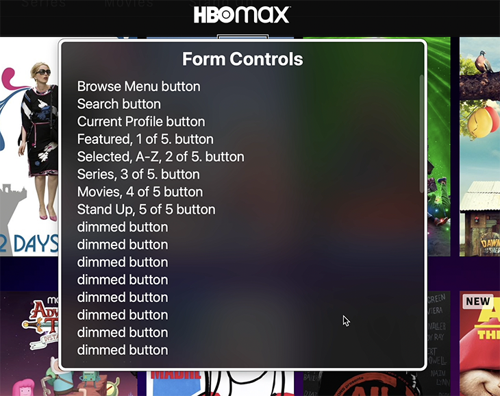
Only eight of these buttons have a meaningful label, or one that gives us a chance of understanding what they do. The rest of them are labeled dimmed button.
A “dimmed button” is VoiceOver’s way of announcing that a button is currently disabled and not usable by the application. You may think that the dimmed buttons are for navigating the categories by first letter of the movie titles, but when you click to see the titles that start with that particular letter, you’ll realize this is not the case (especially because it’s unlikely you’d count the number of dimmed buttons and realize that there are more than 26).
You might also think that the dimmed buttons cannot be interacted with at all, but they can be. If you click the first dimmed button, then the focus will be set on the first element in the second row of movies, and you will hear VoiceOver announce “Link: Adventure Time”.
But these buttons are inside of link elements. Why a button is inside a link, I don’t know, as I was not part of the development process, but I can assume that someone thought they should be disabled for screenreaders because they put the aria-disabled="true" attribute on them, without considering what the actual effect of doing so would be on the UX.

In the screenshot above, you can see that the link to Adventure Time is aria-disabled="false" and it wraps a div with role="button" that is aria-disabled. This shows up in our list of dimmed buttons.
I will also note, because it is somewhat infuriating, that there is another button inside the link. This button is not disabled, but is instead marked with aria-hidden="true", so a screenreader cannot interact with it at all. What does this button do? It allows you to add the media to your favorites list.

Funnily enough, it does have an aria-label that tells you its purpose, although really it should say something like “Add Adventure Time to my list”.
Oh, wait — I became so involved in everything that was wrong with this little bit of the UI that I forgot to talk about the glossary!
As you can see, the dimmed buttons are not the parts of the glossary; instead, they are not exposed as buttons, they are just straight-up text.
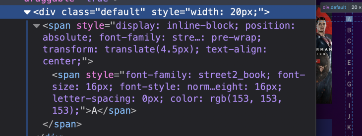
If you manage to navigate to that list of letters that you can click, and reach the first of the entries starting with the letter you clicked, you will hear only “A,” “B,” “C,” and so forth as you navigate through them. Furthermore, it does not inform the screenreader user that the letters they’re hearing are clickable!
So, in short, sometimes it is helpful to see something that is completely unusable in order to consider what needs to be done to make something useful.
Now that we’ve spent a lot of time talking about why I’m writing this, and showing examples of good glossaries and those that are decidedly bad, I think it’s time to get into code — that is to say, we’ll get into the tools we need to implement what we consider good.
First, I’m just going to talk about some very specific parts of the code, and then, as we get into the implementation, we will discuss the code overall.
One thing that pretty much everyone will need if they are trying to make any part of their site accessible is a way to expose some content only to screenreaders. The fact is, many things need to be explained to a visually disabled user that are otherwise obvious from a visual context. This article from WebAim goes over various ways of hiding and exposing content to screenreaders using CSS.
One obvious thing to note is that the methods for exposing content to screenreaders (but hiding them from other users) are all hacks. It is, in my opinion, unfortunate that there is not an aria-only attribute or a similar solution so that we don’t have make do with these hacks, as the hack has suboptimal behaviors. For example, the most common solution is to place the screenreader-only content in the part of the DOM where we want it to be encountered and using CSS to move it out of visible view. This has the side effect of confusing people navigating via keyboards because focusable elements will still be in the navigation flow, but outside their view.
All that said, we will be using the following CSS, borrowed from the linked WebAim article above, for our screenreader-only class:
.sr-only {
    position:absolute;
    left:-10000px;
    top:auto;
    width:1px;
    height:1px;
    overflow:hidden;
}
Aside from that, we will make one decision that goes against general accessibility recommendations: making some of our buttons not look like buttons.
Why are we doing this? Because, pragmatically, that ship has sailed. People want to make buttons look like other things, but we need them to be buttons for their accessibility benefits.
Since people often want buttons that don’t look like buttons, I’m going to show you how using unstyled buttons can still be accessible. We will not use an unstyled button class, but instead apply the following properties to the buttons we will not be styling.
{
background: none;
    border: none;
    color: inherit;
    cursor: pointer;
    font: inherit;
    padding: 0;
    outline: inherit;
}
We will be writing sections of our glossary as description lists, also sometimes referred to as definition lists. Here is an example list of glossary items under the letter A, related to assistive technologies:
See the Pen
Description List Accessibility Terms Letter A by Bryan Rasmussen (@bryanrasmussen)
on CodePen.
The terms and definitions have themselves been borrowed from usability.gov.
Aside from that, as you know, we will be using buttons to represent the letters of our glossary, which will look similar to this:
<button class='letter' aria-label="Glossary letter A">A</button>
Here, we have a simple first attempt at a glossary. The glossary is hidden, but there is a button that says Show Glossary. When clicked, the glossary becomes visible and the button becomes invisible.
See the Pen
glossary step 1 by Bryan Rasmussen (@bryanrasmussen)
on CodePen.
Glossary hidden:

Glossary shown:

But, of course, we need to use a screenreader with what we have — and right off the bat there are some things that are just no good.
For example, we can see that not every one of our letters contains subitems in the glossary because we have disabled the letters that do not have anything under them. But how do those same letters present to a screenreader?
Below, on the left, you can see some of these disabled buttons; on the right is the web rotor Form Controls menu for the page.
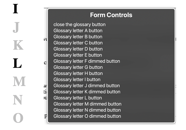
That’s really irritating. The disabled buttons still show up in the Form Controls, which means that if someone is going to listen to all the available buttons, they will also hear these dimmed buttons.
It’s true that they can hear that the button is dimmed, realize that the letter does not allow interaction, and presume it’s because it does not have any entries in the glossary. But it seems arduous to convey that information that way.
Furthermore, there is no quick way to go to the actual current, opened glossary content; thus, if you start going through the glossary with your screenreader, you will have to read each button first, before you get to the content.
This also applies if you click one of the buttons, let’s say button B. You will still have to go through all the buttons of the alphabet before you get to the glossary terms you made visible when you clicked the letter B.
Finally, most screenreaders display different behaviors when interacting with content in the browser than when the user interacts with it directly. Here, for example, is what the glossary looks like when VoiceOver is used to click the Show Glossary button:

That’s right, the glossary is shown, but the focus is still on the now-hidden button.
The same thing happens here when you click the Close Glossary button.

Finally, if you are not a screenreader user but are using the keyboard to navigate between elements, our unstyled buttons do not adequately show focus settings.
Here, I’d suggest we remove the parts of the glossary that are not usable from the screenreader.
Let’s fix these issues. Here is our next version:
See the Pen
glossary step 2 by Bryan Rasmussen (@bryanrasmussen)
on CodePen.
First, let’s tackle the easy low-hanging stuff: adding a nice focus style for the Close button and the letters.
The Close button, when focused, gets a navy-colored background and a white-colored X.

The letters get the same styling in a rounded button, but with some further padding to give a nice experience of them popping out.
.letter:focus {
  text-decoration: none;
  border: 2px solid #000;
  border-radius: 300px;
  padding-left: 10px;
  padding-right: 5px;
  padding-top: 2px;
}

.letter:focus ,.close:focus {
  outline: blue;
  background-color: navy;
  color: white;
}
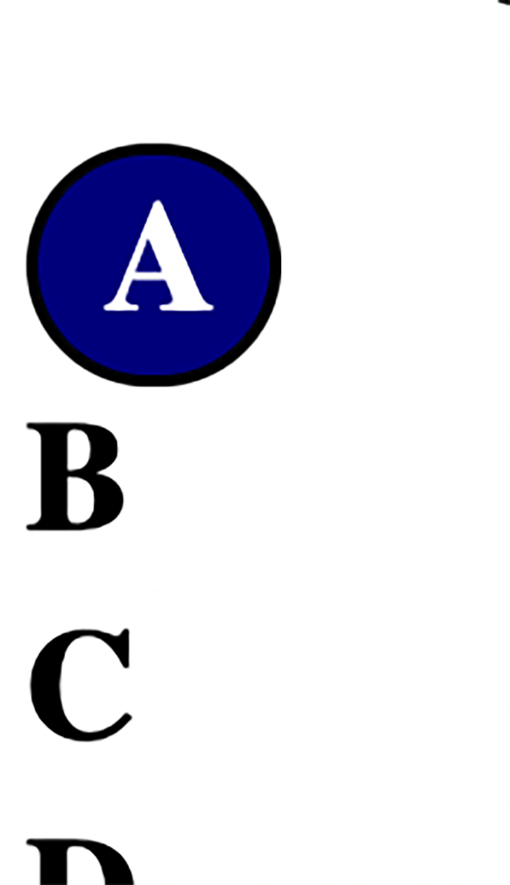
Second, let’s get rid of all the disabled buttons. This is easy enough to do; if they are disabled, we can also give them an aria-hidden="true" attribute.
Obviously, both the glossary sections and the headings for those sections should only be available when that letter has been accessed. Otherwise, we would run into the problem we discussed before of having too much content to effectively navigate.
Our main problems will be focusing on the elements and getting our screenreaders to follow our focusing in different browser combinations.
We have two situations in which we need to change the focus:
When looking at the glossary, you can see the letter A content on the right of the glossary. When you go to the next letter B and click, you’ll see the content on the right get replaced with the content for the letter B.
But, if you are using a screenreader and are visually disabled enough that you cannot see the content appear on the right, when you are browsing in the letter A and click the letter B, you will not have access to the content.
This is why the second point is important. If your focus isn’t set for you onto the content that becomes visible, you would have to navigate through the whole list to get into the content! That would be very annoying.
To allow navigation into the letter content, put a heading at the top of each section so that you can use heading navigation to get there quickly. Then, set the focus inside the glossary section when you click on a letter. Inside of the heading is a button to go to the next letter.
Different Safari versions can have difficulties when changing the focus to other elements based on a button event that involves VoiceOver. There are some workarounds for this, such as using an A element acting as a local link with role attribute="button", or, as I have done in the code for this article, running your focus code within a setTimeout with greater than 0ms. I have done it with a 16ms setTimeout to place it on top of the next iteration of the event loop (with, of course, the usual provisos applying).
Of course, if this was being done in a React or similar project, we might render components based on state changes from the click events, and in that case, we might decide to use the autofocus attribute on the elements we want to focus on, but in this case, we will set the focus dynamically with JavaScript.
So, I think we have something done that is reasonable. To prove it, I’m going to show some screenshots of how I expect a screenreader user (in this case using VoiceOver) will navigate the glossary.
First, we enter the page with VoiceOver. If you press the VoiceOver key combination (CTRL-option-U), you would see the following:
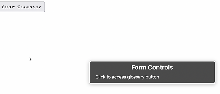
This isn’t that interesting to look at, but it shows you that you have two ways to get to the glossary button. Pressing the VO key + down key will select the glossary button:
 Click it and the glossary becomes visible with our focus set on the heading for the letter A contents.

As you can see, VoiceOver will show the sections it is currently focused on due to the VoiceOver cursor being turned on. For development purposes, I think it is really useful, and generally speaking, many screenreader users who are not blind use the cursor to help keep visual track of where they are on a page.
When we open up the glossary and look at the Form Controls again, we can see that only our non-disabled buttons are available because we added aria-hidden="true" to every button that is also disabled.
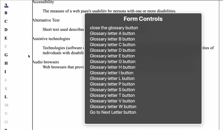
With this, users familiar with our glossary on a page where it is found can open the glossary, go directly to the Form Controls, and navigate down to the letter they want without having to go through the heading, close button, text sections, and so forth.
You’ll notice we have that Go to Next Letter button. Here, it depends on you keeping track of your context if you want to use it, so one might want to either not use it at all, or to add more content, like changing the label to be Go to Next Letter (B), assuming the currently active button is A.
This is the point at which genericity must give way to how you want your site to work, in the same way generic components will have styles changed to fit a site’s overall look and feel.
When the user selects a button from the Form Controls menu, they will end up with that button selected on the page.
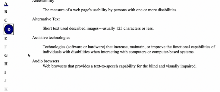 At this point, they can click the button, show the definitions for that letter, and set the focus on that letter.
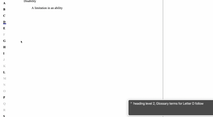
We can see that while there is no visible h2, we have focused on it and the screenreader has read it to the user. If they navigate to the next step, they get:
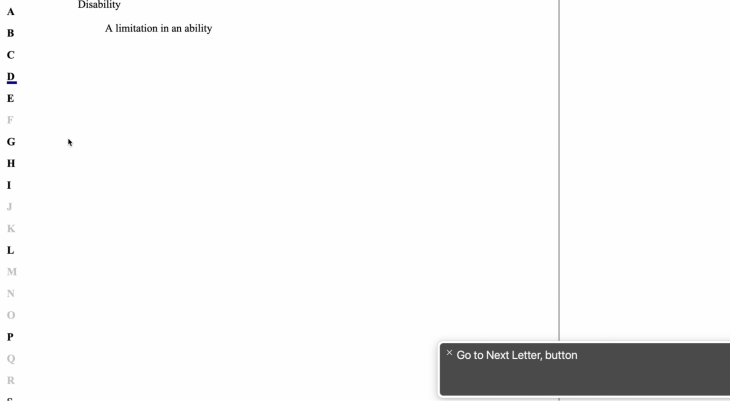
Here we are again, in a matter of opinion. There are a few issues you can see in the choice of a Go to Next Letter button, and these might make leaving it out altogether or changing its location in the DOM worth considering.
The first issue is that we do not have a visible Go to Next Letter button, meaning that people who use a screenreader that can see might be confused by this step. Of course, we did not have the previous header, either, but that is less problematic because when adding in these things that one cannot see it is best to have it follow the visual context as closely as possible. It’s not so disorienting to see or hear about a header under the letter you clicked as it may be to be told a button is there to click without being able to see such a button.
As this example has such short glossaries, it might make sense to have the Go to Next Letter button at the end of each section of terms, or you might decide to remove it altogether and rely on people to use their screenreader’s web rotor to go to the next button, which would work equally well if you had few definitions or many.
It might be confusing for a user to have the Go to Next Letter button before the definitions because users who are actually blind might think that meant there were no terms defined for that letter.
Finally, there is a limitation of the Go to Next Letter button as presented in the rotor:
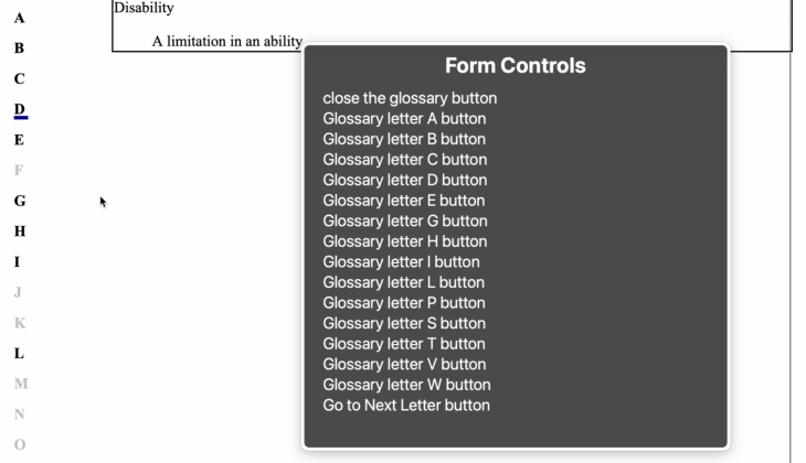
When using the rotor, you are not told what the next letter would be or even what the current letter is.
It might be beneficial to have the current Glossary letter button say if it were the currently displayed letter, i.e., the text reads Currently Showing Glossary Letter A button, and the Go to Next Letter button says Go to Next Letter, B button.
Thus, if you are navigating down the list of buttons in the rotor, you have two places that will easily place your context.
I am going to make those changes, which can be seen here:
See the Pen
glossary step 3 by Bryan Rasmussen (@bryanrasmussen)
on CodePen.
Since the Go to Next buttons are all in the markup, it would be up to whatever code you’re using to produce your markup to generate that (whether templates, React, Vue or just doing it by hand). The only relevant change is in the switchSelectedLetters function, which is called whenever you click one of the glossary buttons, as shown below:
const switchSelectedLetters = (target) => {
  const selector = "selectedLetter";
  const currentSelectedLetter = document.querySelector(`.${selector}`);
  const currentAria = currentSelectedLetter.getAttribute("aria-label");
  const targetAria = target.getAttribute("aria-label");
  const selectionText = "Current selected, ";
  //use [...selectionText] because we want number of characters, not code units.
  currentSelectedLetter.setAttribute("aria-label", currentAria.substring([...selectionText].length))
  currentSelectedLetter.classList.remove(selector);
  target.setAttribute("aria-label", selectionText + targetAria);
  target.classList.add(selector);
}
Let’s go with these changes and use the glossary again. You are informed that the glossary button you are currently accessing is the currently selected button.
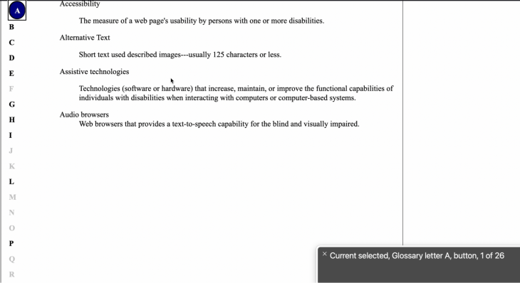
When you click the Next button, it becomes the currently selected button, and you can see this in the rotor. Furthermore, the Go to Next Letter button also tells you what that next letter will be.
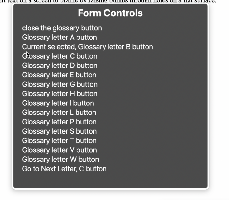
I think that, in the end, this implementation gives us some nice features to make a usable, accessible glossary of definitions that will benefit not just blind users, but also other users of screenreaders.
Finally, I’ll show quickly how everything is accessible for mobility-challenged users who would primarily use the keyboard for navigation.
The Show Glossary button is tabbable to, and indicates when it is focused:
Clicking the button opens the glossary:
 Pressing Tab again selects the Close button:

The next Tab selects a letter:

If you tab, you will go to the next letter. After that, you can click to see the letter’s definitions, and if you tab after that, you will be at Close Letter again, so you are able to close at any time quite quickly. You might want to add a handler for the Escape key, in this case, to enable closing the glossary by pressing the Escape key, but as it stands now it is usable and, I think, logically understandable.
Making something accessible is not especially difficult, as long as you can envision the problems your clients will encounter and keep in mind the limitations and models of the world that various assistive technologies have to work from.
Debugging code is always a tedious task. But the more you understand your errors, the easier it is to fix them.
LogRocket allows you to understand these errors in new and unique ways. Our frontend monitoring solution tracks user engagement with your JavaScript frontends to give you the ability to see exactly what the user did that led to an error.
LogRocket records console logs, page load times, stack traces, slow network requests/responses with headers + bodies, browser metadata, and custom logs. Understanding the impact of your JavaScript code will never be easier!
Hey there, want to help make our blog better?
Join LogRocket’s Content Advisory Board. You’ll help inform the type of content we create and get access to exclusive meetups, social accreditation, and swag.
Sign up now
Not sure if low-code is right for your next project? This guide breaks down when to use it, when to avoid it, and how to make the right call.

Compare Firebase Studio, Lovable, and Replit for AI-powered app building. Find the best tool for your project needs.

Discover how to use Gemini CLI, Google’s new open-source AI agent that brings Gemini directly to your terminal.

This article explores several proven patterns for writing safer, cleaner, and more readable code in React and TypeScript.