The box-shadow CSS property allows you to add shadows to elements, giving you control over their size, blur, spread, and color. This feature enhances depth and visual emphasis, making it a popular choice for styling buttons, cards, and other UI components to improve both aesthetics and usability.
In this article, we’ll take a deep dive into the box-shadow property. We’ll start with a detailed breakdown of its syntax before exploring advanced techniques such as layered, neon, and neumorphic shadows. Additionally, we’ll provide a browser compatibility table, practical examples, and an interactive box-shadow generator to help you apply these styles effectively.
Update history:
box-shadow property, including the View Transitions API, native CSS nesting, and the CSS @layer rulebox-shadow: <x-offset> <y-offset> <blur-radius> <spread-radius> <shadow-color>;
| Property | Description |
|---|---|
x-offset |
Sets the horizontal position of the shadow. Positive moves right, negative moves left. |
y-offset |
Sets the vertical position of the shadow. Positive moves down, negative moves up. |
blur-radius |
Defines the softness of the shadow. Higher values create more diffuse shadows. |
spread-radius |
Determines shadow size. Positive values expand, negative values shrink. |
color |
Specifies the shadow color in HEX, rgba(), or hsla(). |
.card-1 {
  box-shadow: 0px 5px 10px 0px rgba(0, 0, 0, 0.5);
}

.card-2 {
  box-shadow: 0px -5px 10px 0px rgba(0, 0, 0, 0.5);
}
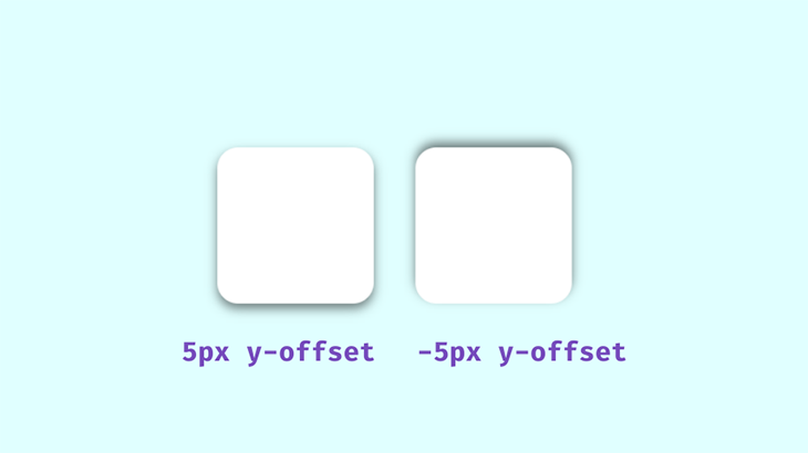
We’ll frequently use rgba() colors due to their alpha value, which allows for opacity control — an essential factor in creating realistic shadows. In well-lit environments, shadows aren’t purely black; instead, they adopt subtle hues influenced by surrounding light.
When styling with the box-shadow property, transparent shadows work best, as they blend seamlessly with multicolored backgrounds. Pay attention to how real-world shadows interact with their light sources — this observation will help you craft more natural-looking effects in CSS:
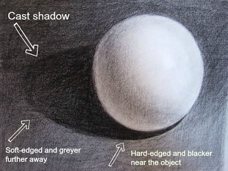
The area closest to the object has the darkest shadows, then it spreads and blurs outward gradually. Opaque or completely black shadows would be distracting, ugly, and imply a complete blockage of light, which isn’t what we’re after.
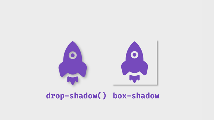
box-shadow vs. drop-shadow()The drop-shadow() function applies shadows to images while respecting transparency, whereas box-shadow applies to the entire bounding box of an element. Here’s a visual comparison:
Example code:
.box-shadow {
  box-shadow: 5px 5px 5px 0px rgba(0,0,0,0.3);
}

.shadow-filter {
  filter: drop-shadow(5px 5px 5px rgba(0,0,0,0.3));
}
box-shadowUse box-shadow for UI elements like cards and buttons, and drop-shadow() for images or elements with transparency, ensuring the shadow follows their shape.
The following table outlines the key differences between box-shadow and drop-shadow():
ƒ
| Feature | box-shadow |
drop-shadow() |
|---|---|---|
| Works on | Any block-level element | Images and elements with transparency |
| Follows transparency? | ❌ No, applies to the entire box | ✅ Yes, follows the element’s shape |
| Customizable blur & spread? | ✅ Yes | ❌ No |
| Best for | UI elements like buttons and cards | PNGs, SVGs, and transparent images |
While drop-shadow() is ideal for non-rectangular images, box-shadow provides more flexibility for UI elements. If you need shadows that adapt to transparent areas, drop-shadow() is the better option.
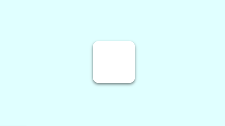
box-shadowFirst, create a simple box container with HTML:
<div class="box">
  ...
</div>
Next, apply the box-shadow property in CSS:
.box {
  height: 150px;
  width: 150px;
  background: #fff;
  border-radius: 20px;
  box-shadow: 0px 5px 10px 0px rgba(0, 0, 0, 0.5);
}
This will render a simple box with a shadow:
box-shadow generatorTry adjusting the values below using our interactive box-shadow generator. Modify parameters such as x-offset, y-offset, blur, and spread to see real-time changes. Once satisfied, copy the generated CSS for immediate use in your projects:
box-shadow use casesbox-shadow with the :hover pseudo-class and transform propertyThe box-shadow property can be dynamically modified using the :hover pseudo-class. You can add a shadow to an element that previously had none or adjust an existing shadow. In this example, the transform property enhances the illusion of depth:
.box:hover {
  box-shadow: 0px 10px 20px 5px rgba(0, 0, 0, 0.5);
  transform: translateY(-5px);
}
The transform property makes it appear as though the box is lifting off the page. Conversely, using the inset keyword places the shadow inside the element’s frame, giving the effect of it sinking into the page:
.box2 {
  box-shadow: inset 0px 5px 10px 0px rgba(0, 0, 0, 0.5);
}
.box2:hover {
  transform: translateY(5px);
  box-shadow: inset 0px 10px 20px 2px rgba(0, 0, 0, 0.25);
}
You can experiment with these values to achieve the desired effect. Here’s what these shadows look like:
An alternative to translate() is scale(), which increases the size of the element rather than repositioning it. In this example, the scale() function enlarges the box when hovered:
.box2:hover {
  transform: scale(1.1);
  box-shadow: 0px 10px 20px 2px rgba(0, 0, 0, 0.25);
}
This effect scales the box to 1.1 times its original size:
box-shadow property with text-shadowLike box-shadow, the text-shadow property allows you to define a shadow’s blur radius, color, and offset. This property lets you create visual effects that enhance text readability and aesthetics. Here’s the basic syntax:
.selector {
  text-shadow: <horizontal-offset> <vertical-offset> <blur-radius> <color>;
}
While text-shadow applies only to text elements, it can be combined with box-shadow to add depth and dimension to UI components. Here’s an example:
<div class="site-container">
  <div class="card">...</p>
</div>
In this example, both box-shadow and text-shadow enhance the .card class. The two shadow layers create a neumorphic effect, while the text shadow adds contrast and visual appeal:
.card {
  padding: 2rem;
  border-radius: 0.5rem;
  background: linear-gradient(145deg, #cacaca, #f0f0f0);
  color: #764abc;
  text-shadow:
    -6px 6px 15px rgba(0, 0, 0, 0.5),
    6px -6px 15px rgba(255, 255, 255, 0.8);
  box-shadow:
    20px 20px 60px #bebebe,
    -20px -20px 60px white;
}
Here’s the result:
You can stack multiple shadows by separating them with commas. This technique produces smooth, layered effects:
.stacked-shadows {
  box-shadow: 0px 1px 2px rgba(0,0,0,0.1),
              0px 2px 4px rgba(0,0,0,0.1),
              0px 4px 8px rgba(0,0,0,0.1),
              0px 8px 16px rgba(0,0,0,0.1);
}
Notice that the spread value isn’t included — it’s optional and depends on the desired effect. Alternatively, setting the offset and blur radius to 0px while adding a spread value creates a border-like shadow:
.bordered-stacked-shadows {
  box-shadow: 0px 0px 0px 2px rgba(0,0,0,0.5),
              0px 2px 4px rgba(0,0,0,0.1),
              0px 4px 8px rgba(0,0,0,0.1),
              0px 8px 16px rgba(0,0,0,0.1);
}
Since this border effect uses box-shadow, it doesn’t add extra space to the element’s parent container:
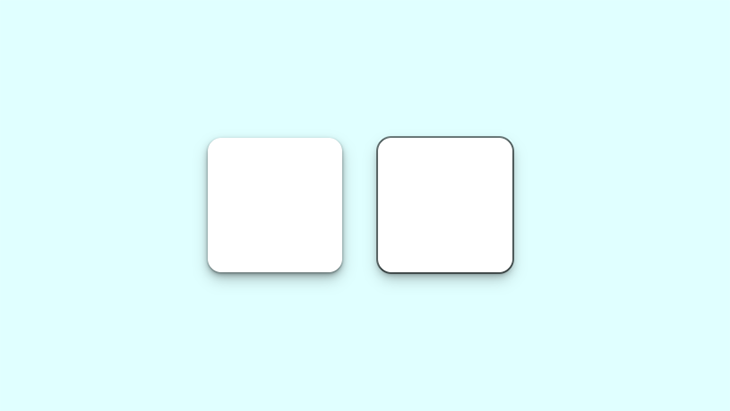
The left box features a smooth, layered shadow, while the right box has a defined shadow border.
Now, let’s look at the box-shadow in a practical scenario. This property can be used on almost any element on a webpage, but the more common ones include the navbar, text cards, and images. It can also be added to input fields and buttons:
Build a simple webpage like the one shown in the demo, and try styling the box-shadow yourself!
In the real world, shadows are usually black or gray with varying opacity. But what if shadows had colors? Colored shadows occur when the light source itself is colored. Since there’s no real equivalent of a light source in CSS, you can achieve this neon effect by adjusting the color value in box-shadow.
Let’s modify our first example:
.box{
  box-shadow: 0px 5px 10px 0px rgba(0, 0, 0, 0.7);
}
.box2{
  box-shadow: inset 0px 5px 10px 0px rgba(0, 0, 0, 0.7);
}
This is the output:
To create a more vibrant glow, you can layer multiple shadows:
box-shadow: 0px 1px 2px 0px rgba(0,255,255,0.7),
            1px 2px 4px 0px rgba(0,255,255,0.7),
            2px 4px 8px 0px rgba(0,255,255,0.7),
            2px 4px 16px 0px rgba(0,255,255,0.7);
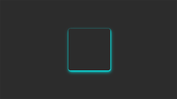
Neon shadows are best showcased on dark-themed web pages. Dark themes are widely popular, and when combined with contrasting colors, neon shadows can enhance the aesthetic.
To see this effect in action, we’ll adjust the earlier demo by darkening the background and experimenting with different shadow colors:
Using colors that contrast well—like the blue box-shadow against a dark background in this demo—ensures the effect is visually striking. Increasing the opacity makes the glow even brighter.
Neumorphism is a modern design trend derived from skeuomorphism, which replicates real-world objects in digital interfaces. This effect makes UI components appear to extrude from the background, creating a soft, three-dimensional look.
To achieve this, you can apply two opposite box-shadow values:
.neumorphic-shadow {
  box-shadow:
    -10px -10px 15px rgba(255,255,255,0.5),
    10px 10px 15px rgba(70,70,70,0.12);
}
To create an inset effect, place the shadows inside the element:
.neumorphic-shadow {
  box-shadow:
    inset -10px -10px 15px rgba(255, 255, 255, 0.5),
    inset 10px 10px 15px rgba(70, 70, 70, 0.12);
}

In the example above, two shadows work in opposite directions. The white box-shadow simulates the light source, acting as a highlight—similar to how light interacts with objects in real life:
Neumorphic design mimics real-world objects in a way that makes them feel tangible. Let’s take this a step further and create an interactive push switch using a checkbox:
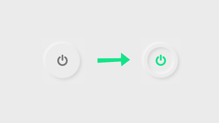
<input type="checkbox" class="neumorphic-checkbox" />
.neumorphic-switch {
  display: flex;
  align-items: center;
  justify-content: center;
  height: 200px;
  width: 200px;
  border-radius: 50%;
  box-shadow:
    -10px -10px 15px rgba(255, 255, 255, 0.5),
    10px 10px 15px rgba(70, 70, 70, 0.12);
  border: 20px solid #ececec;
  outline: none;
  cursor: pointer;
  -webkit-appearance: none;
}
We’ll use Font Awesome for the power button icon. Link the CDN and add the icon’s Unicode:
.neumorphic-switch::after {
  font-family: FontAwesome;
  content: "\f011"; /*ON/OFF icon Unicode*/
  color: #7a7a7a;
  font-size: 70px;
}
When clicked, the button will invert the shadow effect using two inset layers:
.neumorphic-switch:checked{
  box-shadow:
  -10px -10px 15px rgba(255, 255, 255, 0.5),
  10px 10px 15px rgba(70, 70, 70, 0.12),
  inset -10px -10px 15px rgba(255, 255, 255, 0.5),
  inset 10px 10px 15px rgba(70, 70, 70, 0.12);
}
Finally, update the icon color when the switch is activated:
.neumorphic-switch:checked::after{
  color: #15e38a;
}
Here’s the final result:
box-shadow examplesThere are many different ways to use box-shadow, depending on your design needs. Below is an interactive gallery showcasing various shadow styles along with their corresponding code snippets:
box-shadow with the View Transitions APIWith the View Transitions API, you can dynamically apply box-shadow styles for smooth element and page transitions. Let’s explore how this works with a simple example that focuses on same-document transitions.
We’ll start by defining styles for a card component that expands and collapses when clicked:
.card {
  ...
  box-shadow: 0 0 0.25rem 0.5rem rgba(0, 0, 0, .15);
}

.card--collapsible {
  height: 120px;
  overflow: hidden;
  view-transition-name: card;
}

.card--expanded {
  height: auto;
  box-shadow: 0 1rem 2rem rgba(0, 0, 0, .35);
}
Using JavaScript’s classList API, we can toggle the CSS class that controls box-shadow styles:
const card = document.querySelector(".card");

card?.addEventListener("click", () => {
  card.classList.toggle("card--elevated");
});
This logic can be used inside the startViewTransitions method of the View Transitions API to enhance the effect:
As demonstrated in the demo, the View Transitions API applies a default cross-fading animation, making it appear as though the shadow itself is smoothly transitioning.
If you prefer handling styles via JavaScript, you can use the boxShadow property:
const targetElement = document.querySelector(".my-element");
targetElement?.style.boxShadow = "0 0 3px 4px hsl(25deg 50% 50% / 20%)"
Before implementing this in production, make sure to check the browser support for View Transtions, which is currently just above 74 percent.
box-shadow with native CSS nestingWhen managing complex box-shadow utilities, native CSS nesting helps reduce redundancy and improves maintainability.
For example, say you have a card component with different shadow styles for hover, active, and focus states. Instead of writing separate rules, you can use CSS nesting to simplify the structure:
/* Simple card */
.card {
  /* Card styles */
  box-shadow: ...;
  &:hover {
    box-shadow: ...;
  }
  &:active {
    box-shadow: ...;
  }
}

/* Elevated card variation */
.card--elevated {
  /* Elevated card styles */
  box-shadow: ...;

  &:hover { ... }
  &:active { ... }
}
This structure is easier to manage and maintain compared to separate rule sets. We can take this one step further with cascade layers, another important modern CSS feature covered in the next section.
box-shadow in @layer blocksThe @layer rule in CSS helps control specificity issues and maintain cleaner styles. You can use it to structure box-shadow utilities in a more organized way.
The first line below establishes the specificity order, ensuring that utility styles override component styles:
css
CopyEdit
@layer base, components, utilities;
css
CopyEdit
@layer base {
  :root {
    --shadow-sm: 0 1px 2px rgba(0, 0, 0, 0.1);
    --shadow-md: 0 1px 3px rgba(0, 0, 0, 0.15);
    --shadow-lg: 0 4px 6px rgba(0, 0, 0, 0.2);

    @media (prefers-color-scheme: dark) {
      --shadow-sm: 0 1px 2px rgba(0, 0, 0, 0.2);
      --shadow-md: 0 1px 3px rgba(0, 0, 0, 0.3);
      --shadow-lg: 0 4px 6px rgba(0, 0, 0, 0.4);
    }
  }
}
box-shadow styles within component and utility layerscss
CopyEdit
@layer components {
.card {
box-shadow: var(--shadow-md);
&:hover { box-shadow: var(--shadow-lg); }
&:active { box-shadow: var(--shadow-sm); }
}
}
@layer utilities {
.shadow-sm { box-shadow: var(--shadow-sm); }
.shadow-md { box-shadow: var(--shadow-md); }
.shadow-lg { box-shadow: var(--shadow-lg); }
}
Because utility styles are declared later in the specificity order, they automatically override component styles when necessary.
This layering strategy enhances maintainability, improves organization, and makes integrating styles with CSS frameworks much easier.
box-shadow generatorWe have explored various use cases for the CSS box-shadow property. If you want to go further and try out even more styles, you can experiment with this interactive box-shadow generator below:
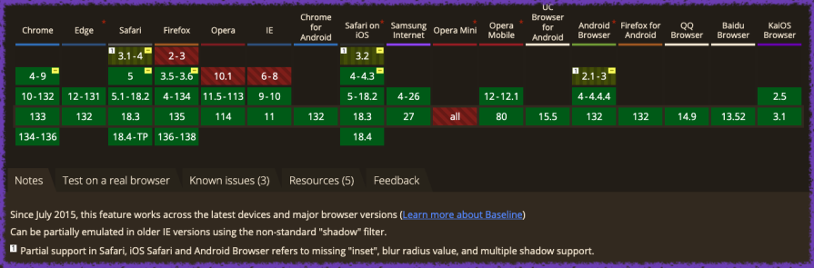
According to Can I use, the box-shadow CSS property is fully supported across all modern browsers, including their latest released versions.
box-shadow best practicesThe box-shadow property is a powerful way to enhance the visual appeal of your website, but improper use can negatively impact performance and design. Here are some best practices to keep in mind:
- Less is more – When layering multiple shadows, the browser has to perform more rendering work. This may not be an issue on high-end devices, but users with older hardware or slow internet connections might experience lag
- Be consistent – Avoid using inconsistent shadow styles. Shadows should follow a single light source to maintain a cohesive and realistic design
- Use animations sparingly – Animating box-shadow can significantly impact performance. Since box-shadow already enhances UI elements, keep animations minimal, such as a subtle transition effect on :hover
- Use a shadow layering tool – Instead of manually writing multiple shadow values, use tools like [shadows.brumm.af](https://shadows.brumm.af/). This tool allows you to generate and adjust up to 10 box-shadow layers, making it easier to achieve complex and refined shadow effects
In this article, we explored various techniques for using the box-shadow CSS property, including:
box-shadow with the View Transitions API, native CSS nesting, and cascade layersbox-shadow with text-shadow to create well-rounded visual effectsNow, you’re well on your way to mastering box-shadow! The best way to improve is through hands-on experimentation. Try using an inline box-shadow generator to see how many shadow layers you can stack, experiment with different color combinations, and test your designs across multiple devices to ensure optimal performance.
As web frontends get increasingly complex, resource-greedy features demand more and more from the browser. If you’re interested in monitoring and tracking client-side CPU usage, memory usage, and more for all of your users in production, try LogRocket.

LogRocket lets you replay user sessions, eliminating guesswork around why bugs happen by showing exactly what users experienced. It captures console logs, errors, network requests, and pixel-perfect DOM recordings — compatible with all frameworks.
LogRocket's Galileo AI watches sessions for you, instantly identifying and explaining user struggles with automated monitoring of your entire product experience.
Modernize how you debug web and mobile apps — start monitoring for free.

Learn how to protect full-stack projects from NPM supply chain attacks with a practical security checklist.

Explore 15 essential MCP servers for web developers to enhance AI workflows with tools, data, and automation.

Learn how contrast-color() automatically picks accessible text colors using native CSS, without JavaScript.

Learn how to build a harness-style AI workflow using Claude Code with specialized Dev, QE, and Ops subagents, gated handoffs, MCP telemetry, and LEARNING.md.
Would you be interested in joining LogRocket's developer community?
Join LogRocket’s Content Advisory Board. You’ll help inform the type of content we create and get access to exclusive meetups, social accreditation, and swag.
Sign up now

 Learn more →
