As a React developer, you may need to represent data in the form of a table but manually creating a table comes with the cost of spending time on styling it. Since React has a vast ecosystem, there are a lot of third-party libraries to choose from. In this article, let’s compare some of the top table libraries that are available for React.

material-table is a powerful way of representing data in a table format in a React application. It follows Material UI guidelines to style the elements. It is one of the most popular open-source libraries available in the React space and provides different individual components. These components can be used to tackle the styling depending on the complexity. The latest version of this library supports a minimum React version of 16.8.5.
To see it in action, install the library by running the following commands in a React app from a terminal window:
yarn add material-table @material-ui/core
Then add Material Icons. There are two ways to do this. The initial way is that you can simply import the Material Icons font using HTML in the file public/index.html:
<link
  rel="stylesheet"
  href="https://fonts.googleapis.com/icon?family=Material+Icons"
/>
The alternative way is to install the @material-ui/icons package in the React app:
yarn add @material-ui/icons
In a real-world application, the data provided to a React app comes from an external API. To keep things minimal, let’s use a small set of dummy data. Create a new file called data.js inside the src/ directory and add the following code snippet:
export const data = [
  {
    id: 1,
    title: 'The Hunger Games',
    authors: 'Suzanne Collins',
    num_pages: 374,
    rating: 4.33
  },
  {
    id: 2,
    title: 'Harry Potter and the Order of the Phoenix',
    authors: 'J.K. Rowling',
    num_pages: 870,
    rating: 4.48
  },
  {
    id: 3,
    title: 'To Kill a Mockingbird',
    authors: 'Harper Lee',
    num_pages: 324,
    rating: 4.27
  },
  {
    id: 4,
    title: 'Pride and Prejudice',
    authors: 'Jane Austen',
    num_pages: 279,
    rating: 4.25
  },
  {
    id: 5,
    title: 'Twilight',
    authors: 'Stephenie Meyer',
    num_pages: 498,
    rating: 3.58
  },
  {
    id: 6,
    title: 'The Book Thief',
    authors: 'Markus Zusak',
    num_pages: 552,
    rating: 4.36
  }
];
Then create a new file called MTable.js and import the material-table library and the array of dummy data:
import MaterialTable from 'material-table';
import { data } from '../data';
Since material-table is a React component, you can return it in the JSX of any custom component. Define a custom component like this:
const MTable = () => {
  //...
};
export default MTable;
There are two props that the material-table library expects to receive. The prop data to display the data in row format. Another prop columns defines the number of columns. It is an array that expects each column’s title as the heading of the specific column and the original field. The value of the field should represent the exact field in an object inside the data array:
const columns = [
  { title: 'Title', field: 'title' },
  { title: 'Author', field: 'authors' },
  { title: 'Page Count', field: 'num_pages' },
  { title: 'Rating', field: 'rating' }
];
A third prop on <MaterialTable /> component called title can be used to give the title to the whole table. A complete use of this component can be returned in the form of JSX as shown below:
return (
  <div style={{ maxWidth: '100%' }}>
    <MaterialTable columns={columns} data={data} title='Books Directory' />
  </div>
);
To see it in action, import the custom table component in the App.js file:
import MTable from './components/MTable';
function App() {
  return (
    <div style={{ padding: '30px' }}>
      <h1>Material Table Example</h1>
      <MTable />
    </div>
  );
}
export default App;
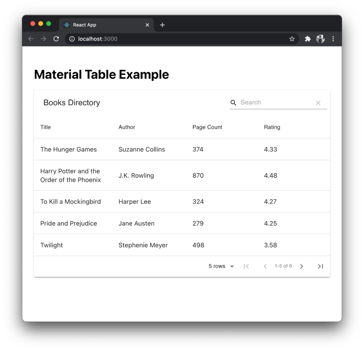
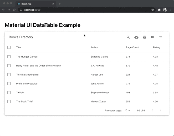
By default, the material-table library displays a search bar and pagination.
You can customize the view of the table by adding a fourth prop called options that is an object and is used to customize the table.
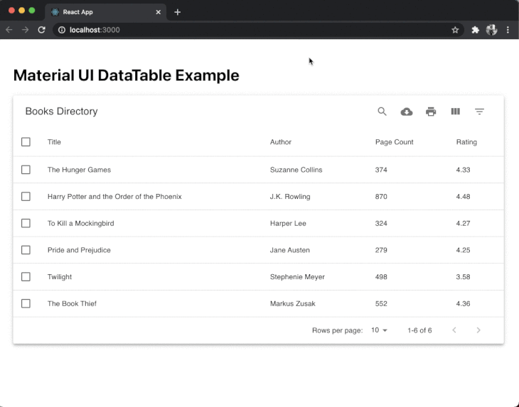
In MTable.js, let’s remove the search bar from the table and add a background to each row of the data when it is selected. This is done by a prop called onRowClick which accepts the ID selectedRow from the table when clicked or selected.
Add the following prop to <MaterialTable/>:
import { useState } from 'react';
import MaterialTable from 'material-table';
import { data } from '../data';
const MTable = () => {
  const [selectedRow, setSelectedRow] = useState(null);
  const columns = [
    { title: 'Title', field: 'title' },
    { title: 'Author', field: 'authors' },
    { title: 'Page Count', field: 'num_pages' },
    { title: 'Rating', field: 'rating' }
  ];
  return (
    <div style={{ maxWidth: '100%' }}>
      <MaterialTable
        columns={columns}
        data={data}
        title='Books Directory'
        onRowClick={(evt, selectedRow) =>
          setSelectedRow(selectedRow.tableData.id)
        }
        options={{
          search: false,
          rowStyle: rowData => ({
            backgroundColor:
              selectedRow === rowData.tableData.id ? '#67aeae' : '#FFF'
          })
        }}
      />
    </div>
  );
};
export default MTable;
Here is the output:
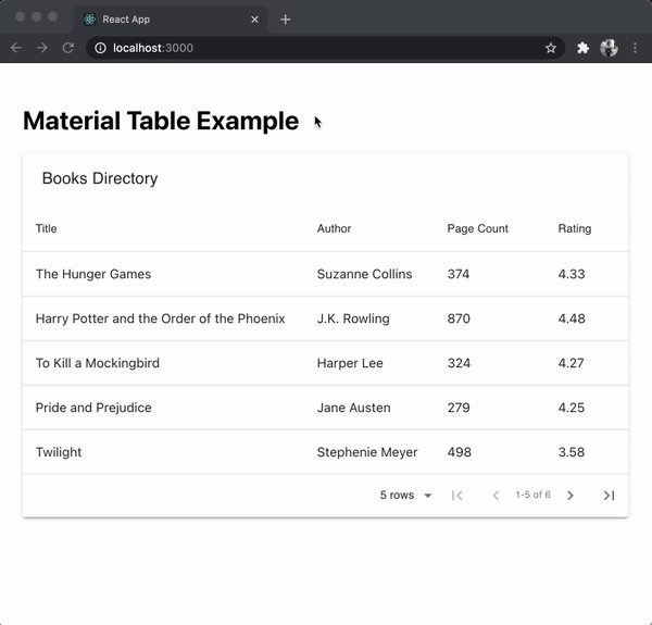
You can see that using React hooks, it is possible to add functionalities such as selecting a row and applying custom styling. The pagination also works out of the box. You can find more information on customizing the table using different props here.
If you are using Bootstrap based UI components in your React app, then to display data tables and to use the same design system, react-react-bootstrap-table2 is a perfect match. It provides a cleaner design and a small bundle size which voids handling too much business logic.
To use it in a React app, run the following command from a terminal window to install it:
yarn add react-bootstrap-table-next
Then, import the Bootstrap CSS library in the React app. This is usually done inside the App.js or index.js file:
import 'react-bootstrap-table-next/dist/react-bootstrap-table2.min.css';
Then, create a custom component file called BTable.js and import the component BootstrapTable from the react-bootstrap-table-next library. Let’s use the same dummy data set to display the data inside the table component, thus, also import it from the file src/data.js.
import BootstrapTable from 'react-bootstrap-table-next';
import { data } from '../data';
It accepts three props by default:
data array displays each object in a row in the tablekeyField prop accepts a unique value to identify different rows. Generally, an id or the index of each row in the array is the value for this propcolumns to identify different labels and customize themThe columns is defined as an array and each field from the data array that you want to display as an object. The text in each object represents the custom header name of each column and the value of dataField represents the actual field from the data array:
const BTable = () => {
  const columns = [
    { text: 'Title', dataField: 'title' },
    { text: 'Author', dataField: 'authors' },
    { text: 'Page Count', dataField: 'num_pages' },
    { text: 'Rating', dataField: 'rating' }
  ];
  return (
    <div style={{ maxWidth: '100%' }}>
      <BootstrapTable columns={columns} data={data} keyField='id' />
    </div>
  );
};
export default BTable;
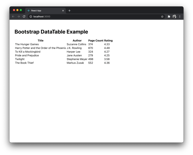
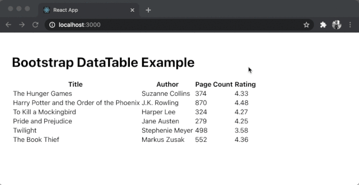
Here is a basic table output:
To add custom options, there are two ways. The first is to provide basic features such as sorting values in columns that are added like this:
const columns = [
  { text: 'Title', dataField: 'title', sort: true },
  { text: 'Author', dataField: 'authors' },
  { text: 'Page Count', dataField: 'num_pages' },
  { text: 'Rating', dataField: 'rating', sort: true }
];
In the above code snippet, we are adding a third property called sort with a boolean value of true to data fields title and rating. This will enable the sorting based on ascending and descending values in these two columns.
To use other features such as pagination, you will have to install a separate component library called react-bootstrap-table2-paginator and follow its process. Even though this component library supports these kinds of advanced data managing features inside a table, going through the process of installing each separate component, and integrating can be tedious. However, the advantage here is that you can pick which advanced features to use and this will help you keep the bundle size as a minimum based on the components that you are using in your React app. Another point to note is that it has support up to Bootstrap version 4 only as of now.
Another Material UI based data table component on this list. MUI-Datatables is a great way to represent data tables if you are using a Material UI based design system in your React app. It supports features like filtering, selecting a row, search, exporting the data table to CSV format, sorting, and more.
To see it in action, start by installing it in a React project. Since this component is based on Material UI, you need to install @material-ui/core and @material-ui/icons:
yarn add mui-datatables @material-ui/core @material-ui/icons
Then, create a custom component file called MUITable.js and import the component from mui-datatables. Let’s use the same dummy data set to display the data inside the table component, thus, also import it from the file src/data.js:
import MUIDataTable from 'mui-datatables';
import { data } from '../data';
Similar to the material-table component library, it also accepts four props by default:
data array displays each object in a row in the tabletitle to give a title to the tablecolumns to identify different labels and customize themoptions to add more customizations on the tableThe columns is defined as an array and each field from the data array that you want to display as an object. The label in each object represents the custom header name of each column:
const MUITable = () => {
  const columns = [
    { label: 'Title', name: 'title' },
    { label: 'Author', name: 'authors' },
    { label: 'Page Count', name: 'num_pages', options: { sort: true } },
    { label: 'Rating', name: 'rating' }
  ];
  const options = {
    filterType: 'checkbox'
  };
  return (
    <div style={{ maxWidth: '100%' }}>
      <MUIDataTable
        columns={columns}
        data={data}
        title='Books Directory'
        options={options}
      />
    </div>
  );
};
export default MUITable;
By default, the MUIDataTable component supports a lot of functionalities that the material-table component such as highlighting a row when hovered, highlighting a row when selected, and pagination.
Other features such as searching, hide a specific column, and filtering a value are also provided out of the box.
There are a lot of different functionalities provided by this library and if any of these functionality fits your use case, this is the component to consider.
react virtualized is a multi-purpose component library that supports the rendering of large lists and data tables. It supports data tables to display in a simple table format and other supported formats are gird, masonry, list, and collection. Due to the reason of supporting multiple formats and dynamic data lists, it is one of the most popular open-source component libraries in this list.
To use it in a React app, run the following command from a terminal window to install it:
yarn add react-virtualized
Then, create a custom component file called RVTable.js and import the component from the react-virtualized library. Let’s use the same dummy data set to display the data inside the table component, thus, also import it from the file src/data.js.
It uses its own CSS styles and for that reason, you have to import react-virtualized/styles.css:
import { Column, Table } from 'react-virtualized';
import 'react-virtualized/styles.css';
import { data } from '../data';
A data table is constructed using two components provided by this library. The Table is used to define the size and rows inside a table. Using the prop called rowGetter on this component, the array data is iterable.
The Column component represents each component. It accepts a label prop that displays the header title of the column, the dataKey prop which represents the field in the data array, and a custom value for width for each column:
const RVTable = () => {
  return (
    <div style={{ maxWidth: '100%' }}>
      <Table
        headerHeight={20}
        width={920}
        height={300}
        rowHeight={30}
        rowGetter={({ index }) => data[index]}
        rowCount={data.length}
      >
        <Column label='Title' dataKey='title' width={400} />
        <Column label='Author' dataKey='authors' width={200} />
        <Column label='Pages' dataKey='num_pages' width={100} />
        <Column label='Rating' dataKey='rating' width={100} />
      </Table>
    </div>
  );
};
export default RVTable;
Here is the output:
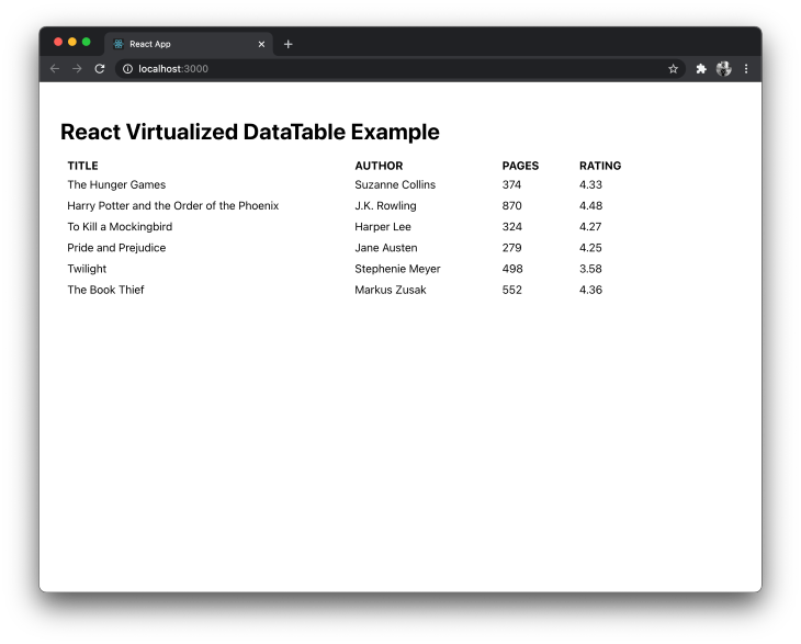
Unlike other components, react virtualized is the bare minimum when it comes to applying custom styles and functionalities. Using this library, you will have to define your own styles and implement features such as pagination or searching in the table.
React Table is a lightweight library to represent data in a table format. It is not a table component library as compared to other libraries in this list but a utility library.
It is lightweight (bundle size between 5kb to 14kb), composable and extensible. Out of the box, it does not comes with markup or styles. This means that it can be used in a React app regardless of the design system.
To see it action, let’s install it first by running the command below in a terminal window:
yarn add react-table
Then, create a custom component file called RTTable.js. Since it has support for React hooks, import the hook useTable from thereact-table library. Let’s use the same dummy data set to display the data inside the table component, thus, also import it from the file src/data.js:
import BootstrapTable from 'react-bootstrap-table-next';
import { data } from '../data';
The useTable hook accepts an object of columns and data as the argument. To define the structure of columns of the table, add the following:
const RTTable = () => {
  const columns = [
    {
      Header: 'Title',
      accessor: 'title'
    },
    {
      Header: 'Author',
      accessor: 'authors'
    },
    {
      Header: 'Pages',
      accessor: 'num_pages'
    },
    {
      Header: 'Rating',
      accessor: 'rating'
    }
  ];
  //...
};
export default RTTable;
The accessor property has the same value as the key in the data array. To ensure that the array of data is recreated on every render, React Table library recommends the use of the useMemo hook. You can import the hook from the react library and modify the code snippet as below:
import { useMemo } from 'react';
import { useTable } from 'react-table';
import { data as mockData } from '../data';
const RTTable = () => {
  const data = useMemo(() => mockData, []);
  const columns = useMemo(
    () => [
      {
        Header: 'Title',
        accessor: 'title'
      },
      {
        Header: 'Author',
        accessor: 'authors'
      },
      {
        Header: 'Pages',
        accessor: 'num_pages'
      },
      {
        Header: 'Rating',
        accessor: 'rating'
      }
    ],
    []
  );
  // ...
};
Now, React Table calculates the columns based on the data provided only when the memoized value is changed. After defining the columns and data array, pass them as an argument to the hook useTable to create a table instance.
Using this instance, you can loop over the header rows to display column headers and over the table rows to display the appropriate data in each row under the specific column. The react-table library does not come with any kind of styling or markup, so you can use your own styles and HTML elements like table, thead, and tbody to create the complete table:
const tableInstance = useTable({ columns, data });
const {
  getTableProps,
  getTableBodyProps,
  headerGroups,
  rows,
  prepareRow
} = tableInstance;
return (
  <table {...getTableProps()} style={{ border: 'solid 1px blue' }}>
    <thead>
      {headerGroups.map(headerGroup => (
        <tr {...headerGroup.getHeaderGroupProps()}>
          {headerGroup.headers.map(column => (
            <th
              {...column.getHeaderProps()}
              style={{
                background: '#657',
                color: 'white',
                fontWeight: 'bold'
              }}
            >
              {column.render('Header')}
            </th>
          ))}
        </tr>
      ))}
    </thead>
    <tbody {...getTableBodyProps()}>
      {rows.map(row => {
        prepareRow(row);
        return (
          <tr {...row.getRowProps()}>
            {row.cells.map(cell => {
              return (
                <td
                  {...cell.getCellProps()}
                  style={{
                    padding: '10px',
                    border: 'solid 0.6px gray',
                    background: '#fff'
                  }}
                >
                  {cell.render('Cell')}
                </td>
              );
            })}
          </tr>
        );
      })}
    </tbody>
  </table>
);
Here is the output for the above basic example:
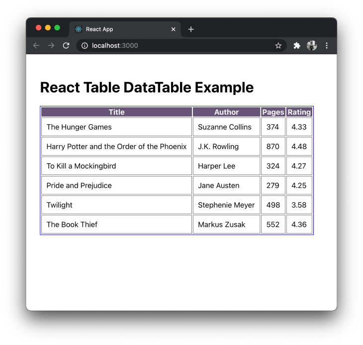
You can simply integrate react-table with UI component libraries such as Material UI and Bootstrap. The core foundation of react-table library is to provide hooks for everything to use in functional React components and this means that it provides hooks for features such as pagination, selecting a row, using filters, resizing columns, etc.
The open-source libraries included in the list are either based on personal experience or those which are actively maintained. The motive of these component libraries is to let you represent the data in a table as well as have a good developer experience. Some of the integrations provided by these libraries are hard to implement from scratch considering the cost of development.
If you are familiar with another table component library in the React ecosystem that is not mentioned in this post, leave its link in the comment section below and tell us why you like it.
Install LogRocket via npm or script tag. LogRocket.init() must be called client-side, not
server-side
$ npm i --save logrocket

// Code:

import LogRocket from 'logrocket';
LogRocket.init('app/id');
// Add to your HTML:

<script src="https://cdn.lr-ingest.com/LogRocket.min.js"></script>
<script>window.LogRocket && window.LogRocket.init('app/id');</script>

AI tools generate working React code fast, but miss race conditions, empty states, debouncing, and accessibility. Here’s how to catch bugs before production.

Learn how to use Gemini CLI subagents to delegate frontend, backend, testing, and docs tasks to specialized agents with guardrails and clear ownership.

Learn how next-browser gives AI agents runtime context for debugging Next.js apps, including React props, hydration, PPR, forms, and performance.

Build dynamic LLM routing in Next.js with OpenRouter, TanStack AI, task classification, model fallbacks, and cost-aware routing.
Would you be interested in joining LogRocket's developer community?
Join LogRocket’s Content Advisory Board. You’ll help inform the type of content we create and get access to exclusive meetups, social accreditation, and swag.
Sign up now

 Learn more →
