
Editor’s note: This post was updated on 1 December 2021 to acknowledge the wider browser support of CSS Grid and Flexbox items, improve the explanations of block formatting contexts and declarative CSS, and bring the post more generally in line with modern CSS usage.

CSS looks deceptively simple. We just declare how something should look in a couple of rules, and the browser works its magic. This results in many courses and learning resources teaching CSS in a practical, easy to follow, quick-results approach that is based pretty much in memorizing rules like a robot.
Even some of the most popular resources fall short when it comes to teaching CSS theory: the extremely awesome freeCodeCamp just brushes through it, always-trusty W3Schools pretty much just lists the properties and values, and even premium courses out there mostly focus on building something fast without even mentioning some of the core concepts.
Well, that’s exactly where the problem lies. We’re learning CSS the wrong way.
For starters, we humans are not that good at memorizing a ginormous (and ever-growing) set of rules, but focusing on the rules alone means skipping through CSS theory concepts, which comes back to bite us every time. You know how the joke goes:
Two CSS properties walk into a bar.
A barstool in a completely different bar falls over.
And there’s some merit to that! The declarative nature of CSS makes it act in unexpected ways, especially for developers who are used to working with imperative languages like JavaScript and well-defined scopes.
In this article, we’ll cover five core concepts that I believe, if taught correctly, would save us from 99% of CSS issues. These are:
Block formatting context is the least well-known, so let’s start there.
The Replay is a weekly newsletter for dev and engineering leaders.
Delivered once a week, it's your curated guide to the most important conversations around frontend dev, emerging AI tools, and the state of modern software.
The classic method of CSS layout is flow layout, a.k.a. “normal flow”. In CSS, we think of page elements as boxes. When we have any block-level boxes in the normal flow, we describe them as part of the block formatting context.
In this context, block elements are arranged vertically, one below the other, and using the CSS margin properties, we can add spacing to these elements. This may seem extremely simple, until we encounter collapsing margins and floating issues.
Understanding how margins behave is an important CSS skill, and so we will explain that next.
When two block-level elements are stacked, their vertical margins collapse together. This behavior makes sense, for instance, in paragraphs where we would like to have a 16px margin at the top and bottom, but definitely not a 32px margin between them.
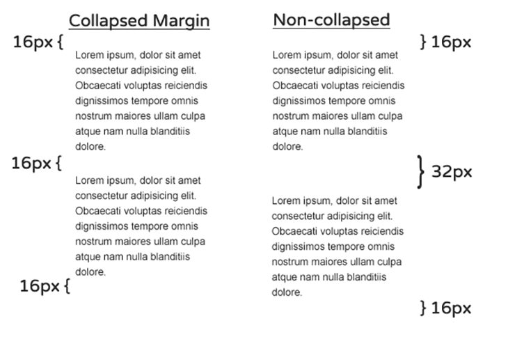
Collapsing margins between siblings seems like a reasonable decision — and one that saves us quite a bit of work for the given use case — but in other instances, especially when dealing with negative margins, it can cause all kinds of weird behavior.
Margins also collapse between parents and children which, more often than not, is not something we would like to see.
Let’s demonstrate this weird behavior. Given a div container with heading and paragraphs elements:
<div class="container">
  <h1>Collapsing margin</h1>
  <p>
    <!-- ... -->
  </p>
  <p>
    <!-- ... -->
  </p>
</div>
We’ve removed the paragraph contents for brevity. If we apply margin: 64px 0; to the div container and margin: 16px 0; to the elements within the container, like so —
.container {
  /* ... */
  margin: 64px 0;
}

p, h1 {
  margin: 16px 0;
}
— we will see this result:
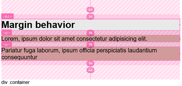
We’ve highlighted the margin area in the layout above.
In the image at the top of this section, we saw how margins collapse between siblings. This second image also demonstrates that, as seen in the gap between the paragraphs, <p>, but again, notice how the margin of the parent div (measuring 64px) collapses with the top and bottom element’s margins (16px each for h1 and p, respectively).
The effect is more visible if the parent element does not have margins. By removing the margins from the parent div, we will have:
See the Pen
noBFC by Ibaslogic (@ibaslogic)
on CodePen.

Looking at the CodePen view, we immediately notice a gap in the top of the view. This is weird and may not be the intended result. The gap is coming from the children margins and spills out of the parent.
To prevent that, we can make the parent element a block formatting context. We will see how to achieve this in a moment.
As for floats, we have all been there; when the content is smaller than the float, it will overflow the element we intended to use as a container (or in other words, the container background and border now fall short of the floated element).

Most of the time we can sort this out with the clearfix hack. This involves applying a pseudo element containing a clear property to the container element. But instead of using a hack, we will use the block formatting context to solve the floating issue as well.
A block formatting context (BFC) defines the scope in which margins will collapse and floats will be contained. We can think of it as a mini-layout within the overall layout.
When we create a BFC, we’re telling the browser to treat the elements it contains as an autonomous piece of layout for floats and margins concerns. In essence, it allows elements to contain internal floats, exclude external floats and prevent margin collapsing.
There are many ways to create block formatting contexts. It involves applying some specific CSS properties or using the root element of the document. Here, we use one of the methods to solve the issues we’ve noted earlier — the floating image and collapsing margins.
Let’s start with the collapsing margin between parents and children. To prevent this, we can apply a display: flow-root; on the container element. This will create a new block formatting context and prevent the margin from spilling out.
.container {
  display: flow-root;
  /* ... */
}
As we can see in the CodePen below, a redundant gap is not being created at the top like we saw before applying the formatting context.
See the Pen
withBFC by Ibaslogic (@ibaslogic)
on CodePen.
Using the above method, we can also apply display: flow-root; to the parent element containing the floating object to solve the overflowing issue. Now, instead of this layout:

We will have this (see the CodePen view):
See the Pen
overflow-element by Ibaslogic (@ibaslogic)
on CodePen.
As we can see, knowing how a block formatting context works gives us much better control of our floats and margins, allowing us to make better layouts, and prevents us from accidentally breaking them.
Unlike the block element, margins behave differently for flex and grid items. When we declare a flex or grid container, the direct children become flex or grid items, respectively. As “flex children” or “grid children”, these items naturally create a block formatting context, and hence, they no longer collapse. This may cause unexpected behavior.
Additionally, once elements become flex items, using display: block; and display: inline; on the items has no impact. Understanding the flex and grid behavior makes it very easy to work with them.
Let’s see an example of a container element containing three items:
<div class="container">
  <div class="item"><!-- ... --></div>
  <div class="item"><!-- ... --></div>
  <div class="item"><!-- ... --></div>
</div>
We’ve removed the div content for brevity.
Like every block element, the margins among the siblings will collapse and the children margins will spill out of the parent. But the moment we make the container a grid or flex container, the items’ margins no longer collapse, and the children margin is contained within the container.
See the implementation for Grid below:
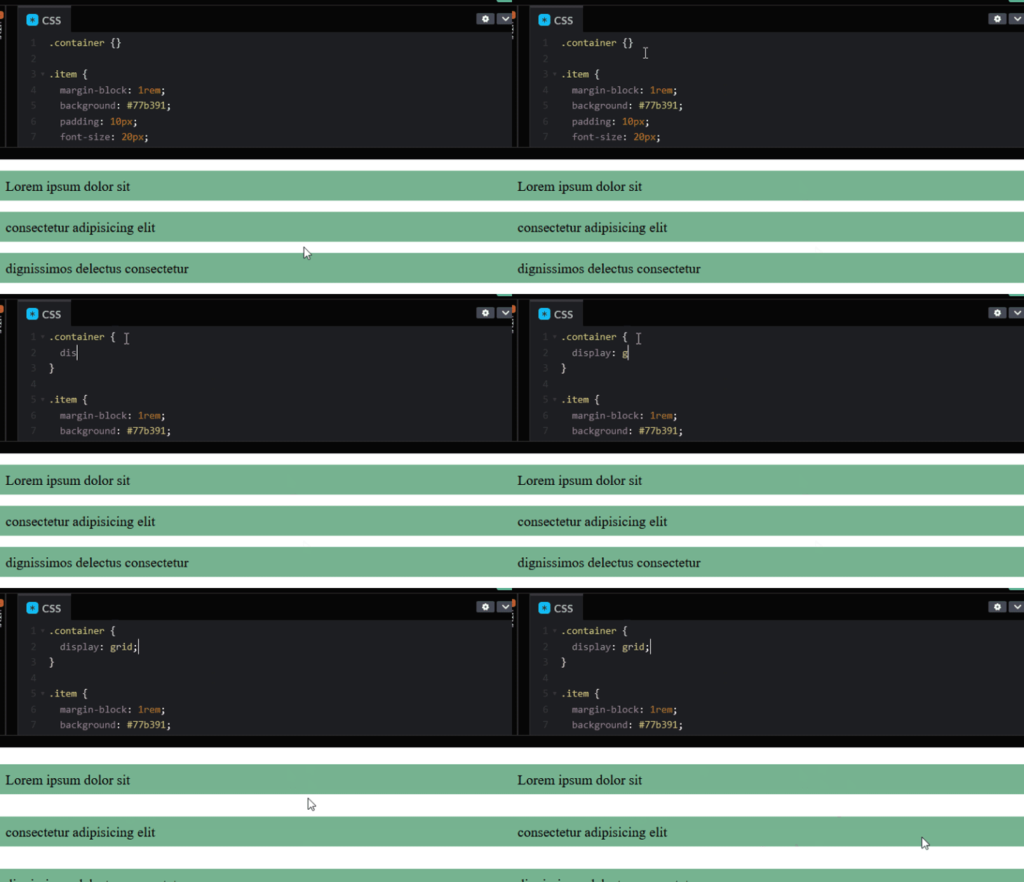
The same effect also happens for a flex container.
This is not something we would like to experience in our layout. We want to maintain collapsing margins amongst the siblings while preventing the children margin from spilling outside of the parent.
A recommendation is to avoid spacing items with margins because they tend to add up but not collapse, which causes the extra spacing. In our code, we have defined margin: 1rem 0; to space the items in the top and bottom.
Once we remove the margins, the items will stick together. We can then apply the gap property to the container to add the intended spacing.
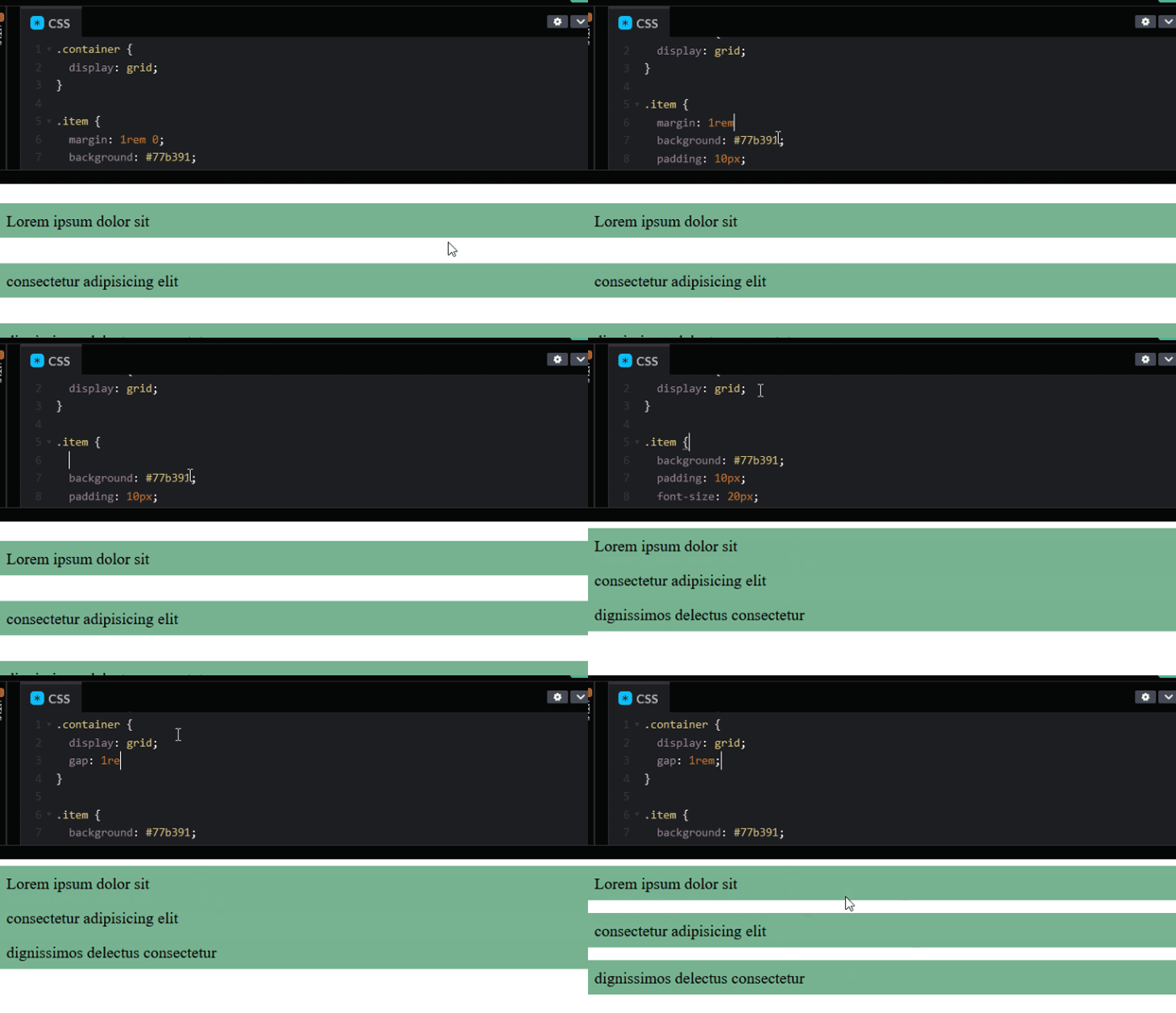
For Flexbox, we can also use the gap property to space items as it is now supported in all modern browsers.
Browsers use an algorithm known as the Cascade (the C in CSS) to decide which rules apply to each element when they encounter conflicting declarations (i.e., when more than one rule assigns different values to an element’s property).
The first factor in the algorithm is source order. Max Stoiber broke the Twitter web development community with this simple CSS question a while back:
How well do you know CSS? 👨🏼🏫
Given these classes:
.red {
color: red;
}.blue {
color: blue;
}Which color would these divs be?
<div class=”red blue”>
<div class=”blue red”>— Max Stoiber (@mxstbr) September 7, 2018
The right choice is “both blue,” but don’t feel bad if you missed it — you certainly are not alone. The real trick in his question is that browsers don’t look at the order on which the classes are declared in the HTML, but in the CSS.
In this case, the style that comes after takes precedence — i.e., the style that is nearest to the bottom is the one that is executed.
As previously mentioned, the order in the CSS source is only one of many factors in the cascade algorithm. A really big part of determining which rules should apply to an element is known as specificity. Different types of CSS selectors carry different weights.
Here’s a list of them, in order of priority:
#something).something) & pseudo-classes (:hover)p)& pseudo-elements (:``:``before)Combinators (+, >, and ~), universal selectors (*) and the :not pseudo-class have no effect on specificity.
A rule defined via an ID will always take precedence over one defined via a class, and a class over an element selector.
When we use combined selectors, such as body #login button .red{}, the browser will count the number of IDs, classes/pseudo classes, and elements/pseudo elements, and assign a specificity value to each rule in order to compare it to the others and decide which one to use.
This is normally represented in three counters: IDs, classes, and elements. For instance, the rule body #login button .red{} has a specificity of:
#login).red)body and button)This rule’s specificity can be represented as 1, 1, 2.
Let’s consider another example. If given two conflicting rules, the one with higher specificity will be applied.
.btn .big { height: 40px }
.btn { height: 20px }
In the above code, the former rule is going to be applied, as it has a specificity of 0, 2, 0, while the latter has a specificity of 0, 1, 0.
It’s important to remember that the more specific type of selector always takes precedence. A rule that has 1, 0, 0 specificity — that is, a single ID, such as #red{color: red} will be considered more important than another with 0, 20, 10. Not that you would really want to write such a ridiculous selector, anyway.
In order to overwrite a rule defined with 1 ID, you’ll need to have another with at least 1 ID and 1 element or class — or, you’ll at least need to match the specificity and let the order in the source take control. This is why it’s generally considered a good practice to avoid using IDs for styling, as they can be extremely hard to overwrite.
Going back to the cascading algorithm, we can imagine this as each HTML element having a related styling table where it writes each property, its current value, and the specificity of the rule that set it.
<h1 id="main-title" class="red"> This is a title </h1>

.red{ color: red; }
h1#main-title{ border-bottom: 2px solid black}
This will give the H1 the following styles:
| Property | Value | Specificity |
|---|---|---|
| color | red | 0, 1, 0 |
| border-bottom | 2px solid black | 1, 0, 1 |
If our stylesheets had additional, conflicting declarations, the cascade will check the specificity that set the current value for a given property, compare it to the specificity of the new rule, and change the value only if the specificity of the new rule is higher or equal to the previous one.
Specificity is not a bug but a feature — and it can be really handy when used properly. It also can be extremely frustrating when it’s not. There are plenty of architectures that help to deal with the cascade in order to write scalable, maintainable CSS. So if there’s one CSS concept you should really master, this is it.
Some methodologies such as the block element modifier (BEM) encourage using flat selectors (i.e., avoiding complex selectors and just using a class for each one) to prevent specificity wars altogether. Others, such as the original OOCSS, let you write higher specificity code in a mindful way. On the other hand, functional CSS tends to avoid conflicting declarations.
It doesn’t really matter which architecture your team chooses, the important part is having an architecture that everyone follows to avoid issues.
There are other factors in the cascade algorithm, such as higher priority to inlined CSS and declarations using the !important keyword.
Each element in the HTML creates a rectangular “box” to represent it. Each of these boxes in turn has a set of rules applied to it that determine the width and height it should occupy in the browser, as well as how much of it is content vs. spacing.
The only exceptions are lists and tables that create two boxes each, and elements with display: none or display: contents, each of which creates no box at all.
The box has the following measures applied to it:
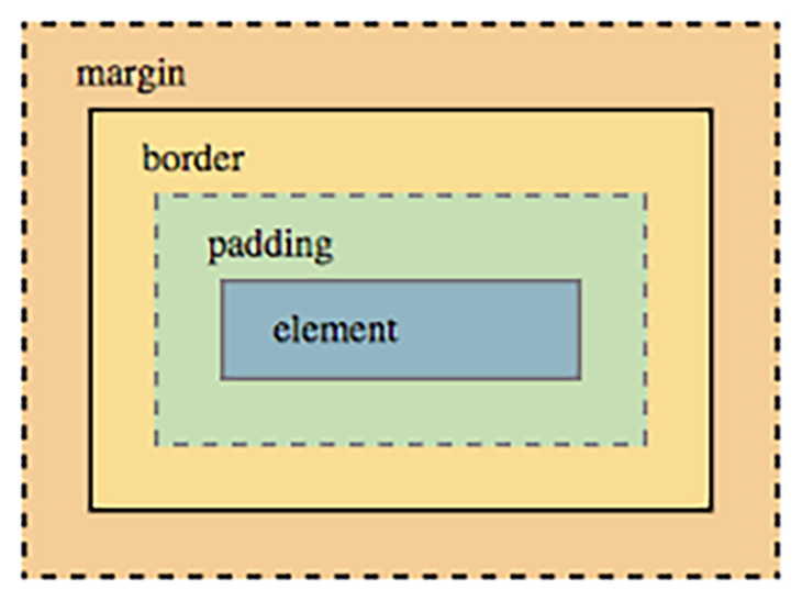
In modern CSS, we have two main ways to define the box, which we can switch using the value of the property box-sizing. They are:
content-boxborder-boxThe more traditional — and therefore, the default — one is called content-box. In content-box, the declared width and height is interpreted as the dimensions of the content, and padding and borders can add to the element actual rendered size, which can be extremely frustrating.
For instance, if we set a width of 50 percent on two left-floated elements, they’ll line up perfectly side-by-side. But the moment we add some padding or a border to them, each one will occupy more than 50 percent of the parent, and therefore, the second one will wrap below the first.
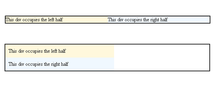
This usually required using weird calcs and preprocessor variables to compensate, and in the old times, actually having to calculate and adjust the widths every time we changed the borders or padding.
Believe it or not, the solution to this issue was inspired by a weird bug in Internet Explorer 6.
When IE6 was set to quirks mode, the width property would set the total rendered width of the element, while paddings and borders would be taken out of the content area, keeping a stable and predictable total width. This is pretty much what we now know as border-box.
Nowadays, most developers choose to reset everything to border-box, so it’s extremely likely that you’ll find some version of this snippet in your codebase:
*, *:before, *:after {
  box-sizing: border-box;
}
There are some variations on the above, with some people arguing for inheriting box-sizing:
html {
  box-sizing: border-box;
}

*, *:before, *:after {
  box-sizing: inherit;
}
It’s funny how the most used sizing in CSS can be thought of as “remember that weird bug in IE6?… really wish we could do that”.
For further research, here is a great guide on the box model and box-sizing.
CSS is primarily a 2-D styling system, but it can also be very powerful in dealing with 3-D and sorting things in the z-axis. As a rule of thumb, when two or more elements overlap, they will be stacked by their order in the source: elements that appeared last in the HTML will be above other, overlapped elements in the viewport (a.k.a, it’s “closer” to the user).
Positioning the elements (setting position to any value other than the default static) and using the z-index property allows us to control how layers of our design stack against each other. But if you have more than five minutes of experience with it, I’m sure you have run into its issues.
Many times we set the stack in perfect order, then something breaks it inexplicably. Turns out, you can create a stacking context, which is a local stack of several properties or elements amongst which z-index applies. We can move elements inside each local stack, as well as move the stacks around in the encompassing stacks, but we can’t interpolate elements from a stack with elements from another.
Some of the properties that create a stacking context are:
z-index other than autoopacity below 1mix-blend-mode other than normalclip-path, mask, filter, or transform other than noneHere’s a classic challenge that helps to grasp the concept: given the following code, try to move the red box behind the green without changing its z-index, position, or the HTML source.
Hint: the trick is in the containing divs.
See the Pen
Stacking Order (problem) by Philip Walton (@philipwalton)
on CodePen.
The solution is creating a new stacking context in the div containing the red span, so the z-index of the red span won’t affect the main stack, letting the source order take over.
See the Pen
Stacking Order (solution) by Philip Walton (@philipwalton)
on CodePen.
Notice that even if we gave the red span a z-index of 1 million, it will not move in front of the green and blue ones because it is isolated in a local stack. If we want to move it, we need to change the position and z-index of the containing div.
Again, Benjamin Johnson covered Stacking Contexts in depth for this publication, so that’s a great source for further understanding of how this works. I also recommend Phillip Walton’s article on z-index, that’s the source for the above challenge and a great dive into how stacking contexts works.
CSS is an extremely powerful styling tool. Whether you choose to go with a pre-processor and “vanilla” CSS or opt for a CSS-in-JS solution, these core concepts are something you should really master to avoid recurring issues.
With many people coming from boot camps that put the emphasis on JS (as is the industry itself), and with the proliferation of pre-packaged solutions such as Bootstrap, the quality of HTML and CSS has taken a toll.
It’s been ten years since Chris Coyier said it, but this quote is still relevant:
CSS is like chess. You can learn the basics in a day and spend a lifetime mastering it.
Some people are convinced the newcomers disrespect HTML and CSS and consider it “below” them, precisely for how easy it is to learn the basics. While I believe some of those people exist, I tend to disagree. I’m convinced most people actually are trying to master it, only they are lost between no longer relevant info and way too many bad resources, and that’s where this frustration comes from.
The real trick to mastering CSS is how you approach it. If you can use a bit of advice, stay away from the “quick results” tutorials, stay away from the frameworks, and stay away from property lists. Get hands-on experience and focus on learning the theory, give the specs a good read, dive into MDN reference on every CSS thing you learn, no matter how small it seems to be, you’ll always find some interesting concepts that makes it “click” into place.
As web frontends get increasingly complex, resource-greedy features demand more and more from the browser. If you’re interested in monitoring and tracking client-side CPU usage, memory usage, and more for all of your users in production, try LogRocket.

LogRocket lets you replay user sessions, eliminating guesswork around why bugs happen by showing exactly what users experienced. It captures console logs, errors, network requests, and pixel-perfect DOM recordings — compatible with all frameworks.
LogRocket's Galileo AI watches sessions for you, instantly identifying and explaining user struggles with automated monitoring of your entire product experience.
Modernize how you debug web and mobile apps — start monitoring for free.

When should you move API logic out of Next.js? Learn when Route Handlers stop scaling and how ElysiaJS helps.

Explore how Dokploy streamlines app deployment with Docker, automated builds, and simpler infrastructure compared to traditional CI/CD workflows.

A side-by-side look at Astro and Next.js for content-heavy sites, breaking down performance, JavaScript payload, and when each framework actually makes sense.

AI-generated tests can speed up React testing, but they also create hidden risks. Here’s what broke in a real app.re
Would you be interested in joining LogRocket's developer community?
Join LogRocket’s Content Advisory Board. You’ll help inform the type of content we create and get access to exclusive meetups, social accreditation, and swag.
Sign up now