Editor’s note: This post was updated by Oscar Jite-Orimiono in January 2026 to focus on Tailwind’s v4 updates and include perspective about Tailwind’s future amidst AI developments

The word “tailwind” means the wind blowing in the same direction as a plane or boat’s course of movement. It helps an object travel faster and reach its destination quicker, ensuring speed and efficiency.
Tailwind CSS is a utility-first framework that lets you “rapidly build modern websites without leaving your HTML.” It’s not every developer’s cup of tea, but Tailwind CSS has gained significant popularity since its release in 2019.
Bootstrap was the undisputed king, but you’ll likely find Tailwind CSS listed as number 1 on many lists when you search for “Top CSS frameworks” today. If you ask ChatGPT, Claude, or other AI tools to build a web UI, they’ll almost always reach for Tailwind CSS if you don’t set constraints.
Speaking of AI, Tailwind Labs was forced to lay off 75% of its engineering team because devs weren’t visiting their docs anymore. AI tools have become so proficient at generating Tailwind code that developers rarely need to consult their documentation or purchase premium UI kits. At a time when Tailwind is more popular than ever, the company’s revenue dropped by approximately 80%. Adam Wathan, Tailwind’s CEO, reported that traffic to their docs dropped 40% from early 2023.
However, as Wathan noted, there has to be a correlation between the benefits of easier use and making the framework sustainable. He also said the company is working to figure out ways to offer its commercial products in a way that aligns with the AI-dominated dev landscape.
This is a sad situation, but it’s important to note that AI hasn’t “killed” Tailwind yet, as some tweets and YouTube thumbnails suggest. The layoffs do not reflect a decline in relevance or quality, but rather our current reality that encourages vibe coding and how developers learn. StackOverflow is a prominent AI casualty, but we’re hoping Tailwind’s future is brighter.
In the meantime, this article will provide a preview and in-depth analysis of Tailwind v4. We’ll cover CSS-first features, practical theme customization examples, migration strategies for existing projects, and compare with similar CSS frameworks while exploring the benefits and limitations of using Tailwind.
The Replay is a weekly newsletter for dev and engineering leaders.
Delivered once a week, it's your curated guide to the most important conversations around frontend dev, emerging AI tools, and the state of modern software.
Tailwind v4.0’s first public beta version was released in November 2024. The full version was released in early 2025, and the current v4.1 followed in April with additional improvements. For more detailed information, you can visit the official documentation, but this guide highlights the exciting features developers can use in v4.
The Tailwind team announced a new performance engine, Tailwind Oxide, in March 2024. Key benefits include a unified toolchain and simplified configuration to speed up the build process.
The most significant change introduced in Tailwind v4.0 is the shift to a CSS-first configuration. In v3, the tailwind.config.js served as the customization hub where you can add custom utility classes and themes, disable plugins, and more.
In v4, you don’t need a tailwind.config.js file or @tailwind directives. You’ll only need to import "tailwindcss" into your main CSS file, and you’re good to go:
@import "tailwindcss";
This reduces the number of steps when starting a new project and the number of files.
For existing (legacy) v3 projects, you can still use a JS config file with the @config directive to load it in your CSS file:
@import "tailwindcss";

@config "../../tailwind.config.js";
However, features like corePlugins, separator, and safelist are not supported in Tailwind v4.
You can control which files Tailwind scans using the source() function:
@import "tailwindcss" source("../src");
For additional sources not detected by default, like anything in your .gitignore file, you can add them using the @source directive:
@import "tailwindcss";
@source "../node_modules/@my-company/ui-lib/src/components";
You can exclude specific paths:
@source not "../src/components/legacy";
You can also disable source detection entirely:
@import "tailwindcss" source(none);
You can import the specific individual layers you need for your project and disable Tailwind’s base styles:
@layer theme, base, components, utilities;
@import "tailwindcss/theme" layer(theme);
@import "tailwindcss/utilities" layer(utilities);
The CSS-first approach in v4 makes customization significantly more intuitive. All customization is added directly to your main CSS file using native CSS syntax.
@theme directiveThe @theme directive is where you’d define all your design tokens with custom CSS properties, instead of JavaScript. CSS variables drive all theme styling in Tailwind v4.
You can easily configure custom styling for essentially every theme namespace in the main CSS file: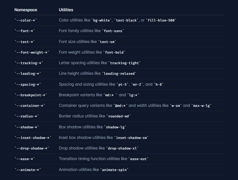
You may be thinking, Why not use root: to define custom styling? While :rootdefines CSS variables, @theme generates corresponding utility classes.
For example, ---color-purple-500 in @theme creates utilities like bg-purple-500, text-purple-500, and so on. Basically, you get the entire suite of Tailwind utilities.
Tailwind v4 uses OKLCH colors by default. It enables more vibrant, uniform colors and is less limited than rgb. However, you can use any color format in your custom theme. So, hex codes, RGB, HSK, or OKLCH will work just fine.
Let’s create a custom theme:
@import "tailwindcss";

@theme {
  --color-deep-purple: #414387;
  --color-vibrant-purple: #764abc;
  --color-lavender: #eae3f5;
  --color-light-purple: #baa2dc;
  --color-orchid: #cb9cd9;
  --color-mauve: #dcadd5;
  --color-pink-light: #eabad2;
  --color-rose: #ee9cb6;
  --color-magenta: #f0456f;
}
The utility classes can then be added to your HTML or JSX document. You now have utilities like bg-vibrant-purple, text-rose, and border-magenta available throughout your project.
In v4, you can disable a specific theme namespace — that is, the default utilities for colors, fonts, text, and more, or the entire Tailwind theme and configure your own.
You can create new utility classes by defining new variables within a specific namespace:
@import "tailwindcss";

@theme {
  --font-display: "Poppins", sans-serif;
  --font-body: "Inter", sans-serif;
}
Two new utilities font-display and font-body will be created and added to the default Tailwind theme.
To disable the entire default theme, use --*: initial. If you wanted to disable a specific Tailwind namespace, like font, and define your own, you’d use --font-*: initial followed by your custom styling:
@import "tailwindcss";

@theme {
  --font-*: initial
  --font-display: "Poppins", sans-serif;
  --font-body: "Inter", sans-serif;
}
In this case, only font-display and font-body will be available as font utilities in your project.
You can also set default properties for custom utilities using double dashes:
@theme {
  --font-*: initial
  --font-display: "Poppins", sans-serif;
  --font-body: "Inter", sans-serif;

  --text-logo: 1.5rem;
  --text-logo--font-weight: 700;

  --text-big: 6rem;
  --text-big--font-weight: 700;
  --text-big--letter-spacing: -0.025em;
  --text-big--line-height: 1.1;
}
Now, when you use the utilities text-logo or text-big, all default properties apply automatically:
<div class="bg-background-100 h-screen">
  <header class="flex justify-between py-4 px-8">
    <a href="/" class="font-logo text-logo text-light-100">LogRocket - Oscar</a>

    <ul class="hidden md:flex items-center gap-4 font-display text-lilac-100">
      <li><a href="#" class="py-2 px-4 rounded-md">Home</a></li>
      <li><a href="#">About</a></li>
      <li><a href="#">Contact</a></li>
    </ul>
  </header>

  <div class="container px-32 py-32 font-display">
    <h1 class="text-lilac-100 text-big">Tailwind CSS</h1>
    <h3 class="text-3xl text-light-100">
      Build websites with utility classes from the comfort of your HTML
    </h3>
    <p class="text-2xl text-light-100">
      Lorem ipsum dolor sit amet consectetur adipisicing elit. Fugit
      at veniam atque unde laudantium. Ipsa nam quisquam quod non
      officiis porro?
    </p>
  </div>
</div>
This will help reduce class bloat in your HTML or JSX. The alternative for the h1 with the className, text-big, would have been:
<h1 class="text-lilac-100 text-8xl tracking-tight text-bold">Tailwind CSS</h1>
Three utilities for the price of one! This approach reduces dependency on default Tailwind values. Multiple classes can be replaced with one custom utility that includes all necessary properties.
Other benefits include having a consistent design. You can define default properties, colors, typography, spacing, and more, once in the @theme directive with native CSS. Changing one property updates it everywhere in your project.
You can create custom utilities with the @utility directive:
@utility tab-4 {
  tab-size: 4;
}
@utility text-balance {
  text-wrap: balance;
}
@utility container {
  margin-inline: auto;
  padding-inline: 2rem;
  max-width: 80rem;
}
These then become available as single-class Tailwind utilities in your project.
Here’s a custom theme setup for a web page with a popup modal:
<@import url("https://fonts.googleapis.com/css2?family=Poppins:wght@100;200;300;400;500;600;700;800;900&display=swap");
@import "tailwindcss";
@theme {
  --font-*: initial;
  --font-display: "Poppins", sans-serif;

  --color-deep-purple: oklch(0.38 0.09 284);
  --color-vibrant-purple: oklch(0.48 0.15 293);
  --color-lavender: oklch(0.92 0.02 293);
  --color-light-purple: oklch(0.74 0.08 293);
  --color-orchid: oklch(0.74 0.11 311);
  --color-mauve: oklch(0.80 0.09 326);
  --color-pink-light: oklch(0.84 0.09 343);
  --color-rose: oklch(0.76 0.13 358);
  --color-magenta: oklch(0.65 0.21 13);

  --ease-fluid: cubic-bezier(0.3, 0, 0, 1);
  --ease-snappy: cubic-bezier(0.2, 0, 0, 1);
}
/* Glassmorphism utility */
@utility glass {
  background: rgba(186, 162, 220, 0.15);
  backdrop-filter: blur(12px);
  border: 1px solid rgba(234, 227, 245, 0.2);
}
/* Stronger glass effect for popups and modals */
@utility glass-strong {
  background: rgba(118, 74, 188, 0.5);
  backdrop-filter: blur(15px);
  border: 1px solid rgba(118, 74, 188, 0.5);
}
/* Popup overlay blur */
@utility popup-blur {
  backdrop-filter: blur(5px);
  background-color: rgba(118, 74, 188, 0.1);
}
It starts with overriding the default fonts to use only Poppins, imported from Google Fonts. Next, we have our custom color palette and animations. We’ve also created a glass utility that combines multiple properties to create the glassmorphism effect. This effect can then appear on navigation, popups, cards, etc.
Using the @utility directive ensures consistency, the same effect on any element that needs to have the frosted glass look. It’s also easy to maintain.
Here’s the JSX for this page:
<import { useState } from 'react';>
function LandingPage({ onNavigate }) {
  const [popupOpen, setPopupOpen] = useState(false);
  return (
    <div className="min-h-screen bg-vibrant-purple font-display relative">
      {/* Navigation with glass effect */}
      <nav className="glass fixed top-0 left-0 right-0 flex justify-between items-center h-[65px] px-8 z-50">
        <a href="#" className="text-[1.5rem] font-bold text-lavender">
          LogRocket - Oscar
        </a>
        <ul className="hidden md:flex gap-2 text-lavender">
          <li>
            <a className="block px-8 py-2 hover:text-pink-light transition-colors" href="#">
              Home
            </a>
          </li>
          <li>
            <a className="block px-8 py-2 hover:text-pink-light transition-colors" href="#">
              Blog
            </a>
          </li>
          <li>
            <button
              onClick={onNavigate}
              className="block px-8 py-2 hover:text-pink-light transition-colors cursor-pointer"
            >
              Dashboard
            </button>
          </li>
        </ul>
      </nav>

      {/* Hero Section */}
      <div className="relative flex items-center min-h-screen pt-[65px]">
        <div className="absolute left-[10%] top-1/2 -translate-y-1/2
                        max-md:left-1/2 max-md:-translate-x-1/2 max-md:px-4
                        text-left max-md:w-full">
          <h1 className="text-6xl font-bold text-lavender mb-4 max-md:text-4xl">
            This is <br />
            <span className="text-pink-light">Tailwind CSS v4</span>
          </h1>
          <p className="text-[1.25rem] text-light-purple mb-6 max-md:text-lg">
            Build websites with utility classes from the comfort of your HTML
            <br />
            <span className="text-[1rem]">Click the button to join us!</span>
          </p>
          <button
            onClick={() => setPopupOpen(true)}
            className="bg-magenta/50 border border-white/10 text-white
                       px-8 py-3 rounded-lg hover:bg-orchid hover:text-deep-purple
                       transition-all duration-300 ease-[cubic-bezier(0.3,0,0,1)]"
          >
            Take Flight!
          </button>
        </div>
        <img
          src="https://omjsblog.wordpress.com/wp-content/uploads/2024/05/untitled-design6.png"
          alt="Rocket"
          className="absolute bottom-0 left-[80%] -translate-x-[50%] h-[500px]
                     grayscale-[30%] max-md:hidden"
        />
      </div>

      {/* Popup Modal using glass-strong */}
      <div className={`popup-blur fixed inset-0 flex items-center justify-center z-50 transition-opacity
                      ${popupOpen ? "opacity-100" : "opacity-0 pointer-events-none"}`}>
        <div className={`glass-strong w-[500px] max-w-[90%] rounded-lg shadow-2xl p-8
                        transition-transform duration-500
                        ${popupOpen ? "scale-100" : "scale-0"}`}>
          <h1 className="text-rose text-4xl font-bold mb-3">You're in!</h1>
          <p className="text-white mb-5">
            Lorem ipsum dolor sit amet consectetur adipisicing elit. Placeat
            saepe quas voluptate eius, delectus ab nihil fugiat sint.
          </p>
          <button
            onClick={() => setPopupOpen(false)}
            className="w-full h-[45px] bg-magenta/80 rounded-md text-white
                       font-medium hover:bg-light-purple/50 transition"
          >
            OK
          </button>
        </div>
      </div>
    </div>
  );
}
export default LandingPage;
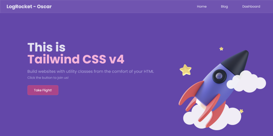
Here’s a screenshot of the theme in action:
@variant directiveYou can define custom variants for specific interaction states with the @variant and use them with any utility:
@variant hover (&:hover);
@variant focus-visible (&:focus-visible);
@variant hocus (&:hover, &:focus);


<button class="bg-blue-500 hocus:bg-blue-600">
  Hover or focus me
</button>
@source directiveIf there are files you don’t want to include, you can use the source() function when importing Tailwind to limit automatic detection:
@import "tailwindcss" source("../src");
For additional sources that Tailwind doesn’t detect by default, like anything in your .gitignore file, you can control which directories Tailwind scans using the @source directive:
@import "tailwindcss";

@source "../src";
@source "../components";
@source "../../packages/ui/src";
You can also disable source detection entirely:
@import "tailwindcss" source(none);
You can import the specific individual layers you need for your project and disable Tailwind’s base styles:
@layer theme, base, components, utilities;
@import "tailwindcss/theme" layer(theme);
@import "tailwindcss/utilities" layer(utilities);
Spacing utilities, like m-*, w-*, mt-*, px-*, and more, are generated dynamically using a base spacing value of 0.25rem defined in the default Tailwind v4.0 theme.
Every multiple of the base spacing value is available in the spacing scale. So if mt-1 is 0.25rem, mt-2 will be 0.25rem multiplied by two, which is 0.5rem, and mt-21 will be 5.25rem:
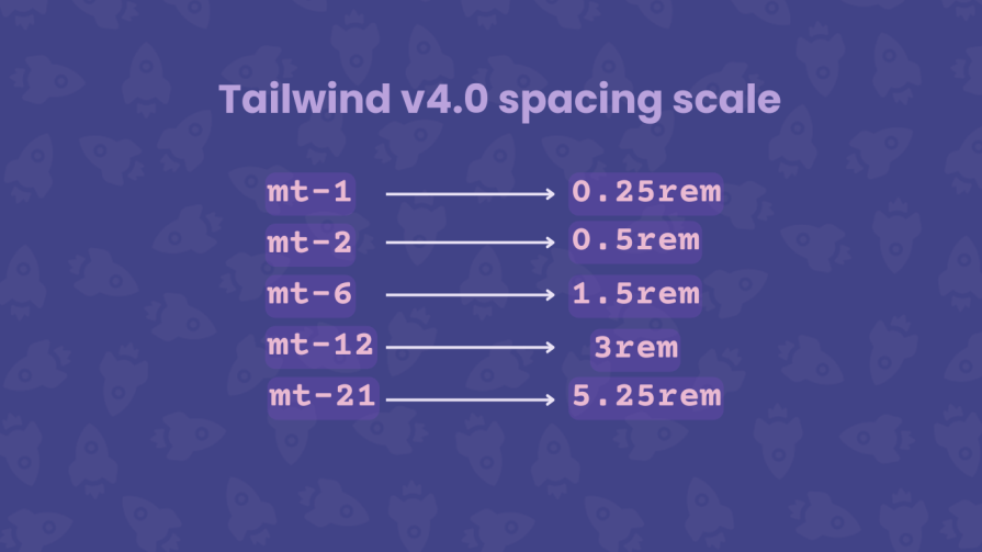
You can use spacing utilities with values that aren’t explicitly defined. In Tailwind v3, you’d need to use an arbitrary value like mt-[5.25rem] or a custom theme. There’s no need for additional configuration, and you can create more consistent designs.
If you want to limit the available spacing values, you can disable the default variable and define a custom scale:
@theme {
  --spacing: initial
  --spacing-1: 0.25rem
  --spacing-2: 0.5rem
  --spacing-4: 1rem
  --spacing-8: 2rem
  --spacing-12: 3rem
}
With this setup, every Tailwind spacing utility will only use the specifically defined values.
Container queries now have built-in support in Tailwind CSS v4.0; you won’t need the @tailwindcss/container-queries plugin to create responsive containers.
Container queries are used to apply styling to an element based on the size of its parent container. This means your site’s layout adapts to individual components rather than the entire viewport.
In v4.0, you create container queries by adding the @container utility to a parent element. For the child elements, you use responsive utilities like @sm and @lg to apply styling based on the parent’s size:
<<div className="@container">
   <header className="flex justify-between @sm:grid-cols-2 @lg:grid-cols-4">
     <!-- child content -->
   </header>
</div>
Tailwind v4.0 also introduces a new @max-* variant for max-width container queries. It makes it easier to add styling when the container goes below a certain size. You can combine @min-* and @max-* to define container query ranges:
<div className="@container">
   <div className="flex @min-md:@max-xl:hidden">
     <!-- child content -->
   </div>
</div>
In this code, the child div will be hidden when the width of the parent container is between md and xl (768px and 1280px).
Use cases for container queries include navigation, sidebars, cards, image galleries, and responsive text. They also provide more flexibility and are well supported across browsers, so you can start using them in your v4 projects.
Tailwind provides an upgrade tool to automate most migration tasks:
npx @tailwindcss/upgrade@next
The tool handles dependency updates, migrates your JS config to CSS, and updates template files. Tailwind recommends:
git diffComplex projects may require manual adjustments. The upgrade tool is continuously improved, with v4.1 bringing enhanced migration capabilities.
PostCSS plugin: In v4.0, the PostCSS plugin is now available as a dedicated package, @tailwindcss/postcss. You can remove postcss-import and auto-prefixer from the postcss.config.mjs file in your existing project:
export default {
  plugins: {
    '@tailwindcss/postcss': {},
  },
};
If you are starting a new project, you can now install Tailwind alongside the PostCSS plugin by running the following command:
npm install tailwindcss@next @tailwindcss/postcss@next
Vite plugin: Tailwind CSS v4.0 also has a new dedicated Vite plugin, which they recommend you migrate to from the PostCSS plugin:
import { defineConfig } from 'vite';
import tailwindcss from '@tailwindcss/vite';

export default defineConfig({
  plugins: [
    tailwindcss()
  ],
});
As we’ve seen with PostCSS, you can install v4.0 along with the Vite plugin when setting up a new project.
npm install tailwindcss@next @tailwindcss/vite@next
Tailwind CLI: Using the CLI tool is the easiest and fastest way to set up Tailwind CSS, and it now resides in a dedicated @tailwind/cli package.
You’d need to update your build commands accordingly:
npx @tailwindcss/cli -i input.css -o output.css
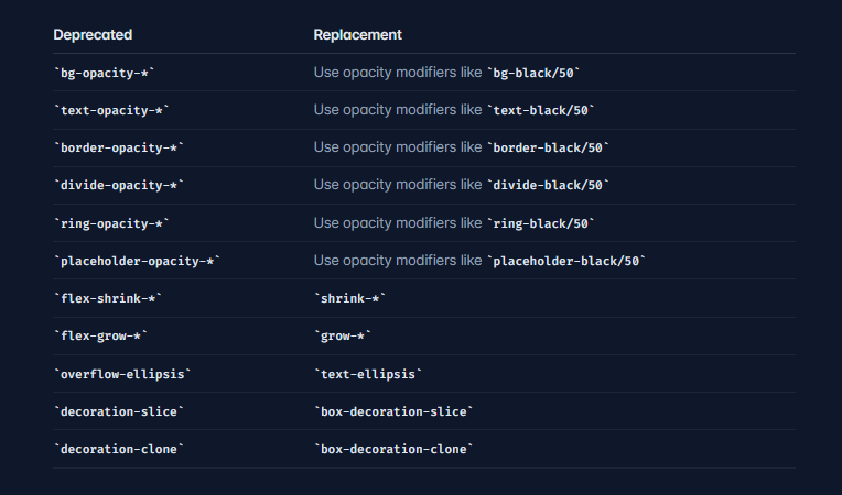
Several outdated or undocumented utilities have been removed and replaced with modern alternatives:
The primary alternative to Tailwind CSS is Bootstrap, the world’s most popular CSS framework with an extensive library of predefined components.
Bootstrap is more beginner-friendly—you can create ready-to-use components with straightforward class names, while Tailwind requires understanding utilities and their underlying CSS rules. Bootstrap also includes JavaScript by default, whereas Tailwind must be combined with JS frameworks.
However, Bootstrap isn’t as customizable or flexible as Tailwind CSS. A long-standing criticism is that Bootstrap sites look similar. Tailwind’s utility-first approach offers more flexibility and design control.
Other utility-first frameworks like missing.css and Mojo CSS have emerged in recent years, but none have matched Tailwind’s popularity or ecosystem.
While Tailwind has its critics, the framework offers compelling advantages:
Rapid development: Build interfaces quickly without switching between CSS and HTML files. Utility classes let you style elements inline, dramatically speeding up prototyping and iteration.
Design consistency: Utility classes enforce a consistent design system. Instead of arbitrary values, you use predefined spacing, colors, and sizing scales, ensuring visual coherence across your project.
No CSS bloat: Unlike traditional CSS, where unused styles accumulate, Tailwind only generates the classes you actually use. This results in smaller CSS files.
Responsive design: Built-in responsive utilities make it trivial to create adaptive layouts. Prefix utilities with breakpoints like md: or lg: to apply styles at different screen sizes.
Customization: Despite being utility-first, Tailwind is highly customizable. The new v4 CSS-first approach makes customization even more intuitive, letting you override or extend any aspect of the design system.
No naming conventions: Describe what you want visually, and apply the corresponding utility.
Performance: The new Oxide engine and unified toolchain make builds significantly faster.
Community and ecosystem: Tailwind has a massive ecosystem of plugins, components, templates, and UI kits. The community provides extensive resources, tutorials, and solutions to common problems. The v4 release only offers more possibilities.
Framework compatibility: You can use the same approach across different projects and frameworks. The new Vite plugin provides especially tight integration for Vite-based projects.
AI integration: Tailwind is the default choice for many LLMs. The CSS-first approach in v4 also makes it easier for AI tools to generate and modify styles.
Despite its advantages, Tailwind has limitations:
Steep learning curve: The utility-first approach and large number of classes can be difficult for beginners to learn. Understanding what utilities to use and how they compose requires time investment.
Code readability: HTML files can become cluttered as elements accumulate utilities, making code harder to read and maintain, especially for those unfamiliar with Tailwind.
Inconsistent design: The flexibility that makes Tailwind powerful can lead to inconsistent designs if developers aren’t mindful about following design systems or reusing components.
Switching frameworks: Projects can become tightly coupled with Tailwind CSS, making it difficult to switch to another framework without significant refactoring.
HTML bloat: While CSS files are small, HTML files can become large with many utility classes.
Some of these issues are avoidable; devs just need a good understanding of CSS. And, you can always override the entire Tailwind default theme with --*: initial; and start with a clean slate. But then that defeats the purpose of using Tailwind in the first place.
Upgrading existing projects to v4 may seem daunting, particularly for complex applications, but the benefits are substantial. Tailwind v4 makes everything faster and simpler by removing additional configuration files, providing clearer CSS-native syntax, and moving closer to standard or popular conventions.
For developers who previously found Tailwind too abstract, v4’s CSS-first approach may change their perspective. The framework now feels less like a separate tool and more like an enhancement to CSS itself, making it more approachable while retaining the benefits that made Tailwind popular in the first place.
Whether you’re starting fresh or migrating an existing project, Tailwind CSS v4 represents a step forward in making utility-first CSS more intuitive, even as the company navigates an uncertain landscape. Tailwind has unintentionally become popular with AI models. It is a good framework, but it now has to adapt to a world where all of its assets are available for free through AI.
As web frontends get increasingly complex, resource-greedy features demand more and more from the browser. If you’re interested in monitoring and tracking client-side CPU usage, memory usage, and more for all of your users in production, try LogRocket.

LogRocket lets you replay user sessions, eliminating guesswork around why bugs happen by showing exactly what users experienced. It captures console logs, errors, network requests, and pixel-perfect DOM recordings — compatible with all frameworks.
LogRocket's Galileo AI watches sessions for you, instantly identifying and explaining user struggles with automated monitoring of your entire product experience.
Modernize how you debug web and mobile apps — start monitoring for free.
Build a CRUD REST API with Node.js, Express, and PostgreSQL, then modernize it with ES modules, async/await, built-in Express middleware, and safer config handling.

Discover what’s new in The Replay, LogRocket’s newsletter for dev and engineering leaders, in the March 25th issue.

Discover a practical framework for redesigning your senior developer hiring process to screen for real diagnostic skill.
I tested the Speculation Rules API in a real project to see if it actually improves navigation speed. Here’s what worked, what didn’t, and where it’s worth using.
Would you be interested in joining LogRocket's developer community?
Join LogRocket’s Content Advisory Board. You’ll help inform the type of content we create and get access to exclusive meetups, social accreditation, and swag.
Sign up now

 Learn more →
