
Design constraints are limitations on what designers can do with a design. They can feel like a bad thing, but they can be useful.
A design philosophy is a guiding light for a designer’s approach to their craft. Here’s how to craft your own.

This post breaks down what design debt is and gives you 6 smart ways to fix it, without killing team velocity.
Here, you’ll learn what bottom sheets are, when and why they’re useful, and how to make them as usable and as accessible as possible.
Here’s an in-depth look at shadows, some techniques for executing them, and how to create them in Figma — with plugins.
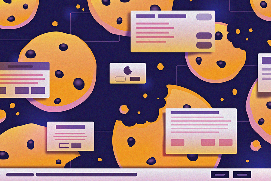
How cookie banners are implemented can affect a user’s experience. Learn how to create a perfect, nonobtrusive cookie banner.
One new design trend is neumorphism. It mixes the effects of minimalism and realism to create interfaces that are easy to comprehend.

Atomic design provides a structured way of building up complex UIs from basic building blocks and components.

In this guide, you can learn how to use Autodesigner, Uizard’s AI-powered wireframe generator, to speed up your design process.

This guide shows you how to apply the UX honeycomb in your design process — plus how it stacks up to other UX models.
Get strategic with your design process. This blog walks through 15 UX frameworks, categorized and summarized for fast, informed decision-making.
Tooltips are useful and sometimes a necessity in user experience design because they can help guide users through a UI pattern.