I’ve spent enough time designing with WCAG 2.2 to know it’s not enough. Here’s why I’m skeptical and cautiously hopeful about WCAG 3.0.
I learned this lesson the hard way. Good UX doesn’t survive endless approval loops. Here’s what went wrong — and how to protect your vision.
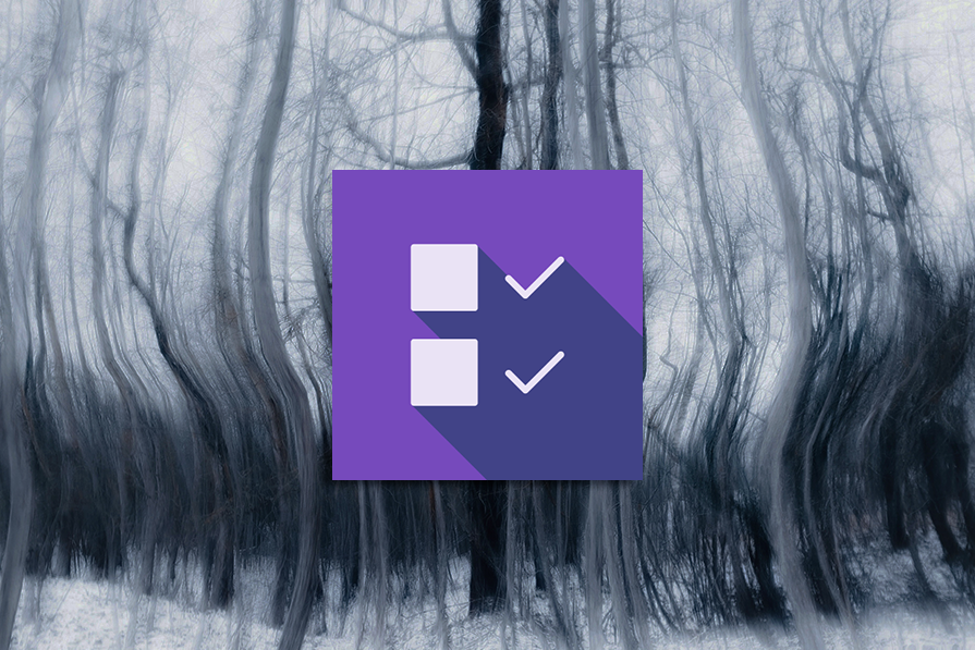
The checkbox is one of the most common elements in UX design. Learn all about the feature, its states, and the types of selection.

Optimization fatigue is real. Here’s why designing only for metrics drains creativity, and how to bring the human back into UX.

Let’s explore why and when to use drag and drop, discussing real-world examples, platform-specific considerations, and accessibility tips.
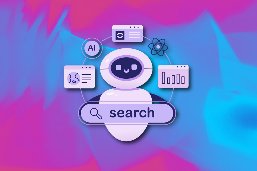
After designing AI search systems, I’ve seen what builds trust — and what kills it. Here’s my take on what really works.
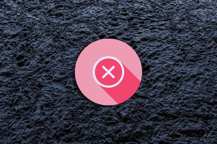
Design cancel buttons that feel safe, not frustrating. Learn how to build clear, accessible flows that protect users and their data.

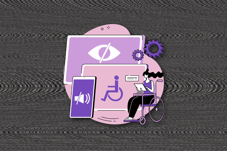
Accessibility isn’t just dev work — find out what designers can do from day one to support accessible, inclusive user experiences.

The rule of thirds is a hidden rule in design but is everywhere you look. Let’s look at how it can impact landing page design.
Streamline your UX process with proven techniques for research, ideation, prototyping, and testing — explained step by step.
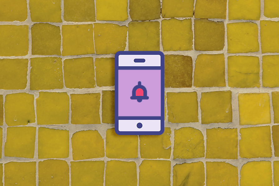
Learn when and how to use toast notifications in UX—plus best practices, use cases, pitfalls, and accessibility tips.

Explore linear design in 2025—what it is, how it’s changed, and how to use it without making your product look like every other site.