To avoid hurting UX, we must maintain good modal anatomy, and the most important aspect is deciding when a modal is appropriate to use.

Designing for enterprise isn’t just about looks — it’s about making complex workflows easy. Here’s how to do it right.
Let’s examine examples of poorly implemented search filters and highlight some tips you can use to produce a satisfying filtering experience.

When familiar patterns start to feel stale, these seven ways will help you revive your design inspiration and to create standout user experiences.

Midjourney is an effective resource for generating inspiration and ideas for UI design with minimal effort.
Here’s the lowdown. Scaling icons properly keeps them crisp and clear on any screen size. I talk more on this in the blog.
Brands like Amazon and Walmart have a product page design that sells itself. In this blog, I analyze how they do it and what you can learn from them.
The aesthetic-usability effect shows that users equate beauty with functionality. But where’s the line between looks and usability? The challenge lies in balancing visual appeal with true usability.

Digital overload is real, and your design doesn’t have to contribute to it. In this blog, I use examples to show how good, humane designs put users first and build lasting trust.
Contrasting colors do more than catch the eye; they determine whether your interface is accessible to all users, including those with low vision. More on this in this blog!

Capturing attention is one thing; keeping it is another. Beyond the binary of ‘engaged’ or ‘not’ lies a richer understanding of user motivation — I talk more about that in this blog.
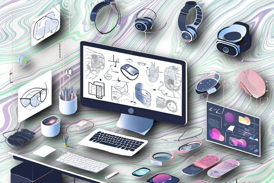
Smart rings, watches, eyewear — web design for wearables demands a whole new playbook. Today, I explore how sleek UX and futuristic tech blend and transform the way we experience wearables every day.