
The <details> and <summary> HTML elements, collectively referred to as a disclosure widget, are not easy to style. People often make their own version with a custom component because of the limitations. However, as CSS has evolved, these elements have gotten easier to customize. In this article, I will cover how you can customize the appearance and behavior of a disclosure widget.
The Replay is a weekly newsletter for dev and engineering leaders.
Delivered once a week, it's your curated guide to the most important conversations around frontend dev, emerging AI tools, and the state of modern software.
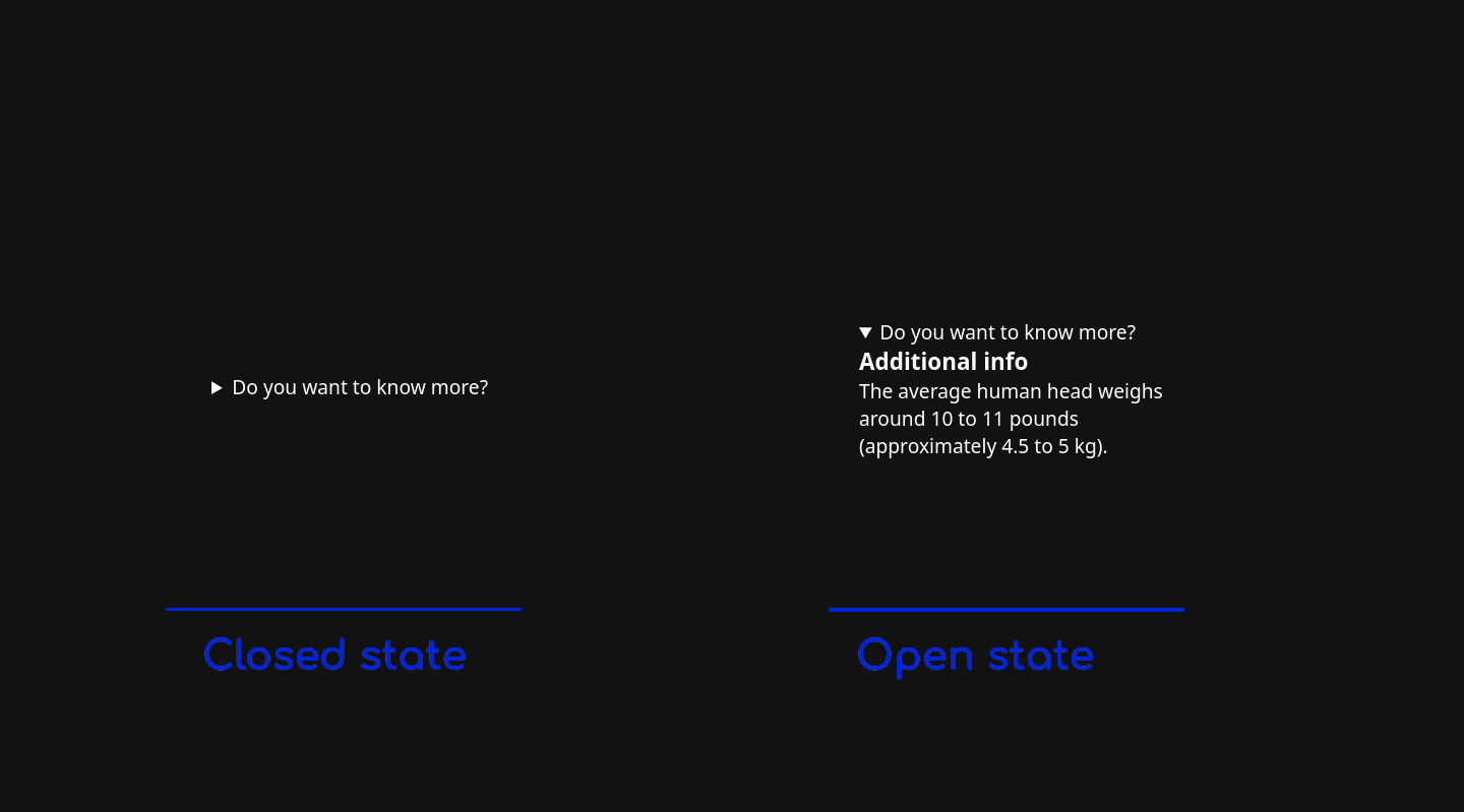
<details> and <summary> work together?<details> is an HTML element that creates a disclosure widget in which additional information is hidden. A disclosure widget is typically presented as a triangular marker accompanied by some text.
When the user clicks on the widget or focuses on it and presses the space bar, it opens and reveals additional information. The triangle marker points down to indicate that it is in an open state:

The disclosure widget has a label that is always shown and is provided by the <summary> element. This is the first child. If it is omitted, a default label is provided by the browser. Usually, it will say “details”:

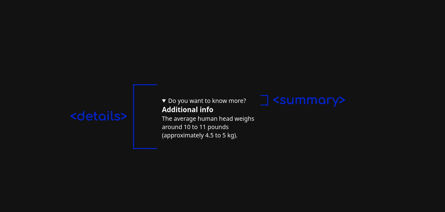
You can also provide multiple elements after the <summary> element to represent the additional information:
<details>
  <summary>Do you want to know more?</summary>
  <h3>Additional info</h3>
  <p>The average human head weighs around 10 to 11 pounds (approximately 4.5 to 5 kg).</p>
</details>
<details> and <summary>There are a few interoperability issues that should be considered when styling the <details> and <summary> elements. Let’s cover the basics before we get into some common use cases.
The <summary> element is similar to a <li> element because its default style includes display: list-item. Therefore, it supports the list-style shorthand property and its longhand properties. The browser support for the list-style properties is quite good, but Safari is still lagging.
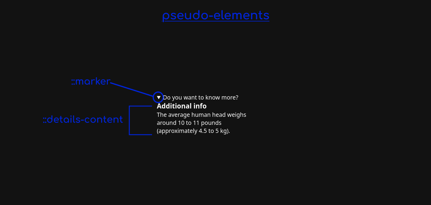
The disclosure widget has two pseudo-elements to style its constituent parts:
::marker pseudo-element: Represents the triangular marker that sits at the beginning of <summary>. The styling story for this is a bit complicated. We are limited to a small set of CSS properties. Browser support is good for ::marker, but Safari doesn’t currently support the complete set of properties. I will discuss this in more detail in the “Styling the summary marker” section of this article::details-content pseudo-element: Represents the “additional information” of <details>. This is a recent addition, so browser support is currently limited to Chrome
In the following sections, I will demonstrate some of the newer, lesser-known ways to customize a disclosure widget.
When you open a disclosure widget, it snaps open instantly. Blink, and you will miss it!
It is preferable to transition from one state to another in a more gradual way to show the user the impact of their action. Can we add a transition animation to the opening and closing actions of a disclosure widget? In short, yes!
To animate this, we want the height of the hidden content to transition from zero to its final height. The default value of the height property is auto, which leaves it to the browser to calculate the height based on the content. Animating to a value of auto was not possible in CSS until the addition of the interpolate-size property. While browser support is a bit limited for the newer CSS features we need to use — chiefly interpolate-size and ::details-content — this is a great example of a progressive enhancement. It will currently work in Chrome!
Here’s a demonstration video of the animation:
Here is a CodePen example of the animation.
First, we add interpolate-size so we can transition to a height of auto:
details {
    interpolate-size: allow-keywords;
}
Next, we want to describe the closed style. We want the “additional info” content to have a height of zero and ensure that no content is visible, i.e., we want to prevent overflow.
We use the ::details-content pseudo-element to target the hidden content. I use the block-size property rather than height because it’s a good habit to use logical properties. We need to include content-visibility in the transition because the browser sets content-visibility: hidden on the content when it is in a closed state — the closing animation will not work without including it:
/* closed state */
details::details-content {
  block-size: 0;

  transition: content-visibility, block-size;
  transition-duration: 750ms;

  transition-behavior: allow-discrete;
  overflow: hidden;
}
The animation still won’t work as expected because the content-visibility property is a discrete animated property. This means that there is no interpolation; the browser will flip between the two values so that the transitioned content is shown for the entire animation duration. We don’t want this.
If we include transition-behavior: allow-discrete;, the value flips at the very end of the animation, so we get our gradual transition.
Also, we get content overflow by setting the block-size to 0 when the disclosure widget is in an intermediate state. We show most of the content as it opens. To prevent this from happening, we add overflow: hidden.
Lastly, we add the style for the open state. We want the final state to have a size of auto:
/* open state */
details[open]::details-content {
  block-size: auto;
}
Those are the broad strokes. If you would prefer a more detailed video explanation, check out Kevin Powell’s walkthrough for how to animate <details> and <summary>.
The disclosure widget may grow horizontally if the “additional information” content is wider than the <summary> content. That may cause an unwanted layout shift. In that case, you may want to set a width on <details>.
Like any animation, you should consider users who are sensitive to motion. You can use the prefers-reduced-motion media query to cater to that scenario:
>@media (prefers-reduced-motion) {
  /* styles to apply if a user's device settings are set to reduced motion */

   details::details-content {
      transition-duration: 0.8s; /* slower speed */
   }
}
<details> group (exclusive accordion)A common UI pattern is an accordion component. It consists of a stack of disclosure widgets that can be expanded to reveal their content. To implement this pattern, you just need multiple consecutive <details> elements. You can style them to visually indicate that they belong together:
<details>
    <summary>Payment Options</summary>
    <p>...</p>
</details>
<details>
    <summary>Personalise your PIN</summary>
    <p>...</p>
</details>
<details>
    <summary>How can I add an additional cardholder to my Platinum Mastercard</summary>
    <p>...</p>
</details>
The default style is fairly simple:


Each <details> occupies its own line. They are positioned close together (no margin or padding) and are perceived as a group because of their proximity. If you want to emphasize that they are grouped together, you could add a border and give them the same background styles as shown in the example below:
See the Pen
<details> stack – an accordion even by rob2 (@robatronbobby)
on CodePen.
A variation of this pattern is to make the accordion exclusive so that only one of the disclosure widgets can be opened at a time. As soon as one is opened, the browser will close the other. You can create exclusive groups through the name attribute of <details>.
Having the same name forms a semantic group:
<details name="faq-accordion">
    <summary>Payment Options</summary>
    <p>...</p>
</details>
<details name="faq-accordion">
    <summary>Personalise your PIN</summary>
    <p>...</p>
</details>
<details name="faq-accordion">
    <summary>How can I add an additional cardholder to my Platinum Mastercard</summary>
    <p>...</p>
</details>
See the Pen
<details> exclusive group by rob2 (@robatronbobby)
on CodePen.
Before using exclusive accordions, consider if it is helpful to users. If users are likely to want to consume more of the information, this will require them to open items often, which can be frustrating.
This feature is currently supported in all modern browsers so you can use it right away.
A disclosure widget is typically presented with a small triangular marker beside it. In this section, we’ll cover the process of styling this marker.
The marker is associated with the <summary> element. The addition of the ::marker pseudo-element means that we can style the marker box directly. However, we are limited to a small set of CSS properties:
colorwhite-spacetext-combine-upright, unicode-bidi, and direction propertiescontentAs mentioned earlier, <summary> is similar to a <li>; it supports the list-style shorthand property and its longhand properties. While this might sound a bit hodge-podge, it will be easier to understand the styling options with some examples.
Before jumping into examples, a quick word on browser support. At the time of writing, Safari is the only major browser that doesn’t fully support styling the marker:
color and font-size properties of the ::marker pseudo-element. Safari supports the non-standard pseudo-element ::-webkit-details-markerlist-style properties at all. See CanIUse for referenceSay we wanted to change the color of the triangular marker to red and make it 50% larger. We can do the following:
summary::marker {
  color: red;
  font-size: 1.5rem;
}


This should work across all browsers. Here’s the CodePen example.
By default, the marker is to the side of the text content of <summary> and they are in the same bounding box. The list-style-position is set to inside. When it is an open state, the “additional information” is directly underneath the marker. Perhaps you want to change the spacing and alignment of this:

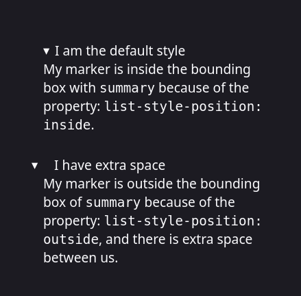
If we set list-style-position to outside, the marker sits outside of the <summary> bounding box. This enables us to adjust the space between the summary text and the marker:
summary {
  list-style-position: outside;
  padding-inline-start: 1rem;
}
You can see this in the second instance in the screenshot above. Here is a CodePen of this example.
If you want to change the content of the marker, you can use the content property of the ::marker pseudo-element. Based on your preferences, you can set it to text. For my example, I used the zipper mouth emoji for the closed state and the open mouth emoji for the open state:
summary::marker {
  content: '🤐 ';
  font-size: 1.2rem;
}

details[open] summary::marker {
  content: '😮 ';
}
See the Pen
<details> with custom text marker by rob2 (@robatronbobby)
on CodePen.
To use an image for the marker, you can use the content property of the ::marker pseudo-element, or the list-style-image property of <summary>:
summary::marker {
  content: url("arrow-circle-right.svg");

  /* you can use a data URI too */
  content: url('data:image/svg+xml,<svg height="1em" width="1em" viewBox="0 0 24 24" xmlns="http://www.w3.org/2000/svg"><path fill="white" d="M12 16.725L16.725 12 12 7.275 10.346 8.93l1.89 1.89h-4.96v2.36h4.96l-1.89 1.89zm0 7.087q-2.45 0-4.607-.93-2.156-.93-3.75-2.525-1.595-1.593-2.525-3.75Q.188 14.45.188 12q-.002-2.45.93-4.607t2.525-3.75q1.592-1.594 3.75-2.525Q9.55.188 12 .188q2.45 0 4.607.93 2.158.93 3.75 2.525 1.593 1.593 2.526 3.75.933 2.157.93 4.607-.004 2.45-.93 4.607-.93 2.157-2.526 3.75-1.597 1.594-3.75 2.526-2.154.932-4.607.93"/></svg>');
}

/* OR */

summary {
  list-style-image: url("arrow-circle-right.svg");
}
In the following example, we are using two arrow icons from Material Symbols for the marker. The right-facing arrow is for the closed state, and the down-facing arrow is for the open state:
See the Pen
<details> with SVG marker by rob2 (@robatronbobby)
on CodePen.
These examples will work as expected in Chrome and Firefox, but Safari will ignore the styles. You can approach this as a progressive enhancement and call it a day. But if you want the same appearance across all browsers, you can hide the marker and then add your own image as a stand-in. This gives you more freedom:
/* Removes default marker. Please consider accessibility, read below. */
summary::-webkit-details-marker {
 display: none;
}

summary {
 list-style: none;
}
You can visually indicate the state using a new marker icon, such as an inline image or via pseudo-elements. The <summary> already (mostly) indicates the expand/collapse state. So if you use an inline graphic, it should be treated as decorative. An empty alt attribute does this:
<!-- You can add your own image inside <summary> as a decorative element instead of the hidden marker.  -->
<details>
  <summary><img src="my-marker.png" alt>Do you want to know more?</summary>
  <div>Yes</div>
</details>
You can choose to position the marker at the end of <summary>, too, if you wish:
<!-- You can place it at the end of the summary text  -->
<details>
  <summary>Do you want to know more?<img src="my-marker.png" alt></summary>
  <div>Yes</div>
</details>
However, it is important to note that hiding the marker causes accessibility issues with screen readers. Firefox, VoiceOver, JAWS, and NVDA all have an issue with consistently announcing the toggled state of the disclosure widget if the marker is removed. Unfortunately, the style is tied to the state. It is preferable to avoid doing this.
<details>You may want to style the “additional information” section of the disclosure widget without leaking styles to the <summary>. Because you can have a variable number of elements inside a <details>, it would be nice to have a catch-all rule:
<details>
  <summary>Do you want to know more about styling the hidden section?</summary>
  <h2>Styling hidden section</h2>
  <p>Tell me more.</p>
  <div>This is a div</div>
</details>
My go-to is to exclude the <summary> element using the :not() function. Just keep in mind that this targets each element rather than the content as a single section!
details > *:not(summary) {
  color: palegoldenrod;
  font-size: 0.8em;
  margin-block-start: 1rem;
}

Alternatively, you can use the ::details-content pseudo-element, which targets the entire section. This is why you want to use this for animating the opening and closing state transitions:
/* browser support is limited */
details::details-content {
  color: palegoldenrod;
  font-size: 0.8em;
  margin-block-start: 1rem;
}
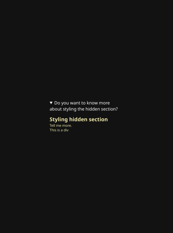
Notice the difference? There is only one margin at the start of the section. The <p> and <div> do not have margins.
The downside of using the ::details-content pseudo-element is that browser support is currently limited to Chrome.
display type of the <details> element. This restriction has been relaxed in Chromedisplay type of <summary>. The default is display: list-item;; if you change it to display: block;, it may result in the marker being hidden in some browsers. This was an issue in Firefox:
/* This may cause the marker to be hidden in some browsers */
summary {
  display: block;
}
<details><summary> element has a default ARIA role of button, it strips all roles from child elements. Therefore, if you want to have a heading like a <h2> in a <summary>, assistive technologies such as screen readers won’t recognize it as a heading. Try to avoid this pattern:
<!-- h2 is not recognized as a heading by assistive technologies -->
<details>
  <summary><h2>Spoilers</h2></summary>
  <ol>
    <li>Steven Spielberg shot the film in chronological order to invoke a real response from the actors (mainly the children) when E.T. departed at the end. All emotional responses from that last scene are real.</li>
    <li>When E. T. is undergoing medical treatment, an off-camera voice says, "The boy's coming back. We're losing E.T." The person delivering this line is Melissa Mathison, who wrote the screenplay for the film.</li>
  </ol>
</details>
Recently, there was a big proposal to help make <details> more customizable and interoperable between browsers. Phase 1 includes some of what I covered in this article:
display property restrictions so you can use other display types like flex and grid::details-content pseudo-element to address the second slot so that a container for the “additional information” in the <details> element can be styledThe exciting news is items 1 and 3 in the list above have shipped in Chrome 131 (as of November 2024). The next phase should be tackling improving the styling of the marker. Additionally, there is a set of related changes that will help improve the ability to animate these elements.
The <details> HTML element has gotten much easier to customize in CSS. You can now make exclusive groups with full browser support, animate the transition of opening/closing states as a progressive enhancement, and perform simple styling of the marker.
The Achilles’ heel of <details> is the styling of the marker. The good news is that there is an active proposal that addresses this and some other pain points. This should remove all of the stumbling blocks when using <details>. In the near future, you won’t need to write your own disclosure widget or use a third-party web component! 🤞
As web frontends get increasingly complex, resource-greedy features demand more and more from the browser. If you’re interested in monitoring and tracking client-side CPU usage, memory usage, and more for all of your users in production, try LogRocket.

LogRocket lets you replay user sessions, eliminating guesswork around why bugs happen by showing exactly what users experienced. It captures console logs, errors, network requests, and pixel-perfect DOM recordings — compatible with all frameworks.
LogRocket's Galileo AI watches sessions for you, instantly identifying and explaining user struggles with automated monitoring of your entire product experience.
Modernize how you debug web and mobile apps — start monitoring for free.

AI companies are buying developer tools as coding agents turn runtimes, package managers, and linters into strategic infrastructure.

Learn how AI-assisted development governance uses rules, agents, hooks, and protocols to help AI coding tools produce safer, more consistent code.

A step-by-step guide to building your first MCP server using Node.js, covering core concepts, tool design, and upgrading from file storage to MySQL.

Using security headers in your Next.js apps is a highly effective way to secure websites from common security threats.
Hey there, want to help make our blog better?
Join LogRocket’s Content Advisory Board. You’ll help inform the type of content we create and get access to exclusive meetups, social accreditation, and swag.
Sign up now