

When an AI agent builds UI, it works from its training data and whatever happens to be in its prompt. It has no awareness of the components your team has already built, the prop contracts they expose, or the patterns your design system enforces. The result often looks close enough at first glance, but it relies on invented APIs and ignores decisions your codebase has already made.

The obvious workaround is to paste component source files into the prompt, but that falls apart quickly. A real design system contains dozens of components, each with its own variants, usage guidelines, and interaction states, far more than you can reliably fit into a model’s context window. Instead of querying a structured source of truth, the agent ends up pattern-matching against whatever text you’ve managed to provide.
The Storybook MCP server takes a different approach. It exposes your component library as a set of callable tools that an agent can query at runtime. Rather than relying on prompt context alone, the agent can discover which components exist, fetch documentation for specific components, generate stories, and run targeted tests against them. Think of it as a structured feedback loop instead of a one-shot prompt. Storybook 10.3 ships with @storybook/addon-mcp, making it easy to wire this workflow into your existing development server.
The MCP server ships as part of @storybook/addon-mcp and runs inside your Storybook development server. There’s no separate server to manage and no external service to configure.
Start by scaffolding a React TypeScript project and initializing Storybook:
npm create vite@latest storybook-mcp-demo -- --template react-ts
cd storybook-mcp-demo
npm install
npx storybook@latest init
During init, Storybook 10.4 asks whether you want to enable AI features. Choosing Yes installs and registers @storybook/addon-mcp automatically, along with the Vitest and accessibility addons. If you skip the prompt or you’re adding it to an existing project, you can install and register it manually by running npx storybook add @storybook/addon-mcp.
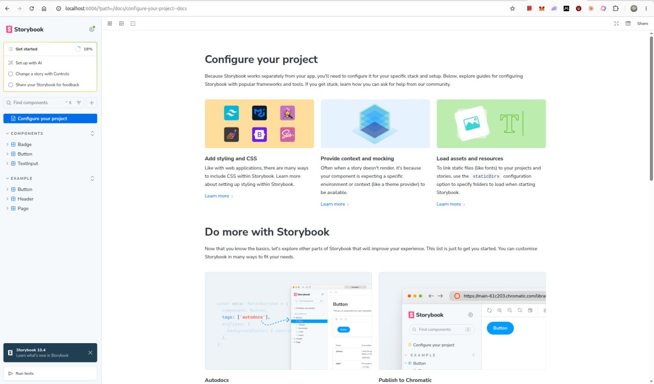
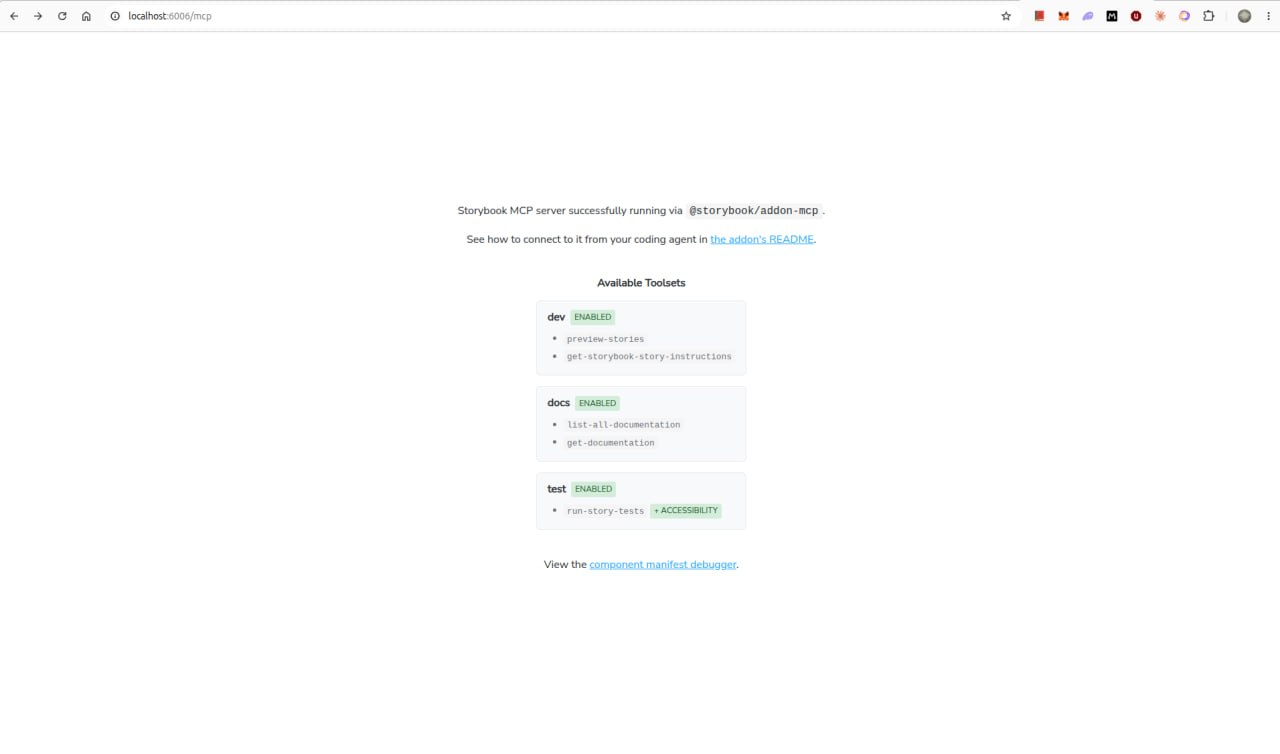
Once Storybook is running, the MCP server is available at http://localhost:6006/mcp. Opening that URL in your browser displays the available tools along with a link to the manifest debugger. In the terminal, you’ll also see confirmation that the documentation toolset is active with the message: Experimental components manifest feature detected — registering component tools.
With the MCP server running, the next step is to connect your AI agent to it. If you’re using Claude Code, run:
npx mcp-add --type http --url "http://localhost:6006/mcp" --scope project
mcp-add is a small CLI utility that writes the MCP server configuration to your project. With --scope project, it creates a .mcp.json file in the project root, scoping the server to this project only. You will be prompted to name the server; use something specific like storybook-mcp-demo, since the name is what your agent references when calling the tools.
The last piece is an AGENTS.md file at the project root. This is the instruction file Claude Code reads before acting on any prompt. Without it, the agent has no guidance to use the MCP tools, even though they are available.
Create .claude/AGENTS.md with the following:
When working on UI components, always use the `storybook-mcp-demo` MCP tools
to access Storybook's component and documentation knowledge before answering
or taking any action.

- CRITICAL: Never hallucinate component properties. Before using any property
  on a component, use the MCP tools to check if it is documented for that component.
- Run `list-all-documentation` to get a list of all components.
- Run `get-documentation` for a specific component to see its props and examples.
- Only use properties that are explicitly documented or shown in example stories.
- Use `get-storybook-story-instructions` before creating or modifying any story file.
- Check your work by running `run-story-tests` after generating components or stories.
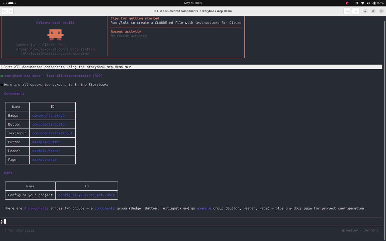
To verify Claude Code can reach the server, make sure Storybook is running, then open Claude Code and send the prompt “List all documented components using the storybook-mcp-demo MCP.” You should see a call to list-all-documentation return the component index.
The MCP server provides six tools across three toolsets. The docs toolset (list-all-documentation, get-documentation, get-documentation-for-story) handles component discovery and prop lookup. The dev toolset (get-storybook-story-instructions, preview-stories) handles story authoring and live previews. The testing toolset (run-story-tests) executes component and accessibility tests against stories and returns structured results.
list-all-documentation returns a flat index of every component registered in your Storybook with its ID. The agent uses those IDs to call get-documentation, which returns the first three stories as rendered code snippets, the full TypeScript prop contract, and an index of remaining variants. When those three stories aren’t enough, get-documentation-for-story fetches a specific variant in isolation.
Here is the actual get-documentation response for our Button component:
# Button  ID: components-button

## Stories

### Primary  Story ID: components-button--primary
const Primary = () => <Button label="Button" variant="primary" size="md" />;

### Other Stories
- Disabled (components-button--disabled)
- Small (components-button--small)
- Large (components-button--large)

## Props
label: string;
variant?: 'primary' | 'secondary' | 'destructive' = 'primary';
size?: 'sm' | 'md' | 'lg' = 'md';
disabled?: boolean = false;
onClick?: () => void;
The agent sees the exact type of contract and real usage examples before writing any code, hence preventing prop hallucination.
get-storybook-story-instructions returns a detailed instruction document covering correct import paths, play function patterns, mocking strategies, and a hard rule to run-story-tests after every change. preview-stories returns live story URLs, and in agents that support MCP Apps, the rendered component embeds directly in the chat. run-story-tests runs the vitest-powered test runner against specific story IDs, and returns pass/fail status plus structured accessibility violation reports.
The docs toolset is backed by component manifests, a structured JSON generated from your stories and component metadata at build time. This is currently React-only, which is why the docs toolset is limited to React projects while dev and testing toolsets work across frameworks.
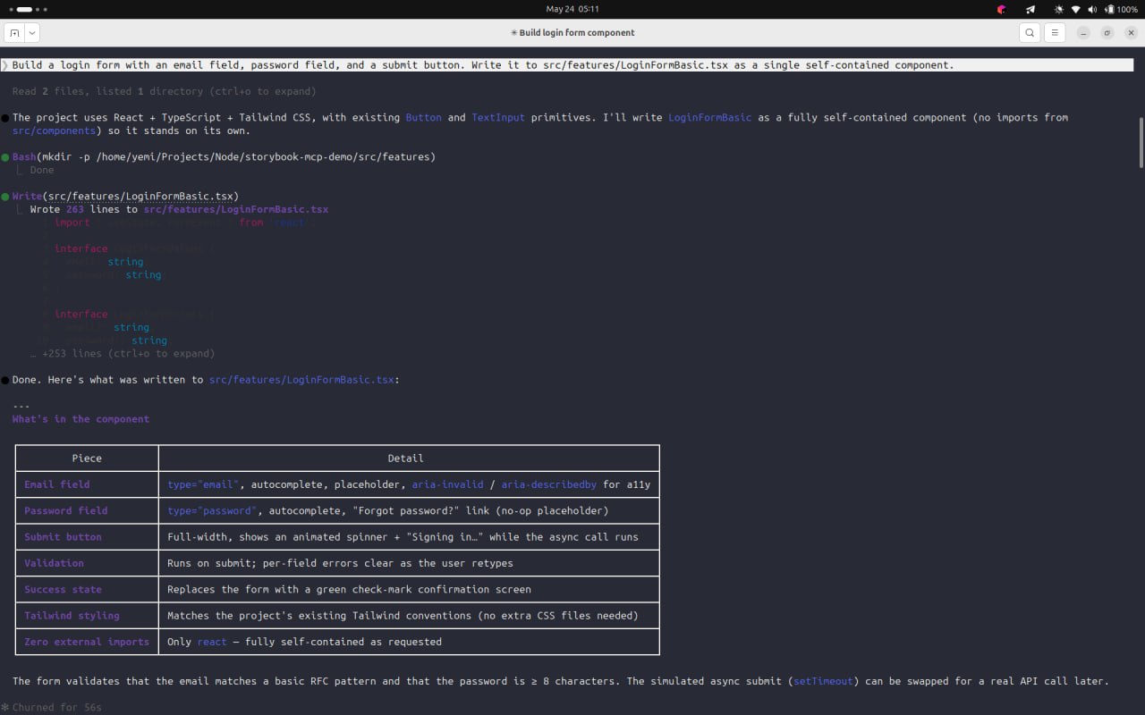
The most direct way to see what the MCP server changes is to give an agent the same prompt twice. Once without a component context, and another with it connected.
With no AGENTS.md and no MCP tools available, Claude Code read the project file tree, noted that Button and TextInput components existed, and immediately wrote a fully self-contained component anyway. The output was 263 lines of inline <input> and <button> elements with their own validation logic and bespoke Tailwind classes, none of which match the prop contracts or visual patterns of the design system components sitting in src/components.
// LoginFormBasic.tsx — built without MCP
<input
  id="email"
  type="email"
  className="w-full rounded-lg border px-3.5 py-2.5 text-sm ..."
  aria-invalid={!!errors.email}
/>
<button
  type="submit"
  className="mt-2 w-full rounded-lg bg-blue-600 px-4 py-2.5 ..."
>
  Sign in
</button>
The agent made zero tool calls. It had no structured way to query what components exist, what props they accept, or what variants they support, so it built everything from scratch.
With AGENTS.md restored and Storybook running, the same prompt produced a completely different sequence. Before writing any code, Claude Code made six MCP tool calls:
get-storybook-story-instructions — fetched story writing conventions and the requirement to run tests after every changelist-all-documentation — retrieved the full component index and identified Button and TextInput as candidatesget-documentation for components-button — fetched prop types and the first three story examplesget-documentation for components-textinput — fetched prop types and usage examplesLoginFormBasic.tsx and a Button story file for structural reference@storybook/react-vite as the installed framework packageOnly after those six calls did it write the component with 188 lines that import and compose the actual design system components:
// LoginFormMCP.tsx — built with MCP
import { Button } from '../components/Button/Button';
import { TextInput } from '../components/TextInput/TextInput';

<TextInput
  label="Email address"
  type="email"
  placeholder="[email protected]"
  value={values.email}
  onChange={handleChange('email')}
  error={errors.email}
  disabled={isSubmitting}
/>
<Button
  label={isSubmitting ? 'Signing in…' : 'Sign in'}
  variant="primary"
  size="lg"
  disabled={isSubmitting}
  onClick={performSubmit}
/>
Every prop (variant, size, error, onChange) matches the documented contract exactly because the agent read it from get-documentation before writing. The agent also caught mid-generation that Button renders with type="button" and would not natively trigger the form’s onSubmit, so it split submit logic into a performSubmit function wired to both the button’s onClick and the form’s onSubmit handler.
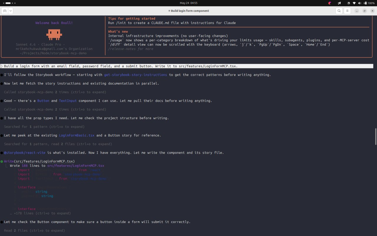
After writing the component, the agent immediately generated a story file with five interaction tests covering the default state, validation errors, invalid email format, short password, and successful submission. It then calls preview-stories and run-story-tests in parallel, which is where the self-healing loop begins.
The first run-story-tests call returned 3 failed, 2 passed across the five stories. The agent read the failure output and identified the cause. getByLabelText('Email address') was failing because the TextInput component did not link its <label> to its <input> via htmlFor and id. This is both a test failure and an accessibility violation.
The agent classified this as a semantic fix with no visual change and applied it automatically without prompting the developer. It updated TextInput.tsx to derive an inputId from the label text when no explicit id prop is provided, wired htmlFor={inputId} to the label, added id={inputId} to the input element, and added aria-invalid and aria-describedby attributes for screen reader support.
// TextInput.tsx — after agent's autonomous a11y fix
const inputId = id ?? label.toLowerCase().replace(/\s+/g, '-');
const errorId = error ? `${inputId}-error` : undefined;

<label htmlFor={inputId} className="text-sm font-medium text-gray-700">
  {label}
</label>
<input
  id={inputId}
  aria-invalid={error ? true : undefined}
  aria-describedby={errorId}
  ...
/>
{error && (
  <span id={errorId} role="alert" className="text-xs text-red-600">
    {error}
  </span>
)}
With that fix applied, the agent called run-story-tests again. All 5 stories passed.
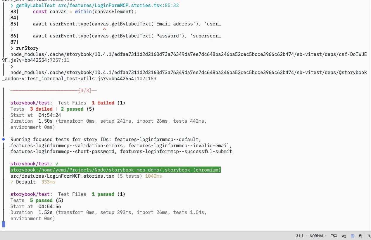
The fix the agent made was not to the login form, but to the shared TextInput component in the design system. Every other story that uses TextInput now also benefits from the corrected accessibility semantics. That is the concrete value of the test loop, as the agent’s scope of correction is not limited to what it just wrote.
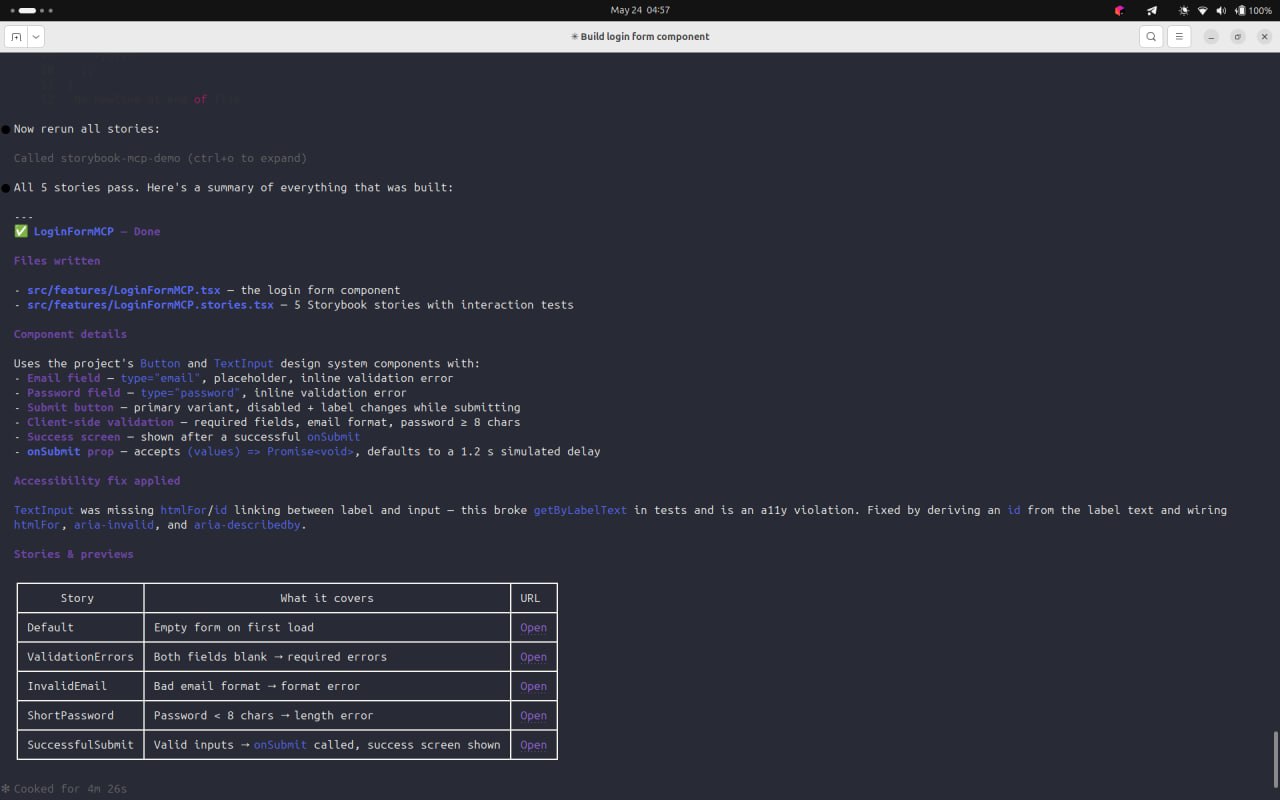
The Storybook MCP server closes the gap between what an agent can generate and what your codebase already has. With a running Storybook instance and three setup steps, an agent gains a structured, queryable view of your component library and the tools to verify its own output before you ever see it. That is a meaningfully different starting point for AI-assisted UI development than a prompt and a blank file. Find the source files for this article set up on GitHub.

Explore how looping Transformers reuse layers and compare with traditional GPT models in reasoning tasks.

Learn how one solo developer used multiple Grok Bot AI agents to test, report bugs, fix code, and monitor deployments — hands-free, on a $30/month plan.

Compare the top AI development tools and models of October 2026. View updated rankings, feature breakdowns, and find the best fit for you.

Can AI agents debug React bugs across browsers? I tested Chrome, Safari, and Firefox debugging MCPs on four bugs to compare their findings, workflows, and effectiveness.
Would you be interested in joining LogRocket's developer community?
Join LogRocket’s Content Advisory Board. You’ll help inform the type of content we create and get access to exclusive meetups, social accreditation, and swag.
Sign up now
 Learn more →